Master Excel Line Charts: Transform Your Data into Visual Stories
Unlock the Power of Data Visualization to Reveal Insights at a Glance
I've discovered that transforming raw spreadsheet numbers into compelling visual narratives is one of the most powerful skills in today's data-driven world. Whether you're tracking sales performance, monitoring key metrics, or analyzing scientific data, mastering Excel line charts will revolutionize how you communicate insights and make data-driven decisions.
Why Line Charts Matter for Data Analysis
I've spent years working with data, and I can confidently say that line charts are essential tools for displaying trends and patterns over time in Excel. They're perfect for tracking sales performance, monitoring metrics, and analyzing scientific data in ways that raw numbers simply can't match.
Unlike staring at endless rows of spreadsheet numbers, line charts reveal insights at a glance. My experience has shown that they're invaluable for financial reporting, project tracking, and performance monitoring across virtually every industry. When I need to use line graphs to visualize trends, I always start with Excel's powerful charting capabilities.
Common Line Chart Applications
What I find particularly powerful is how PageOn.ai can transform these Excel concepts into interactive visual presentations using AI Blocks, making complex data stories even more engaging and accessible to wider audiences.
Setting Up Your Excel Data for Success
I've learned that successful data visualization in Excel starts with proper data organization. The foundation of any great line chart is clean, well-structured data that Excel can easily interpret.
Data Organization Best Practices
- Structure data with clear column headers and consistent formatting
- Place time intervals (dates, months, years) in the first column
- Add numerical values in subsequent columns for each data series
- Ensure data is clean - no blank cells or text in number columns
- Use consistent date formats throughout your dataset
- Label columns descriptively (e.g., "Q1 Sales" instead of just "Sales")
- Remove any merged cells that could interfere with chart creation
- Sort data chronologically for better visual flow
Data Structure Workflow
flowchart LR
                        A[Raw Data] --> B[Clean Headers]
                        B --> C[Format Dates]
                        C --> D[Remove Blanks]
                        D --> E[Sort Chronologically]
                        E --> F[Ready for Chart]
                        style A fill:#FFE5CC
                        style F fill:#CCFFCC
I've discovered that PageOn.ai's Deep Search feature could automatically find and integrate relevant data visualizations, saving hours of manual preparation work and ensuring consistency across all your charts.
Creating Your First Line Chart: Step-by-Step Process
When I create my first line chart, I follow a systematic approach that ensures success every time. The process is surprisingly straightforward once you understand the key steps.
Essential Chart Creation Steps
- Select your data range including headers - I click any cell within my data to let Excel auto-detect the range
- Navigate to Insert tab → Charts group → Insert Line Chart
- Choose your chart type between 2-D Line, Line with Markers, or 3-D Line options
- Excel automatically generates the chart with default settings
- Right-click to access "Select Data" for manual adjustments
- Use the Chart Design tab for quick layout changes
- Apply recommended charts feature for optimal visualization suggestions
Pro Tip: I've found that leveraging PageOn.ai's Vibe Creation can help explain these complex chart creation steps conversationally, making them easier for team members to follow and implement.
Advanced Customization Techniques
I've discovered that the difference between a good chart and a great one lies in the customization details. Excel offers numerous options to transform basic line charts into professional visualizations that tell compelling data stories.
Professional Formatting Options
Visual Enhancements
- • Apply smooth lines for polished presentations
- • Add data markers at key points
- • Customize legend position and formatting
- • Use error bars to show variability
Chart Elements
- • Modify chart titles for clarity
- • Adjust axis scales to focus data
- • Add trendlines (linear, exponential)
- • Format gridlines with transparency
Impact of Customization on Chart Clarity
I particularly appreciate how PageOn.ai's AI Blocks can combine these customization elements into dynamic presentations, creating data visualization charts that are both beautiful and functional.
Working with Multiple Data Series
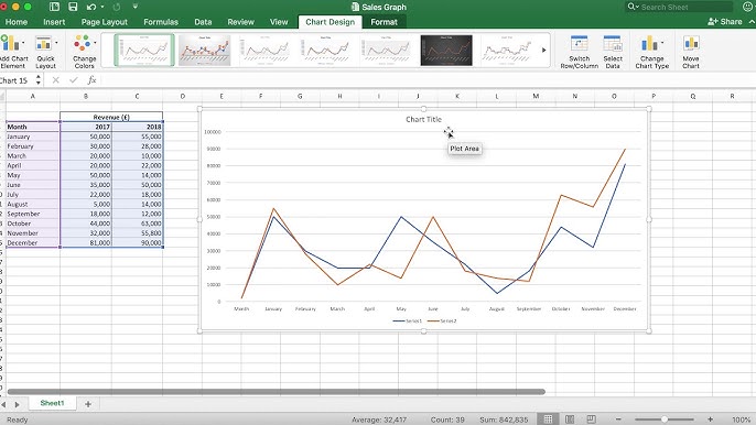
When I need to compare multiple datasets, Excel's ability to display several lines on one chart becomes invaluable. However, I've learned that clarity is key - too many lines can overwhelm viewers.
Comparing Data Effectively
Multiple Series Management Process
flowchart TD
                        A[Select Data Source] --> B{Number of Series?}
                        B -->|2-3 Series| C[Use Different Colors]
                        B -->|4+ Series| D[Consider Secondary Axis]
                        C --> E[Add Clear Legend]
                        D --> F[Use Line Styles]
                        E --> G[Final Chart]
                        F --> G
                        style A fill:#FFE5CC
                        style G fill:#CCFFCC
- Add additional lines through "Select Data" → "Add Series"
- Assign different colors and line styles to each series
- Use secondary axes for data with different scales
- Create combination charts mixing lines with columns
- Hide/show specific series using chart filters
- Limit charts to 3-4 lines for optimal clarity
- Use contrasting colors for easy differentiation
- Add data labels at critical points
I often visualize these comparisons with PageOn.ai's structured content blocks, which can transform static multi-series charts into interactive explorations of data relationships.
Troubleshooting Common Line Chart Issues
Over the years, I've encountered and solved numerous line chart problems. Understanding these common issues and their solutions can save you hours of frustration.
Quick Fixes for Better Charts
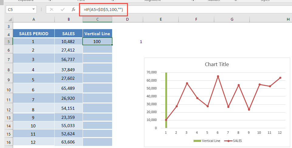
Problem: Incorrect Axis Plotting
Solution: Use "Switch Row/Column" when data appears reversed. This instantly fixes most orientation issues.
Problem: Missing Data Points
Solution: Check for blank cells in your data range. Excel skips empty cells, creating gaps in your line.
Problem: Date Axis Formatting
Solution: Right-click the axis, select "Format Axis," and choose appropriate date formatting options.
Problem: Overlapping Labels
Solution: Adjust text orientation or reduce the number of labels shown by changing axis intervals.
I've found that transforming these troubleshooting guides into visual tutorials with PageOn.ai makes them far more accessible and actionable for team members who are new to Excel charting.
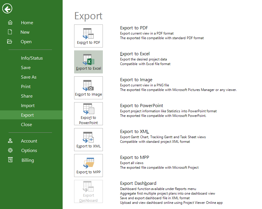
Exporting and Sharing Your Line Charts
Once I've created the perfect line chart, sharing it effectively becomes crucial. Excel provides multiple export options, each suited for different purposes and audiences.
Integration Best Practices
| Export Method | Best For | File Format |
|---|---|---|
| Copy & Paste | PowerPoint/Word | Native Office |
| Save as Image | Universal sharing | PNG, JPEG |
| Export as PDF | Professional reports | |
| Link to Source | Auto-updating | Excel Link |
| Embed in Dashboard | Real-time monitoring | Dynamic |
- Maintain consistent formatting across multiple charts
- Use templates for standardized reporting
- Create dynamic charts with slicers and filters
- Build interactive dashboards combining multiple visualizations
I enhance my presentations by converting static Excel charts into PageOn.ai's interactive visual narratives, creating experiences that engage viewers and facilitate deeper understanding of the data.
Beyond Basic Line Charts: Advanced Variations
As I've expanded my Excel expertise, I've discovered powerful variations that go beyond standard line charts. These advanced techniques can transform how you present and analyze data.
Innovative Visualization Approaches
Advanced Chart Types Usage
- Explore sparklines for mini in-cell trend visualization
- Create waterfall charts for cumulative effect analysis
- Use scatter plots with connecting lines for correlation analysis
- Implement dynamic charts with dropdown controls
- Combine with other chart types for comprehensive analysis
- Add reference lines for benchmarks and goals
- Create band charts to show ranges
- Use conditional formatting to highlight trends
- Build forecast models with trendline projections
Advanced Tip: I transform these advanced concepts into clear visual explanations using PageOn.ai's Agentic processes, making even the most complex visualizations accessible to all stakeholders.
Whether you're creating a simple bar chart in Excel or complex multi-dimensional visualizations, the principles remain the same: clear data, thoughtful design, and purposeful customization lead to impactful visual communication.
Transform Your Visual Expressions with PageOn.ai
Ready to take your data visualization beyond Excel? PageOn.ai empowers you to create stunning, interactive visual narratives that bring your data to life. From AI-powered content blocks to dynamic presentations, discover how our platform can revolutionize the way you communicate insights.
Start Creating with PageOn.ai TodayYour Journey to Excel Mastery
Throughout my journey with Excel line charts, I've discovered that mastering these visualization tools isn't just about technical skills—it's about transforming data into stories that drive decisions and inspire action. From basic line graphs to advanced variations, each technique adds another tool to your analytical arsenal.
Remember, the best chart is one that clearly communicates your message. Whether you're presenting to executives, sharing insights with colleagues, or even creating an org chart in Microsoft Word, the principles of clear visual communication remain constant.
As you continue developing your Excel expertise, consider how platforms like PageOn.ai can amplify your impact. By combining Excel's analytical power with AI-driven visual storytelling, you can create presentations that not only inform but truly engage and inspire your audience. The future of data visualization is here—and it's more accessible than ever before.
You Might Also Like
The AI-Powered Pitch Deck Revolution: A Three-Step Framework for Success
Discover the three-step process for creating compelling AI-powered pitch decks that captivate investors. Learn how to clarify your vision, structure your pitch, and refine for maximum impact.
Essential MCP Tools for Automated Slide Creation and Design | PageOn.ai
Discover essential Model Context Protocol (MCP) tools for automated slide creation and design. Learn how to transform presentation workflows with AI-powered automation.
Visualizing Momentum: Creating Traction Timelines That Win Investor Confidence
Learn how to build compelling traction timelines that prove startup momentum to investors. Discover visualization techniques and best practices for showcasing growth and product-market fit.
Revolutionizing Slide Deck Creation: How AI Tools Transform Presentation Workflows
Discover how AI-driven tools are transforming slide deck creation, saving time, enhancing visual communication, and streamlining collaborative workflows for more impactful presentations.