Mastering Percentage Line Charts: From Data to Visual Insight
I've discovered that percentage line charts are among the most powerful tools for revealing trends and patterns in proportional data. Let me guide you through everything from fundamental concepts to advanced visualization techniques that will transform how you present and interpret percentage-based information.
Understanding the Fundamentals of Percentage Line Charts
What Makes Percentage Line Charts Unique
I've found that percentage line charts offer a unique advantage in data visualization by combining the dynamic nature of line graphs to visualize trends with the universal language of percentages. Unlike absolute value charts, they level the playing field, allowing us to compare entities of vastly different scales on the same visual plane.
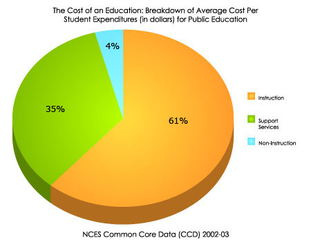
What truly sets these charts apart is their ability to display proportional changes and trends over time. When I'm analyzing market share data or tracking improvement metrics, percentage line charts reveal patterns that might be obscured in raw numbers. They're particularly powerful for visualizing cumulative percentages alongside categorical data, as we often see in Pareto charts where the 80/20 principle comes to life.
Basic Percentage Line Chart Structure
Core Components and Structure
In my experience working with percentage line charts, I've learned that the Y-axis configuration is crucial. We typically work with percentage scales from 0-100%, but sometimes cumulative percentages can exceed 100% when tracking growth rates. The choice between these configurations fundamentally changes how viewers interpret the data.
The X-axis offers flexibility - it can represent time periods for trend analysis, categories for comparison, or sequential data points for process tracking. I always emphasize the critical importance of proper scaling. A truncated scale starting at 50% instead of 0% can make a modest 10% improvement appear dramatic, potentially misleading stakeholders.
Common Applications and Use Cases
Throughout my career, I've applied percentage line charts across diverse domains. In quality control, they're indispensable for tracking defect rates and measuring the effectiveness of improvement initiatives. Business analysts rely on them for monitoring market share fluctuations, conversion rate optimization, and growth percentage tracking.
In educational settings, I've used these charts to visualize grade distributions and track student performance trends across semesters. Financial professionals find them particularly valuable for displaying portfolio allocations and revenue breakdowns, where the relative proportions matter more than absolute dollar amounts.
Creating Accurate Percentage Line Charts with PageOn.ai
Data Preparation and Calculation Methods
I've learned that successful percentage line charts begin with meticulous data preparation. Converting raw data to percentages requires understanding the context - are we calculating part-to-whole relationships or percentage changes over time? Each approach demands different formulas and considerations.
When working with multi-series comparisons, I ensure data integrity by verifying that percentages sum appropriately. Sometimes, rounding can cause totals to deviate from 100%, requiring careful adjustment. To streamline this complex process, I often leverage PageOn.ai's AI Blocks feature, which transforms intricate percentage calculations into clear, modular visual components that anyone can understand.
Data Transformation Process
Here's how I approach converting raw data into percentage visualizations:
flowchart LR
                        A[Raw Data] --> B[Identify Base Values]
                        B --> C[Calculate Percentages]
                        C --> D[Validate Totals]
                        D --> E[Structure for Visualization]
                        E --> F[Create Chart]

                        style A fill:#FFE4B5
                        style B fill:#FFD4A3
                        style C fill:#FFC491
                        style D fill:#FFB380
                        style E fill:#FFA36E
                        style F fill:#FF8000
Design Best Practices for Clarity
My approach to designing percentage line charts prioritizes clarity above all else. I typically start scales at 0% unless there's a compelling reason to focus on a narrower range. When dealing with multiple series, I employ a consistent color coding strategy - warm colors for positive metrics, cool colors for areas needing attention.
Label placement requires careful consideration. I position data labels to avoid overlap while maintaining readability, often using smart labeling algorithms or manual adjustments for critical points. To find inspiration and best practices, I frequently use PageOn.ai's Deep Search feature to discover relevant visual examples and templates from successful data visualization charts across industries.
| Design Element | Best Practice | Common Mistake |
|---|---|---|
| Scale Range | Start at 0% for context | Truncated scales that exaggerate changes |
| Color Coding | Consistent, meaningful palette | Too many similar colors |
| Labels | Strategic placement at key points | Overcrowding with every data point |
| Grid Lines | Subtle, at meaningful intervals | Too prominent or too many |
Avoiding Common Pitfalls
I've witnessed how truncated scales can dramatically distort perception. A line showing growth from 70% to 75% can appear as a steep climb when the Y-axis starts at 69%, but reveals its modest nature when properly scaled from 0%. This is why I always consider the story I'm telling and ensure the visualization supports honest interpretation.
Managing overlapping lines in multi-series charts requires creative solutions. I often use interactive elements, transparency adjustments, or small multiples to ensure each series remains visible and distinguishable. Rounding errors, while seemingly minor, can accumulate and confuse viewers when percentages don't sum to 100%, so I always include explanatory notes when necessary.
Advanced Techniques for Complex Percentage Visualizations
Combining Chart Types for Enhanced Understanding
I've discovered that combining different chart types can dramatically enhance understanding of percentage data. One of my favorite techniques is overlaying percentage lines on bar charts to create Pareto visualizations. This combination brilliantly illustrates both individual contributions and cumulative impact, making the 80/20 principle immediately apparent.
Stacked area charts excel at showing how percentage compositions change over time, while dual-axis charts allow me to display absolute values alongside percentages for complete context. The key is knowing when to use each approach - percentage line charts outperform pie charts for trend analysis, while horizontal bar charts might better suit static comparisons. With PageOn.ai's modular block system, I can build sophisticated multi-chart dashboards that combine these various visualization types seamlessly.
Pareto Chart: Combining Bar and Line Visualizations
Interactive and Dynamic Percentage Displays
Modern percentage line charts demand interactivity. I implement drill-down capabilities that allow viewers to explore percentage breakdowns at multiple levels - from company-wide metrics to department-specific details. Time-based animations bring percentage evolution to life, showing how market dynamics shift month by month.
Responsive design is non-negotiable in today's multi-device world. My charts automatically adapt to screen sizes, adjusting label density and interaction methods accordingly. Tooltips and hover effects provide additional context without cluttering the primary visualization, revealing exact percentages, sample sizes, and relevant notes on demand.
Statistical Enhancements and Analysis
I enhance percentage line charts with statistical overlays that provide deeper insights. Adding trend lines reveals underlying patterns obscured by short-term fluctuations, while moving averages smooth out noise to highlight genuine trends. These techniques are particularly valuable when analyzing volatile percentage data like daily conversion rates.
Highlighting significant thresholds transforms charts from mere displays into decision-support tools. I often mark industry benchmarks, target percentages, or statistical significance levels directly on the visualization. When dealing with survey data or sample-based percentages, I include confidence intervals to communicate uncertainty honestly, ensuring stakeholders understand both the insights and their limitations.
Real-World Implementation Strategies
Business Intelligence Applications
In my business intelligence work, percentage line charts have become indispensable for visualizing conversion funnel performance. I track how conversion percentages evolve at each stage, identifying bottlenecks and improvement opportunities. These visualizations have helped teams increase conversion rates by focusing efforts where percentage drops are steepest.
Customer analytics benefit enormously from percentage trend visualization. I monitor retention rates, churn percentages, and customer lifetime value trends, creating dashboards that update in real-time. For competitive analysis, market share percentage lines reveal strategic positioning over time. To create compelling narratives around these metrics, I use PageOn.ai's Vibe Creation feature to transform raw percentage data into stories that resonate with stakeholders and drive action.
KPI Achievement Percentages Across Departments
Educational and Scientific Uses
In educational settings, I've implemented percentage line charts to track student improvement across subjects and semesters. These visualizations help educators identify learning trends, compare class performance, and adjust teaching strategies based on percentage-based success metrics.
Scientific research benefits from percentage visualizations when presenting survey response distributions or experimental success rates. I've created charts showing percentage changes in population demographics, disease prevalence trends, and treatment efficacy rates. These visualizations make complex statistical findings accessible to broader audiences, from peer reviewers to policy makers.
Tool-Specific Implementation Guides
Each visualization tool offers unique capabilities for percentage line charts. In Excel, I leverage built-in chart types and custom formatting to create publication-ready visualizations. The key is understanding when to use standard line charts versus specialized options like the combination charts for Pareto analysis.
Power BI takes percentage visualization further with DAX measures that calculate complex percentages dynamically. I create measures for year-over-year percentage changes, running totals, and percentage of parent calculations. Tableau's calculated fields offer similar power, with the added benefit of intuitive drag-and-drop interfaces. For web applications, JavaScript libraries like Chart.js provide complete control over every aspect of the visualization. To streamline this entire workflow, I often employ PageOn.ai's Agentic process, which automatically generates appropriate percentage visualizations based on data characteristics and intended insights.
Implementation Workflow Across Platforms
flowchart TD
                        A[Data Source] --> B{Choose Platform}
                        B --> C[Excel]
                        B --> D[Power BI]
                        B --> E[Tableau]
                        B --> F[Web/JS]

                        C --> G[Pivot Tables]
                        D --> H[DAX Measures]
                        E --> I[Calculated Fields]
                        F --> J[API Integration]

                        G --> K[Generate Chart]
                        H --> K
                        I --> K
                        J --> K

                        K --> L["Customize & Deploy"]

                        style A fill:#E8F5E9
                        style K fill:#FF8000
                        style L fill:#66BB6A
Interpreting and Communicating Percentage Line Charts
Reading Patterns and Trends
I've learned to read percentage line charts like a language, where each pattern tells a story. Acceleration in percentage growth appears as an upward curve rather than a straight line, signaling momentum building in the measured metric. Conversely, deceleration shows as a flattening curve, often preceding a plateau or decline.
Identifying inflection points - where trends reverse or accelerate - provides crucial insights for decision-making. I pay special attention to the slope of percentage lines; a steep slope indicates rapid change, while gentle slopes suggest gradual evolution. Understanding the difference between linear and exponential percentage trends helps me anticipate future developments and adjust strategies accordingly. For deeper analysis of these patterns, exploring growth strategies visualization techniques can provide valuable frameworks.
Contextualizing Percentage Data
Context transforms percentage data from numbers into insights. I always provide baseline comparisons - industry averages, historical performance, or competitor benchmarks - to give viewers perspective. A 5% improvement might seem modest until compared to an industry average of 2%.
I'm careful to explain the significance of percentage changes versus absolute changes. A 50% increase sounds dramatic, but if it's from 2 to 3 customers, the context changes everything. Understanding bar charts vs histograms helps in choosing the right visualization to provide this context. I use annotations strategically to highlight anomalies, explain external factors affecting percentages, and guide viewers to key insights without overwhelming them.
Percentage Change vs. Absolute Values
Presentation and Storytelling
Crafting narratives around percentage trends transforms data into decisions. I structure presentations to build understanding progressively - starting with overall trends before diving into specifics. Multiple charts in sequence can tell a story of challenge, intervention, and improvement that a single complex visualization might obscure.
I balance detail with simplicity based on my audience. Executives need high-level percentage trends with clear implications, while analysts want granular data with statistical confidence. PageOn.ai has become my secret weapon for transforming raw percentage data into visually compelling stories. Its intelligent visualization engine understands the narrative I'm trying to convey and suggests the most effective ways to present percentage-based insights that resonate with stakeholders and drive meaningful action.
Transform Your Visual Expressions with PageOn.ai
Ready to elevate your percentage line charts and data visualizations? PageOn.ai's cutting-edge AI-powered platform makes it simple to create stunning, interactive visualizations that tell compelling data stories. From automated chart generation to intelligent design suggestions, discover how PageOn.ai can revolutionize your approach to percentage data visualization.
Start Creating with PageOn.ai TodayYour Journey to Percentage Chart Mastery
Throughout this guide, I've shared my comprehensive approach to creating, interpreting, and communicating with percentage line charts. From fundamental concepts to advanced visualization techniques, these tools have the power to transform how we understand proportional data and trends.
Remember that effective percentage visualization isn't just about technical execution - it's about choosing the right approach for your data story, maintaining integrity in your representations, and always keeping your audience's needs at the forefront. Whether you're tracking business KPIs, analyzing scientific data, or presenting educational outcomes, percentage line charts offer unparalleled clarity when used thoughtfully.
As you embark on your own percentage visualization projects, consider how tools like PageOn.ai can accelerate your workflow and enhance your visual storytelling capabilities. The combination of solid foundational knowledge and powerful visualization platforms will enable you to create percentage line charts that not only inform but inspire action. Start small, practice regularly, and soon you'll be crafting percentage visualizations that turn complex data into clear, actionable insights.
You Might Also Like
Transform ChatGPT Prompts into Professional PowerPoint Slides | Ultimate Guide
Learn how to transform ChatGPT prompts into stunning PowerPoint presentations with our comprehensive guide. Discover expert techniques, tools, and workflows for AI-powered slides.
Creating Dynamic Picture Backgrounds in PowerPoint: Transform Your Presentations
Learn how to create stunning dynamic picture backgrounds in PowerPoint presentations to boost engagement, improve retention, and enhance visual appeal with step-by-step techniques.
Mastering Image Cropping and Alignment: Creating Visual Harmony in Your Designs
Learn essential techniques for image cropping and alignment to create visually harmonious designs. Discover aspect ratios, composition strategies, and alignment principles for professional results.
Transform Your Presentations: Mastering Slide Enhancements for Maximum Impact
Learn how to elevate your presentations with effective slide enhancements, formatting techniques, and visual communication strategies that captivate audiences and deliver powerful messages.