Master Excel Pie Chart Rotation: Transform Complex Data into Clear Visual Stories
Unlock the Power of Strategic Chart Rotation for Better Data Storytelling
When I first started working with Excel pie charts, I quickly discovered that the default orientation rarely told the clearest story. Through years of creating data visualizations for executives and stakeholders, I've learned that mastering pie chart rotation can dramatically improve how your audience understands and engages with your data.
When Pie Charts Need a New Perspective
I've spent countless hours perfecting data visualizations, and one truth stands out: pie charts are powerful tools for visualizing proportional data, but their default orientation doesn't always tell the clearest story. Whether you're presenting market share data, budget distributions, or survey results, the ability to rotate your pie chart can dramatically improve readability and impact.
Key Insight: Strategic rotation can transform a cluttered, confusing pie chart into a clear, compelling visual narrative that guides your audience's attention exactly where you want it.
- • The critical difference between standard and strategically rotated pie charts lies in how they guide the viewer's eye
- • Rotation matters for data label clarity and visual hierarchy, especially with multiple small segments
- • Modern tools like PageOn.ai's AI Blocks can help structure your chart presentations without complex software knowledge
Understanding Pie Chart Rotation Fundamentals
What Makes Rotation Essential
In my experience working with Excel pie charts, I've noticed they begin at 0 degrees by default, with the first data slice starting from the 12 o'clock position. This standard placement often creates challenges that can undermine your data's impact.
Common Challenges with Default Positioning:
- • Data labels overlap when multiple small slices cluster together
- • Important segments may appear in less prominent positions
- • The visual flow doesn't match your narrative structure
The Technical Foundation
Rotation Angle Reference Guide
Understanding how different rotation angles affect your pie chart's starting position
The "Angle of First Slice" setting controls your pie chart's rotation, ranging from 0 to 360 degrees. I've found that understanding these key positions helps you make informed rotation decisions quickly.
When working with data visualization in Excel, I often use PageOn.ai's Deep Search feature to automatically find and integrate relevant visualizations that complement my rotated charts. This saves hours of manual research and ensures my presentations are comprehensive.
Step-by-Step Guide to Rotating Your Pie Chart
Basic Rotation Process
Pie Chart Rotation Workflow
Follow this simple workflow to rotate your pie chart effectively
flowchart LR
                        A[Select Chart] --> B[Right-Click]
                        B --> C[Format Data Series]
                        C --> D[Series Options]
                        D --> E[Adjust Angle]
                        E --> F[View Results]

                        style A fill:#FF8000,stroke:#333,stroke-width:2px,color:#fff
                        style F fill:#66BB6A,stroke:#333,stroke-width:2px,color:#fff
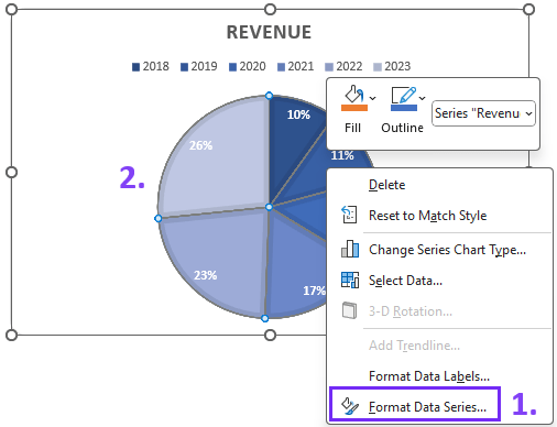
- 1. Select Your Chart: Click on any slice of your pie chart to select the entire chart
- 2. Access Format Options: Right-click and select "Format Data Series" from the context menu
- 3. Navigate to Series Options: In the Format Data Series pane, locate the "Series Options" section
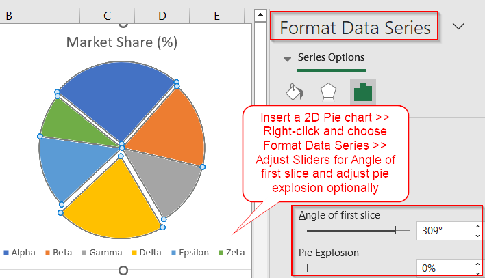
-
4. Adjust the Angle: Find "Angle of first slice" and either:
- • Type your desired degree value (0-360)
- • Use the slider to rotate incrementally
- • Watch your chart update in real-time
Advanced Rotation Techniques
For 3-D Pie Charts
Access additional X and Y rotation controls through "3-D Rotation" settings
For Doughnut Charts
Apply the same rotation principles with the added benefit of center space for annotations
For Pie of Pie Charts
Note that secondary pie charts cannot be independently rotated
I've discovered that leveraging PageOn.ai's Vibe Creation feature can transform these rotation instructions into conversational, easy-to-follow visual guides. The AI-powered suggestions help determine optimal rotation angles based on your specific dataset, making the process much more intuitive.
Strategic Applications and Best Practices
Solving Common Visualization Challenges
Challenge 1: Overlapping Labels
Rotate to position small slices in corners where more space is available.
Example: A 30-degree rotation can move clustered small segments from bottom to corner positions
Challenge 2: Emphasizing Key Data
Position your most important slice at the top or right side for Western readers.
Use rotation to align with reading patterns and presentation flow
Challenge 3: Multiple Small Slices
Consider Pie of Pie or Bar of Pie alternatives when rotation alone isn't sufficient.
Implement the "three consecutive small slices" rule: rotate when 3+ slices total less than 10%
Impact of Strategic Rotation on Label Clarity
Comparing label readability before and after rotation optimization
Integration with Modern Visualization Tools
I've found that PageOn.ai's Agentic processes can analyze your data and suggest optimal rotation angles automatically. This is particularly useful when combining rotated pie charts with bar charts in Excel for comprehensive dashboards.
Using AI pie chart generators can also automate rotation decisions, ensuring your visualizations are always optimized for maximum clarity and impact.
Advanced Customization and Automation
VBA Automation for Dynamic Rotation
For datasets that change regularly, I recommend automating rotation with VBA. This approach has saved me countless hours when working with recurring reports.
Sub RotatePieChart()
    Dim cht As Chart
    Dim optimalAngle As Integer

    ' Reference your chart
    Set cht = ActiveSheet.ChartObjects("Chart 1").Chart

    ' Calculate optimal angle based on data distribution
    optimalAngle = CalculateOptimalAngle(cht)

    ' Apply rotation
    cht.ChartGroups(1).FirstSliceAngle = optimalAngle
End Sub- • Detect slice distribution programmatically
- • Apply conditional rotation based on data patterns
- • Create reusable rotation templates for recurring reports
Combining Rotation with Other Enhancements
Exploded Slices
Pull out individual segments while maintaining optimal rotation
Color Optimization
Adjust color schemes to complement your chosen rotation
Label Positioning
Fine-tune data label placement after rotation for maximum clarity
I've discovered that transforming complex rotation workflows into simple drag-and-drop operations with PageOn.ai's AI Blocks makes advanced customization accessible to everyone, regardless of technical expertise.
Choosing Between Pie Charts and Alternatives
When to Rotate vs. When to Switch
Chart Selection Decision Tree
Use this decision tree to determine the best visualization approach
flowchart TD
                        A[Data to Visualize] --> B{Parts of Whole?}
                        B -->|Yes| C{Less than 7 categories?}
                        B -->|No| D[Use Bar/Column Chart]
                        C -->|Yes| E{Labels Clear?}
                        C -->|No| F[Consider Bar Chart]
                        E -->|Yes| G[Keep Current Pie]
                        E -->|No| H{Can Rotation Help?}
                        H -->|Yes| I[Rotate Pie Chart]
                        H -->|No| J[Use Alternative]

                        style A fill:#FF8000,stroke:#333,stroke-width:2px,color:#fff
                        style I fill:#66BB6A,stroke:#333,stroke-width:2px,color:#fff
                        style J fill:#42A5F5,stroke:#333,stroke-width:2px,color:#fff
Sometimes rotation isn't the answer. Through my experience, I've learned to recognize when alternative visualizations serve the data better.
Consider alternatives when:
- • You have more than 7 categories (use a bar chart instead)
- • Comparing pie vs donut charts for multi-series data
- • The data doesn't represent parts of a whole
Making Data-Driven Decisions
- • Use rotation for fine-tuning existing pie charts
- • Switch chart types for fundamental visualization challenges
- • Apply the best ways to present data in Excel based on your audience and context
Troubleshooting and Optimization
Common Issues and Solutions
Labels Still Overlapping
Combine rotation with "Best Fit" label positioning for optimal results
3-D Charts Looking Distorted
Balance X and Y rotation for optimal depth perception
Printing Issues
Adjust worksheet orientation alongside chart rotation
Performance Optimization Tips
- ✓ Keep rotation angles between key positions (0°, 90°, 180°, 270°) for cleaner alignment
- ✓ Test different angles with your specific data before finalizing
- ✓ Document rotation choices for consistency across report updates
I've found that letting PageOn.ai's AI assistant analyze your chart and suggest optimal rotation settings based on your data patterns can eliminate much of the trial and error. The ability to transform rotation guidelines into reusable visual templates with AI Blocks has revolutionized my workflow efficiency.
Transform Your Visual Expressions with PageOn.ai
Ready to take your data visualizations to the next level? PageOn.ai combines AI-powered insights with intuitive design tools to help you create stunning, clear visual stories from complex data. No more struggling with manual chart adjustments – let AI guide your visualization decisions.
Start Creating with PageOn.ai TodayElevating Your Data Storytelling
Mastering pie chart rotation in Excel is more than a technical skill—it's about transforming data into compelling visual narratives. Through my journey of creating countless visualizations, I've learned that strategically rotating your charts can guide viewers' attention, eliminate confusion, and ensure your key insights shine through.
Whether you're manually adjusting angles or leveraging AI-powered tools like PageOn.ai to automate the process, the goal remains the same: turning complex data relationships into clear, actionable insights that drive better decision-making.
Remember:
The perfect rotation angle is the one that best serves your data story. Start with the fundamentals covered here, experiment with your specific datasets, and don't hesitate to combine rotation with other visualization techniques for maximum impact. Your audience will thank you for the clarity and professionalism that well-rotated charts bring to your presentations.
You Might Also Like
Transform ChatGPT Prompts into Professional PowerPoint Slides | Ultimate Guide
Learn how to transform ChatGPT prompts into stunning PowerPoint presentations with our comprehensive guide. Discover expert techniques, tools, and workflows for AI-powered slides.
The Strategic Color Palette: Mastering Color Theory for Brand Recognition
Discover the fundamentals of color theory for effective brand communication. Learn how strategic color choices impact brand recognition, emotional response, and consumer decisions.
The Art of Visual Hierarchy: Elevating UX Design Through Strategic Emphasis
Learn how to create powerful visual impact in UX design through strategic emphasis techniques. Discover principles of visual hierarchy that drive user behavior and boost engagement.
Stock Photos in Presentations: Bringing Vibrancy and Depth to Visual Storytelling
Discover how to transform your presentations with strategic stock photography. Learn selection techniques, design integration, and visual consistency to create compelling visual narratives.