Mastering 3D Clustered Column Charts
From Data Chaos to Visual Clarity
I've discovered that presenting multi-dimensional data effectively is one of the most challenging aspects of data visualization. When flat visualizations fall short and we need that extra dimension to truly understand our data patterns, 3D clustered column charts become our secret weapon. Let me guide you through transforming your raw numbers into compelling visual stories that speak volumes.
Why 3D Column Charts Matter
I've spent countless hours wrestling with complex datasets, trying to make sense of multiple variables across different categories. The breakthrough came when I realized that sometimes, flat 2D visualizations simply aren't enough. When we're dealing with multi-dimensional data – like comparing quarterly sales across regions and product lines simultaneously – we need that extra dimension to truly grasp the patterns and relationships.
3D clustered column charts excel in scenarios where we need to compare multiple data series across categories while maintaining visual separation. I've found them particularly effective when presenting to stakeholders who need to quickly understand complex relationships without diving into spreadsheets. The depth perception adds an intuitive layer of understanding that flat charts can't provide.
Pro Tip: When I work with PageOn.ai's AI Blocks, I can transform raw data into these compelling visual stories in minutes rather than hours. The AI understands the context of my data and suggests the most effective visualization approach automatically.
Understanding the Architecture of 3D Clustered Column Charts
Let me break down the core components that make 3D clustered column charts so powerful. Understanding these elements has been crucial in my journey to creating effective visualizations.
3D Chart Component Architecture
Here's how the different elements work together to create depth and clarity:
                    flowchart TD
                        A[3D Clustered Column Chart] --> B[X-Axis: Categories]
                        A --> C[Y-Axis: Values]
                        A --> D[Z-Axis: Depth]
                        B --> E[Product Categories]
                        B --> F[Time Periods]
                        C --> G[Numerical Data]
                        C --> H[Scale Settings]
                        D --> I[Data Series]
                        D --> J[Visual Separation]
                        I --> K[Series 1: Q1 Data]
                        I --> L[Series 2: Q2 Data]
                        I --> M[Series 3: Q3 Data]
                        I --> N[Series 4: Q4 Data]

                        style A fill:#FF8000,stroke:#333,stroke-width:2px
                        style B fill:#e8f5e9,stroke:#4caf50,stroke-width:2px
                        style C fill:#e3f2fd,stroke:#2196f3,stroke-width:2px
                        style D fill:#fff3e0,stroke:#ff9800,stroke-width:2px
Core Components
- • Axes: Three dimensions for comprehensive data mapping
- • Columns: Vertical bars representing data values
- • Clusters: Grouped columns for category comparison
- • Depth: Z-axis providing visual separation
Key Advantages
- • Enhanced visual separation between series
- • Intuitive pattern recognition
- • Professional presentation appeal
- • Better handling of overlapping data
The magic happens when clustering works in harmony with the third dimension. I've learned that grouping related data series allows viewers to make comparisons both within clusters (same category, different series) and across clusters (different categories, same series). This dual comparison capability is what sets 3D clustered column charts apart from their 2D counterparts.
Step-by-Step Implementation Across Platforms
Excel and PowerPoint Integration
I remember my first attempt at creating a 3D clustered column chart in Excel – it seemed daunting until I discovered the straightforward process. Here's my refined approach that I use daily:
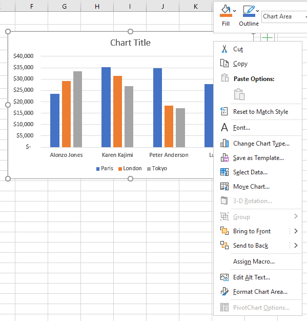
- 1. Navigate to Insert: Click the Insert tab → Chart group → Column chart dropdown → 3D Clustered Column option
- 2. Data Preparation: Organize your categories in the first column and series data in adjacent columns with clear headers
- 3. Customize Rotation: Right-click the chart → 3D Rotation → Set angles between 15-20 degrees for optimal clarity
- 4. Fine-tune Perspective: Adjust the perspective to 15 degrees to avoid distortion while maintaining depth
PageOn.ai Integration: I often use PageOn.ai's Deep Search feature to find and integrate relevant data visualization charts directly into my Excel workflows, saving hours of manual formatting.
Google Sheets Approach
Google Sheets takes a slightly different approach, but I've found it equally powerful once you know the tricks:
- 1. Select Your Data Range: Highlight your data including headers
- 2. Insert Chart: Insert menu → Chart → Column chart type in the Chart Editor
- 3. Access 3D Options: In Chart Editor → Customize tab → Chart style → Check "3D" option
- 4. Configure Series: Setup tab → Series → Add multiple data series for clustering
Smart Tip: I use PageOn.ai's Vibe Creation to explain complex chart configurations through natural conversation, making it easier to share setup instructions with my team.
Advanced Platforms (WPF, Access)
For those of us working with programmatic solutions, here are the key considerations I've learned:
- • Dynamic Data Binding: Implement real-time updates from database connections
- • Custom Controls: Create rotation and perspective sliders for user interaction
- • Performance Optimization: Cache rendered views for large datasets
- • Export Capabilities: Build in high-resolution export for presentations
Data Preparation and Best Practices
Structuring Your Data for Maximum Impact
Through years of creating visualizations, I've learned that proper data structure is 80% of the battle. Here's my proven framework for organizing data that translates beautifully into 3D clustered column charts:
| Month | Product A | Product B | Product C | Product D |
|---|---|---|---|---|
| January | 150 | 200 | 180 | 130 |
| February | 160 | 210 | 185 | 140 |
| March | 170 | 220 | 190 | 150 |
Data Structure Insight: I always organize categories in the first column and each series in separate columns. This structure helps Excel and other tools automatically understand how to group and plot the data. When working with PageOn.ai's AI Blocks, this structured approach allows for instant visualization generation.
Visual Design Principles
Optimal Design Elements Comparison
This chart demonstrates the impact of different design choices on viewer comprehension:
✅ Best Practices I Follow
- • 15-20° rotation angle for clarity
- • High contrast between series colors
- • Maximum 7-8 categories per chart
- • Clear, concise axis labels
- • Subtle depth effects
❌ Pitfalls I Avoid
- • Extreme viewing angles (>30°)
- • Similar colors for different series
- • Overcrowding with too many categories
- • Overlapping or angled labels
- • Excessive 3D effects
Real-World Applications and Use Cases

I've implemented 3D clustered column charts across various industries, and each application has taught me something new about their versatility. Let me share some of the most impactful use cases I've encountered:
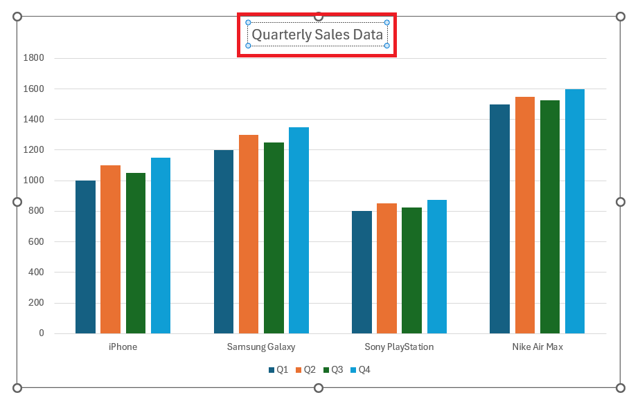
📊 Sales Performance Analysis
In my work with retail clients, I use 3D clustered columns to display quarterly sales by region with product breakdown. The depth dimension allows stakeholders to instantly see which products perform best in which regions, leading to more informed inventory decisions.
Example: Four quarters (clusters) × Five regions (series) × Product categories (values)
💰 Financial Reporting
Multi-year revenue comparisons across departments become crystal clear with 3D visualization. I've helped CFOs present complex budget allocations where traditional flat charts would have required multiple separate graphs.
Example: Years (clusters) × Departments (series) × Revenue streams (values)
🔬 Scientific Data
Experimental results across multiple variables shine in 3D. I've worked with research teams to visualize test results where temperature, pressure, and time all affect outcomes – the 3D clustering makes patterns immediately apparent.
Example: Test conditions (clusters) × Sample types (series) × Measurement values
🏭 Manufacturing Metrics
Production output by facility and product line benefits enormously from 3D visualization. I've helped operations managers identify bottlenecks and optimize production schedules using these charts.
Example: Facilities (clusters) × Product lines (series) × Production volumes
Transform Your Data: Using PageOn.ai's Agentic process, I can transform these complex datasets into clear visuals in minutes. The AI understands the context and automatically suggests the most effective clustering approach for each use case.
Common Pitfalls and How to Avoid Them
After creating hundreds of 3D charts, I've made my share of mistakes. Here are the most common pitfalls I've encountered and how I've learned to avoid them:
Technical Challenges
Common Issues and Solutions
                    flowchart LR
                        A[Common Problems] --> B[Data Distortion]
                        A --> C[Overlapping Columns]
                        A --> D[Scale Issues]
                        A --> E[Resolution Problems]

                        B --> F[Solution: Limit rotation to 15-20°]
                        C --> G[Solution: Adjust gap width]
                        D --> H[Solution: Use consistent scales]
                        E --> I[Solution: Export at 300 DPI]

                        style A fill:#ff6b6b,stroke:#333,stroke-width:2px
                        style F fill:#51cf66,stroke:#333,stroke-width:2px
                        style G fill:#51cf66,stroke:#333,stroke-width:2px
                        style H fill:#51cf66,stroke:#333,stroke-width:2px
                        style I fill:#51cf66,stroke:#333,stroke-width:2px
⚠️ Problem: Data Distortion
3D perspective can make back columns appear smaller than they actually are, misleading viewers about actual values.
✓ My Solution: Keep rotation angles modest and always include data labels for critical values.
⚠️ Problem: Overlapping Columns
Dense datasets can cause columns to overlap, making individual values impossible to distinguish.
✓ My Solution: Increase gap width between clusters and limit series to 4-5 maximum.
Design Mistakes
-
✗
Overuse of 3D effects:
I once created a chart with maximum depth settings – it looked impressive but was completely unreadable. Now I use subtle depth just enough to separate series.
-
✗
Poor angle selection:
Extreme viewing angles can hide important data points behind taller columns. I stick to 15-20 degrees maximum rotation.
-
✗
Inconsistent clustering:
Mixing different data types within clusters confuses viewers. I ensure each cluster represents the same logical grouping.
-
✗
Neglecting colorblind users:
I now always test my charts with colorblind simulators and use patterns or textures as secondary differentiators.
Optimization Techniques for Professional Presentations

Over the years, I've developed a systematic approach to optimizing 3D clustered column charts for maximum impact in professional settings. Here's my proven framework:
Strategic Data Label Placement
I've learned that data labels can make or break a 3D chart. My approach:
- • Place labels only on front-facing columns to avoid clutter
- • Use callout boxes for exceptional values that need highlighting
- • Implement smart label positioning that adjusts based on column height
- • Consider using a data table below the chart for complete transparency
Interactive Elements for Digital Presentations
When presenting digitally, I add these interactive features:
- • Hover tooltips showing detailed breakdowns
- • Click-to-drill-down functionality for nested data
- • Animation sequences that build the chart progressively
- • Toggle buttons to show/hide specific series
Combining with Other Chart Types
I often create comprehensive dashboards by combining 3D clustered columns with:
- • Line charts for trend analysis overlay
- • Pie charts for proportion breakdowns of selected columns
- • Heat maps for correlation analysis
- • Gauge charts for KPI tracking alongside the main visualization
Export Settings for Different Media
My tested export configurations for various use cases:
- • 300 DPI minimum
- • CMYK color mode
- • Vector format when possible
- • SVG for scalability
- • PNG for compatibility
- • Optimized file size under 200KB
- • High contrast settings
- • 1920×1080 resolution
- • Larger fonts (min 14pt)
- • Responsive sizing
- • Touch-friendly interactions
- • Simplified labels
Speed Up Your Workflow: I build professional presentations significantly faster using PageOn.ai's drag-and-drop AI Blocks. The system automatically optimizes charts for my chosen export format, saving me hours of manual adjustment.
Advanced Customization and Automation
Dynamic Chart Updates
I've automated much of my chart creation process, and it's been a game-changer for productivity. Here's how I set up dynamic, self-updating 3D charts:
Live Data Integration Performance
Comparison of update methods and their efficiency:
🔗 Linking to Live Data Sources
- • Connect directly to SQL databases
- • Pull from REST APIs in real-time
- • Sync with cloud storage (Google Drive, OneDrive)
- • Import from multiple Excel workbooks
🔄 Automatic Refresh Mechanisms
- • Schedule hourly/daily/weekly updates
- • Trigger updates on data changes
- • Implement version control for chart states
- • Set up alert notifications for anomalies
Enhanced Visual Elements
Custom Legends and Annotations
I create interactive legends that allow viewers to filter data series on the fly. Annotations with leader lines highlight key insights without cluttering the chart space.
Trendlines in 3D Space
Adding trendlines to 3D charts requires careful positioning. I project them onto a transparent plane that sits just behind the columns, maintaining visibility while preserving the 3D effect.
Secondary Axes for Different Scales
When combining percentage data with absolute values, I implement dual Y-axes. The key is using distinct visual cues (like different column patterns) to clearly indicate which axis applies to which series.
Integration Tip: For comprehensive reporting, I combine my 3D charts with other data visualization charts to create dashboards that tell complete stories. The key is maintaining visual consistency across all chart types.
Comparing Tools and Choosing the Right Platform
After working with virtually every charting platform available, I've developed a clear understanding of each tool's strengths and limitations. Here's my comprehensive comparison:
| Feature | Excel | Google Sheets | Specialized Software | PageOn.ai |
|---|---|---|---|---|
| 3D Customization | Excellent | Basic | Advanced | AI-Optimized |
| Ease of Use | Moderate | High | Low | Very High |
| Collaboration | Limited | Excellent | Varies | Excellent |
| Cost | $$ (Office Suite) | Free | $$$-$$$$ | $-$$ |
| Learning Curve | Moderate | Low | Steep | Minimal |
When I Choose Excel
- ✓ Working with corporate clients using Office 365
- ✓ Need advanced 3D rotation controls
- ✓ Creating templates for repeated use
- ✓ Integrating with other Office applications
When I Choose Google Sheets
- ✓ Collaborative projects with remote teams
- ✓ Quick visualizations without software installation
- ✓ Budget-conscious projects
- ✓ Real-time data sharing requirements
Why PageOn.ai Streamlines Everything
I've found that PageOn.ai bridges the gap between all platforms. It understands my data context and automatically generates optimized 3D charts that I can export to any format. The AI handles the technical complexity while I focus on the insights. Whether I need a quick visualization for a meeting or a polished chart for a board presentation, PageOn.ai delivers consistently professional results in a fraction of the time.
- • Natural language chart creation - just describe what you want
- • Automatic optimization for your chosen export platform
- • Built-in best practices for 3D visualization
- • Seamless integration with existing workflows
Future-Proofing Your Data Visualization Skills

The landscape of data visualization is evolving rapidly, and I'm constantly adapting my skills to stay ahead. Here's what I'm seeing on the horizon and how I'm preparing:
🚀 Emerging Trends in 3D Data Visualization
- • Real-time rendering: Charts that update instantly as data streams in
- • GPU acceleration: Handling millions of data points smoothly
- • WebGL integration: Browser-based 3D without plugins
- • Touch and gesture controls: Intuitive manipulation on all devices
🥽 AR/VR Applications
I'm already experimenting with immersive data exploration. Imagine walking through your data, literally examining columns from different angles, or collaborating with team members in a virtual data room. This isn't science fiction – I'm using these tools today for specialized projects.
- • Virtual data rooms for collaborative analysis
- • AR overlays for real-world data context
- • Gesture-based chart manipulation
- • Spatial data arrangement for pattern discovery
🤖 AI-Assisted Chart Creation
The future is already here with AI-powered visualization. I'm using tools that understand my intent and automatically create optimized charts. Here's what's transforming my workflow:
- • Natural language chart requests: "Show me quarterly sales by region with emphasis on growth"
- • Automatic anomaly highlighting and insight generation
- • Predictive chart suggestions based on data patterns
- • Self-optimizing visualizations that adapt to viewer behavior
Evolution of 3D Data Visualization
                    timeline
                        title Data Visualization Evolution Timeline

                        2020 : Static 3D Charts
                             : Manual Creation
                             : Desktop Software

                        2023 : Interactive Web-Based
                             : Cloud Integration
                             : Real-time Updates

                        2024 : AI-Powered Generation
                             : Natural Language Input
                             : Automated Insights

                        2025+ : AR/VR Integration
                              : Spatial Computing
                              : Predictive Visualization
Building Your Visualization Portfolio
I recommend building a diverse portfolio of visualization techniques. Start with mastering 3D clustered columns, then expand to:
- • Interactive dashboards combining multiple chart types
- • Animated data stories that guide viewers through insights
- • Responsive designs that adapt to any screen size
- • Accessible visualizations that work for all users
Stay Ahead with PageOn.ai: I'm continuously amazed by PageOn.ai's evolving AI capabilities. Every update brings new ways to create visual content that would have taken me hours to produce manually. The platform learns from millions of visualizations, constantly improving its suggestions and automations. By integrating PageOn.ai into my workflow, I'm not just keeping up with the future – I'm helping to shape it.
Transform Your Visual Expressions with PageOn.ai
Ready to revolutionize how you create 3D clustered column charts and other data visualizations? PageOn.ai's AI-powered platform understands your data context and generates professional, optimized charts in seconds – not hours. Join thousands of professionals who've already transformed their data storytelling capabilities.
Start Creating with PageOn.ai TodayYou Might Also Like
Mastering Object Animations: Transform Static Slides into Engaging Visual Stories
Learn how to enhance your presentations with dynamic object animations. Discover techniques for entrance effects, motion paths, interactive elements, and more for PowerPoint and Google Slides.
Engaging Your Audience: Crafting Interactive and Visually Captivating Slides
Discover how to transform static presentations into interactive visual experiences that captivate audiences through strategic design, interactive elements, and data visualization techniques.
Mastering Information Hierarchy: Building Effective User Navigation Systems
Learn how to create intuitive information hierarchy for better user navigation. Discover visual prioritization techniques, content grouping strategies, and implementation best practices.
Vibe Coding: Transforming Ideas into Working Software Through Natural Language
Discover how vibe coding revolutionizes software development by using natural language to create working code. Learn the mechanics, workflow, and future of this AI-powered approach.