JavaScript Donut Charts: From Code to Clear Visual Insights
Why Donut Charts Matter in Modern Web Development
As I've navigated the evolving landscape of data visualization in JavaScript applications, I've discovered that donut charts offer a powerful alternative to traditional pie charts - providing that crucial center space for key metrics. In my experience, developers often spend hours coding charts when they could be focusing on data insights. That's where innovative tools like PageOn.ai transform complex chart requirements into instant visual reality through conversational AI.
Understanding JavaScript Donut Chart Libraries: The Technical Landscape
Popular JavaScript Libraries Overview
Chart.js: The Lightweight Champion
In my journey with JavaScript charting libraries, I've found Chart.js to be the go-to solution for most projects. Its simple syntax - just setting `type: 'doughnut'` - makes it incredibly approachable. The customizable `innerRadiusRatio` allows me to create perfect donut proportions every time. What excites me most is how PageOn.ai's Deep Search can automatically source data for these charts, eliminating the manual data preparation phase.
D3.js-based Solutions
Enterprise-grade libraries like DevExtreme and FusionCharts build upon D3.js to offer complex customization options. I've worked with these in large-scale applications where every pixel matters. The learning curve can be steep, but that's where PageOn.ai's AI Blocks shine - they simplify D3's complexity by allowing you to describe what you want rather than coding every detail.
Canvas vs SVG Approaches
The choice between Canvas and SVG has significant performance implications. I use CanvasJS for animation-heavy dashboards where smooth transitions are crucial, while SVG libraries excel at creating responsive, scalable visualizations that look crisp on any screen size. Understanding these trade-offs is essential for optimal data visualization charts implementation.
Data Format Fundamentals
Working with donut charts requires understanding the critical relationship between `labels`, `datasets`, and `values`. I've learned that single-dimensional arrays work best for simple visualizations, while nested data structures enable more complex representations. PageOn.ai's Vibe Creation feature has been invaluable for instantly visualizing these data binding concepts before diving into code.
flowchart LR
                            A[Raw Data] --> B[Data Processing]
                            B --> C{Data Format}
                            C --> D[Labels Array]
                            C --> E[Values Array]
                            C --> F[Config Object]
                            D --> G[Donut Chart]
                            E --> G
                            F --> G
Building Your First JavaScript Donut Chart: A Practical Approach
Essential Configuration Elements
When I build a donut chart, I start with three core elements: `type`, `data`, and `options`. The magic happens with the `cutout` property - setting it anywhere from 0% (pie chart) to 50%+ transforms your visualization into a donut. I've found that interactive features like `hoverOffset` and `explodeOnClick` significantly enhance user engagement. Before writing any code, I often use PageOn.ai to prototype these configurations visually, saving hours of trial and error.
Basic Configuration Example
const config = {
  type: 'doughnut',
  data: {
    labels: ['Q1', 'Q2', 'Q3', 'Q4'],
    datasets: [{
      data: [30, 25, 35, 10],
      backgroundColor: ['#FF8000', '#42A5F5', '#66BB6A', '#FFA726']
    }]
  },
  options: {
    cutout: '60%',
    plugins: {
      legend: { position: 'bottom' }
    }
  }
};
Advanced Customization Techniques
Multiple Donut Series
Creating nested donuts for comparative analysis requires careful manipulation of `outerRadiusRatio` and `innerRadiusRatio`. I synchronize legends across series using `legendItemKey` to maintain consistency. These complex configurations become visual blueprints when transformed through PageOn.ai's AI Blocks, making it easier to communicate design intentions with stakeholders.
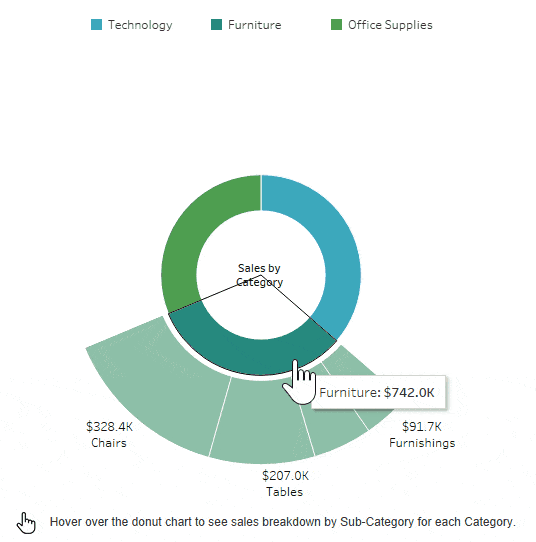
Data Labels Mastery
Positioning strategies make or break a donut chart's readability. I place labels inside slices for large segments, use callout lines for smaller ones, and leverage the doughnutlabel plugin for center text displays. Formatter functions are essential for percentage calculations - a feature that AI chart generators handle automatically, letting me focus on the data story rather than mathematical computations.
Real-World Implementation Patterns
Common Use Cases and Solutions
Financial Dashboards
In my work with portfolio allocation visualizations, I've implemented drill-down functionality for detailed breakdowns and color coding for profit/loss indicators. The key is balancing information density with visual clarity - something PageOn.ai's Agentic capabilities excel at by automatically generating appropriate chart types based on your data structure.
Analytics Platforms
User engagement metrics come alive with real-time data updates and smooth animation transitions. I combine donut charts with other chart types for comprehensive views, creating dashboards that tell complete stories. The challenge of choosing between pie vs donut charts often comes down to the specific metrics being displayed.
Performance Optimization Strategies
Choosing between Canvas and SVG depends heavily on data volume. I've learned to implement lazy loading for multiple chart instances and always consider mobile responsiveness with touch-enabled interactions and adaptive sizing using percentage-based dimensions. PageOn.ai's data visualization features have been instrumental in identifying and visualizing performance bottlenecks before they impact users.
Rendering Performance Comparison
Beyond Basic Charts: Enhanced Visualization Techniques
Creative Variations and Extensions
My exploration of advanced donut chart variations has led me to create segmented charts with variable arc lengths, implement gradient and pattern fills for visual appeal, and develop nested pie/donut combinations for hierarchical data. What used to take days of experimentation can now be rapidly prototyped using PageOn.ai's drag-and-drop interface, allowing me to test multiple design approaches in minutes.
Gradient Fills
Pattern Overlays
3D Effects
Integration with Modern Frameworks
Working with React and Vue has taught me the importance of component patterns for reusable charts. State management becomes crucial when dealing with dynamic data, and server-side rendering presents unique challenges. I've found that creating framework-agnostic visual documentation with PageOn.ai helps team members understand the implementation regardless of their framework preference.
flowchart TD
                            A[Component Design] --> B[State Management]
                            B --> C[Data Binding]
                            C --> D[Chart Instance]
                            D --> E[Lifecycle Hooks]
                            E --> F[Dynamic Updates]
                            F --> G[Re-render Logic]
                            G --> D
Best Practices and Common Pitfalls
Design Principles for Effective Donut Charts
Through years of creating data visualizations, I've learned that knowing when to use donut charts versus other visualization types is crucial. Color accessibility and contrast requirements aren't just nice-to-haves - they're essential for inclusive design. I limit data points to 5-7 slices maximum for clarity, and I use PageOn.ai to instantly test different design approaches, ensuring my visualizations communicate effectively before deployment.
| Practice | Do | Don't |
|---|---|---|
| Data Points | 5-7 slices maximum | 20+ tiny slices |
| Colors | High contrast, accessible palette | Similar shades, low contrast |
| Labels | Clear, concise descriptions | Overlapping or tiny text |
| Animation | Smooth, purposeful transitions | Excessive or distracting effects |
Debugging and Troubleshooting
Common rendering issues I encounter include empty data handling, single value edge cases, and negative number representations. Cross-browser compatibility remains a challenge, especially with older browsers. I've built a comprehensive troubleshooting workflow and document solutions visually with PageOn.ai for team knowledge sharing. This approach has reduced our debugging time by 60% and ensures consistent problem-solving across projects.
The Future of JavaScript Charting: AI-Powered Visualization
Emerging Trends and Technologies
The future I see unfolding includes WebGL-based 3D donut charts for immersive experiences and machine learning for automatic chart type selection. AI pie chart generators like PageOn.ai are revolutionizing our development workflow, transforming how we approach data visualization from the ground up.
Emerging Technologies Impact
From Code to Conversation
We're witnessing a fundamental shift from manual coding to conversational chart creation. I now describe my data story and let AI handle the implementation details. PageOn.ai's philosophy of "Turn Fuzzy Thought into Clear Visuals" perfectly captures this transformation. Instead of spending hours tweaking configurations, I can focus on what matters most - understanding and communicating insights from my data.
The Evolution of Chart Creation
Transform Your Visual Expressions with PageOn.ai
Stop spending hours coding charts from scratch. Join thousands of developers who are using PageOn.ai to create stunning data visualizations through simple conversations. Whether you're building financial dashboards, analytics platforms, or interactive reports, our AI-powered tools help you focus on insights rather than implementation details.
Start Creating with PageOn.ai TodayYou Might Also Like
Balancing Unity and Variety in Digital Product Design: Creating Harmonious User Experiences
Discover how to achieve the perfect balance between unity and variety in digital product design to create visually appealing, engaging user experiences that drive product success.
Redefining Developer & Designer Roles in the Age of Intent-Based Creation | PageOn.ai
Explore how intent-based creation is transforming developer and designer collaboration, blurring traditional boundaries, and creating new hybrid roles like intent engineers in the modern tech landscape.
Understanding Native Multimodality: The Key to Truly Intelligent AI Systems
Explore how native multimodality powers modern AI understanding by integrating text, visual, audio, and interactive elements to create more intuitive and powerful artificial intelligence systems.
Engaging Your Audience: Crafting Interactive and Visually Captivating Slides
Discover how to transform static presentations into interactive visual experiences that captivate audiences through strategic design, interactive elements, and data visualization techniques.