Decoding Left-Skewed Histograms: Transform Statistical Complexity into Visual Clarity
When Data Tells an Asymmetric Story
I've discovered that understanding left-skewed histograms is like learning a new visual language—one that reveals hidden patterns in data that symmetrical distributions simply can't capture. Join me as we explore how these fascinating distributions shape our understanding of everything from income inequality to test scores.
When Data Tells an Asymmetric Story
I've spent countless hours analyzing data distributions, and I can tell you that left-skewed histograms are among the most fascinating patterns we encounter in statistical analysis. Unlike the familiar bell curve, these distributions challenge our intuitions about data and reveal important truths about the phenomena we're studying.
The fundamental challenge I face when interpreting non-symmetrical data distributions is that our traditional measures of central tendency—mean, median, and mode—no longer align as they do in normal distributions. In left-skewed data, we observe a distinctive pattern where the mean is less than the median, which is less than the mode. This relationship isn't just a mathematical curiosity; it has profound implications for how we understand and communicate our findings.

Why do left-skewed histograms matter so much in real-world analysis? I've found them everywhere—from income patterns where most people earn decent salaries but a few earn significantly less, to test scores where most students perform well but a handful struggle significantly. Understanding these patterns helps us make better decisions and develop more effective interventions.
This is where visual intelligence tools like PageOn.ai become invaluable. I've discovered that transforming abstract skewness concepts into comprehensible narratives isn't just about creating pretty charts—it's about making complex statistical relationships accessible to stakeholders who need to understand the data but may not have a statistical background.
The Anatomy of Left-Skewed Distributions
When I first learned to identify left-skewed distributions, I focused on their signature characteristics: the longer left tail and the peak shifted to the right. These visual markers are unmistakable once you know what to look for. The tail extending to the left represents those rare but important low values that pull our mean downward.
Distribution Characteristics Flow
Understanding how different aspects of left-skewed distributions relate to each other:
flowchart LR
                        A[Data Distribution] --> B[Check Symmetry]
                        B --> C{Is it Symmetric?}
                        C -->|No| D[Check Tail Direction]
                        D --> E{Longer Left Tail?}
                        E -->|Yes| F[Left-Skewed]
                        F --> G["Mean < Median < Mode"]
                        E -->|No| H[Right-Skewed]
                        H --> I["Mean > Median > Mode"]
                        C -->|Yes| J[Normal Distribution]
                        J --> K[Mean = Median = Mode]
The mathematical relationship in left-skewed distributions—where Mode ≥ Median ≥ Mean—isn't just a formula to memorize. I think of it as a story the data is telling us. The mode, sitting at the peak, shows us where most of our data lives. The median, resistant to outliers, gives us the true middle. And the mean, sensitive to those low outliers, gets pulled down the left tail.
Visual markers that distinguish left from right skewness become second nature with practice. I look for where the bulk of the data sits—in left-skewed distributions, it's on the right side. The difference between bar charts and histograms becomes particularly important here, as histograms show us the continuous nature of the distribution.
Creating clear visual comparisons has become much easier with modern tools. I've found that PageOn.ai's AI Blocks feature allows me to illustrate distribution differences side by side, making it immediately apparent how left-skewed data differs from normal or right-skewed distributions. This visual clarity is essential when presenting findings to diverse audiences.
Real-World Applications and Interpretations
Income and Wealth Distribution Analysis
In my experience analyzing compensation data, I've consistently observed left-skewed patterns where most employees earn average or above-average salaries, with only a few earning significantly less. This pattern often reflects entry-level positions or part-time workers who pull the mean below the median.
Salary Distribution Example
A typical left-skewed salary distribution in a corporate setting:
When I interpret median versus mean in compensation studies, I always emphasize to stakeholders that the median often provides a more accurate picture of the "typical" employee's salary. The mean, pulled down by those few lower salaries, can underestimate what most employees actually earn.
Visualizing salary disparities effectively requires thoughtful design choices. I've learned that using PageOn.ai's Deep Search feature helps me find relevant industry benchmarks and create compelling visual narratives that resonate with both HR professionals and executives.
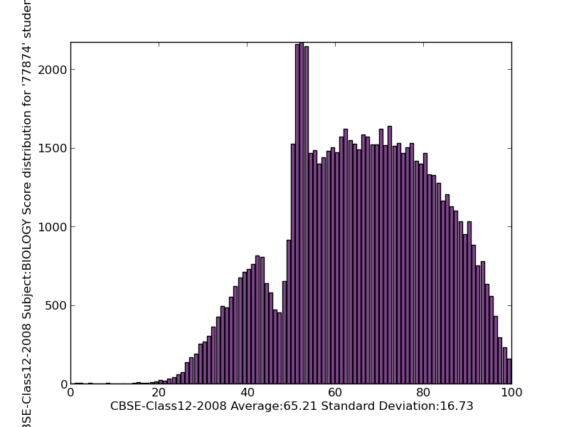
Educational Performance Metrics
Test score distributions often exhibit left skewness, particularly on well-designed assessments where most students perform adequately. I've analyzed countless exam results where the bulk of students score between 70-90%, but a small group struggles significantly, creating that characteristic left tail.
Retirement age patterns provide another fascinating example. Most people retire around 65-70, but early retirees—whether due to health issues, financial independence, or job displacement—create a left tail extending down to ages 50 or even younger. This distribution helps policymakers understand the full spectrum of retirement timing.
Building compelling visual narratives around performance data has become one of my specialties. With PageOn.ai's Vibe Creation feature, I can quickly generate visualizations that tell the story behind the numbers, helping educators and administrators understand not just what the data shows, but what it means for their students.
Statistical Methods for Analyzing Left-Skewed Data
When I work with left-skewed data, calculating and comparing measures of central tendency becomes crucial. I always compute all three—mean, median, and mode—because their relationships tell us so much about the distribution's shape. The greater the difference between mean and median, the more pronounced the skewness.
Knowing when to use median over mean for accurate representation is a judgment call I make frequently. In my reports on income data or any distribution with significant skewness, I typically lead with the median while noting the mean for context. This approach provides a more accurate picture of the "typical" case while acknowledging the influence of outliers.
| Transformation Technique | When to Use | Effect on Data | Example Application |
|---|---|---|---|
| Logarithmic | Moderate to severe left skew | Compresses left tail | Income data analysis |
| Square Root | Mild left skew | Moderate adjustment | Count data |
| Cube Root | Very mild skew | Gentle correction | Volume measurements |
| Box-Cox | Any degree of skew | Optimal transformation | Complex datasets |
Data transformation techniques have saved me countless times when traditional parametric tests weren't appropriate. I frequently apply logarithmic transformations to severely left-skewed data, which can often normalize the distribution enough for standard statistical procedures. Square root transformations work well for milder skewness.
Integrating statistical tools and visualizations has become seamless with modern platforms. I particularly appreciate how PageOn.ai's drag-and-drop interface allows me to quickly experiment with different transformations and immediately see their visual impact. This iterative approach helps me find the most appropriate analysis method for each dataset.
Creating Effective Visualizations of Skewed Data
Histogram Construction Best Practices
Choosing appropriate bin sizes for left-skewed data requires careful consideration. I've learned that too few bins can mask the skewness, while too many can create noise that obscures the pattern. I typically start with Sturges' rule or the square root of the sample size, then adjust based on visual inspection.
Visualization Creation Process
My workflow for creating effective skewed data visualizations:
flowchart TD
                        A[Raw Data] --> B[Assess Skewness]
                        B --> C[Choose Visualization Type]
                        C --> D{Histogram}
                        C --> E{Box Plot}
                        C --> F{Density Plot}
                        D --> G[Select Bin Size]
                        E --> H[Identify Whiskers]
                        F --> I[Choose Bandwidth]
                        G --> J[Create Initial Plot]
                        H --> J
                        I --> J
                        J --> K[Refine and Annotate]
                        K --> L[Add Context]
                        L --> M[Final Visualization]
When comparing software tools, I've worked extensively with Excel, R, Python, and Minitab. Excel works well for quick visualizations, but I prefer R's ggplot2 for publication-quality graphics. Python's matplotlib and seaborn offer excellent flexibility, while Minitab excels for Six Sigma applications. Each has its place in my toolkit.
How PageOn.ai streamlines histogram creation through conversational commands has revolutionized my workflow. Instead of writing code or clicking through menus, I can simply describe what I want: "Create a histogram of salary data with 10 bins, highlighting the left skew." The platform understands context and generates appropriate visualizations instantly.
Alternative Visualization Methods
Box plots offer a different perspective on left skewness. I look for the telltale sign: a longer lower whisker with the median pushed toward the upper quartile. While less intuitive than histograms for general audiences, box plots excel at comparing multiple groups' skewness patterns simultaneously. Understanding horizontal bar charts can also help when presenting skewed categorical comparisons.
Density plots have become one of my favorite tools for visualizing skewed distributions. They smooth out the histogram's roughness while preserving the distribution's shape. For left-skewed data, the gentle curve clearly shows the extended left tail and right-shifted peak, making the asymmetry immediately apparent.
Combining multiple visualization types using PageOn.ai's modular blocks has proven incredibly effective. I often create dashboards that show the same left-skewed dataset as a histogram, box plot, and density plot side by side. This multi-perspective approach helps different stakeholders connect with the data in ways that resonate with their analytical preferences.
Implications for Decision-Making
Understanding how left skewness affects business interpretations has been crucial in my consulting work. I've seen executives make flawed decisions by focusing on means in left-skewed data, underestimating typical performance levels. For instance, when analyzing customer satisfaction scores that are left-skewed, the mean might suggest problems that don't reflect most customers' experiences.
Risk Assessment Comparison
How skewness affects risk interpretation in financial returns:
Risk assessment in financial contexts with negatively skewed returns requires special attention. I've observed that left-skewed return distributions often indicate strategies with frequent small gains but occasional large losses—a pattern that can be deceptive if only examining average returns. This "picking up pennies in front of a steamroller" phenomenon has caught many investors off guard.
Policy implications when analyzing demographic data with left skewness are profound. Consider age at retirement: if policymakers focus on the mean retirement age in a left-skewed distribution, they might overlook the significant number of early retirees who need different support structures. I always advocate for examining the full distribution, not just summary statistics.
Transforming complex statistical insights into actionable visuals has become essential in my practice. With PageOn.ai's Agentic processes, I can create interactive visualizations that allow decision-makers to explore different scenarios and see how left skewness impacts various outcomes. This interactive approach leads to more informed, nuanced decisions.
Advanced Considerations and Future Applications
Statistical Testing with Skewed Data
Non-parametric alternatives have become my go-to solution for left-skewed data. The Mann-Whitney U test replaces the t-test when comparing two groups, while the Kruskal-Wallis test serves as an alternative to ANOVA for multiple groups. These tests don't assume normality, making them robust to skewness.
Bootstrapping methods for confidence intervals have revolutionized how I handle skewed data. By resampling with replacement thousands of times, I can estimate the sampling distribution of statistics without making distributional assumptions. This approach is particularly valuable when working with small samples of left-skewed data.
Visualizing test results and assumptions clearly is crucial for transparency. I create diagnostic plots showing the original left-skewed distribution alongside the bootstrap distribution of the test statistic. This visual approach helps stakeholders understand why traditional tests might be inappropriate and builds confidence in the alternative methods. Learning to calculate sample means accurately is fundamental before applying these advanced techniques.
Machine Learning and Big Data Applications
Anomaly detection in left-skewed datasets presents unique challenges. I've found that the extended left tail can mask true anomalies or flag normal low values as outliers. My approach involves using robust statistical methods like the median absolute deviation (MAD) or isolation forests that handle skewness more gracefully than traditional z-score methods.
Machine Learning Pipeline for Skewed Data
Processing left-skewed data in ML applications:
flowchart LR
                        A[Left-Skewed Data] --> B[Exploratory Analysis]
                        B --> C[Feature Engineering]
                        C --> D[Transformation]
                        D --> E{Model Selection}
                        E --> F[Tree-Based Models]
                        E --> G[Neural Networks]
                        E --> H[Robust Regression]
                        F --> I[No Transformation Needed]
                        G --> J[Normalize Features]
                        H --> K[Use Huber Loss]
                        I --> L[Model Training]
                        J --> L
                        K --> L
                        L --> M[Validation]
                        M --> N[Deployment]
Predictive modeling considerations for asymmetric distributions have taught me valuable lessons. Tree-based models like random forests and gradient boosting handle left-skewed features naturally, while linear models often benefit from transformations. I've learned to let the model's assumptions guide my preprocessing choices rather than automatically transforming all skewed features.

Real-time visualization of streaming skewed data with PageOn.ai's dynamic capabilities has opened new possibilities. I can now create dashboards that update as new data arrives, automatically adjusting bin sizes and scales to maintain clarity as the distribution evolves. This is particularly valuable for monitoring systems where left skewness might indicate emerging issues.
From Statistical Confusion to Visual Mastery
As we conclude this journey through left-skewed histograms, I want to emphasize the key takeaways that have proven most valuable in my practice. First, always remember the fundamental relationship: in left-skewed distributions, mean < median < mode. This simple formula unlocks so much understanding about your data's story.
The importance of choosing appropriate statistical measures and visualizations cannot be overstated. I've learned that the median often tells a more accurate story than the mean in left-skewed data, and that combining multiple visualization types provides the fullest picture. Whether you're analyzing salaries, test scores, or customer metrics, understanding skewness helps you avoid misinterpretation and make better decisions.
What excites me most is how modern tools like PageOn.ai transform the journey from fuzzy statistical concepts to clear, actionable insights. No longer do we need to struggle with complex coding or settle for basic charts. We can now create sophisticated, interactive visualizations that make left-skewed distributions accessible to any audience. The ability to use conversational commands to generate complex statistical graphics has democratized data visualization in ways I never imagined possible.
Your next steps for applying these concepts in your data analysis workflow should include:
- Practice identifying left skewness in your own datasets
- Experiment with different transformation techniques when appropriate
- Create multiple visualizations to fully understand your distributions
- Always report both mean and median for skewed data
- Consider the context and implications of skewness for your specific domain
Understanding the difference between scattergraphs and quadrant charts and knowing how to create bar charts in Excel are also valuable skills that complement your understanding of skewed distributions.
Remember, every left-skewed histogram tells a story—about exceptional cases, about boundaries, about the reality of the phenomena we're studying. By mastering these concepts and leveraging powerful visualization tools, we transform abstract statistical complexity into clear, compelling narratives that drive understanding and action. The journey from confusion to mastery is not just about learning formulas; it's about developing the visual literacy to see patterns, understand their implications, and communicate them effectively.
Transform Your Visual Expressions with PageOn.ai
Ready to turn complex statistical concepts like left-skewed histograms into stunning, interactive visualizations? PageOn.ai empowers you to create professional data stories through simple conversations. No coding required—just describe what you want to see, and watch your data come to life.
Start Creating with PageOn.ai TodayYou Might Also Like
Five Core Primitives That Power Modern AI Connectivity - Visual Guide
Explore the fundamental building blocks enabling modern AI systems to communicate: memory stores, context management, tool APIs, data movement, and agent coordination primitives visualized.
Creating Dynamic Picture Backgrounds in PowerPoint: Transform Your Presentations
Learn how to create stunning dynamic picture backgrounds in PowerPoint presentations to boost engagement, improve retention, and enhance visual appeal with step-by-step techniques.
Price Anchoring: Transform Customer Perception of Value | Strategic Marketing Guide
Learn how to implement price anchoring strategies to enhance perceived value, influence purchasing decisions, and create more effective pricing displays for your products and services.
Mastering Presentation Efficiency: Build Impactful Decks by Reusing Slides
Learn how to save time and create better presentations by reusing slides. Discover PowerPoint's built-in reuse features, strategic approaches, and how PageOn.ai enhances your workflow.