From Manual Frustration to Visual Mastery: Transform Your Pie Chart Creation Process
Master the art of creating pie charts in Adobe Illustrator while discovering revolutionary AI-powered alternatives that eliminate technical barriers and amplify your creative potential.
The Hidden Complexity Behind Simple Circles
When I first opened Adobe Illustrator to create a simple pie chart, I expected it to be straightforward. After all, it's just a circle divided into proportional segments, right? What I discovered was a labyrinth of tools, hidden menus, and technical requirements that turned what should be a five-minute task into an hour-long odyssey.

The deceptive simplicity of pie charts masks a fundamental challenge in data visualization: the gap between our creative vision and the technical execution required by traditional design tools. While Illustrator remains incredibly powerful, its approach to chart creation feels stuck in a bygone era where manual precision trumped intuitive workflow.
Today, I'm sharing my complete journey through Illustrator's pie chart creation process – from the basic steps that tutorials often gloss over to the advanced techniques that can transform your data into visual art. More importantly, I'll show you how modern AI-powered alternatives are revolutionizing this entire workflow, making professional-quality visualization accessible to everyone.
The Traditional Illustrator Workflow: A Deep Dive
Setting Up Your Workspace
My first challenge was simply finding the Pie Graph Tool. Unlike more prominent tools, it's nestled within a group of graph tools that many users never explore. If you're using the Basic toolbar (which most beginners do), you won't even see it initially.
Pro Tip: Switch to the Advanced toolbar by navigating to Window > Toolbars > Advanced. The Pie Graph Tool is hidden under the Column Graph Tool icon – click and hold to reveal the flyout menu.
Creating Your First Pie Chart
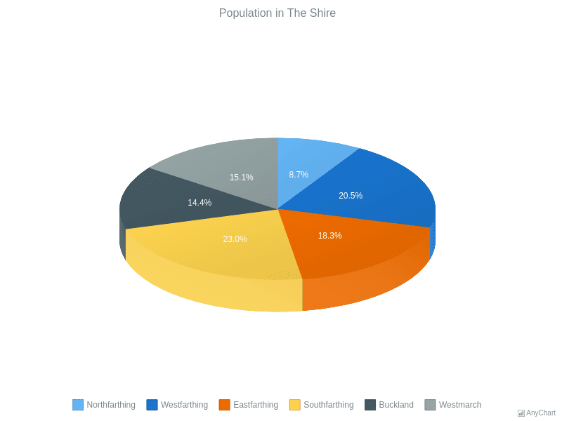
Once I located the tool, the process seemed straightforward enough. Click on the artboard, set your dimensions, and a data entry window appears. But here's where things get tricky – the interface feels like it hasn't been updated since the 1990s.
Sample Pie Chart Created in Illustrator
The data entry process requires careful attention – your values must add up to exactly 100 if you're working with percentages. I learned this the hard way when my chart kept displaying incorrectly. The system won't automatically normalize your data, leading to frustrating trial and error.
Advanced Styling Techniques
After creating the basic chart, I wanted to customize its appearance. This is where Illustrator's power shines – but also where its complexity becomes overwhelming. Using the Direct Selection Tool, you can modify individual segments, but each change requires multiple steps:
- First, ungroup the chart (which means you can no longer edit the data)
- Select each segment individually to change colors
- Remove the default black strokes for a modern look
- Manually position labels and create legends
Beyond Basic: Advanced Illustrator Techniques
Creating Donut Charts from Pie Charts
One of my favorite discoveries was transforming pie charts into donut charts. The process isn't intuitive, but the results can be stunning. After ungrouping your pie chart, you create a circle in the center and use the Shape Builder tool to subtract it from your segments.
Pie to Donut Chart Transformation Process
flowchart LR
                        A[Create Pie Chart] --> B[Ungroup Elements]
                        B --> C[Draw Center Circle]
                        C --> D[Use Shape Builder]
                        D --> E[Delete Center]
                        E --> F[Donut Chart Complete]
For a deeper dive into when to use pie vs donut charts, I've found that donut charts work better when you need to display a total value in the center or when comparing multiple data sets.
The 3D Dimension: Adding Depth to Data
Illustrator's 3D effects can transform flat charts into eye-catching visuals. The Extrude & Bevel effect offers two modes – Classic and the newer version. I prefer Classic for its predictable results, though it requires patience to get the angles right.
Design Note: While 3D charts look impressive, they can actually make data harder to interpret. Use them sparingly and only when the visual impact justifies the potential loss of clarity.
Creating Custom Pie Chart Shapes
My most ambitious project involved creating animal-shaped pie charts for a wildlife conservation presentation. Using the Pathfinder tool, I divided custom shapes into proportional segments. The process was incredibly time-consuming but produced unique results that standard charts couldn't achieve.
Common Challenges and Professional Solutions
Data Accuracy and Visual Hierarchy
One of my biggest struggles was maintaining data accuracy while creating visually appealing charts. Illustrator doesn't automatically check your proportions after manual adjustments, leading to charts that look good but misrepresent data.
I developed a color strategy based on these principles:
- Use a maximum of 7 distinct colors for clarity
- Apply gradients from the same color family for related data
- Ensure sufficient contrast for accessibility
- Test colors in grayscale to verify hierarchy
Workflow Optimization
After creating dozens of charts, I realized the importance of building reusable templates. However, Illustrator's template system feels clunky compared to modern alternatives. Each new chart still requires significant manual work, even with templates.
The AI Revolution: PageOn.ai's Game-Changing Approach
Voice-to-Visual: The New Paradigm
After wrestling with Illustrator's complexity, discovering PageOn.ai's Vibe Creation feature felt like stepping into the future. Instead of clicking through menus and manually entering data, I simply described what I wanted: "Create a pie chart showing our Q3 budget allocation with warm colors and modern styling."
The PageOn.ai Difference:
While Illustrator requires technical expertise, PageOn.ai understands natural language. I can focus on what I want to communicate rather than how to operate the software. This shift from tool mastery to creative expression fundamentally changes the design process.
AI Blocks for Dynamic Chart Building
PageOn.ai's AI Blocks feature revolutionizes how we combine multiple visualizations. Unlike Illustrator's rigid approach, I can drag and drop different chart types, automatically maintaining consistent styling across all elements. When I needed to create a comprehensive data visualization dashboard, what would have taken hours in Illustrator was accomplished in minutes.
Time Investment Comparison
Deep Search Integration
Perhaps the most impressive feature is PageOn.ai's Deep Search capability. When I mentioned "sustainability metrics" in my chart description, the system automatically suggested relevant icons, color schemes, and complementary visual elements. This contextual understanding eliminates the tedious asset hunting that consumes so much time in traditional workflows.
For those exploring different AI chart generators, PageOn.ai stands out by offering complete visual storytelling rather than just chart creation.
Practical Applications and Use Cases
Business Presentations
In my consulting work, I've created countless pie charts for quarterly reports and budget presentations. The traditional Illustrator approach meant late nights before deadlines, manually adjusting every element. Now, with PageOn.ai's Agentic approach, I can generate multiple variations of the same data, letting stakeholders choose their preferred visualization style.
Educational Materials
Teaching data visualization to students revealed how intimidating traditional tools can be. Many gave up on Illustrator and resorted to basic Excel charts. PageOn.ai changes this dynamic entirely – students can focus on understanding data relationships rather than software mechanics.
While Excel remains popular for basic charts (and you can learn to create bar charts in Excel easily), the visual quality and customization options pale in comparison to what's possible with modern AI tools.
Marketing and Social Media
Social media demands quick turnaround and multiple format variations. Creating a pie chart in Illustrator and then adapting it for Instagram, LinkedIn, and Twitter used to be a multi-hour project. With AI pie chart generators like PageOn.ai, I can describe my needs once and receive optimized versions for each platform instantly.
Best Practices and Professional Tips
Design Principles for Effective Pie Charts
Through years of creating pie charts, I've developed these essential guidelines:
The 5-7 Slice Rule
Never exceed 7 slices in a single pie chart. Beyond this, viewers struggle to differentiate segments and compare values accurately.
Start at 12 O'Clock
Always position your most important segment starting from the top. This creates a natural reading flow and emphasizes key data.
Color Accessibility
Ensure your color choices work for colorblind viewers. Test with online simulators or use patterns in addition to colors.
Mobile-First Design
Design for the smallest screen first. If your chart works on mobile, it will scale beautifully to larger displays.
Data Storytelling Techniques
The best pie charts don't just display data – they tell stories. I've learned to think beyond the numbers and consider the narrative. What insight should viewers gain? What action should they take? PageOn.ai's conversational interface naturally encourages this storytelling approach, as you describe not just the data but the context and purpose.
Data Storytelling Workflow
flowchart TD
                        A[Identify Key Message] --> B[Select Relevant Data]
                        B --> C[Choose Visual Style]
                        C --> D["Add Context & Annotations"]
                        D --> E[Test with Audience]
                        E --> F[Iterate Based on Feedback]
                        F --> G[Final Presentation]
The Future of Chart Creation
Emerging Trends in Data Visualization
The future of chart creation is moving rapidly toward AI-powered, conversational interfaces. We're seeing a shift from static images to dynamic, interactive visualizations that respond to viewer engagement. Real-time data integration means charts that update automatically, eliminating the manual refresh cycle that plagues traditional workflows.
Future Capabilities Comparison
Why PageOn.ai Represents the Future
PageOn.ai isn't just another tool – it's a fundamental reimagining of how we create visual content. By eliminating technical barriers, it democratizes professional-quality data visualization. The Agentic process means the system learns from your preferences, becoming more aligned with your style over time.
The platform's ability to understand intent rather than just execute commands represents a paradigm shift. When I say "create a pie chart that shows our environmental impact reduction over the past year," PageOn.ai doesn't just generate a chart – it understands the context, suggests appropriate green color schemes, and even recommends complementary visualizations that strengthen the sustainability narrative.
Choosing Your Path Forward
After mastering Illustrator's pie chart tools and experiencing the efficiency of AI-powered alternatives, I've gained perspective on when each approach makes sense. Illustrator remains unmatched for pixel-perfect control and integration with existing Adobe workflows. If you're already an Illustrator expert working on high-stakes projects where every pixel matters, the traditional approach still has merit.
However, for the vast majority of use cases – from business presentations to educational materials, from social media content to data dashboards – the AI-powered approach offers compelling advantages. The time saved, the reduced learning curve, and the ability to iterate quickly far outweigh any minor compromises in granular control.
PageOn.ai bridges the gap between idea and execution in ways traditional tools simply cannot match. Its conversational interface means you can start creating immediately, without months of tutorial watching or manual reading. The platform grows with you, understanding your preferences and style, making each project easier than the last.
Take Action: Start with Voice, End with Impact
The future of data visualization isn't about mastering complex software – it's about communicating ideas effectively. Whether you choose to continue with traditional tools or embrace AI-powered solutions, remember that the goal is always clear communication of your data story.
If you're ready to transform your workflow and focus on creativity rather than technicality, I encourage you to explore PageOn.ai's revolutionary approach. Start with your voice, describe your vision, and watch as professional-quality visualizations emerge from your ideas.
Start Creating with PageOn.ai TodayYou Might Also Like
Transforming Business Intelligence: How AI Bridges the Research-to-Insight Gap
Discover strategies for bridging the gap between AI research and business insights. Learn how to transform technical AI capabilities into actionable business intelligence using visualization tools.
Transform Your Presentations: Mastering Slide Enhancements for Maximum Impact
Learn how to elevate your presentations with effective slide enhancements, formatting techniques, and visual communication strategies that captivate audiences and deliver powerful messages.
Creating Dynamic Picture Backgrounds in PowerPoint: Transform Your Presentations
Learn how to create stunning dynamic picture backgrounds in PowerPoint presentations to boost engagement, improve retention, and enhance visual appeal with step-by-step techniques.
Revolutionizing Market Entry Presentations with ChatGPT and Gamma - Strategic Impact Guide
Learn how to leverage ChatGPT and Gamma to create compelling market entry presentations in under 90 minutes. Discover advanced prompting techniques and visual strategies for impactful pitches.