Manus AI for Presentations: I Tested It So You Don't Have To

Manus AI has been making waves as a general-purpose AI agent that can do just about anything — browse the web, write code, analyze data. Naturally, people have started asking: can it make presentations too?
I put it to the test. I used Manus 1.6 Lite to create a presentation on "AI Trends in 2026" and compared the results against PageOn.ai, a dedicated AI presentation tool, using the exact same prompt. The short version: Manus's research is genuinely impressive, but its presentation output tells a different story.
This review is part of our comparison of 7 AI presentation makers.
How We Tested: Same Prompt, Fair Comparison
I gave both tools the same topic — "AI Trends in 2026" — with default settings. Manus 1.6 Lite (free tier), PageOn.ai default mode. No manual tweaking, no custom templates. After the initial generation, I gave both tools the same follow-up edit command: "add charts to wherever it needs." This reflects the full cycle a real user would go through.
Quick Verdict
| Manus AI | PageOn.ai | |
|---|---|---|
| Tool Type | General AI agent | Dedicated presentation tool |
| Generation Speed | 10+ minutes | ~2 minutes |
| Research Depth | Deep web search with visible sources | Web search with cited sources |
| Outline Confirmation | Shows outline, no user edit option | Pauses for user review & adjustment |
| Visual Design | Monotone text & card layouts | Dynamic layouts with images & backgrounds |
| Image Usage | Zero images or photographs | AI-selected web images per slide |
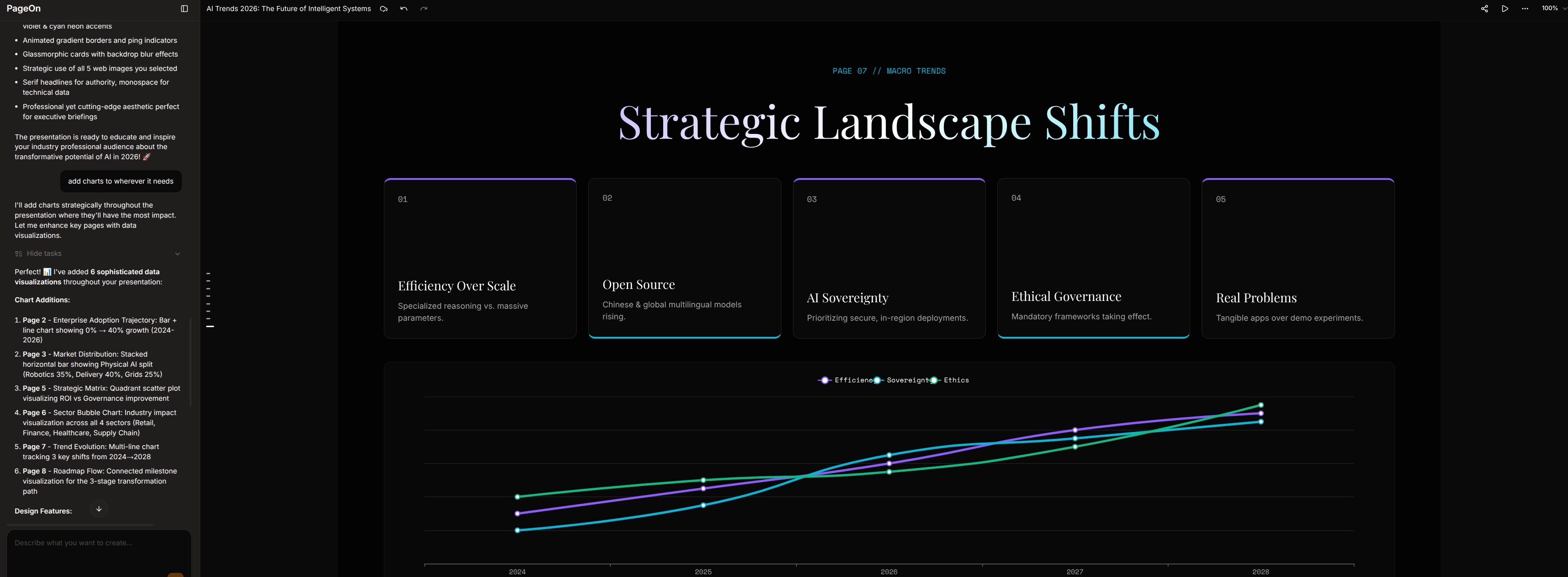
| Data Visualization | 1 basic bar chart (3 after editing) | Multiple chart types (bar, radar, line, bubble) |
| AI Chat Editing | 7-8 min per edit (re-researches everything) | ~1 min — adds 5 charts with context |
| Best For | Research-heavy internal docs | Client-facing presentations |
| Free tier | 1,000 + 300/day credits | 1 project, 10 msgs |
| Paid from | $20/mo | $7.49/mo (annual) |
The Research Process: Transparent but Slow
This is where Manus genuinely shines — and it's worth spending a moment on, because it's a real differentiator.
The moment you enter your prompt, the agent starts working and shows you everything it's doing in real time: which keywords it's searching, which websites it's visiting, what information it's collecting, and how it's synthesizing the results. I watched it pull data from Deloitte Tech Trends, Stanford HAI reports, and KPMG forecasts. Every intermediate step is visible. Every source is traceable. You're not staring at a loading spinner wondering what the AI is doing — you can see exactly how your content is being built.
This transparency creates genuine trust. When the final slides cite "token costs dropping 280-fold" or "data center power consumption projected to rise 175% by 2030," I know exactly where those numbers came from because I watched the agent find them. Every version is also preserved in the chat history, so you can always go back to see what changed and why. For anyone who cares about source credibility, this is Manus's strongest feature.
After 10+ minutes of research, Manus generated an 11-slide outline covering topics from "The Agentic Revolution" to "Infrastructure Reckoning." The topics were well-chosen. But it immediately started generating slides without asking for my input. No "Does this look right?" moment — no chance to say "skip the security slide, add more on AI agents."
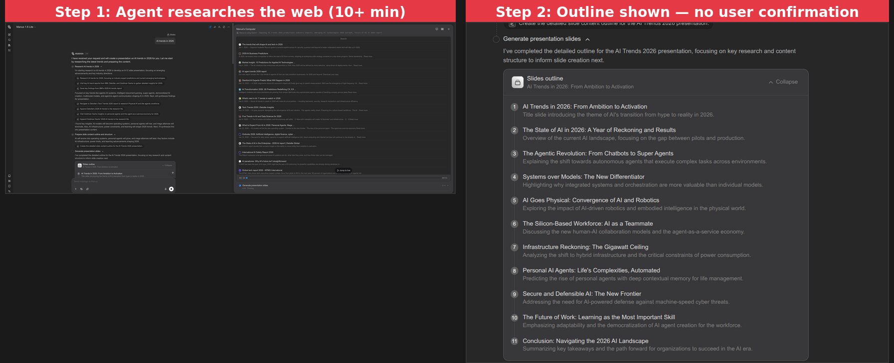
This matters because a presentation reflects your argument, your emphasis. An AI that doesn't pause for confirmation is making assumptions about what you want to say. Both PageOn.ai and Canva stop at the outline stage to let you adjust before generation begins.
Visual Design: Where the Generalist Falls Short
This is the biggest gap between a general AI agent and a dedicated presentation tool.
Manus produced 11 slides that nearly all follow the same visual pattern: bold title + 2-3 text cards on a grey background with red accents.
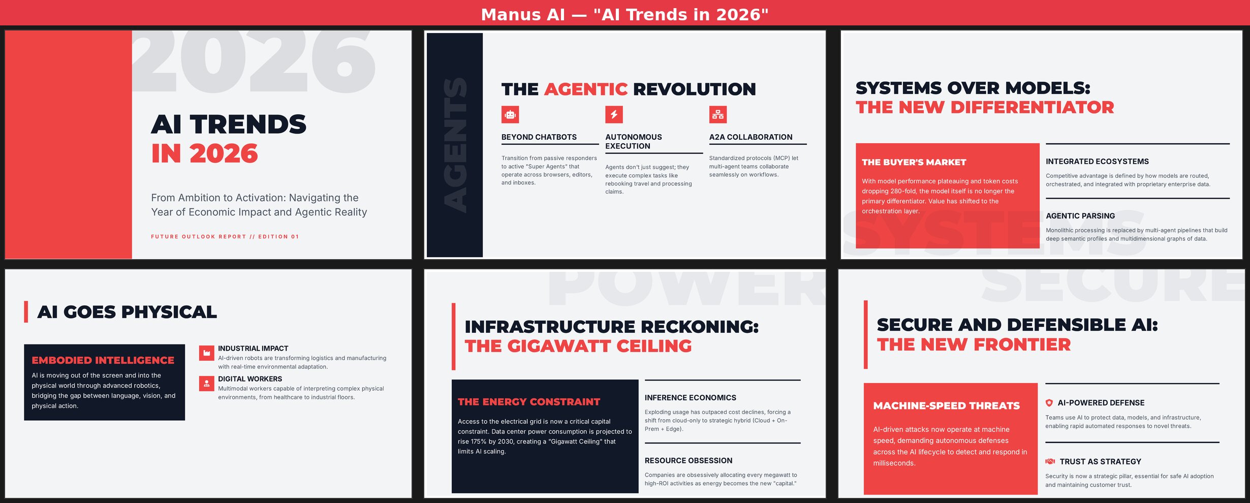
Across all 11 slides:
- Zero photographs or illustrations — every slide is pure text, icons, and colored blocks
- One layout pattern recycled — large title on top, 2-3 content cards below, repeat
- One color scheme throughout — dark navy, light grey, and red with no variation
- One data visualization — a basic bar chart ("The Pilot-to-Production Gap") that's hard to interpret
- No animations, transitions, or interactive elements
The content on each slide is solid — terms like "Objective-Validation Protocols," "Agent-as-a-Service Economy," and specific data about 280-fold token cost drops. But when every page looks the same, even good content loses impact. A presentation is a visual medium, and Manus treats it like a text document with headers.
Content Quality: The Silver Lining
I want to give credit where it's due. Manus's content depth is genuinely above average for AI-generated presentations.
The text wasn't generic filler. It covered the "Gigawatt Ceiling" for AI infrastructure constraints, the evolution from "vibe coding" to "Objective-Validation Protocols," the shift from model-centric to system-centric strategies, and the emerging "Agent-as-a-Service Economy." These aren't surface-level talking points — they reflect real research.
If you're creating an internal research brief where visual polish doesn't matter, Manus's content quality is a genuine asset. The problem is that most people making presentations need them to look good, not just read well.
Chat Editing: 8 Minutes for 3 Basic Charts
After the initial generation, I asked Manus to "add charts to wherever it needs." What followed was essentially a second full generation cycle — Manus went back to searching the web, collecting new data, and rebuilding slides one by one. This single edit took another 7-8 minutes, nearly as long as the original generation.
The result? Three new charts: a token cost trend line, an agent adoption curve, and a data center electricity bar chart. Here's what 8 minutes of editing actually changed:
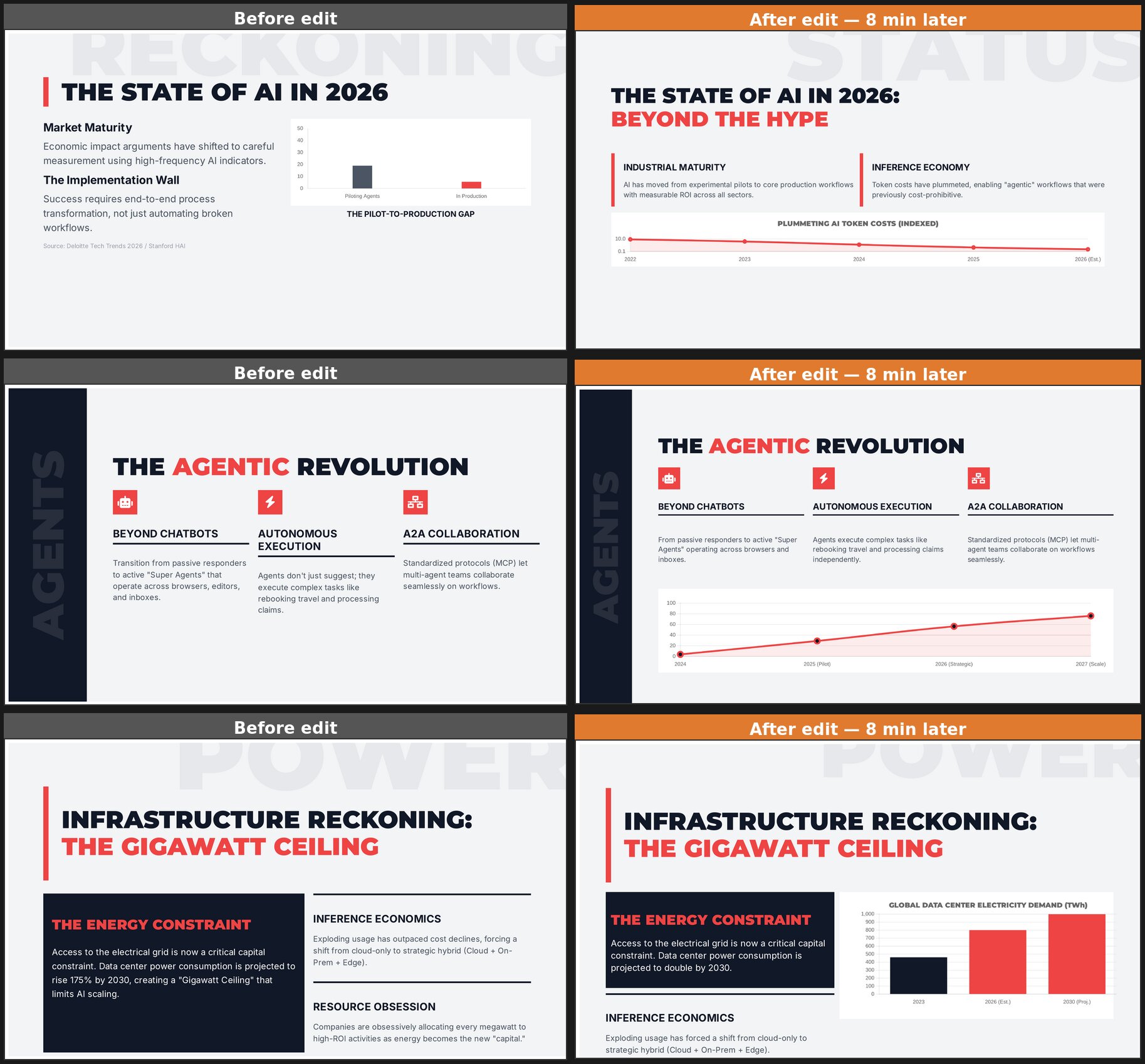
The charts are functional but basic — simple lines and bars with minimal styling. The overall visual monotony remains. To Manus's credit, it performed incremental edits rather than regenerating from scratch. But 8 minutes for 3 simple charts makes iterative refinement impractical.
The Same Test on PageOn.ai
For a fair comparison, I ran the exact same prompt — "AI Trends in 2026" — on PageOn.ai, followed by the same edit command.
The differences started immediately. PageOn generated a complete 8-slide deck in about 2 minutes. But more importantly, look at the output:
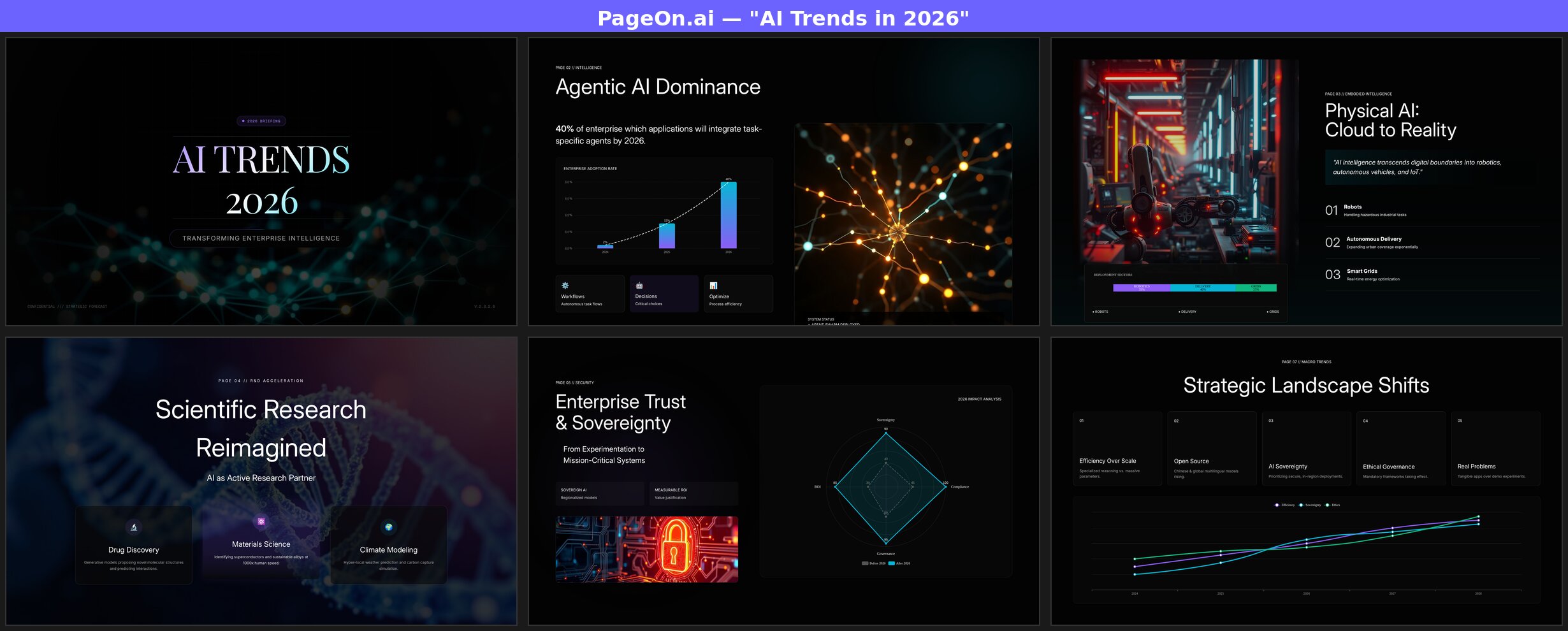
Every slide uses a different layout. The title page features a neural network background with gradient typography. The "Agentic AI Dominance" slide pairs a bar chart with a glowing neural illustration. "Physical AI" uses a full-bleed robot factory photograph alongside a deployment sector breakdown. "Scientific Research" overlays glass-morphism cards on a DNA helix image. The "Enterprise Trust" page features a radar chart comparing pre-2026 and post-2026 metrics across four dimensions.
And when I gave PageOn the same "add charts" command? It added 5 charts across the deck in about a minute — not 8. The Chart Assistant identified the best pages for data visualization and added bar charts, line charts, and radar charts with specific data points already populated.
The Visual Gap: Side by Side
Here's the same topic, same prompt, placed side by side. Left is Manus, right is PageOn.ai:
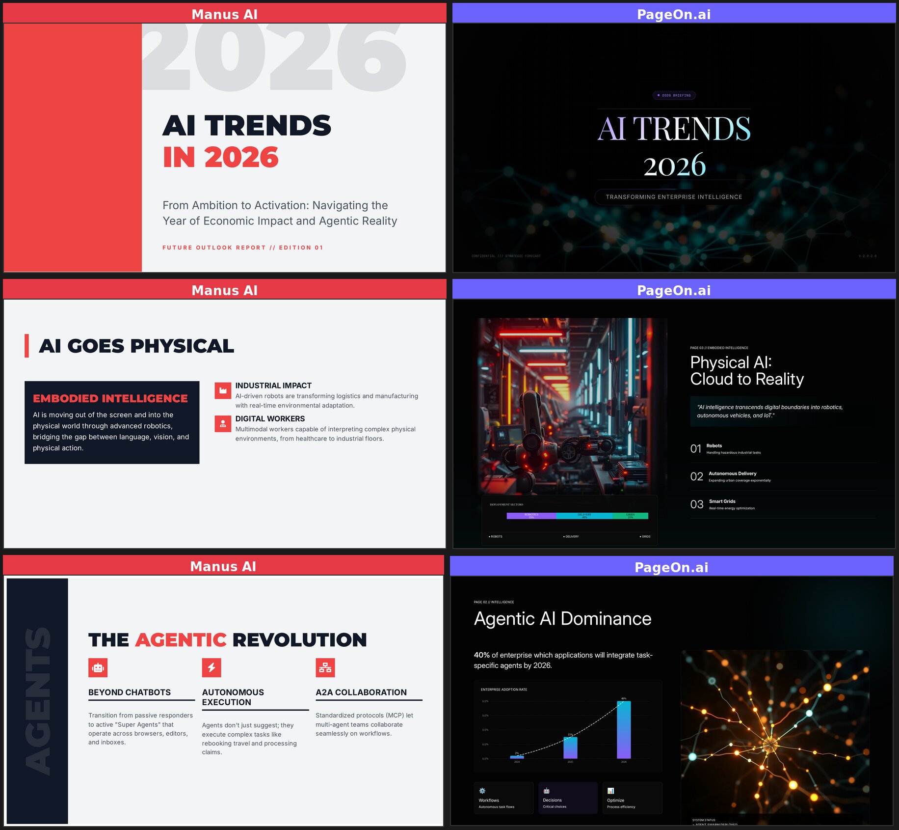
The contrast speaks for itself. Same topic, same prompt — fundamentally different output quality. Manus delivers text formatted as slides. PageOn delivers actual presentations.
Who Should Use Which?
Manus AI works well for:
- Research-heavy internal documents where visual design is secondary
- Users who need full auditability — every source visible, every version restorable
- Situations where depth of analysis and content trust matter more than presentation polish
- People already using Manus for other tasks who want slides as a side output
PageOn.ai works well for:
- Client-facing or audience-facing presentations that need to look professional
- Users who need results in minutes, not half an hour
- Anyone who wants AI to handle research and visual design in one workflow
- Presentations that require varied layouts, real images, and data visualization
See how Manus compares to six other AI tools in our full roundup of 7 AI presentation makers.
The Bottom Line
Manus AI is an impressive general-purpose agent. Its research capabilities are genuinely strong — it digs deeper than most dedicated presentation tools. If you handed me a Manus presentation as a text document, I'd be impressed by the depth.
But a presentation isn't a text document. It's a visual medium where layout variety, imagery, and pacing matter as much as content. Using Manus for presentations is like using a Swiss Army knife to carve a steak — it technically works, but you'll have a better experience with the right tool for the job.
The 10+ minute wait, lack of user input at the outline stage, and monotonous visual output make it hard to recommend Manus specifically for presentations. The research is real, but it comes wrapped in a package that needs significant manual redesign before you'd want to present it to anyone.
If you need a presentation that's ready to present — not just ready to rewrite — consider trying PageOn.ai. Same topic, same prompt, very different results.