Mastering MATLAB Histograms: From Raw Data to Visual Insights
Unlock the Power of Statistical Visualization with Advanced Histogram Techniques
I've spent countless hours working with MATLAB histograms, and I'm excited to share my comprehensive guide that transforms complex statistical data into clear, actionable visual insights. Whether you're analyzing experimental results or exploring data distributions, this guide will elevate your visualization game.
Why Histograms Matter in MATLAB
In my journey through data analysis, I've discovered that histograms are the unsung heroes of statistical visualization. They reveal patterns, outliers, and distributions that raw numbers simply can't convey. MATLAB's histogram capabilities have evolved significantly, offering us unprecedented control over how we visualize and interpret data distributions.
Key Insight: Understanding histograms isn't just about plotting data—it's about uncovering the story your data is telling. With PageOn.ai's AI Blocks, I can transform these complex statistical concepts into clear, digestible visual explanations that resonate with any audience.
MATLAB provides unique capabilities that set it apart from other statistical tools. The automatic binning algorithms intelligently adapt to your data's characteristics, while the extensive customization options ensure your visualizations meet publication standards. Whether you're analyzing experimental results or exploring massive datasets, MATLAB's histogram functions scale elegantly to meet your needs.
Common Histogram Use Cases
Core Histogram Functions and Syntax
Let me walk you through the fundamental building blocks of MATLAB histograms. I've learned that mastering these core functions is essential for effective data visualization. The modern `histogram()` function has replaced the deprecated `hist()`, bringing with it a wealth of new capabilities.
Essential Syntax Patterns
% Basic histogram
histogram(data)

% Specify number of bins
histogram(data, 20)

% Use specific bin edges
histogram(data, [0:5:100])

% Advanced with properties
histogram(data, 'Normalization', 'pdf', 'FaceColor', '#FF8000')
The key difference between the old `hist()` and new `histogram()` functions lies in their return values and property access. While `hist()` returns bin counts and centers, `histogram()` returns a histogram object with extensive properties you can modify after creation. This object-oriented approach gives us incredible flexibility in fine-tuning our visualizations.
Histogram Function Architecture
flowchart TD
                        A[Raw Data Input] --> B[histogram Function]
                        B --> C{Binning Algorithm}
                        C --> D[Auto Binning]
                        C --> E[Manual Bins]
                        C --> F[Bin Edges]
                        D --> G[Histogram Object]
                        E --> G
                        F --> G
                        G --> H[Visual Output]
                        G --> I[Properties Access]
                        I --> J[Dynamic Modification]
Understanding bin edges versus bin counts is crucial. Bin edges define the boundaries of each bin, while bin counts represent the number of data points falling within each bin. PageOn.ai's structured content blocks help me visualize these concepts clearly, making it easier to explain complex binning algorithms to colleagues and students.
Customizing Histogram Appearance and Behavior
I've discovered that the true power of MATLAB histograms lies in their customization capabilities. From controlling bin specifications to fine-tuning visual aesthetics, every aspect can be tailored to your specific needs. Let me share the techniques that have transformed my data presentations.
Bin Control Properties
- • NumBins: Set exact number of bins
- • BinWidth: Control bin width uniformly
- • BinEdges: Define custom bin boundaries
- • BinLimits: Restrict data range
Normalization Options
- • count: Raw frequency (default)
- • probability: Relative frequency
- • pdf: Probability density
- • percentage: Display as percentages
Color and styling properties elevate your histograms from basic plots to professional visualizations. I often combine FaceColor, EdgeColor, and transparency settings to create visually appealing charts. When integrating these with PageOn.ai's Deep Search assets, I can create comprehensive visual documentation that explains both the data and the methodology.
Pro Tip: Use transparency (FaceAlpha) when overlaying multiple histograms. This technique reveals overlapping distributions clearly, making comparative analysis more intuitive.
Advanced Histogram Techniques
Working with Pre-computed Bin Counts
One challenge I frequently encounter is working with data that's already been binned. Perhaps you've received counts from an external source, or you're working with aggregated data. MATLAB's histogram function elegantly handles this scenario through the 'BinCounts' and 'BinEdges' parameters.
% Working with pre-computed data
edges = [0:10:100];
counts = [5, 12, 23, 45, 67, 54, 32, 18, 8, 3];

% Create histogram from existing counts
histogram('BinEdges', edges, 'BinCounts', counts)

% Style the histogram
h = histogram('BinEdges', edges, 'BinCounts', counts);
h.FaceColor = '#FF8000';
h.EdgeColor = 'none';
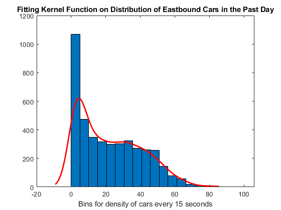
Statistical Distribution Fitting
Integrating `histfit()` transforms your histogram into a powerful analytical tool. I use this function to overlay theoretical distributions, helping identify whether my data follows normal, exponential, or other distributions. This visual comparison is invaluable for hypothesis testing and model validation.
Distribution Comparison
When dealing with sparse data or zero-count bins, I've learned to use the 'ShowEmptyBins' property strategically. This reveals gaps in your data distribution that might otherwise go unnoticed, providing crucial insights into data collection issues or natural boundaries in your phenomenon.
Specialized Histogram Applications
My exploration of MATLAB's histogram capabilities has revealed powerful specialized functions that extend beyond basic univariate analysis. These tools have revolutionized how I approach complex data visualization challenges.
2D Histograms for Bivariate Analysis
The `histogram2()` function creates stunning heatmap-style visualizations for bivariate data. I use this extensively when analyzing correlations between two variables. The ability to visualize joint distributions has helped me identify patterns that would be invisible in separate univariate histograms.
Categorical Histograms
Perfect for survey data, categorical histograms visualize frequency distributions of non-numeric data with automatic category detection.
Time-Series Histograms
Using datetime and duration data types, create temporal distribution analyses with intelligent bin sizing.
3D Bar Histograms
Transform 2D histograms into 3D visualizations for dramatic presentation impact and enhanced depth perception.
Using PageOn.ai's Agentic process, I transform these complex histogram workflows into step-by-step visual guides. This approach has been invaluable when training team members on advanced visualization techniques, breaking down sophisticated concepts into digestible, actionable steps.
Data Visualization Best Practices
Through years of creating histograms for research papers, presentations, and reports, I've developed a set of best practices that ensure my visualizations are both informative and visually compelling. Let me share these insights with you.
Choosing the Right Bin Method
flowchart LR
                        A[Data Characteristics] --> B{Distribution Type}
                        B --> C["Normal: 'scott'"]
                        B --> D["Outliers: 'fd'"]
                        B --> E["Integer: 'integers'"]
                        B --> F["Unknown: 'auto'"]
                        C --> G[Optimal Binning]
                        D --> G
                        E --> G
                        F --> G
Understanding when to use histograms versus bar charts is crucial. I use histograms for continuous data distributions and bar charts for categorical comparisons. This distinction ensures your audience immediately understands the nature of your data.
Publication-Ready Histogram Checklist
- ✓ Clear, descriptive title that includes the sample size
- ✓ Labeled axes with units of measurement
- ✓ Appropriate bin width (not too narrow or wide)
- ✓ Color scheme that prints well in grayscale
- ✓ Legend if multiple datasets are shown
- ✓ Statistical annotations (mean, median, std) when relevant
Integrating MATLAB histograms with broader data visualization charts strategies creates comprehensive analytical dashboards. I often combine histograms with box plots, scatter plots, and trend lines to provide multiple perspectives on the same dataset.
Practical Implementation Examples
From Raw Data to Insights
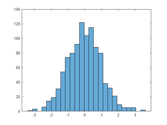
Let me walk you through a complete workflow that I use regularly when analyzing experimental data. This example demonstrates how to create, customize, and extract insights from histograms dynamically.
% Generate sample data (simulating experimental measurements)
rng(42); % For reproducibility
data = [randn(1000,1)*15+100; randn(500,1)*10+130];

% Create initial histogram
h = histogram(data);
title('Initial Distribution Analysis')
xlabel('Measurement Value')
ylabel('Frequency')

% Dynamically adjust bins for better insight
morebins(h); % Increase bin resolution
morebins(h);

% Apply statistical normalization
h.Normalization = 'probability';
h.FaceColor = '#FF8000';
h.EdgeColor = 'none';

% Add statistical markers
hold on
xline(mean(data), 'r--', 'LineWidth', 2, 'Label', 'Mean')
xline(median(data), 'b--', 'LineWidth', 2, 'Label', 'Median')
hold off

% Extract and display key statistics
fprintf('Mean: %.2f\n', mean(data))
fprintf('Std Dev: %.2f\n', std(data))
fprintf('Skewness: %.2f\n', skewness(data))
Interactive Bin Adjustment Impact
Integration with Other Tools
Exporting MATLAB histograms to Excel for further analysis bridges the gap between advanced statistical computing and accessible business tools. I frequently export histogram data for colleagues who prefer Excel's familiar interface.
Combining histogram data with statistical measures like sample means provides a complete statistical picture. Using PageOn.ai's Vibe Creation feature, I explain these complex statistical concepts conversationally, making them accessible to non-technical stakeholders.
Troubleshooting and Optimization
Over the years, I've encountered and resolved numerous histogram-related challenges. Let me share the solutions that have saved me countless hours of debugging and optimization.
Common Errors and Solutions
- Error: "Bin edges must be monotonically increasing"
Solution: Ensure your edge vector is sorted:edges = sort(edges) - Error: "Data contains NaN or Inf values"
Solution: Clean data first:data = data(~isnan(data) & ~isinf(data)) - Error: "Too many bins requested"
Solution: MATLAB limits bins to 65,536. Use wider bins or sample your data.

Performance Optimization Strategies
For large datasets, I've discovered several optimization techniques that dramatically improve performance:
- GPU Acceleration: Use
gpuArray()for datasets with millions of points - Tall Arrays: Process data that doesn't fit in memory using tall array support
- Pre-binning: Use
histcounts()first, then create histogram from counts - Selective Plotting: Plot every nth point for real-time visualization during analysis
Memory-efficient histogram computation becomes critical when working with big data. I've learned to leverage MATLAB's built-in optimization features while being mindful of memory allocation patterns. This approach has allowed me to process datasets that previously seemed impossible to visualize.
Future-Proofing Your Histogram Workflows
As MATLAB continues to evolve, I've learned the importance of building adaptable histogram workflows. Transitioning from deprecated functions like `hist()` to modern alternatives ensures your code remains maintainable and leverages the latest performance improvements.
Building Reusable Templates
function h = createStandardHistogram(data, options)
    % Reusable histogram template with consistent styling
    arguments
        data (:,1) double
        options.Title string = "Data Distribution"
        options.Normalization string = "count"
        options.Color (1,3) double = [1, 0.5, 0]
    end

    h = histogram(data);
    h.Normalization = options.Normalization;
    h.FaceColor = options.Color;
    h.EdgeColor = 'none';

    title(options.Title)
    xlabel('Value')
    ylabel(options.Normalization)
    grid on

    % Add statistical annotations
    addStatisticalMarkers(data);
end
Using PageOn.ai to document and share histogram methodologies visually has transformed how I collaborate with my team. The platform's ability to create interactive visual guides means that complex statistical workflows become accessible reference materials that evolve with our understanding.
Looking Ahead: MATLAB's histogram capabilities continue to expand with each release. Stay current by following the release notes and experimenting with new features in a sandbox environment before implementing them in production code.
Transform Your Visual Expressions with PageOn.ai
Ready to elevate your MATLAB visualizations? PageOn.ai empowers you to create stunning, interactive visual documentation that brings your data stories to life. Join thousands of data scientists and engineers who are revolutionizing how they communicate complex insights.
Start Creating with PageOn.ai TodayYou Might Also Like
Transforming Presentations: Strategic Use of Color and Imagery for Maximum Visual Impact
Discover how to leverage colors and images in your slides to create visually stunning presentations that engage audiences and enhance information retention.
Revolutionizing Slide Deck Creation: How AI Tools Transform Presentation Workflows
Discover how AI-driven tools are transforming slide deck creation, saving time, enhancing visual communication, and streamlining collaborative workflows for more impactful presentations.
Unlocking Innovation: How Democratized Development Tools Break Technical Barriers
Discover how democratized development tools are reshaping technical landscapes by breaking down barriers, enabling non-technical users to create sophisticated applications without coding expertise.
The Art of Data Storytelling: Creating Infographics That Captivate and Inform
Discover how to transform complex data into visually compelling narratives through effective infographic design. Learn essential techniques for enhancing data storytelling with visual appeal.