Mastering Matplotlib Histograms
From Basic Plots to Publication-Ready Visualizations
I've spent years perfecting the art of data visualization with Python, and I'm here to share my comprehensive guide to creating stunning histograms with Matplotlib. Whether you're analyzing distributions, exploring datasets, or preparing publication-quality figures, this guide will transform how you visualize data.
Why Histograms Matter in Data Science
In my journey through data science, I've found that histograms are perhaps the most underappreciated yet powerful tools for understanding data distributions. They're the Swiss Army knife of exploratory data analysis, revealing patterns, outliers, and insights that summary statistics alone can't capture.
Matplotlib stands as the cornerstone of Python data visualization, offering unparalleled control and flexibility. When combined with modern tools like PageOn.ai's **AI Blocks**, we can structure histogram creation workflows that transform raw data into compelling visual stories with unprecedented efficiency.
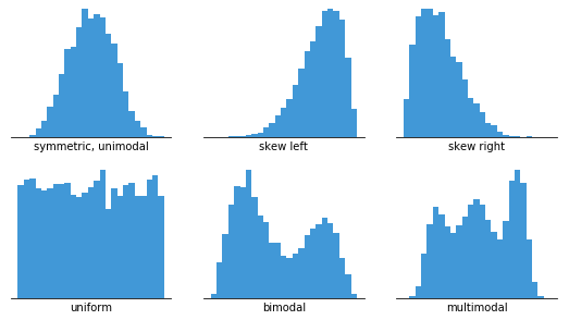
Pro Tip: I always start my data analysis with histograms. They immediately reveal whether data is normally distributed, skewed, or multimodal - crucial insights that guide all subsequent analysis decisions.
What we'll achieve together: From simple plots that take seconds to create, to professional-grade visualizations worthy of academic publications and executive presentations. PageOn.ai's visualization capabilities can help you document and share these insights seamlessly across your team.
Getting Started with Matplotlib Histograms
Essential Setup and Configuration
Let me walk you through the essential setup that I use in every data visualization project. First, we need to install and import the core libraries:
import matplotlib.pyplot as plt
import numpy as np
import pandas as pd
import seaborn as sns

# My preferred style settings
plt.style.use('seaborn-v0_8-whitegrid')
plt.rcParams['figure.figsize'] = (10, 6)
plt.rcParams['font.size'] = 12
I've learned that configuring Matplotlib properly from the start saves hours of tweaking later. Whether you're working in Jupyter notebooks or standalone scripts, these settings ensure consistent, professional-looking output.
Your First Histogram in 5 Lines of Code
Here's the beauty of Matplotlib - we can create meaningful visualizations with minimal code:
data = np.random.randn(1000)
plt.figure(figsize=(8, 4))
plt.hist(data, bins=30, color='skyblue', edgecolor='black', alpha=0.7)
plt.xlabel('Value')
plt.ylabel('Frequency')
plt.title('My First Matplotlib Histogram')
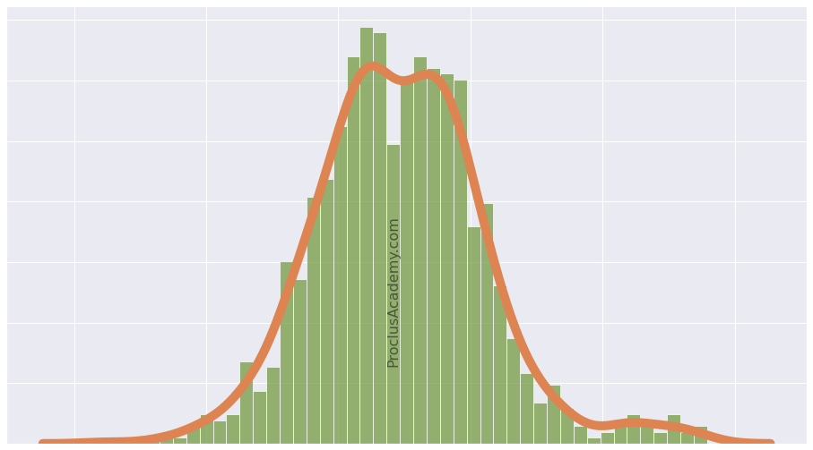
plt.show()Example Distribution Visualization
Understanding the return values is crucial: plt.hist() returns a tuple containing the frequency counts (n), bin edges (bins), and patch objects (patches). I often use these for further analysis or customization.
Core Histogram Customization Techniques
Bin Optimization Strategies
One of the most critical decisions in histogram creation is choosing the right number of bins. I've experimented with various methods, and here's what works best:
Bin Selection Decision Tree
flowchart TD
                        A[Start: Choose Bins] --> B{Data Size?}
                        B -->|< 30 points| C[5-7 bins]
                        B -->|30-100 points| D[Sturges Rule]
                        B -->|> 100 points| E{Distribution Type?}
                        E -->|Normal| F["Scott's Rule"]
                        E -->|Skewed| G[Freedman-Diaconis]
                        E -->|Unknown| H[Try Multiple]
                        D --> I[bins = log2(n) + 1]
                        F --> J[bins = 3.5σ/n^(1/3)]
                        G --> K[bins = 2*IQR/n^(1/3)]
I typically start with the Freedman-Diaconis rule for real-world data, as it's robust to outliers. For cleaner datasets, Scott's rule often produces aesthetically pleasing results.
Visual Enhancement Methods
Let me share my favorite techniques for creating visually stunning histograms that communicate effectively:
- Color Gradients: I use color mapping to encode additional information, like density or categories
- Transparency: Setting alpha=0.7 allows overlapping distributions to remain visible
- Edge Colors: Black edges with colored fills create the clearest visual separation
- Statistical Overlays: Adding KDE curves or percentile lines enriches the information density
Advanced Histogram Techniques
Statistical Histograms
When I need to compare distributions of different sizes, normalized histograms are essential. Here's how I create probability density functions:
# Normalized histogram with KDE overlay
plt.hist(data, bins=30, density=True, alpha=0.7, color='lightblue')
from scipy import stats
kde = stats.gaussian_kde(data)
x_range = np.linspace(data.min(), data.max(), 100)
plt.plot(x_range, kde(x_range), 'r-', linewidth=2, label='KDE')
PageOn.ai's **Agentic processes** can automate this type of statistical visualization, generating consistent plots across multiple datasets with minimal manual intervention.
Multi-Dataset Visualization
I frequently need to compare multiple distributions. Here are my go-to approaches:
Comparing Multiple Distributions
Advanced Tip: For comparing more than 3 distributions, I use violin plots or ridge plots instead of overlapping histograms to maintain clarity.
Real-World Applications and Case Studies
Let me share some practical applications from my experience working with diverse datasets:
Age Distribution Analysis - StackOverflow Survey
I analyzed the 2019 StackOverflow developer survey with over 79,000 responses. The histogram revealed fascinating insights about the developer community:
Key Finding 1
40,000 respondents were between 20-30 years old, showing the youth dominance in tech
Key Finding 2
Median age was 29, with a right-skewed distribution indicating fewer senior developers
Price Distribution Analysis - Avocado Dataset
Working with market price data requires careful histogram design. I discovered that adding percentile markers helps stakeholders make pricing decisions:
# Add percentile lines for business decisions
percentiles = [5, 25, 50, 75, 95]
for p in percentiles:
    value = np.percentile(prices, p)
    plt.axvline(value, linestyle='--', alpha=0.7)
    plt.text(value, plt.ylim()[1]*0.9, f'{p}th', rotation=90)
Building interactive dashboards with PageOn.ai's **Vibe Creation** feature allows stakeholders to explore these distributions dynamically, adjusting parameters in real-time to test different scenarios.
Industry-Specific Examples
Financial Data
Stock return distributions reveal market volatility patterns and help identify black swan events
Scientific Research
Measurement error distributions validate experimental precision and identify systematic biases
Machine Learning
Feature distributions guide preprocessing decisions and reveal data quality issues
Comparison with Other Visualization Tools
Understanding when to use histograms versus other visualization types is crucial. I've created this comparison based on years of experience:
Histograms vs. Bar Charts
Many people confuse these two, but the distinction is critical. As I explain in detail when comparing bar charts vs histograms, histograms show continuous data distributions while bar charts display categorical comparisons.
| Aspect | Histogram | Bar Chart |
|---|---|---|
| Data Type | Continuous numerical | Categorical or discrete |
| Bar Spacing | No gaps (touching bars) | Gaps between bars |
| X-axis Order | Must be sequential | Can be reordered |
| Use Case | Distribution analysis | Comparison between groups |
Alternative Plotting Libraries
While Matplotlib is my foundation, I often combine it with other libraries for specific needs. The landscape of data visualization charts offers many options:
Library Comparison Matrix
My Recommendation: Start with Matplotlib for learning fundamentals, add Seaborn for statistical elegance, and incorporate Plotly when interactivity is essential.
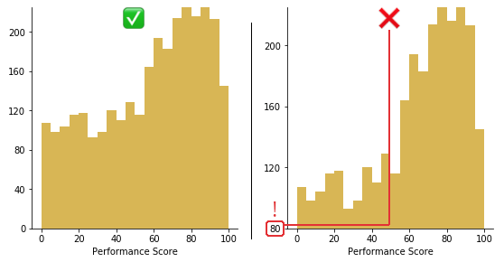
Best Practices and Common Pitfalls
Design Principles
Through countless visualizations, I've developed these core principles for effective histograms:
✅ DO
- • Label axes clearly with units
- • Use colorblind-friendly palettes
- • Add context with titles and captions
- • Test different bin sizes
- • Include sample size in title/caption
❌ DON'T
- • Use too many bins (noise)
- • Use too few bins (loss of detail)
- • Forget to handle outliers
- • Mix scales on dual axes
- • Ignore missing data patterns
Troubleshooting Guide
Here are solutions to the most common histogram issues I encounter:
Common Issues Resolution Flow
flowchart LR
                        A[Empty Histogram] --> B[Check for NaN values]
                        B --> C[df.dropna()]

                        D[Histogram Too Dense] --> E[Reduce bins]
                        E --> F[Use log scale]

                        G["Can't See Details"] --> H[Adjust xlim/ylim]
                        H --> I[Consider subplots]

                        J[Memory Error] --> K[Sample data]
                        K --> L[Use numpy.histogram]
Performance Tip: For datasets over 1 million points, I pre-compute bins with numpy.histogram() and plot with plt.bar() for 10x speed improvement.
Integration with Data Science Workflows
Effective histogram creation isn't just about the code - it's about seamlessly integrating visualization into your entire data science pipeline. Here's how I structure my workflows:
Workflow Automation
I've developed reusable functions that standardize histogram creation across projects:
def create_publication_histogram(data, title, xlabel,
                                  bins='auto', color='#FF8000'):
    """My go-to function for publication-ready histograms"""
    fig, ax = plt.subplots(figsize=(10, 6))

    # Calculate optimal bins if auto
    if bins == 'auto':
        q75, q25 = np.percentile(data, [75, 25])
        bin_width = 2 * (q75 - q25) / len(data)**(1/3)
        bins = int((data.max() - data.min()) / bin_width)

    # Create histogram with KDE
    n, bins, patches = ax.hist(data, bins=bins,
                               density=True, alpha=0.7,
                               color=color, edgecolor='black')

    # Add KDE overlay
    from scipy.stats import gaussian_kde
    kde = gaussian_kde(data)
    x_range = np.linspace(data.min(), data.max(), 200)
    ax.plot(x_range, kde(x_range), 'r-', lw=2)

    # Styling
    ax.set_xlabel(xlabel, fontsize=14)
    ax.set_ylabel('Density', fontsize=14)
    ax.set_title(title, fontsize=16, pad=20)
    ax.grid(True, alpha=0.3)

    return fig, ax
PageOn.ai's **Deep Search** capability can help you find and integrate relevant visualization assets and code snippets from your organization's knowledge base, accelerating development significantly.
Combining with Exploratory Data Analysis
In my EDA workflow, histograms are the cornerstone. I combine them with summary statistics for comprehensive insights:
Step 1: Overview
Generate histograms for all numerical columns
Step 2: Deep Dive
Focus on interesting distributions with enhanced plots
Step 3: Document
Export findings with PageOn.ai for team sharing
Exporting for Reports and Presentations
Quality matters when presenting to stakeholders. Here are my export settings:
# High-quality export settings
plt.savefig('histogram.png', dpi=300, bbox_inches='tight')
plt.savefig('histogram.svg', format='svg')  # For publications
plt.savefig('histogram.pdf', format='pdf')  # For LaTeX
Future-Ready Histogram Techniques
The field of data visualization is rapidly evolving. Here are the cutting-edge techniques I'm exploring:
Interactive Histograms with Widgets
Using ipywidgets to create dynamic histograms where users can adjust bins, ranges, and overlays in real-time
3D Histogram Visualizations
Exploring three-dimensional histograms for multivariate distributions using matplotlib's mplot3d toolkit
Real-time Streaming Data
Building histograms that update live as new data arrives, perfect for monitoring applications
ML-Enhanced Bin Optimization
Using machine learning to automatically determine optimal binning strategies based on data characteristics
Looking Ahead: The future of histograms lies in interactivity and intelligence. Tools like PageOn.ai are pioneering this transformation, making complex visualizations accessible to everyone.
Transform Your Visual Expressions with PageOn.ai
Ready to take your data visualization to the next level? PageOn.ai combines the power of AI with intuitive design tools to help you create stunning, interactive histograms and beyond. From automated chart generation to intelligent data insights, discover how our platform can revolutionize your data storytelling.
Start Creating with PageOn.ai TodayConclusion and Next Steps
We've journeyed from basic histogram creation to advanced visualization techniques. The key takeaways from my years of experience:
- Start simple, but always consider your audience when adding complexity
- Bin selection can make or break your visualization - experiment liberally
- Combine histograms with other statistical tools for comprehensive analysis
- Automation and reusability save time and ensure consistency
- Modern tools like PageOn.ai can accelerate your visualization workflow dramatically
Your Learning Path Forward
- Master the Basics: Practice creating histograms with different datasets
- Explore Customization: Experiment with colors, styles, and overlays
- Learn Statistical Enhancement: Add KDE, percentiles, and annotations
- Build Reusable Functions: Create your own histogram toolkit
- Embrace Modern Tools: Integrate PageOn.ai for enhanced productivity
- Share Your Work: Document and present your visualizations effectively
Remember, great data visualization is both an art and a science. Each histogram tells a story - your job is to make that story clear, compelling, and actionable. With the techniques we've covered and tools like PageOn.ai at your disposal, you're well-equipped to transform raw data into powerful visual insights.
Final Thought: The best histogram is the one that answers your question clearly. Don't get lost in aesthetics at the expense of clarity. Start with purpose, enhance with technique, and always validate with your audience.
Ready to move beyond static plots? Explore how PageOn.ai can help you create interactive dashboards that bring your histograms to life, enabling real-time exploration and deeper insights from your data.
You Might Also Like
The AI Code Revolution: How Y Combinator Startups Are Building With LLM-Generated Software
Explore how 25% of Y Combinator startups are using AI to write 95% of their code, transforming startup economics and enabling unprecedented growth rates in Silicon Valley's top accelerator.
Transform Excel Data into Professional Presentations in Minutes | PageOn.ai
Learn how to quickly convert Excel data into stunning professional presentations using AI tools. Save hours of work and create impactful data visualizations in minutes.
Engaging Your Audience: Crafting Interactive and Visually Captivating Slides
Discover how to transform static presentations into interactive visual experiences that captivate audiences through strategic design, interactive elements, and data visualization techniques.
Building Powerful Real-World AI Applications with PostgreSQL and Claude | PageOn.ai
Learn how to build sophisticated AI applications by integrating PostgreSQL and Claude AI. Discover architecture patterns, implementation techniques, and optimization strategies for production use.