Transform Your Data Into Dynamic Line Charts with PageOn.ai
From Static Spreadsheets to Interactive Visual Narratives
I've witnessed the evolution of data visualization from tedious manual charting to today's AI-powered revolution. Line charts remain essential for tracking trends, but the way we create them has fundamentally changed. PageOn.ai bridges the gap between complex data and clear visual storytelling, eliminating the technical barriers that once held professionals back.
Understanding Modern Line Chart Creation Needs
I've struggled with traditional chart makers for years, and I know you have too. The limited customization options, manual update requirements, and lack of integration capabilities have made data visualization a chore rather than an opportunity. In 2025, we're witnessing a fundamental shift in how we approach data visualization graph tools with the rise of AI-powered solutions.
Key Requirements for Professional Line Charts
- ▸ Seamless data import from multiple sources including Excel, Google Sheets, and SQL databases
- ▸ Dynamic updating capabilities that reflect real-time data changes
- ▸ Professional presentation-ready outputs without manual formatting
- ▸ Intelligent automation that reduces manual effort
According to recent analysis of AI chart generators, platforms like Tableau AI and Microsoft Power BI's Copilot are leading this transformation. However, PageOn.ai takes a unique approach through its Vibe Creation methodology, addressing these needs in ways that traditional tools simply can't match.
PageOn.ai's Revolutionary Approach to Line Charts
Beyond Basic Chart Generation
I've discovered that PageOn.ai fundamentally reimagines how we create line charts. Instead of wrestling with complex interfaces, I can simply describe what I need using natural language. The platform's AI create charts from text capability transforms voice and text input into instant visualizations.
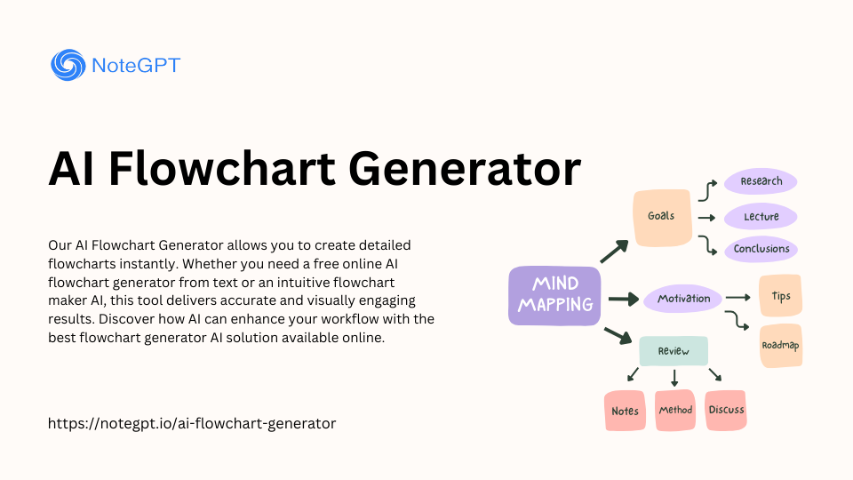
AI Blocks System
Combine data points, trend lines, and annotations like building blocks. Each element intelligently adapts to your overall design.
Smart Template Selection
The AI analyzes your data type and presentation goals to suggest optimal chart configurations automatically.
The Power of Conversational Chart Creation
What truly sets PageOn.ai apart is its natural language processing. I can say "Show me quarterly sales trends with seasonal annotations" and watch as the platform creates exactly what I envisioned. The system provides context-aware suggestions, automatic data cleaning, and intelligent axis scaling - all without manual intervention.
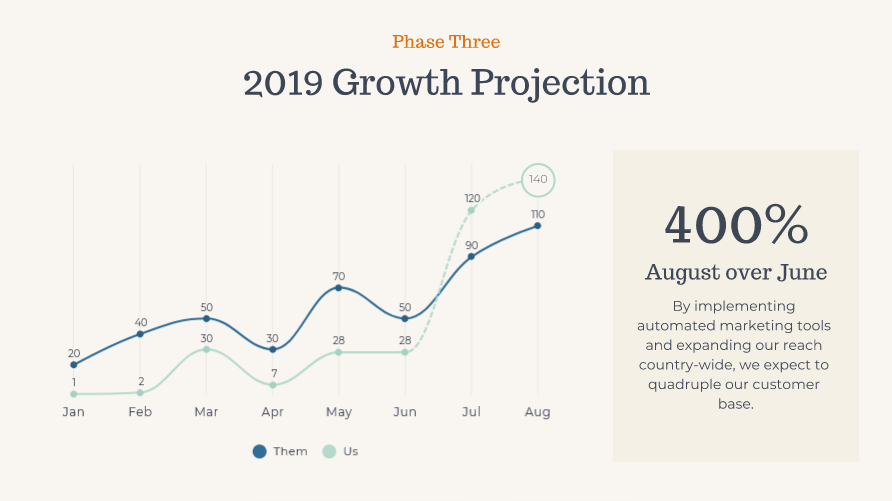
Sample Quarterly Sales Trend
Advanced Features That Set PageOn.ai Apart
Deep Search Integration
One of the most powerful aspects I've discovered is PageOn.ai's ability to automatically find and incorporate relevant benchmarks and industry data. The platform can pull in supporting visuals and context without manual searching, connect to live data sources for real-time updates, and integrate historical data for comprehensive trend analysis.
Deep Search Integration Process
flowchart LR
                            A[Your Data] --> B[AI Analysis]
                            B --> C[Search for Benchmarks]
                            B --> D[Find Industry Data]
                            C --> E[Enhanced Chart]
                            D --> E
                            E --> F[Real-time Updates]
Agentic Processing for Superior Results
PageOn.ai's agentic processing follows a sophisticated workflow that ensures optimal results:
Practical Applications and Use Cases
Business Intelligence and Reporting
I've used PageOn.ai to transform how businesses approach data visualization. The platform excels at creating executive dashboards with multiple synchronized line charts, tracking KPIs across departments with automated updates, and generating investor presentations with compelling growth narratives.
Executive Dashboards
Create comprehensive views with multiple synchronized charts that update in real-time, perfect for C-suite presentations.
Interactive Reports
Build reports that adapt to viewer preferences, allowing stakeholders to explore data at their own pace.
Educational and Research Applications
In academic settings, I've seen PageOn.ai revolutionize how researchers present their findings. The platform handles experimental data with error bars and confidence intervals, creates interactive learning materials for data literacy, and produces publication-ready charts that meet journal standards.
| Application Area | Traditional Tools | PageOn.ai Advantage |
|---|---|---|
| Research Data | Manual error bar calculation | Automatic confidence intervals |
| Teaching Materials | Static images | Interactive explorations |
| Publications | Multiple software needed | One-click journal formatting |
Step-by-Step Guide: Creating Your First AI-Powered Line Chart
Data Preparation and Import
Getting started with PageOn.ai is remarkably straightforward. The platform supports multiple formats including CSV, Excel, Google Sheets, and direct database connections. What I particularly appreciate is how the AI provides data cleaning suggestions, helping identify and resolve issues before they affect your visualizations.
Import Process
Customization and Enhancement
Once your data is imported, PageOn.ai's customization options truly shine. I can apply brand colors and styling guidelines with a single click, add interactive elements like hover effects and drill-downs, and incorporate annotations for key events or milestones. The platform even handles multi-series comparisons with synchronized axes automatically.
Multi-Series Comparison Example
Maximizing Impact: Best Practices and Pro Tips
Design Principles for Effective Line Charts
Through my experience with PageOn.ai and various comparison chart creation tools, I've learned that effective line charts follow specific design principles. Choosing appropriate time intervals and axis scales is crucial - your data should neither be cramped nor stretched unnecessarily.
Color Psychology
Use warm colors (orange, red) for positive trends and cool colors (blue, purple) for comparative data. This enhances comprehension instantly.
Mobile Responsiveness
Ensure your charts adapt gracefully to different screen sizes. PageOn.ai automatically optimizes for cross-platform viewing.
Advanced Techniques with PageOn.ai
I've discovered several advanced techniques that truly leverage PageOn.ai's capabilities. Combining line charts with other visualization types creates comprehensive dashboards. Building animated presentations that reveal data progressively keeps audiences engaged. Creating templates for recurring reports saves countless hours.
Pro Tips for Maximum Impact
- ★ Use AI insights to identify hidden patterns in your data before finalizing your chart design
- ★ Create chart variations for different audiences - executives prefer high-level trends, analysts want detailed data
- ★ Leverage the platform's ai-powered bar chart generators alongside line charts for comprehensive analysis
- ★ Set up automated reports that refresh and distribute themselves on schedule
The Future of Line Chart Creation with PageOn.ai
Emerging Capabilities
The future of data visualization is incredibly exciting. PageOn.ai is already integrating predictive analytics for forecasting, developing AR/VR visualization options for immersive data exploration, and implementing natural language querying of chart data. These features will revolutionize how we interact with and understand our data.
Future Visualization Ecosystem
flowchart TD
                            A[Current Line Charts] --> B[Predictive Analytics]
                            A --> C[AR/VR Visualization]
                            A --> D[Natural Language Query]
                            B --> E[AI-Powered Forecasting]
                            C --> F[Immersive Data Exploration]
                            D --> G[Conversational Analytics]
                            E --> H[Future-Ready Insights]
                            F --> H
                            G --> H
Predictive Analytics
Forecast trends with AI-powered predictions
AR/VR Support
Explore data in immersive 3D environments
Natural Language
Query your charts conversationally
Getting Started Today
I encourage you to explore PageOn.ai's capabilities yourself. The platform offers free trial options and extensive learning resources. The community templates and best practice examples provide excellent starting points for your projects. With its growing integration roadmap covering popular business tools, PageOn.ai is positioned to become your central hub for all data visualization needs.
Your Next Steps
- 1 Start with the free trial to explore core features
- 2 Import your existing data to see instant transformations
- 3 Experiment with AI-powered features for enhanced insights
- 4 Join the community to share and learn from others

Transform Your Visual Expressions with PageOn.ai
Join thousands of professionals who have revolutionized their data visualization workflow. Experience the power of AI-driven chart creation that turns complex data into compelling visual stories.
Start Creating with PageOn.ai TodayYou Might Also Like
Redefining Developer & Designer Roles in the Age of Intent-Based Creation | PageOn.ai
Explore how intent-based creation is transforming developer and designer collaboration, blurring traditional boundaries, and creating new hybrid roles like intent engineers in the modern tech landscape.
The Ultimate Design Tools & Workflow Ecosystem for Creative Professionals
Discover essential design tools and optimized workflows for creative professionals. Learn how to build a cohesive ecosystem of visual tools that streamline ideation, feedback, and asset management.
Mastering Image Cropping and Alignment: Creating Visual Harmony in Your Designs
Learn essential techniques for image cropping and alignment to create visually harmonious designs. Discover aspect ratios, composition strategies, and alignment principles for professional results.
Transform Your Presentations: Mastering Slide Enhancements for Maximum Impact
Learn how to elevate your presentations with effective slide enhancements, formatting techniques, and visual communication strategies that captivate audiences and deliver powerful messages.