The Ultimate Guide to AI-Powered Pie Chart Generators
Transform Your Data into Visual Stories with PageOn.ai and Discover How AI is Revolutionizing Data Visualization in 2025
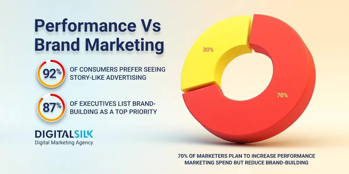
Why Visual Data Matters More Than Ever
I've spent years watching professionals struggle with the same challenge: how do we communicate complex data in today's lightning-fast business environment? We're drowning in numbers, yet starving for insights. That's where the magic of visual storytelling comes in, and pie charts—despite being centuries old—remain one of our most powerful tools for showing part-to-whole relationships.
The evolution from manual chart creation to AI-powered visualization tools has been nothing short of revolutionary. I remember spending hours in Excel, tweaking colors and labels, only to have my audience glaze over during presentations. Today, with AI pie chart generators, we can transform raw data into compelling visual narratives in seconds.
What truly excites me about PageOn.ai is its unique approach: it turns our fuzzy thoughts into clear, compelling visuals without the technical headache. It's not just another chart maker—it's like having a visual thinking partner that understands what we're trying to communicate before we fully articulate it ourselves.
Understanding Modern Pie Chart Generation Needs
Let me share what I've learned from working with hundreds of professionals: traditional chart makers are broken. We're still stuck with time-consuming manual data entry, limited customization options that require design skills most of us don't have, and the eternal struggle of integrating charts into presentations that actually tell a story.
Common Pain Points with Traditional Tools:
- Hours wasted on manual data formatting and entry
- Generic templates that don't match your brand or message
- Zero context or narrative around the numbers
- Collaboration nightmares with version control
What professionals actually need in 2025 goes far beyond basic chart creation. We need natural language input capabilities—the ability to say "show me customer distribution by region" and get exactly that. We need real-time collaboration features that let teams work together seamlessly. Most importantly, we need AI-assisted insights that help us understand what our data is really telling us.
The Evolution of Data Visualization
flowchart LR
                        A[Manual Drawing] --> B[Spreadsheet Tools]
                        B --> C[Design Software]
                        C --> D[Online Chart Makers]
                        D --> E[AI-Powered Generators]
                        E --> F[PageOn.ai: Conversational AI]

                        style F fill:#FF8000,stroke:#333,stroke-width:2px
PageOn.ai's Revolutionary Approach to Data Visualization
Vibe Creation: Conversation-Driven Chart Building
Here's where PageOn.ai truly shines. Instead of wrestling with spreadsheets and dropdown menus, I can simply describe my data needs in plain English. Want a quarterly sales breakdown? Just tell the AI: "Create a pie chart showing Q4 sales by product category, emphasizing our top performer." In under 30 seconds, you have a professional visualization that captures exactly what you envisioned.
The AI doesn't just create charts—it understands context. When I mention "emphasizing our top performer," it automatically applies visual hierarchy, using colors and positioning to draw attention where it matters most. This level of intuitive understanding transforms how we approach data visualization.
AI Blocks: Building Charts Like LEGOs
PageOn.ai's AI Blocks feature revolutionizes how we combine data visualizations. Think of it as having intelligent building blocks that snap together perfectly. I can drag and drop different chart types, combine them with narrative text, and create comprehensive presentations without any technical expertise.
What amazes me most is how the AI suggests complementary visual elements. Working on a market share pie chart? It might recommend adding a trend line showing growth over time, or suggest icons that represent each market segment. These intelligent recommendations turn good charts into great visual stories.
Deep Search: Automated Asset Integration
The Deep Search capability is like having a visual research assistant. It automatically finds relevant icons, images, and supporting visuals that enhance your data story. Creating a pie chart about global markets? The AI seamlessly integrates country flags, currency symbols, or regional imagery that makes your data instantly more relatable and memorable.
Comprehensive Tool Comparison: PageOn.ai vs. Top Alternatives
After testing dozens of AI chart generators, I've identified the key differentiators that matter for real-world use. Let me break down how the top tools compare:
Feature Comparison: Top AI Pie Chart Generators
PageOn.ai
Best for: Narrative-driven presentations and ease of use
- Conversational AI interface
- Visual storytelling focus
- No learning curve
- Transforms fuzzy ideas into polished visuals
ClickUp
Best for: Project-based real-time reporting
- Integration with task management
- Live data updates from workflows
- Team collaboration features
- Limited to project data visualization
According to recent analysis from industry experts at ClickUp, the average professional spends over 30 minutes daily searching for work-related information. That's why choosing the right visualization tool isn't just about features—it's about reclaiming your time and mental energy.
Step-by-Step: Creating Your First AI-Powered Pie Chart with PageOn.ai
Let me walk you through the remarkably simple process of creating professional pie charts with PageOn.ai. What used to take me hours now takes literally minutes.
Upload Your Data or Describe It Conversationally
Start by either uploading your Excel or CSV file, or simply describe your data in plain English. For example: "Show me customer distribution by region for Q4 with percentages." The AI understands context and intent, not just numbers.
Let AI Analyze and Suggest Visualizations
PageOn.ai identifies patterns in your data automatically. It calculates percentages, optimizes segment ordering, and even selects a smart color palette based on the meaning of your data. Financial data? It might use green for profits, red for losses.
Customize with Natural Commands
Want to make changes? Just tell the AI: "Make the European segment stand out" or "Add trend indicators to each segment." No clicking through menus or remembering where settings are hidden.
Enhance with Deep Search Assets
The AI automatically matches icons to your categories, suggests background imagery that complements your data story, and can even integrate supporting charts for additional context. It's like having a professional designer on standby.
Export and Share
Choose from multiple format options—PNG for presentations, PDF for reports, or interactive web versions for online sharing. Real-time collaboration features let your team provide feedback and make adjustments together.
Advanced Use Cases and Best Practices
Business Intelligence Applications
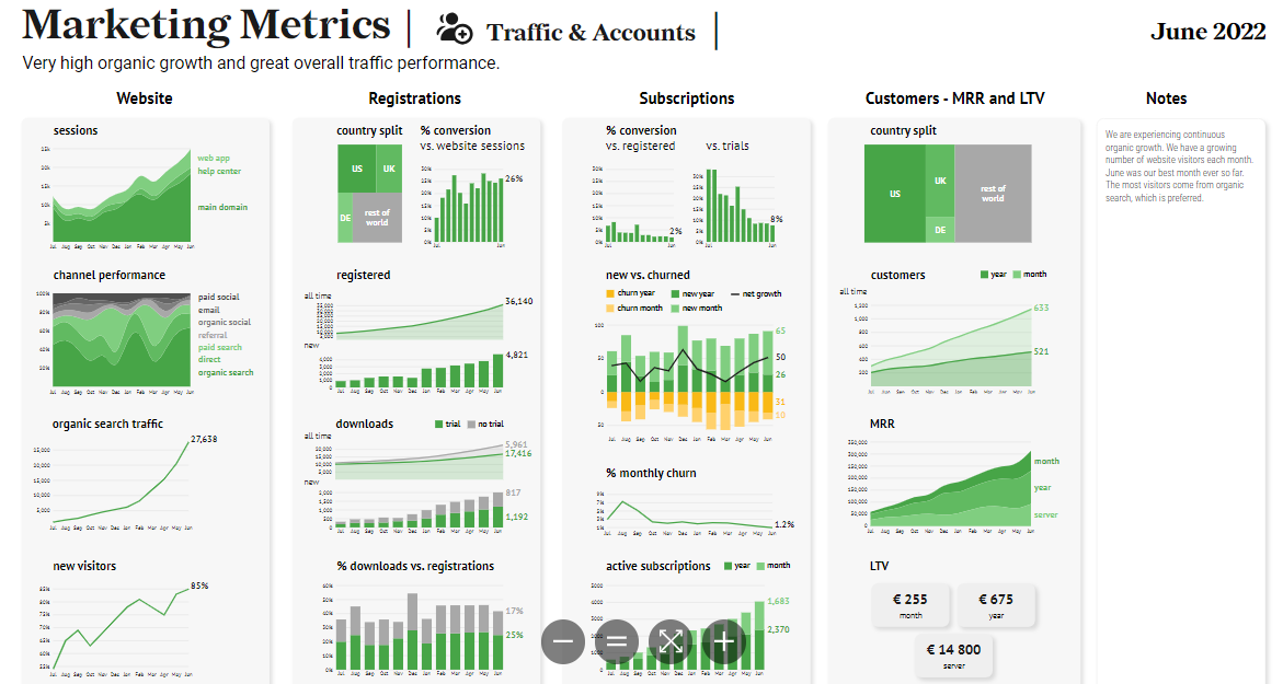
In my experience working with Fortune 500 companies, I've seen how the right visualization can change decision-making. Sales teams use PageOn.ai to create performance dashboards that combine pie charts with AI-powered bar chart generators for comprehensive analysis. Market share visualizations become compelling stories when you can instantly show both current distribution and historical trends.
Q4 2024 Sales Distribution
Educational and Research Applications
Educators and researchers have unique visualization needs. I've helped universities transform student performance analytics into clear visual narratives that inform policy decisions. Research data presentation for publications becomes more impactful when complex findings are distilled into intuitive pie charts that readers can grasp instantly.
Marketing and Content Creation
Marketing teams love PageOn.ai for its ability to quickly generate social media engagement metrics and campaign performance breakdowns. When presenting ROI to clients, the combination of pie charts and narrative context creates presentations that not only inform but persuade.
Maximizing Impact: Design Principles for AI-Generated Pie Charts
Through years of creating data visualizations, I've learned that great pie charts follow specific principles. The optimal number of segments is 5-7 for clarity—any more and your audience gets lost in the details. Color psychology matters too: warm colors draw attention, cool colors recede, and consistency across your presentation builds trust.
Key Design Principles:
-
▸
Segment Optimization: Keep it to 5-7 segments maximum. Combine smaller segments into an "Other" category if needed.
-
▸
Color Psychology: Use brand colors for your main segments, complementary colors for contrast, and ensure accessibility for colorblind viewers.
-
▸
3D vs. Flat: Flat designs are cleaner and more accurate. Save 3D effects for when you need extra visual impact, but use sparingly.
-
▸
Context Matters: Understanding when to use pie vs donut charts can significantly impact how your data is perceived.
Remember, the goal isn't just to display data—it's to tell a story that drives action. PageOn.ai excels here by suggesting design choices that align with your narrative goals, whether you're using comparison chart creation tools or focusing on single-metric visualizations.
The Future of Data Visualization with AI
We're standing at the threshold of a visualization revolution. In 2025 and beyond, I see voice-activated chart creation becoming mainstream—imagine walking into a meeting and saying, "Show me last quarter's performance by region" and having a perfect pie chart appear on screen instantly.
The Evolution Continues: What's Next
flowchart TD
                        A[Current: AI-Powered Generation] --> B[Near Future: Voice Activation]
                        A --> C[AR/VR Visualization]
                        A --> D[Predictive Analytics]
                        B --> E[Ambient Computing]
                        C --> E
                        D --> E
                        E --> F[Fully Autonomous Visual Intelligence]

                        style A fill:#FF8000,stroke:#333,stroke-width:2px
                        style F fill:#66BB6A,stroke:#333,stroke-width:2px
AR and VR will transform how we interact with data. Picture walking through your data, literally exploring pie charts in three-dimensional space, or having real-time visualizations overlay your physical environment during meetings. PageOn.ai's Agentic approach—Plan, Search, Act—is already laying the groundwork for these advances.
The shift from static charts to dynamic, interactive visual stories is accelerating. Soon, our pie charts won't just show data—they'll predict trends, suggest actions, and adapt in real-time to audience questions. This is the future PageOn.ai is building toward, and it's incredibly exciting to be part of this transformation.
Implementation Strategy: Getting Started with PageOn.ai
Quick Wins for Immediate Value
Start with your existing Excel reports. Take that monthly sales spreadsheet and transform it into a visual presentation that actually gets people excited. Create weekly team performance dashboards that update automatically. Build client-facing data stories that differentiate your proposals from the competition.
Saved weekly per user
Report generation
Improved engagement
Building a Visualization Workflow
Success with AI-powered visualization isn't just about the tools—it's about the process. Establish data collection best practices, create templates for recurring reports, and set team collaboration guidelines. PageOn.ai makes this easy with its template library and sharing features.
Measure your success by tracking time saved versus traditional methods, monitoring audience engagement metrics, and observing how much faster decisions are made when data is presented visually. The results will speak for themselves.
Transform Your Data Story Today
We've explored why AI pie chart generators are essential in 2025, and how PageOn.ai stands apart with its unique ability to turn complex data into clear, actionable visuals. The competitive advantage of AI-powered visualization isn't just about prettier charts—it's about communicating more effectively, making better decisions faster, and freeing your mind to focus on strategy rather than spreadsheet formatting.
PageOn.ai isn't just another tool in your arsenal—it's a paradigm shift in how we think about data presentation. By combining conversational AI, intelligent design suggestions, and seamless collaboration features, it transforms the daunting task of data visualization into an enjoyable, creative process.
The future belongs to those who can turn information into insight, and insight into action. With PageOn.ai, you're not just keeping up with the visualization revolution—you're leading it. Every fuzzy thought becomes a clear visual expression, every dataset tells a compelling story, and every presentation drives meaningful results.
Transform Your Visual Expressions with PageOn.ai
Join thousands of professionals who've discovered how PageOn.ai revolutionizes data visualization. From simple pie charts to complex visual narratives, experience the power of AI-driven design that understands your intent and amplifies your message.
Start Creating with PageOn.ai TodayNo credit card required • Free trial available • Setup in minutes
Resources for Continued Learning
Essential Guides
Best Practices
- When to Use Pie vs Donut Charts
- Industry Analysis: Top Pie Chart Makers
- Data Visualization Best Practices Guide
Ready to revolutionize how you visualize data? The journey from spreadsheet to stunning visual story starts with a single step. Try PageOn.ai today and discover why professionals worldwide are making the switch to AI-powered visualization.
You Might Also Like
Harnessing Creative Tension: Strategic Conflict in Experience Design | PageOn.ai
Discover how to intentionally use conflict as a creative catalyst in experience design. Learn techniques for implementing productive tension that transforms friction into innovative solutions.
Achieving Visual Harmony: The Art of Scale and Proportion in Interface Design
Master the principles of scale and proportion in interface design to create visually balanced, harmonious user experiences that reduce cognitive load and enhance usability.
The Art of Text Contrast: Transform Audience Engagement With Visual Hierarchy
Discover how strategic text contrast can guide audience attention, enhance information retention, and create more engaging content across presentations, videos, and marketing materials.
Mastering PowerPoint's Grid System: Build Professional Consistent Layouts
Learn how to leverage PowerPoint's grid system to create visually harmonious presentations with consistent layouts, proper alignment, and professional design that improves audience retention.