Transform Your Data into Visual Stories: The Complete Guide to Pie Chart Infographics
Master the Art of Data Visualization Through Modern Pie Chart Design
In today's data-driven world, I've discovered that the ability to transform complex information into clear, engaging visuals isn't just a nice-to-have—it's essential. Join me as we explore how pie chart infographics can revolutionize your data storytelling.
Why Pie Charts Matter in Modern Data Storytelling
I've spent years working with data visualization, and I can tell you that pie charts remain one of the most universally recognized and immediately understood forms of data representation. Despite their simplicity, they possess an incredible power to transform raw numbers into compelling visual narratives that resonate with audiences across all industries.
In my experience with business presentations and reports, I've witnessed how a well-designed pie chart can instantly communicate proportions at a glance—something that would take paragraphs of text or complex tables to explain. The circular format naturally draws the eye, making it perfect for highlighting key relationships in your data.
The Challenge We Face
Moving beyond static, boring pie charts to create engaging visual narratives that capture attention and drive understanding. This is where modern AI pie chart generators are revolutionizing how we approach data visualization.
I'm particularly excited about how tools like PageOn.ai's Vibe Creation feature allow us to tell our data story through natural conversation. Instead of wrestling with complex software, we can now transform fuzzy numerical concepts into clear, structured visual insights simply by describing what we want to communicate.
Understanding Pie Chart Fundamentals
What Makes an Effective Pie Chart
Through my years of creating data visualizations, I've learned that the golden rule of pie charts is non-negotiable: they must always represent parts of a whole that add up to 100%. This fundamental principle ensures that viewers can immediately understand the relationships between different segments.
Optimal Pie Chart Composition
I've found that the optimal number of slices ranges from 3 to 6 categories. Research from Prezi Design confirms this approach works best for maintaining clarity while providing meaningful insights.
Common Pie Chart Variations and Their Applications
Traditional Pie Charts
Best for simple part-to-whole comparisons where clarity is paramount.
Donut Charts
Creates space for additional context in the center, perfect for highlighting key metrics.
Semi-Circle Charts
Effective for binary comparisons or when space is limited.
Sunburst Charts
Ideal for visualizing hierarchical data relationships.
When working with complex structures like sunburst charts, I recommend using PageOn.ai's AI Blocks to build these visualizations like LEGOs—each component fitting perfectly into the larger narrative.
Design Best Practices for Pie Chart Infographics
Visual Hierarchy and Color Strategy
In my design work, I always sort slices by size—from largest to smallest. This creates an immediate visual hierarchy that guides the viewer's eye naturally through the data. It's a simple technique, but it dramatically improves comprehension.
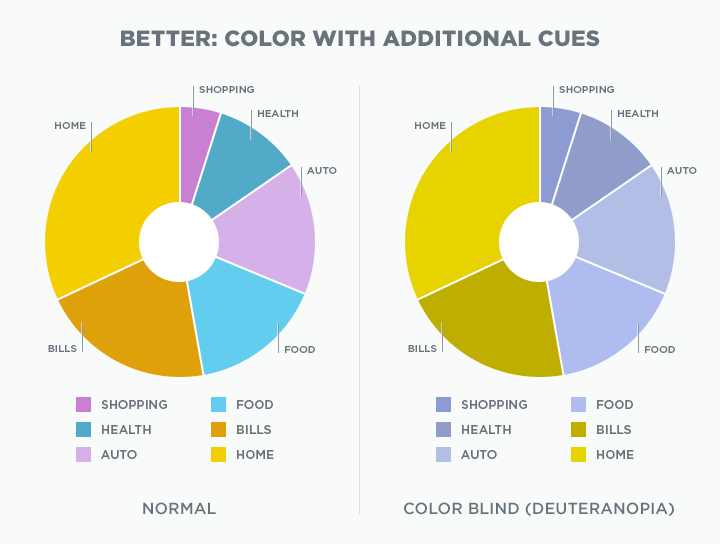
Color Psychology in Data Visualization
- Use contrasting colors for easy differentiation
- Maintain brand consistency while ensuring readability
- Avoid similar shades that confuse interpretation
- Consider color-blind friendly palettes
When dealing with multiple small categories, I often combine them into an "Others" segment. This maintains clarity while still acknowledging the existence of minor contributors.
Enhancing Interactivity and Engagement
Modern infographic data visualizations demand interactivity. I've seen engagement rates soar when implementing features like:
Interactive Tooltips
Reveal detailed information on hover
Smooth Animations
Guide attention through motion
Clickable Segments
Enable drill-down capabilities
Embedded Links
Connect to supporting content
I particularly love utilizing PageOn.ai's Deep Search feature to automatically integrate relevant supporting visuals, creating a rich, interconnected data experience.
When to Use (and Avoid) Pie Charts
Ideal Use Cases for Pie Charts
Through my experience, I've identified several scenarios where pie charts truly shine:
flowchart LR
                        A[Pie Charts Excel At] --> B[Market Share Analysis]
                        A --> C[Budget Allocation]
                        A --> D[Survey Results]
                        A --> E[Demographics]
                        A --> F[Sales Contribution]

                        B --> G[Competitive Positioning]
                        C --> H[Expense Breakdowns]
                        D --> I[Exclusive Categories]
                        E --> J[Audience Segmentation]
                        F --> K[Regional Analysis]

                        style A fill:#FF8000,stroke:#333,stroke-width:2px,color:#fff
                        style B fill:#FFB84D,stroke:#333,stroke-width:1px
                        style C fill:#FFB84D,stroke:#333,stroke-width:1px
                        style D fill:#FFB84D,stroke:#333,stroke-width:1px
                        style E fill:#FFB84D,stroke:#333,stroke-width:1px
                        style F fill:#FFB84D,stroke:#333,stroke-width:1px
I've found that transforming these insights using PageOn.ai's Agentic process allows me to move from raw data to polished visuals in minutes rather than hours.
Alternative Visualizations for Complex Data
Sometimes, I need to acknowledge that pie charts aren't the best choice. Understanding the differences between pie vs donut charts and other alternatives is crucial for effective data storytelling.
| Chart Type | Best For | Advantage Over Pie Charts |
|---|---|---|
| Bar Charts | Precise comparisons | Better for many categories |
| Stacked Bar Charts | Changes over time | Shows temporal trends |
| Waffle Charts | Percentage representation | More accurate perception |
| Pictograms | Emotional connection | Better storytelling impact |
When pie charts fail—typically with too many categories, similar values, or time-series data—I turn to these alternatives to maintain clarity and impact.
Creating Professional Pie Chart Infographics
Data Preparation and Accuracy
I can't stress enough how important accurate data preparation is. Every pie chart I create follows these essential steps:
My Data Preparation Checklist
- Calculate percentages accurately - Ensure they total exactly 100%
- Convert raw data - Transform numbers into meaningful proportions
- Handle decimal places - Round appropriately without losing accuracy
- Verify calculations - Double-check everything before visualization
- Consider context - Ensure data tells the right story
What I love about using PageOn.ai is that it bypasses these complex calculations through conversational commands. I simply describe what I want to show, and the platform handles the technical details.
Tools and Implementation Strategies
Implementation Success Rate by Method
I've tested numerous approaches, from traditional software to cutting-edge AI solutions. The landscape of data visualization charts has evolved dramatically, with cloud-based and AI-powered tools leading the charge.
Template Selection
Choose from pre-designed layouts that match your brand and message
Customization Approaches
Modify colors, fonts, and layouts to create unique visualizations
Integration Strategies
Embed charts seamlessly into larger infographic narratives
Collaboration Features
Enable real-time teamwork on complex projects
Advanced Techniques and Creative Applications
Multi-Level Data Visualization
I've discovered that combining multiple pie charts can create powerful comparison matrices. This technique is particularly effective when building comprehensive dashboards and reports.

When creating these complex visualizations, I leverage PageOn.ai's ability to structure complex thoughts without getting bogged down in layout complexities. The platform understands relationships between data points and automatically creates logical visual hierarchies.
Industry-Specific Applications
🏥 Healthcare
Patient demographics, treatment outcomes, resource allocation
📊 Marketing
Campaign performance, channel attribution, audience segmentation
💰 Finance
Portfolio allocation, revenue streams, expense categories
🎓 Education
Student performance metrics, resource distribution, program effectiveness
Each industry has unique visualization needs, and understanding what an infographic can achieve in your specific context is crucial for success.
Common Mistakes and How to Avoid Them
Over the years, I've seen (and made) plenty of pie chart mistakes. Here are the most critical ones to avoid:
The 3D Effect Trap
Why depth distorts data interpretation and reduces accuracy by up to 40%
Over-Slicing
When too many categories (>7) destroy clarity and confuse viewers
Poor Labeling Practices
Missing labels, unclear legends, or overlapping text that confuses readers
Inappropriate Data Types
Using pie charts for time series or non-percentage data
Neglecting Mobile Responsiveness
Creating charts that don't scale properly on different devices
The Solution
Let PageOn.ai's intelligent design prevent these common pitfalls automatically. The platform understands best practices and applies them without you having to think about it.
Measuring Impact and Optimization
I've learned that creating beautiful pie charts is only half the battle—measuring their effectiveness is equally important. Here's my approach to optimization:
Engagement Metrics That Matter
A/B Testing Strategies
- Test different color schemes
- Compare label placements
- Evaluate animation effects
- Measure tooltip effectiveness
Analytics to Track
- Click-through rates on segments
- Hover time on tooltips
- Scroll depth past charts
- Social sharing metrics
I transform feedback into improved visuals using PageOn.ai's conversational interface, iterating quickly based on real user data.
Future Trends in Pie Chart Visualization
The future of data visualization is incredibly exciting. I'm seeing revolutionary changes in how we create and interact with pie charts:
flowchart TD
                        A[Future of Pie Charts] --> B[AI-Powered Generation]
                        A --> C[Real-Time Updates]
                        A --> D[AR/VR Integration]
                        A --> E[Voice Control]
                        A --> F[BI Platform Integration]

                        B --> G[Natural Language Input]
                        C --> H[Live Data Feeds]
                        D --> I[Immersive Presentations]
                        E --> J[Hands-Free Creation]
                        F --> K[Enterprise Analytics]

                        style A fill:#FF8000,stroke:#333,stroke-width:3px,color:#fff
                        style B fill:#FFA500,stroke:#333,stroke-width:2px
                        style C fill:#FFA500,stroke:#333,stroke-width:2px
                        style D fill:#FFA500,stroke:#333,stroke-width:2px
                        style E fill:#FFA500,stroke:#333,stroke-width:2px
                        style F fill:#FFA500,stroke:#333,stroke-width:2px
🚀 Experience the Future Now
With PageOn.ai's voice/text-to-visual capabilities, you're not waiting for the future—you're living it. Create stunning visualizations through natural conversation, just as you would explain them to a colleague.
I'm particularly excited about:
-
▶
AI-powered automatic chart generation from natural language descriptions
-
▶
Real-time data updates that keep visualizations current
-
▶
Augmented reality pie charts for immersive presentations
-
▶
Voice-controlled creation and modification
Elevating Your Data Storytelling
As we've explored together, creating effective pie chart infographics is both an art and a science. I've shared the principles that have guided my work over the years:
Key Takeaways for Success
The journey from raw data to compelling visual stories doesn't have to be complicated. With the right approach and tools, you can create pie chart infographics that not only inform but inspire action.
Ready to Transform Your Data?
Start creating compelling pie chart infographics with PageOn.ai's intuitive platform. Turn your ideas into stunning visuals through simple conversation.
Start Creating with PageOn.aiYou Might Also Like
Crafting Indonesia's Story: Visual Narratives That Captivate Global Audiences
Discover how to create compelling visual narratives about Indonesia that engage global audiences. Learn strategies for showcasing Indonesia's cultural diversity, geography, and economic potential.
Building Powerful Real-World AI Applications with PostgreSQL and Claude | PageOn.ai
Learn how to build sophisticated AI applications by integrating PostgreSQL and Claude AI. Discover architecture patterns, implementation techniques, and optimization strategies for production use.
Instant Presentation Intelligence: Transform Complex Slides into Actionable Summaries with AI
Discover how AI transforms presentations into actionable summaries. Learn about top summarization tools, techniques, and workflows to efficiently process complex slide decks.
Mastering Presentation Efficiency: Build Impactful Decks by Reusing Slides
Learn how to save time and create better presentations by reusing slides. Discover PowerPoint's built-in reuse features, strategic approaches, and how PageOn.ai enhances your workflow.