Mastering PowerPoint Donut Chart Sorting: From Chaos to Clarity
Transform your unsorted data visualizations into compelling, organized presentations that drive decision-making and enhance understanding.
The Data Organization Challenge
I've been there countless times – staring at a PowerPoint donut chart where the data segments appear randomly scattered, making it nearly impossible for my audience to grasp the key insights. The frustration is real when you're trying to present critical business data, but the visualization fights against clarity rather than enhancing it.
Whether you're showcasing sales performance breakdowns, budget allocations, or market share analysis, proper sorting transforms your donut charts from confusing circular puzzles into powerful storytelling tools. I've discovered that the difference between a mediocre presentation and one that drives action often lies in how well we organize our visual data.
Pro Tip: Before diving into technical solutions, I always ask myself: "What story should this sorted data tell?" This clarity guides every sorting decision that follows.
In this comprehensive guide, I'll share the techniques I've refined through years of creating data-driven presentations. We'll explore everything from basic PowerPoint sorting methods to advanced Power BI solutions, ensuring you have the tools to conquer any donut chart sorting challenge.
Understanding Donut Chart Fundamentals
Let me break down the anatomy of a donut chart in terms that actually matter for sorting. Each segment represents a category with its corresponding value, and the arrangement of these segments can dramatically impact how quickly viewers understand your data. I've found that understanding pie vs donut charts helps in choosing the right visualization for your sorting needs.
Interactive Donut Chart Anatomy
Donut charts excel over other data visualization charts when you need to show multiple data series or when the hollow center provides space for additional information. I particularly appreciate how the center can display totals, averages, or key metrics while the segments show the breakdown.
Common Sorting Requirements I Encounter
- Value-based sorting (largest to smallest or vice versa)
- Alphabetical arrangement for easy category lookup
- Chronological ordering for time-based data
- Custom business logic (priority, risk level, performance tier)
- Color-coded grouping with internal sorting
Native PowerPoint Sorting Techniques
When I first started wrestling with donut chart sorting in PowerPoint, I discovered that the solution often lies in manipulating the underlying data table. Here's my step-by-step approach that has saved me countless hours of frustration.
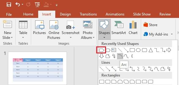
Accessing and Manipulating the Data Table
- Right-click on your donut chart and select "Edit Data"
- Reorganize rows in the Excel sheet that appears – PowerPoint automatically updates the visual
- Use Excel formulas like SORT() or RANK() for dynamic sorting that updates with data changes
- Close the Excel window to see your newly sorted chart
Manual Segment Arrangement Methods
Sometimes, I need more control than data sorting provides. That's when I turn to PowerPoint's rotation features:
Angle of First Slice
Format Data Series → Series Options → Adjust the starting angle (0-360°)
Explosion Feature
Pull out important segments to emphasize sorted hierarchy
For complex sorting patterns that need visual clarity, I've found that PageOn.ai's AI Blocks feature helps me create structured segment relationships that make the sorting logic immediately apparent to viewers. This is especially useful when dealing with multi-level categorical data.
Advanced Sorting Solutions in Power BI
Power BI offers more sophisticated sorting capabilities than PowerPoint, and I've developed several techniques that ensure my donut charts always display data in the exact order I need. The key is understanding how Power BI's data model influences visualization sorting.
Power BI Sorting Workflow
flowchart LR
                        A[Source Data] --> B[Create Sort Table]
                        B --> C[Establish Relationships]
                        C --> D[Apply RELATED Function]
                        D --> E[Configure Sort By Column]
                        E --> F[Sorted Donut Chart]

                        style A fill:#FFE0C0
                        style B fill:#FFD0A0
                        style C fill:#FFC080
                        style D fill:#FFA040
                        style E fill:#FF9020
                        style F fill:#FF8000
Creating Custom Sort Tables
Here's my proven approach for implementing custom sorting in Power BI:
// DAX Formula for Custom Sorting
SortedCategory =
SWITCH(
    [Category],
    "Critical", 1,
    "High", 2,
    "Medium", 3,
    "Low", 4,
    99  // Default for uncategorized
)
Addressing Common Aggregation Challenges
I've encountered numerous issues with Power BI automatically grouping categories by color when values are zero. My solution involves:
- Changing aggregation from Sum to Count when appropriate
- Replacing zero values with 0.01 to maintain visibility
- Using conditional formatting to maintain visual hierarchy
- Creating calculated columns that preserve sort order during aggregation
When dealing with complex sorting scenarios, I leverage PageOn.ai's Vibe Creation feature to transform intricate data relationships into intuitive visual narratives that maintain their sorted structure while telling a compelling story.
Creative Workarounds and Professional Tips
Data Preparation Strategies
Over the years, I've learned that 80% of successful donut chart sorting happens before you even create the chart. Here are my go-to data preparation techniques:
Pre-Sorting in Excel
I always create a master data table with multiple sort columns:
- Primary sort (value-based)
- Secondary sort (alphabetical)
- Custom sort index
- Percentage calculations
Helper Columns Magic
My secret weapon for complex sorting:
- Concatenated sort keys
- Rank formulas
- Conditional sort logic
- Group identifiers
Visual Enhancement Techniques
Color Gradient Implementation
I've discovered that color gradients provide intuitive visual sorting cues. By progressing from dark to light (or using temperature-based colors from hot to cold), viewers instantly understand the hierarchy without reading labels.

For seamless integration of sorted visualizations with existing data assets, I use PageOn.ai's Deep Search capabilities to quickly find and incorporate relevant sorted chart examples and templates from my organization's knowledge base.
Automation and Efficiency Tools
After years of manually sorting donut charts, I've embraced automation tools that have revolutionized my workflow. Let me share the tools and techniques that have saved me hundreds of hours.
VBA Macros for Consistent Sorting
Sub SortDonutChartData()
    Dim ws As Worksheet
    Dim chartData As Range

    Set ws = ActiveSheet
    Set chartData = ws.Range("A1:B10")

    ' Sort by value (column B) in descending order
    chartData.Sort Key1:=ws.Range("B1"), _
                   Order1:=xlDescending, _
                   Header:=xlYes

    ' Refresh chart
    ActiveChart.Refresh
End Sub
Third-Party Add-ins Comparison
| Tool | Best For | Key Feature | Learning Curve |
|---|---|---|---|
| Macabacus | Excel-PowerPoint linking | Maintains sort on update | Moderate |
| Think-cell | Professional formatting | Smart sort suggestions | Steep |
| PageOn.ai | AI-powered automation | Intelligent sorting | Minimal |
I've found that PageOn.ai's Agentic capabilities stand out for automating sorting workflows. The AI understands context and automatically applies appropriate sorting logic based on your data type and presentation goals, generating polished visuals without manual intervention.
Creating Reusable Templates
My template library has become invaluable. Here's what I include in each template:
- Pre-configured sort orders for common data types
- Color schemes that reinforce sorting logic
- Placeholder data with proper formatting
- Documentation on sorting methodology
- Quick-access macros for re-sorting
Best Practices for Sorted Donut Charts
Through trial and error (and many presentation feedback sessions), I've developed a set of best practices that ensure my sorted donut charts always hit the mark.
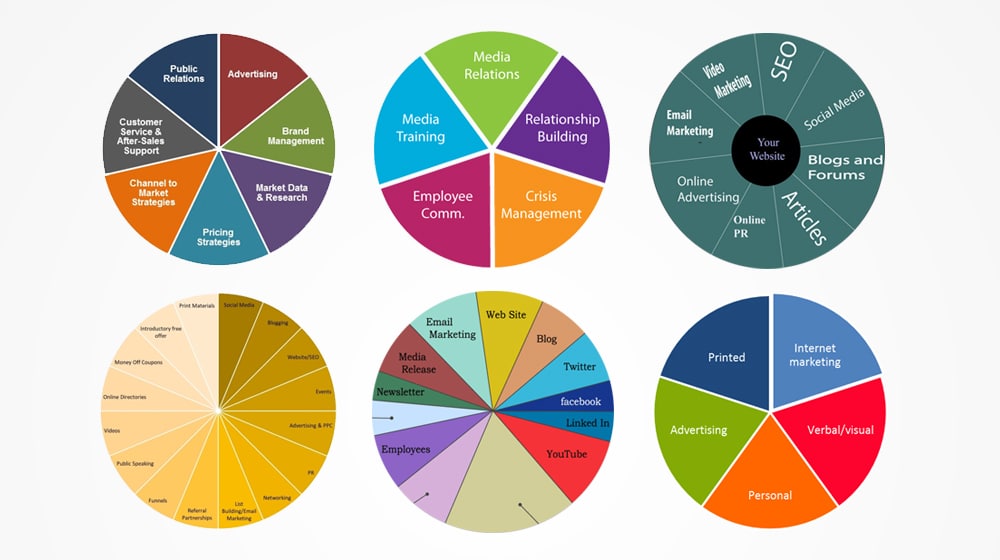
The 7-Segment Rule
I never exceed 7 categories in a single donut chart. When I have more data points, I either:
- Group smaller segments into "Other"
- Create multiple charts for different aspects
- Use nested donuts for hierarchical data
Meaningful Sort Criteria
I choose sort orders that align with the presentation narrative:
- Financial data: Largest to smallest value
- Process flows: Chronological sequence
- Risk assessment: Priority or severity level
Consistency Across Presentations
I maintain a style guide for my team that includes:
- ✓ Standard sort orders for recurring report types
- ✓ Color coding conventions tied to sorting logic
- ✓ Label positioning rules for sorted segments
- ✓ Animation sequences that reveal sorted data progressively

Testing Sort Order Visibility
Before finalizing any presentation, I test my sorted donut charts on different screen sizes and projection systems. Small segments that look fine on my monitor might become invisible on a conference room projector. I always have a backup slide with a comparison chart creation tool ready for detailed data that doesn't translate well to donut format.
Troubleshooting Common Sorting Issues
Even with years of experience, I still encounter sorting challenges. Here are the most common issues and my proven solutions:
Problem: Categories Grouping Unexpectedly
When Power BI automatically combines categories with similar colors...
Solution: Ensure each category has a unique identifier in your data model, even if values are identical.
Problem: Legend Order Doesn't Match Chart
The legend displays in a different order than the donut segments...
Solution: Create a custom legend using text boxes or use data labels directly on the chart.
Problem: Sort Order Resets on Data Refresh
Your carefully arranged chart reverts to default sorting after updating data...
Solution: Implement sort columns in your source data that persist through refreshes.
Multi-Series Donut Chart Complications
Troubleshooting Decision Tree
flowchart TD
                        A[Sorting Issue] --> B{Single or Multi-Series?}
                        B -->|Single| C[Check Data Table]
                        B -->|Multi| D[Verify Relationships]
                        C --> E{Data Correct?}
                        D --> F{Series Aligned?}
                        E -->|Yes| G[Adjust Chart Settings]
                        E -->|No| H[Fix Source Data]
                        F -->|Yes| I[Check Sort Columns]
                        F -->|No| J[Rebuild Relationships]

                        style A fill:#FFE0C0
                        style B fill:#FFD0A0
                        style G fill:#90EE90
                        style H fill:#90EE90
                        style I fill:#90EE90
                        style J fill:#90EE90
When traditional troubleshooting fails, I turn to PageOn.ai to transform sorting challenges into clear, structured visual presentations. The AI understands the intent behind my sorting requirements and automatically generates alternatives that maintain data integrity while improving clarity.
Real-World Applications and Examples
Let me share some actual scenarios where proper donut chart sorting made a significant impact on business decisions:
Financial Reporting: Expense Category Prioritization
In quarterly expense reviews, I sort categories by variance from budget rather than absolute values. This immediately highlights problem areas:
- Red segments (>20% over budget) appear first
- Yellow segments (10-20% over) follow
- Green segments (on or under budget) complete the chart
Sales Performance by Region
Marketing Analytics: Channel Effectiveness
For marketing presentations, I've developed a dual-sorting approach:
Primary Sort: ROI
Channels arranged by return on investment, helping stakeholders see where budget delivers the most value.
Secondary View: Reach
Same data re-sorted by audience reach, showing volume vs. efficiency trade-offs.
Project Management: Resource Allocation
In resource planning meetings, I create "before and after" donut charts showing:
- Current allocation (sorted by department)
- Proposed reallocation (sorted by project priority)
- The visual contrast immediately communicates the strategic shift
For complex multi-stakeholder presentations, I use AI pie chart generators to quickly create variations with different sorting logic, allowing real-time exploration of data perspectives during meetings.
Future-Proofing Your Donut Chart Workflows
As visualization tools evolve, I've learned the importance of building flexible, sustainable sorting workflows. Here's how I ensure my processes remain effective regardless of software updates or team changes.
Establishing Organizational Standards
My Team's Sorting Standards Document Includes:
- Default sort orders by data type
- Color palette assignments
- Segment size thresholds
- Label formatting rules
- Animation sequences
- Accessibility requirements
- Version control procedures
- Update frequency guidelines
Documentation Strategies
I maintain comprehensive documentation that includes:
## Donut Chart Sorting Logic - Q4 Sales Report

### Data Source
- File: Q4_Sales_Data.xlsx
- Sheet: Regional_Summary
- Range: A1:C6

### Sort Configuration
- Primary: Sales Value (Descending)
- Secondary: Region Name (Alphabetical)
- Custom Index: Strategic Priority (1-5)

### Color Mapping
- Top 3 Regions: Brand colors (Blue gradient)
- Others: Neutral gray scale

### Update Procedure
1. Refresh data connection
2. Verify sort column formulas
3. Check color assignments
4. Test on presentation screen
Building a Template Library
My template library has become an invaluable resource. Each template includes:
Financial Templates
Pre-sorted by variance, value, or growth rate
Sales Templates
Regional, product, or customer sorting
Marketing Templates
Channel, campaign, or ROI-based sorting
To streamline future chart creation, I leverage PageOn.ai's AI-powered sorting and visualization tools. The platform learns from my sorting preferences and automatically applies appropriate logic to new datasets, dramatically reducing the time from data to presentation-ready visuals.
Final Thought: The key to mastering donut chart sorting isn't just technical knowledge – it's understanding your audience's needs and choosing the sort order that best tells your data's story. With the techniques and tools I've shared, you're now equipped to transform any chaotic donut chart into a clear, compelling visualization.
Transform Your Visual Expressions with PageOn.ai
Stop struggling with manual chart sorting. Let PageOn.ai's intelligent visualization tools automatically organize your data into stunning, presentation-ready donut charts that communicate insights with crystal clarity.
Start Creating with PageOn.ai TodayYou Might Also Like
Understanding Native Multimodality: The Key to Truly Intelligent AI Systems
Explore how native multimodality powers modern AI understanding by integrating text, visual, audio, and interactive elements to create more intuitive and powerful artificial intelligence systems.
Creating Dynamic Picture Backgrounds in PowerPoint: Transform Your Presentations
Learn how to create stunning dynamic picture backgrounds in PowerPoint presentations to boost engagement, improve retention, and enhance visual appeal with step-by-step techniques.
Revolutionizing Slides: The Power of AI Presentation Tools | PageOn.ai
Discover how AI presentation tools are transforming slide creation, saving hours of work while enhancing design quality. Learn how PageOn.ai can help visualize your ideas instantly.
Mastering Information Hierarchy: Building Effective User Navigation Systems
Learn how to create intuitive information hierarchy for better user navigation. Discover visual prioritization techniques, content grouping strategies, and implementation best practices.