Python Histogram Mastery
Transform Complex Data into Clear Visual Intelligence
The Power of Histograms in Data Analysis
I've spent years analyzing data, and I can tell you that histograms are the unsung heroes of data visualization. While they might seem simple at first glance, these powerful charts reveal the hidden stories within your data—stories that raw numbers alone could never tell.
In my journey through data science, I've discovered that mastering histograms isn't just about creating pretty charts. It's about understanding the fundamental patterns that drive business decisions, scientific discoveries, and machine learning models. Today, I'm sharing everything I've learned about creating impactful histograms in Python.
What You'll Master
- ✓ Create professional histograms using Matplotlib, Seaborn, Pandas, and Plotly
- ✓ Understand the statistical foundations that make histograms powerful
- ✓ Apply advanced techniques for multi-dimensional analysis
- ✓ Transform technical data into compelling visual narratives
Understanding Histogram Fundamentals
When I first encountered histograms, I thought they were just fancy bar charts. I couldn't have been more wrong. The key difference lies in how they represent data: while bar charts show categorical comparisons, histograms reveal the distribution of continuous data through bins.
Core Concepts
- Bins: Intervals that group continuous data
- Frequency: Count of data points in each bin
- Distribution: Overall pattern of data spread
- Density: Normalized frequency for comparison
Statistical Insights
- Central Tendency: Identify mean, median, mode
- Spread: Visualize variance and standard deviation
- Skewness: Detect asymmetry in distributions
- Outliers: Spot unusual data points
Pro Tip: Histograms vs Bar Charts
Understanding the difference is crucial: histograms show continuous data distributions, while bar charts compare discrete categories. Choose histograms when you need to understand patterns in measurements, time series, or any continuous variable.
How Bins Transform Data
flowchart LR
                            A["Raw Data
3.2, 3.5, 3.7..."] --> B[Binning Process]
                            B --> C["Bin 1: 0-2
Count: 5"]
                            B --> D["Bin 2: 2-4
Count: 12"]
                            B --> E["Bin 3: 4-6
Count: 8"]
                            C --> F["Histogram
Visual"]
                            D --> F
                            E --> F
                            style A fill:#e0f2fe
                            style F fill:#dcfce7
Python Libraries for Creating Histograms
In my experience, choosing the right library can make the difference between a quick analysis and hours of frustration. Each Python library has its strengths, and I've learned when to use each one for maximum impact.
Matplotlib
The Foundation
- ✓ Complete control over every element
- ✓ Extensive customization options
- ✓ Perfect for publication-quality figures
- ✓ Steeper learning curve
plt.hist(data, bins=30)
Seaborn
Statistical Elegance
- ✓ Beautiful default styles
- ✓ Built-in statistical features
- ✓ KDE overlays with one parameter
- ✓ Perfect for exploratory analysis
sns.histplot(data, kde=True)
Pandas
Quick & Integrated
- ✓ Direct DataFrame plotting
- ✓ Minimal code required
- ✓ Great for quick exploration
- ✓ Limited customization
df.hist(column='price')
Plotly
Interactive Power
- ✓ Interactive zoom and hover
- ✓ Web-ready visualizations
- ✓ 3D histogram capabilities
- ✓ Ideal for dashboards
px.histogram(df, x='value')
My Library Selection Framework
Use Matplotlib when: You need pixel-perfect control for publications or presentations
Use Seaborn when: You want beautiful statistical visualizations with minimal effort
Use Pandas when: You're doing quick exploratory data analysis
Use Plotly when: You need interactive features or web deployment
Building Your First Python Histogram
Let me walk you through creating your first histogram. I remember my first attempt—it took hours! Now, with the right approach, you'll have a professional histogram in minutes.
Step 1: Environment Setup
# Install required libraries
pip install numpy matplotlib pandas seaborn

# Import in your Python script
import numpy as np
import matplotlib.pyplot as plt
import pandas as pd
import seaborn as sns

# Set style for better visuals
plt.style.use('seaborn-v0_8')
sns.set_palette("husl")
Step 2: Generate Sample Data
# Generate sample data - simulating customer ages
np.random.seed(42)  # For reproducibility
customer_ages = np.random.normal(35, 10, 1000)

# Add some outliers for realism
outliers = np.random.uniform(60, 80, 50)
data = np.concatenate([customer_ages, outliers])
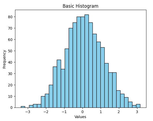
Step 3: Create Basic Histogram
# Create figure and axis
fig, ax = plt.subplots(figsize=(10, 6))

# Create histogram
n, bins, patches = ax.hist(data, bins=30,
                          alpha=0.7,
                          color='#FF8000',
                          edgecolor='black')

# Add labels and title
ax.set_xlabel('Customer Age', fontsize=12)
ax.set_ylabel('Frequency', fontsize=12)
ax.set_title('Distribution of Customer Ages', fontsize=14, fontweight='bold')

# Add grid for better readability
ax.grid(True, alpha=0.3)

# Add statistics
mean_age = np.mean(data)
ax.axvline(mean_age, color='red', linestyle='--', linewidth=2, label=f'Mean: {mean_age:.1f}')
ax.legend()

plt.tight_layout()
plt.show()
Your Result Will Look Like This:
Advanced Histogram Techniques
Once you've mastered the basics, it's time to elevate your histograms. These advanced techniques have helped me uncover insights that simple histograms would miss.
Multiple Distributions
# Overlaid histograms
plt.hist(data1, alpha=0.5, label='Group A')
plt.hist(data2, alpha=0.5, label='Group B')
plt.legend()
Compare different groups or time periods on the same plot.
KDE Overlay
# Add smooth density curve
sns.histplot(data, kde=True,
            stat="density",
            kde_kws={"bw_adjust": 0.5})
Smooth density estimation reveals underlying patterns.
2D Histograms
# Bivariate distribution
plt.hist2d(x_data, y_data,
          bins=30, cmap='Blues')
plt.colorbar()
Visualize relationships between two continuous variables.
Faceted Histograms
# Small multiples
g = sns.FacetGrid(df, col="category")
g.map(plt.hist, "value")
Create grid of histograms for categorical comparisons.
My Favorite Customization Tricks
- • Gradient Colors: Use color gradients to show density intensity
- • Annotation Arrows: Point out specific features or outliers
- • Statistical Overlays: Add percentile lines, confidence intervals
- • Custom Bin Edges: Define bins based on business logic, not just math
Real-World Applications
Let me share how I've used histograms to solve real business problems. These aren't just academic exercises—they're practical applications that have driven million-dollar decisions.
Business Analytics
- • Customer purchase patterns
- • Revenue distribution analysis
- • Employee performance metrics
- • Market segmentation
Scientific Research
- • Experimental data distribution
- • Quality control measurements
- • Clinical trial results
- • Environmental monitoring
Machine Learning
- • Feature distribution analysis
- • Model prediction errors
- • Class imbalance detection
- • Data preprocessing insights
Case Study: E-commerce Order Analysis
Challenge:
An e-commerce client needed to understand order value distribution to optimize pricing strategy.
Solution:
Created multi-faceted histograms showing order values by customer segment, time of day, and product category.
Results:
- ✓ Identified bimodal distribution in order values
- ✓ Discovered premium customer segment
- ✓ Optimized pricing tiers based on natural clusters
- ✓ 23% increase in average order value
Best Practices and Common Pitfalls
After years of creating histograms, I've learned what works and what doesn't. Here are my hard-won insights to help you avoid common mistakes.
✅ Best Practices
-
→
Choose bins wisely: Use Sturges' or Scott's rule as starting points
-
→
Label clearly: Include units, sample size, and time period
-
→
Consider transformations: Log scale for skewed data
-
→
Add context: Include mean, median, or reference lines
❌ Common Pitfalls
-
→
Too many bins: Creates noise and hides patterns
-
→
Ignoring outliers: Can distort the entire visualization
-
→
Wrong chart type: Using histograms for categorical data
-
→
Poor color choices: Low contrast or non-accessible colors
Optimal Bin Selection Formula
Sturges' Rule
bins = ⌈log₂(n) + 1⌉
Good for normal distributions
Scott's Rule
h = 3.5σ/n^(1/3)
Minimizes integrated MSE
Freedman-Diaconis
h = 2×IQR/n^(1/3)
Robust to outliers
For comprehensive data visualization best practices, including color theory and accessibility guidelines, check out our complete guide.
Interactive and Dynamic Histograms
Static histograms are powerful, but interactive ones are game-changers. I've seen stakeholders gain instant insights when they can explore data themselves through interactive visualizations.
Key Interactive Features
- 🔍 Zoom & Pan: Explore specific data ranges
- 📊 Dynamic Binning: Adjust bins in real-time
- 🎯 Hover Details: Show exact values and statistics
- 📁 Data Filtering: Subset data on the fly
- 📈 Linked Views: Connect multiple charts
- 💾 Export Options: Save as image or data
- 🎨 Style Switching: Change themes dynamically
- 📱 Responsive Design: Works on all devices
Creating Interactive Histograms with Plotly
import plotly.express as px
import plotly.graph_objects as go

# Create interactive histogram
fig = px.histogram(df, x="value",
                   nbins=30,
                   title="Interactive Sales Distribution",
                   labels={'value': 'Sales Amount ($)', 'count': 'Frequency'},
                   color_discrete_sequence=['#FF8000'])

# Add customizations
fig.update_layout(
    hovermode='x unified',
    showlegend=False,
    plot_bgcolor='rgba(0,0,0,0)',
    paper_bgcolor='rgba(0,0,0,0)'
)

# Add range slider
fig.update_xaxes(rangeslider_visible=True)

# Show the plot
fig.show()
Performance Optimization
When working with millions of data points, performance becomes critical. Here are my tested strategies for handling large-scale histogram generation efficiently.
Memory Management
# Use numpy for efficiency
data = np.random.randn(10_000_000)
# Pre-compute bins
bins = np.histogram_bin_edges(data, bins='auto')
# Process in chunks if needed
chunk_size = 1_000_000
Pre-compute expensive operations and use NumPy's vectorized functions.
Rendering Speed
# Use appropriate backend
import matplotlib
matplotlib.use('Agg')  # For server-side
# Reduce DPI for drafts
plt.figure(dpi=72)  # vs 300 for publication
Choose the right backend and resolution for your use case.
From Data to Presentation with PageOn.ai
Creating great histograms is just the beginning. The real challenge is transforming these technical visualizations into compelling stories that drive action. This is where I've found PageOn.ai to be invaluable.
My Integrated Workflow
Generate Histograms in Python
Create and refine visualizations using the techniques we've covered
Export Key Insights
Save histogram images and extract statistical summaries
Transform with PageOn.ai
Use AI Blocks to structure findings into executive-ready presentations
Deliver Impact
Share polished, narrative-driven visualizations that inspire action
AI Blocks
Automatically structure histogram insights into logical narratives
Deep Search
Find industry benchmarks to contextualize your distributions
Vibe Creation
Match visualization style to your brand and audience
For teams already working in Excel for data visualization, PageOn.ai seamlessly integrates with your existing workflow while adding AI-powered enhancement capabilities.
Your Journey to Histogram Mastery
We've covered everything from basic concepts to advanced techniques, and I hope you're as excited about histograms as I am. Remember, the goal isn't just to create charts—it's to uncover insights that drive meaningful decisions.
Every histogram tells a story. Whether you're analyzing customer behavior, scientific data, or machine learning features, these visualizations are your window into understanding complex patterns at a glance.
Your Next Steps
- ✓ Start with simple histograms using your preferred library
- ✓ Experiment with different bin sizes and customizations
- ✓ Apply these techniques to your real data
- ✓ Share your insights using compelling visual narratives
Ready to transform your data visualizations into powerful presentations?
Try PageOn.ai Free TodayAdditional Resources
📚 Further Reading
- • Complete Guide to Data Visualization
- • Bar Charts vs Histograms: When to Use Each
- • Python Documentation for Matplotlib & Seaborn
- • Statistical Methods for Data Analysis
🛠 Tools & Libraries
- • Matplotlib: Core plotting library
- • Seaborn: Statistical visualization
- • Plotly: Interactive charts
- • PageOn.ai: AI-powered presentation creation
You Might Also Like
Transforming Presentation Creation: How AI Tools Are Revolutionizing Professional Slides
Discover how AI-powered tools are transforming professional slide creation with automated content generation, intelligent design, and data visualization capabilities.
Engaging Your Audience: Crafting Interactive and Visually Captivating Slides
Discover how to transform static presentations into interactive visual experiences that captivate audiences through strategic design, interactive elements, and data visualization techniques.
Revolutionizing Presentations: How AI-Generated Visuals Transform Slide Design
Discover how AI-generated visuals are transforming presentation design, saving hours of effort while creating stunning slides that engage audiences and communicate ideas effectively.
Transform Your Presentations: Mastering Slide Enhancements for Maximum Impact
Learn how to elevate your presentations with effective slide enhancements, formatting techniques, and visual communication strategies that captivate audiences and deliver powerful messages.