Mastering R Line Charts: From Basic Plots to Professional Visualizations
Transform Your Data Analysis with R's Powerful Visualization Capabilities
I've spent years working with R's visualization ecosystem, and I'm excited to share my comprehensive guide to creating stunning line charts that tell compelling data stories. Whether you're analyzing financial trends or scientific data, let's explore how to leverage R's capabilities alongside modern tools like PageOn.ai to create visualizations that truly resonate.
Why Line Charts Matter in R
I've discovered that line charts are among the most powerful tools in my data visualization arsenal. They excel at revealing trends, patterns, and changes over time in ways that tables of numbers simply cannot match. In R, we have an incredibly rich ecosystem for creating these visualizations, from the simplicity of base R to the sophistication of modern packages.
What makes R particularly compelling for line graphs to visualize trends is its flexibility. I can quickly prototype a simple plot with just a few lines of code, then progressively enhance it into a publication-ready graphic. The journey from data to insight has never been more accessible.
Pro Tip: While R provides powerful plotting capabilities, I often use PageOn.ai's AI Blocks to transform my static R outputs into dynamic, interactive presentations that engage my audience more effectively.
The real challenge I've faced isn't creating the charts—it's bridging the gap between code-based visualization and presentation-ready graphics that communicate clearly to diverse audiences. This guide addresses that challenge head-on.
Foundation: Understanding R's Line Chart Architecture
Core Components of R Line Charts
When I first started with R, understanding the anatomy of plotting functions was crucial. The plot() function serves as our foundation, while lines() allows us to layer additional data series. These functions work together to create complex visualizations from simple building blocks.
R Plotting Function Hierarchy
flowchart TD
                        A[plot Function] --> B[Base Graphics]
                        A --> C[Type Parameters]
                        A --> D[Aesthetic Options]
                        C --> E["type='p' Points"]
                        C --> F["type='l' Lines"]
                        C --> G["type='o' Both"]
                        D --> H[col - Colors]
                        D --> I[lwd - Line Width]
                        D --> J[lty - Line Type]
                        B --> K[lines Function]
                        B --> L[points Function]
                        B --> M[text Function]
Key parameters I use daily include:
- type: Controls whether we see points ('p'), lines ('l'), or both ('o')
- col: Sets colors using names, hex codes, or RGB values
- lwd: Adjusts line width for emphasis
- lty: Creates solid, dashed, or dotted lines
Data Preparation Essentials
I've learned that successful visualization starts with properly structured data. R expects vectors for simple plots and data frames for more complex visualizations. When working with external data, I typically use read.csv() or read.table() to import my datasets.
# My typical data preparation workflow
data <- read.csv("mydata.csv", header = TRUE)
x_values <- data$date
y_values <- data$measurement

# Create the basic plot
plot(x_values, y_values, type = "l",
     main = "My Trend Analysis",
     xlab = "Time", ylab = "Value")
I often leverage PageOn.ai's Deep Search capabilities to find and integrate relevant datasets directly into my analysis workflow, saving hours of manual data hunting.
Building Your First Line Charts
Simple Line Plots with Base R
I always start with the simplest possible visualization and build from there. Here's my approach to creating a basic line chart that effectively communicates trends:
# Generate sample data
days <- 1:30
sales <- 100 + cumsum(rnorm(30, mean = 2, sd = 5))

# Create basic line chart
plot(days, sales, type = "o",
     col = "blue",
     main = "Sales Trend Over 30 Days",
     xlab = "Day",
     ylab = "Sales ($)")
The beauty of this approach lies in its simplicity. With just a few parameters, I've created a chart that clearly shows the sales trend. The type="o" parameter gives us both points and lines, making individual data points visible while maintaining the trend line.
Enhancing Visual Appeal
Once I have the basic structure, I focus on making the chart more visually appealing and informative. Color selection is crucial—I choose colors that are both aesthetically pleasing and accessible to colorblind viewers.
Impact of Visual Enhancements
I've found that using PageOn.ai to create step-by-step visual tutorials from my R code helps my team understand and replicate these enhancements more effectively than traditional documentation.
Advanced Multi-Line Visualizations
Plotting Multiple Series
When I need to compare multiple data series, R's layering approach becomes incredibly powerful. I start with one series and progressively add others using the lines() function:
# Create multiple time series
months <- 1:12
product_a <- c(100, 110, 125, 140, 155, 180, 195, 210, 190, 175, 160, 150)
product_b <- c(80, 85, 90, 100, 115, 130, 145, 160, 155, 150, 145, 140)
product_c <- c(60, 65, 70, 75, 85, 95, 110, 125, 130, 135, 140, 145)

# Plot with proper y-axis range
y_range <- range(c(product_a, product_b, product_c))

plot(months, product_a, type = "l", col = "blue", lwd = 2,
     ylim = y_range,
     main = "Product Sales Comparison",
     xlab = "Month", ylab = "Units Sold")

lines(months, product_b, col = "red", lwd = 2)
lines(months, product_c, col = "green", lwd = 2)

# Add legend
legend("topleft",
       legend = c("Product A", "Product B", "Product C"),
       col = c("blue", "red", "green"),
       lwd = 2)
Managing the y-axis range is crucial when plotting multiple series. I always use range() to ensure all data is visible. This prevents the common mistake of cutting off data from subsequent series.
Time Series and Temporal Data
Working with time-based data requires special attention to date formatting. I've developed a reliable workflow for handling temporal data in R:

For data visualization charts involving time series, I often convert my static R outputs into interactive timelines using PageOn.ai, allowing viewers to explore different time periods dynamically.
Time Series Tip: Always convert date strings to Date objects using as.Date() before plotting. This ensures proper chronological ordering and enables date-specific formatting options.
Professional Chart Customization
Publication-Ready Graphics
Creating publication-quality graphics requires attention to detail. I've learned to optimize every aspect of my charts, from export settings to margin control:
# High-quality PDF export
pdf("publication_chart.pdf", width = 8, height = 6)

# Adjust margins (bottom, left, top, right)
par(mar = c(5, 4.5, 3, 2))

# Create chart with professional styling
plot(x, y, type = "l",
     lwd = 2.5,
     col = "#2E86AB",
     xlab = expression(paste("Time (", mu, "s)")),
     ylab = "Response Amplitude",
     main = "System Response Analysis",
     cex.lab = 1.2,
     cex.axis = 1.1,
     cex.main = 1.4)

# Add grid for readability
grid(col = "gray90", lty = "dotted")

dev.off()
The key to professional graphics lies in consistency and attention to typography. I always ensure my font sizes are appropriate for the final publication medium.
Advanced Styling Techniques
Styling Impact on Readability
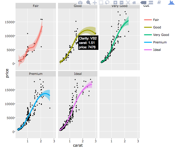
I've discovered that combining multiple plot types can create powerful visualizations. For instance, overlaying a smoothed trend line on scatter data provides both detail and overall pattern recognition.
With PageOn.ai's Agentic features, I can quickly convert my R charts into polished presentation slides that maintain professional quality while adding interactive elements for audience engagement.
Modern Approaches: ggplot2 and Beyond
Introduction to ggplot2 for Line Charts
While base R plotting is powerful, I've embraced ggplot2 for its elegant grammar of graphics approach. The layered structure makes complex visualizations more intuitive:
library(ggplot2)

# Create a data frame
df <- data.frame(
  month = factor(month.abb, levels = month.abb),
  sales = c(120, 135, 155, 165, 180, 210, 235, 245, 220, 195, 175, 160),
  region = rep(c("North", "South"), each = 6)
)

# Create ggplot line chart
ggplot(df, aes(x = month, y = sales, group = 1)) +
  geom_line(color = "#FF6B6B", size = 1.5) +
  geom_point(color = "#4ECDC4", size = 3) +
  theme_minimal() +
  labs(title = "Monthly Sales Performance",
       x = "Month",
       y = "Sales (in thousands)") +
  theme(axis.text.x = element_text(angle = 45, hjust = 1))
The power of ggplot2 lies in its consistency and extensibility. Each element follows the same logical structure, making it easier to build complex visualizations incrementally.
Interactive Visualizations
Static charts tell a story, but interactive visualizations let viewers explore the data themselves. I use plotly for R to add interactivity:
Interactive features like hover tooltips, zoom capabilities, and pan controls transform static charts into exploration tools. I often enhance these further with PageOn.ai's interactive presentation features to create truly engaging data stories.
Interactive Best Practice: Always provide context for interactive elements. Users should understand what they can interact with and why it matters to the data story.
Common Challenges and Solutions
Data Formatting Issues
One of the most common challenges I encounter is dealing with data in the wrong format. R plotting functions often require data in "long" format rather than "wide" format:
Data Format Transformation Process
flowchart LR
                        A[Wide Format Data] --> B[Identify Variables]
                        B --> C[Use reshape2/tidyr]
                        C --> D[Long Format Data]
                        D --> E[Ready for Plotting]

                        A -.-> F[Multiple Columns]
                        D -.-> G[Single Value Column]

                        style A fill:#ffcccc
                        style D fill:#ccffcc
                        style E fill:#99ff99
I've learned to use the tidyr package's pivot_longer() function to efficiently transform data. This single function has saved me countless hours of manual data manipulation.
Visual Clarity Problems
The dreaded "spaghetti chart" syndrome occurs when too many lines overlap, making the visualization unreadable. My solutions include:
- Using faceting to separate groups into subplots
- Implementing interactive highlighting with hover effects
- Applying transparency to see overlapping lines
- Creating small multiples for comparison chart creation tools
I often use PageOn.ai to transform cluttered charts into clear visual narratives by breaking them down into sequential, focused views that guide the viewer through the data story.
Real-World Applications
Business and Financial Analysis
In my financial analysis work, I regularly create line charts for stock price trends, revenue forecasts, and market comparisons. Here's a typical workflow I use for quarterly earnings visualization:
Quarterly Revenue Trends
For executive presentations, I build comprehensive dashboards that combine multiple R charts using PageOn.ai, creating a cohesive narrative that highlights key business metrics and trends.
Scientific and Research Applications
In scientific research, precision and reproducibility are paramount. I ensure my visualizations accurately represent uncertainty and variability in the data:
# Plotting with confidence intervals
library(ggplot2)

# Sample experimental data
time_points <- seq(0, 10, by = 0.5)
mean_response <- sin(time_points) + 2
se <- 0.1 + 0.05 * time_points

df <- data.frame(
  time = time_points,
  mean = mean_response,
  lower = mean_response - 1.96 * se,
  upper = mean_response + 1.96 * se
)

ggplot(df, aes(x = time, y = mean)) +
  geom_ribbon(aes(ymin = lower, ymax = upper),
              alpha = 0.3, fill = "blue") +
  geom_line(size = 1.2, color = "darkblue") +
  theme_minimal() +
  labs(title = "Experimental Response with 95% CI",
       x = "Time (seconds)",
       y = "Response Amplitude")
These visualizations become even more powerful when I use PageOn.ai to create interactive research presentations that allow colleagues to explore different aspects of the data during discussions.
Best Practices and Optimization
Code Organization and Efficiency
I've developed a systematic approach to organizing my R visualization code that ensures reproducibility and maintainability:
# My standard plotting function template
create_line_plot <- function(data, x_col, y_col,
                            title = "Line Chart",
                            color_scheme = "default") {

  # Input validation
  if (!all(c(x_col, y_col) %in% names(data))) {
    stop("Column names not found in data")
  }

  # Set color palette
  colors <- switch(color_scheme,
    "default" = c("#FF8000", "#42A5F5", "#66BB6A"),
    "corporate" = c("#003366", "#006699", "#0099CC"),
    "warm" = c("#FF6B6B", "#FFB347", "#FFD93D")
  )

  # Create plot
  plot(data[[x_col]], data[[y_col]],
       type = "l",
       col = colors[1],
       lwd = 2,
       main = title,
       xlab = x_col,
       ylab = y_col)

  return(invisible(NULL))
}
Creating reusable functions has dramatically improved my workflow efficiency. I maintain a personal library of plotting functions that I can quickly adapt to new projects.
Visual Design Principles
Effective data visualization follows key design principles that I apply to every chart I create:
Data-Ink Ratio
Maximize the proportion of ink devoted to data rather than decoration.
Color Accessibility
Use colorblind-friendly palettes and sufficient contrast.
Appropriate Scales
Choose scales that accurately represent the data without distortion.
Clear Hierarchy
Guide the viewer's eye to the most important information first.
I document my R visualization workflows visually with PageOn.ai's AI Blocks, creating comprehensive guides that help my team understand not just the code, but the reasoning behind design decisions.
Integration and Workflow Enhancement
Combining R with Modern Tools
My visualization workflow extends beyond R itself. I've learned to integrate R outputs with modern presentation and collaboration tools for maximum impact:
The key is maintaining quality while enhancing accessibility. I export high-resolution graphics from R, then seamlessly integrate them into PageOn.ai presentations where they become part of a larger narrative.
Future-Proofing Your Skills
The R ecosystem continues to evolve rapidly. I stay current by:
- Following R-bloggers and the tidyverse blog for updates
- Experimenting with new packages as they emerge
- Contributing to open-source visualization projects
- Using PageOn.ai's Deep Search to discover cutting-edge techniques
My Recommendation for You
After years of creating visualizations in R, I've learned that technical skill is just the beginning. The real value comes from effectively communicating insights to your audience. Whether you're creating simple bar chart in excel alternatives or complex multi-dimensional visualizations, the principles remain the same: clarity, accuracy, and engagement.
I encourage you to explore how tools like PageOn.ai can amplify your R visualization efforts. By combining R's analytical power with modern presentation capabilities, you can create data stories that not only inform but inspire action. The future of data visualization lies in this seamless integration of analysis and communication.
Transform Your R Visualizations with PageOn.ai
Ready to take your R line charts from code to compelling visual stories? PageOn.ai helps you create stunning, interactive presentations that bring your data to life. Whether you're working with horizontal bar charts or complex time series, our AI-powered platform makes it easy to communicate insights effectively.
Start Creating with PageOn.ai TodayYou Might Also Like
The Ultimate Design Tools & Workflow Ecosystem for Creative Professionals
Discover essential design tools and optimized workflows for creative professionals. Learn how to build a cohesive ecosystem of visual tools that streamline ideation, feedback, and asset management.
Stock Photos in Presentations: Bringing Vibrancy and Depth to Visual Storytelling
Discover how to transform your presentations with strategic stock photography. Learn selection techniques, design integration, and visual consistency to create compelling visual narratives.
Visualizing Momentum: Creating Traction Timelines That Win Investor Confidence
Learn how to build compelling traction timelines that prove startup momentum to investors. Discover visualization techniques and best practices for showcasing growth and product-market fit.
Transform Your Google Slides: Advanced Techniques for Polished Presentations
Master advanced Google Slides techniques for professional presentations. Learn design fundamentals, visual enhancements, Slide Master, and interactive elements to create stunning slides.