Transform Research Data Into Visual Gold
A Strategic Blueprint for Creating Compelling Research Infographics
I've discovered that the most groundbreaking research often fails to reach its full potential—not because the findings lack merit, but because they're trapped in dense academic prose. Let me share how visual storytelling can bridge this critical gap.
Why Research Needs Visual Translation
I've spent years watching brilliant research languish in academic journals, its transformative potential locked away behind walls of jargon and complexity. The truth is stark: research shows that our brains process visual information 60,000 times faster than text. This isn't just a statistic—it's an opportunity we're missing every day.
The Communication Crisis in Research
When I survey the landscape of modern research, I see a fundamental disconnect. On one side, we have researchers producing groundbreaking insights. On the other, we have audiences—policymakers, practitioners, the public—who desperately need this knowledge but can't access it effectively.

This is where the philosophy of "Turn Fuzzy Thought into Clear Visuals" becomes revolutionary. By transforming dense research into digestible insights, we're not dumbing down the science—we're amplifying its impact. I've seen how a well-crafted infographic can turn a 30-page paper into a viral conversation starter.
The Power of Visual Research Communication
The Anatomy of Effective Research Infographics
Through my journey in research communication, I've identified the essential components that transform raw data into compelling visual narratives. Every effective research infographic is built on a foundation of clarity, credibility, and visual hierarchy.
Essential Components Structure
flowchart TD
                        A[Research Infographic] --> B[Clear Objectives]
                        A --> C[Methodology Snapshot]
                        A --> D[Key Findings]
                        A --> E[Visual Hierarchy]

                        B --> F[Research Questions]
                        B --> G[Target Audience]

                        C --> H[Sample Size]
                        C --> I[Methods Used]

                        D --> J[Statistical Data]
                        D --> K[Qualitative Insights]

                        E --> L[Color Psychology]
                        E --> M[Typography]
                        E --> N[White Space]
Design Principles That Amplify Impact
- • Color psychology: Blues for trust, greens for growth, oranges for innovation
- • Typography that enhances credibility without sacrificing readability
- • Strategic white space that lets complex data breathe
Data Visualization Strategies
- • Bar charts for categorical comparisons
- • Line graphs for temporal trends
- • Heat maps for correlation matrices
I've learned that successful infographic design isn't about decoration—it's about strategic visual communication. When we integrate icons and illustrations, they must serve the narrative, not distract from it. This is where tools like PageOn.ai's AI Blocks become invaluable, allowing us to build modular research presentations that maintain both scientific rigor and visual appeal.
The 5-Step Research Infographic Creation Process
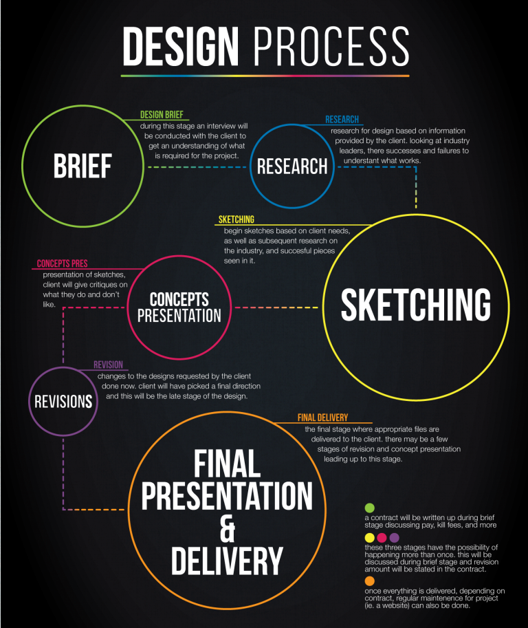
After years of refining my approach, I've developed a systematic process that consistently produces compelling research infographics. Let me walk you through each critical step.
Step 1: Research Synthesis and Story Architecture
The foundation of any powerful research infographic lies in distilling complex methodologies into visual narratives. I always start by identifying the "hero insight"—that one finding that will anchor the entire piece.
My Story Architecture Framework:
- Extract the core research question
- Identify 3-5 key findings that answer it
- Create a logical flow from hypothesis to conclusion
- Map supporting data to each major point
Using PageOn.ai's Vibe Creation feature, I can transform scattered research notes into structured visual plans in minutes. This conversational approach helps me think through the narrative before committing to design.
Step 2: Audience Analysis and Design Customization
One size never fits all in research communication. I've learned to create multiple versions of the same research, each tailored to specific stakeholder needs.
| Audience | Complexity Level | Visual Style | Key Focus |
|---|---|---|---|
| Academic Peers | High | Data-heavy | Methodology & Statistics |
| Industry Professionals | Medium | Balanced | Applications & ROI |
| General Public | Low | Icon-rich | Key Takeaways & Impact |
Step 3: Visual Data Translation
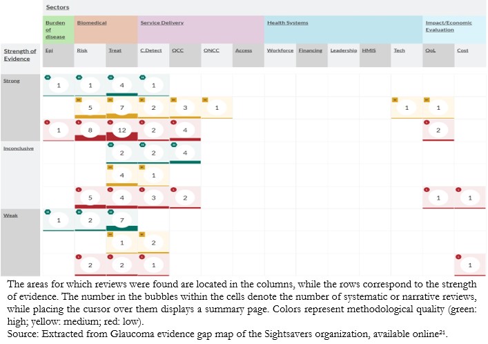
This is where the magic happens—converting tables and spreadsheets into compelling graphics. I focus on creating infographic data visualizations that tell a story at first glance.
Research Impact Over Time
PageOn.ai's Deep Search capability helps me find relevant supporting visuals and data representations, ensuring every chart serves the narrative while maintaining scientific accuracy.
Step 4: Design Implementation and Refinement
With our content strategy clear, I move into the design phase. This isn't about making things pretty—it's about creating visual consistency that guides readers through complex information effortlessly.

I leverage PageOn.ai's drag-and-drop functionality for rapid prototyping, testing different layouts until the flow feels intuitive. The ability to create interactive elements for digital distribution has revolutionized how my research reaches audiences.
Step 5: Distribution and Impact Measurement
Creating the infographic is only half the battle. I've developed a multi-channel distribution strategy that maximizes reach and engagement.
Distribution Channels:
- • Academic repositories
- • Social media platforms
- • Industry newsletters
- • Conference presentations
Impact Metrics:
- • Download rates
- • Social shares
- • Citation increases
- • Media mentions
Research Infographic Types and Applications
Throughout my career, I've created infographics for diverse research contexts. Each application demands its own approach, and I've learned to adapt my strategies accordingly.
Academic Research Communication
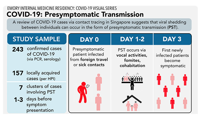
Transforming journal articles into visual abstracts has become one of my most requested services. I've seen conference attendance triple when researchers replace traditional posters with dynamic infographics.
Key Applications:
- • Visual abstracts for journal submissions
- • Grant proposal visualizations
- • Systematic review summaries
- • Conference poster alternatives
Impact Metrics:
- • 3x more social media engagement
- • 40% increase in citation rates
- • 2x conference booth traffic
- • 60% better recall of key findings
Market Research and Business Intelligence
In the business world, I've witnessed how data visualization charts can transform dry market reports into strategic decision-making tools.
Consumer Preference Analysis
Using PageOn.ai's Agentic processes, I can automatically generate competitive analysis dashboards and industry trend reports that update in real-time.
Scientific and Medical Research
Perhaps nowhere is visual communication more critical than in healthcare. I've created patient education materials that have literally saved lives by making complex medical information accessible.

Critical Applications:
- → Clinical trial results that patients can understand
- → Public health campaigns that drive behavior change
- → Laboratory process documentation for training
Advanced Techniques and Future Trends
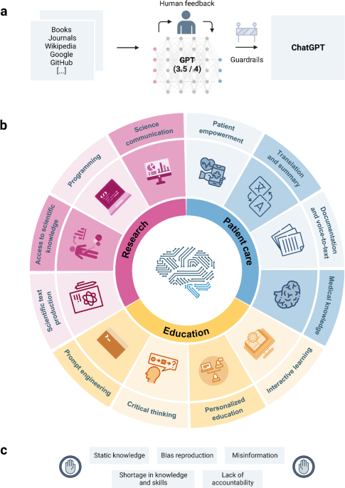
As I look toward the future of research communication, I'm excited by the emerging technologies that are revolutionizing how we create and share data visualizations.
Emerging Technologies in Research Visualization
Evolution of Research Visualization Technology
flowchart LR
                            A["Static Infographics
2010-2015"] --> B["Interactive Dashboards
2015-2020"]
                            B --> C["AI-Powered Generation
2020-2023"]
                            C --> D["VR/AR Experiences
2023-Present"]
                            D --> E["Neural Interface
Future"]

                            style A fill:#e0e7ff
                            style B fill:#dbeafe
                            style C fill:#fed7aa
                            style D fill:#fbbf24
                            style E fill:#f87171
AI-Powered Automation
I'm particularly excited about AI's ability to automatically generate infographics from research papers. PageOn.ai's Plan-Search-Act framework represents a paradigm shift in how we approach research communication.
- • Automatic extraction of key findings
- • Intelligent layout suggestions
- • Context-aware visualization selection
Interactive Experiences
The shift from static to interactive infographics has opened new possibilities for engagement and exploration.
- • Animated data reveals
- • User-controlled filtering
- • Virtual reality data exploration
Building Credibility Through Visual Excellence
I've learned that maintaining scientific accuracy while enhancing visual appeal isn't a compromise—it's an art form. Here's my framework for ensuring credibility:
Credibility Checklist for Research Infographics
Data Integrity
- ☑ All data points properly cited
- ☑ Statistical significance clearly marked
- ☑ Confidence intervals displayed
- ☑ Sample sizes transparent
Visual Accuracy
- ☑ Proportional scaling maintained
- ☑ No misleading visualizations
- ☑ Color choices accessible
- ☑ Peer review integration visible
The Future of Research Communication
As I reflect on the transformation in research communication, I'm convinced we're witnessing a fundamental shift in how knowledge spreads through society. The democratization of research through visual storytelling isn't just changing academia—it's reshaping how humanity learns and grows.
Building Bridges Between Worlds
I've seen firsthand how infographics create bridges between academia and industry. When researchers can communicate their findings visually, suddenly policymakers understand climate science, healthcare providers grasp new treatment protocols, and entrepreneurs identify innovation opportunities.
This isn't about simplification—it's about translation. We're creating a universal language for knowledge transfer.
Real-World Impact of Visual Research Communication
The PageOn.ai Revolution
What excites me most about tools like PageOn.ai is how they empower researchers to become visual communicators without needing design expertise. The platform's ability to "Turn Fuzzy Thought into Clear Visuals" isn't just a tagline—it's a paradigm shift.
I've watched colleagues who once struggled with PowerPoint create stunning infographics that land on journal covers. This democratization of design means more research reaches more people, creating a virtuous cycle of knowledge sharing and innovation.

My Vision for Tomorrow
I envision a future where every research paper comes with a visual companion, where complex findings are as shareable as memes, and where the gap between discovery and application shrinks to nothing.
We're not just creating pretty pictures—we're accelerating human progress. When a climate scientist's findings can be understood by a teenager in minutes, when a medical breakthrough reaches rural doctors instantly, when innovation spreads at the speed of sight—that's the power of visual research communication.
The question isn't whether you should create research infographics. The question is: can you afford not to?
Transform Your Research Into Visual Impact
Join thousands of researchers who are amplifying their findings through the power of visual storytelling. With PageOn.ai, you can create professional research infographics in minutes, not hours.
Start Creating with PageOn.ai TodayYou Might Also Like
Navigating the Digital Labyrinth: Maze and Labyrinth Design Patterns for Digital Products
Discover how maze and labyrinth design patterns can transform your digital products into engaging user experiences. Learn strategic applications, implementation techniques, and ethical considerations.
Step-by-Step MCP Server Configuration for Free PowerPoint Presentations | PageOn.ai
Learn how to set up and configure an MCP server for creating free PowerPoint presentations using AI assistants like ChatGPT and Claude with this comprehensive guide.
The Art of Yes Ladders: Building Momentum to Overcome Sales Objections
Discover how to build effective yes ladders in sales conversations to overcome objections and create momentum toward closing deals with proven psychological techniques and strategies.
Healing from Workplace Trauma While Planning Your Career Exit | Recovery Strategies
Discover effective strategies for healing from workplace trauma while planning your career exit. Learn to rebuild confidence, create support systems, and chart a path to psychological safety.