Segmented Bar Charts: Transforming Complex Data into Clear Visual Stories
When I first encountered segmented bar charts in my data visualization journey, I discovered a powerful tool that revolutionized how I present multi-dimensional data. Let me share with you the comprehensive guide I wish I had when starting out.
Understanding the Foundation of Segmented Bar Charts
When I first started working with data visualization, I quickly realized that simple bar charts weren't enough to tell the complete story. That's when I discovered segmented bar charts – a game-changing visualization that transformed how I present complex categorical relationships.

At its core, a segmented bar chart (also known as a stacked bar chart, divided bar graph, or component bar chart) divides bars into colored segments representing subcategories within a whole. What makes this visualization particularly powerful is its ability to show both composition and totals simultaneously – something I've found invaluable when presenting to stakeholders who need both the big picture and the details.
Key Insight
The primary purpose of segmented bar charts is displaying part-to-whole relationships while enabling category comparisons. This dual functionality sets them apart from standard bar charts and makes them statistically significant – they rank high on perceptual accuracy for data interpretation.
Anatomy and Types of Segmented Bar Charts
Through my experience creating hundreds of visualizations, I've learned that choosing the right type of segmented bar chart can make or break your data presentation. Let me walk you through the three main types I use regularly.
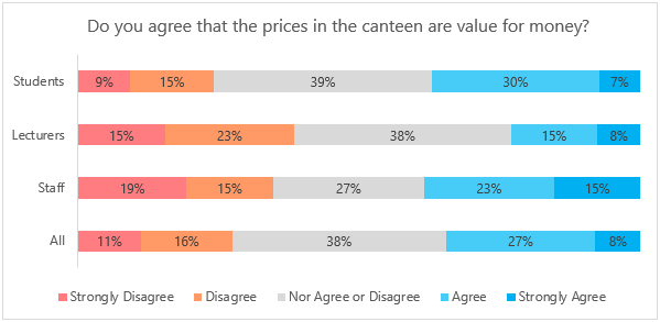
Interactive Example: Sales by Region and Product Category
Simple Segmented Bar Graph
Absolute values stacked end-to-end with variable bar heights representing different totals. I use this when comparing both parts and wholes across categories is essential.
Percentage Segmented Bar Graph
All bars scaled to 100% height with segments showing proportional contributions. Perfect when I need to compare compositional patterns across groups.
Hierarchical Segmented Bar Chart
Subdivisions across two categorical variables with consistent primary bar heights. My go-to choice for multi-dimensional categorical analysis.
Building Segmented Bar Charts with Visual Intelligence
I remember spending hours manually calculating segment positions and struggling with color selection in Excel. Traditional creation methods involve numerous challenges that can drain your productivity. Let me show you how modern approaches have transformed this process.
Traditional vs. AI-Powered Creation Process
                    flowchart LR
                        A[Raw Data] --> B{Creation Method}
                        B --> C[Traditional Process]
                        B --> D[AI-Powered Process]

                        C --> E[Manual Calculations]
                        E --> F[Color Selection]
                        F --> G[Segment Positioning]
                        G --> H[Label Placement]
                        H --> I[Final Chart]

                        D --> J[Natural Language Input]
                        J --> K[Automatic Processing]
                        K --> I

                        style A fill:#f9f9f9
                        style I fill:#FF8000
                        style D fill:#66BB6A
                        style C fill:#ffcccc
Transform Your Creation Process with PageOn.ai
- ✓ Vibe Creation: Describe your data relationships through natural conversation - the AI automatically determines optimal segment arrangements
- ✓ Skip Manual Formatting: Focus on data story insights while AI handles the technical details
- ✓ AI Blocks: Build modular chart components by dragging and dropping segments like building blocks
- ✓ Dynamic Rearrangement: Rearrange categories without recalculating proportions
Critical design decisions that impact clarity include color contrast strategies for segment differentiation, label placement for readability without clutter, and baseline consistency for accurate comparison. When I use PageOn.ai's intelligent features, these decisions are optimized automatically based on data characteristics and best practices.
Real-World Applications and Data Patterns
Throughout my career, I've applied segmented bar charts across diverse industries and use cases. Let me share some of the most impactful applications I've encountered.
Business Analytics Use Cases
Revenue Breakdown by Department
Sales Composition Insights
In analyzing retail data, I've found that equipment consistently drives 50-60% of revenue across locations. This pattern helps identify high-margin product categories for strategic focus.
Market Evolution Tracking
By creating time-series segmented bars, I track how market share evolves quarterly. This visualization immediately highlights shifting customer preferences and emerging trends.
Educational and Research Applications
In educational contexts, I've used segmented bar charts to visualize survey response patterns effectively. For instance, when analyzing health concerns across demographics, these charts reveal critical insights about population segments.
- Survey response patterns showing physical vs. mental health concerns across age groups
- Population demographics broken down by age and gender distributions
- Academic performance visualized across different assessment categories
- Resource allocation for budget planning in educational institutions
Interpreting Complex Relationships
Through years of analysis, I've developed techniques for extracting meaningful patterns from segmented bar charts. The key is looking beyond the obvious to identify trends through segment size changes over time, spot correlations between categorical variables, detect outliers in compositional data, and compare conditional distributions for association analysis.
Advanced Visualization Techniques
Let me share the advanced techniques I've refined over the years that transform good segmented bar charts into exceptional ones.
Enhancing Readability Through Design
- • Optimal spacing: I always use 50% bar width between bars for the perfect balance of density and clarity
- • Strategic annotations: Place values only where they add insight without creating visual clutter
- • Color psychology: Use gradients vs. solid colors strategically for segment distinction
- • Interactive tooltips: Provide detailed values on hover for deeper exploration
Integrating Data with PageOn.ai's Deep Search
One of my favorite features in PageOn.ai is Deep Search, which revolutionizes how I integrate data into visualizations. The system automatically pulls relevant comparison data from multiple sources, embeds real-time statistics directly into chart segments, connects to live databases for dynamic updates, and finds supporting visuals for context.
Percentage Distribution Analysis
Creating Interactive Dashboards
My approach to dashboard creation involves linking segmented bars to detailed drill-down views, combining with horizontal bar charts for comprehensive analysis, synchronizing multiple chart types for unified insights, and enabling user-controlled filtering and segment selection. This creates an immersive analytical experience that empowers users to explore data independently.
Best Practices and Common Pitfalls
After years of creating and reviewing segmented bar charts, I've compiled essential guidelines that ensure accuracy and clarity in every visualization.
✓ Essential Guidelines for Accuracy
- • Always start y-axis at zero to prevent data misrepresentation
- • Limit segments to 5-7 categories for optimal comprehension
- • Use consistent color schemes across related charts
- • Include clear legends with percentage or value labels
- • Maintain visual hierarchy through strategic color intensity
✗ Common Mistakes to Avoid
- • Overcrowding with too many segments reducing interpretability
- • Using similar colors that blur category boundaries
- • Neglecting to show total values alongside proportions
- • Creating 3D effects that distort segment perception
- • Ignoring color-blind accessibility considerations
Optimization with PageOn.ai's Agentic Features
I've found that PageOn.ai's AI-powered features eliminate most common mistakes automatically. The system provides:
- → AI-powered color palette selection based on data relationships
- → Automatic segment ordering for logical flow
- → Smart label positioning to prevent overlap
- → Intelligent data aggregation for cleaner visualizations
Comparative Analysis with Other Chart Types
Understanding when to use segmented bar charts versus other visualization types has been crucial in my data storytelling journey. Let me break down the key comparisons I consider.
Chart Selection Decision Tree
                    flowchart TD
                        A[Data to Visualize] --> B{Need to show composition?}
                        B -->|Yes| C{Multiple categories to compare?}
                        B -->|No| D[Standard Bar Chart]

                        C -->|Yes| E[Segmented Bar Chart]
                        C -->|No| F{Single whole?}

                        F -->|Yes| G[Pie Chart]
                        F -->|No| H[Donut Chart]

                        E --> I[Best Choice!]

                        style A fill:#f9f9f9
                        style E fill:#FF8000
                        style I fill:#66BB6A
| Chart Type | Best Use Case | Key Advantage | Limitation |
|---|---|---|---|
| Segmented Bar | Composition + total comparison | Shows parts and wholes | Complex with many segments |
| Standard Bar | Single value comparison | Simple and clear | No composition view |
| Pie Chart | Single whole visualization | Intuitive percentages | Can't compare multiple wholes |
When integrating with other visualizations, I combine segmented bars with data visualization charts for comprehensive dashboards, use them alongside time series for temporal pattern analysis, and pair them with tables for detailed numerical reference. Understanding bar charts vs histograms also helps in choosing the right visualization for your specific data type.
Creating Powerful Visual Narratives
The true power of segmented bar charts emerges when we use them to tell compelling data stories. Let me share my approach to transforming raw data into narratives that inspire action.
Storytelling Through Segmentation
My storytelling framework involves four key elements:
- 1. Guide viewer attention through strategic color emphasis - I use brighter colors for the segments I want to highlight
- 2. Use animation to reveal segments progressively, building suspense and maintaining engagement
- 3. Highlight key insights with callout annotations that draw the eye to critical data points
- 4. Create before-and-after comparisons for impact analysis that shows transformation clearly
Leveraging PageOn.ai for Enhanced Communication
What excites me most about PageOn.ai is how it transforms my workflow. I can now transform raw data tables into compelling visual stories instantly using natural language commands. The voice command feature lets me adjust segment emphasis in real-time during presentations, making my data stories more dynamic and responsive to audience questions.
The platform's ability to generate multiple visualization perspectives from a single dataset has been game-changing. I can quickly explore different angles of the same data, finding the most impactful way to present my insights. When it's time to share, the export feature delivers presentation-ready charts with professional formatting that impress stakeholders every time.
Visualization Effectiveness Metrics
Measuring Visualization Effectiveness
I continuously improve my visualizations by tracking viewer engagement with interactive elements, analyzing interpretation accuracy through user feedback, optimizing based on comprehension metrics, and iterating designs using AI-suggested improvements. This data-driven approach ensures my segmented bar charts consistently deliver value.
For those looking to streamline their chart creation process even further, exploring AI-powered bar chart generators can revolutionize your workflow. And if you're still using traditional tools, learning how to create a bar chart in Excel efficiently remains a valuable skill.
Transform Your Visual Expressions with PageOn.ai
Ready to create stunning segmented bar charts that tell compelling data stories? PageOn.ai's AI-powered visualization tools make it effortless to transform complex data into clear, actionable insights. Join thousands of professionals who've revolutionized their data presentation workflow.
Start Creating with PageOn.ai TodayYou Might Also Like
Unlocking Innovation: How Democratized Development Tools Break Technical Barriers
Discover how democratized development tools are reshaping technical landscapes by breaking down barriers, enabling non-technical users to create sophisticated applications without coding expertise.
Creating Dynamic LLM Comparison Presentations with Model Context Protocol | Visual Guide
Learn how to build effective LLM comparison presentations using Model Context Protocol. Explore visualization techniques, decision frameworks, and implementation roadmaps with PageOn.ai.
Creating Emotional Journeys Through Strategic Path Design | Transforming Experiences
Discover how strategic path design creates powerful emotional journeys that transform ordinary experiences into memorable stories. Learn practical frameworks and visualization techniques.
Healing from Workplace Trauma While Planning Your Career Exit | Recovery Strategies
Discover effective strategies for healing from workplace trauma while planning your career exit. Learn to rebuild confidence, create support systems, and chart a path to psychological safety.