Mastering Excel Stacked Column Charts: From Data Chaos to Visual Clarity
Transform Multi-Layered Data Into Compelling Visual Stories
I've spent years wrestling with complex datasets in Excel, and I've discovered that stacked column charts are the secret weapon for revealing hidden patterns in categorical data. Let me show you how to master these powerful visualizations.
Why Stacked Column Charts Matter
I remember the first time I had to present quarterly sales data broken down by region and product category. My spreadsheet was a maze of numbers that made perfect sense to me but left my audience confused. That's when I discovered the power of stacked column charts – they transformed my data chaos into visual clarity in minutes.
Stacked column charts excel at solving one of the most common data visualization challenges: showing both individual components and their cumulative totals simultaneously. Whether you're analyzing quarterly sales breakdowns, regional performance metrics, or project resource allocation, these charts reveal patterns that would otherwise remain hidden in rows of numbers.

What You'll Master: By the end of this guide, you'll confidently create basic stacked charts, build complex clustered-stacked combinations, and apply advanced formatting techniques that make your data presentations unforgettable.
Understanding Stacked Column Chart Fundamentals
At its core, a stacked column chart divides vertical columns into color-coded segments, with each segment representing a subcategory of your data. I like to think of them as data layer cakes – each layer tells part of the story, and together they reveal the complete picture.
Chart Type Comparison
Key Advantages I've Discovered
- Shows composition and totals simultaneously – no need for multiple charts
- Reveals trends across categories at a glance
- Perfect for time-series data with multiple components
- Ideal for presenting to executives who need quick insights
Limitations to Consider
Through experience, I've learned that stacked columns aren't always the answer. They struggle when you have too many categories (more than 7 makes them cluttered) or when precise comparisons between middle segments are crucial. For these scenarios, I often turn to alternative visualizations or use data visualization charts that better suit the specific need.
Building Your First Stacked Column Chart in Excel
Data Preparation Essentials
The secret to a great stacked column chart starts with properly structured data. I've learned this the hard way – spending hours troubleshooting charts only to discover my data layout was the culprit.
Example Data Structure:
| Quarter | North | South | East | West |
|---|---|---|---|---|
| Q1 | $45,000 | $38,000 | $52,000 | $41,000 |
| Q2 | $48,000 | $42,000 | $55,000 | $44,000 |
| Q3 | $51,000 | $45,000 | $58,000 | $47,000 |
| Q4 | $56,000 | $49,000 | $62,000 | $52,000 |
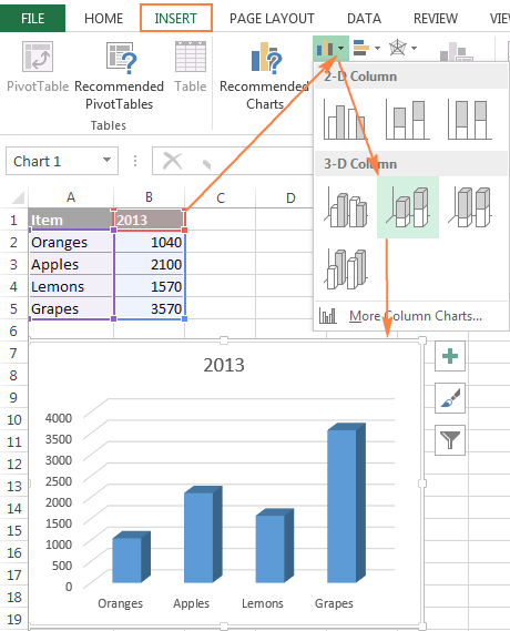
Step-by-Step Chart Creation
Select Your Data Range
Include headers! Click and drag from A1 to E5 in our example. This tells Excel what to label and how to organize your chart.
Navigate to Insert → Charts
Look for the column chart icon. Don't worry if you see multiple options – we want the "Stacked Column" specifically.
Select Stacked Column
Choose the second option in the 2-D column section. Excel will instantly generate your chart with automatic formatting.
Initial Customization
Your chart appears! Now comes the fun part – making it tell your story effectively.
Pro Tip: I always create a backup of my data before charting. Excel sometimes changes data sorting when creating charts, and having a backup saves headaches!
Advanced Techniques: Creating Clustered-Stacked Combinations
Here's where things get exciting. I once needed to compare 2023 vs. 2024 sales data, with each year broken down by product category. Standard stacked charts couldn't handle this complexity, so I discovered the clustered-stacked combination technique.
The Challenge of Multiple Data Sets
When you need to compare multiple groups (like different years) while showing composition within each group, standard stacked charts fall short. The solution? Combination charts with strategic data arrangement.
Clustered-Stacked Chart Process Flow
                    flowchart LR
                        A[Original Data] --> B[Add Helper Rows]
                        B --> C[Create Combo Chart]
                        C --> D[Adjust Series Types]
                        D --> E[Configure Axes]
                        E --> F[Format & Polish]
                        F --> G[Professional Chart]

                        style A fill:#FF8000,stroke:#333,stroke-width:2px
                        style G fill:#66BB6A,stroke:#333,stroke-width:2px
Building Complex Clustered-Stacked Charts
Key Steps I Follow:
- Set up helper data: Add spacer rows between data groups. I typically use blank rows named "Spacer 1" and "Spacer 2" with white font to hide them.
- Use combo chart functionality: Go to Chart Design → Change Chart Type. This opens up possibilities Excel doesn't advertise.
- Mix chart types strategically: Set your main data as stacked columns on the primary axis, spacers as clustered columns on secondary axis.
- Adjust series overlap and gap width: This is crucial! I usually set both to 0% for clean separation.
- Align axes: Use min/max formulas to ensure both axes show the same scale.
This technique has saved me countless hours when preparing executive presentations. Instead of creating multiple charts, I can show year-over-year comparisons with categorical breakdowns in a single, powerful visualization.

Data Organization Strategies for Complex Charts
Pivot Table Integration
I've found that pivot tables are the unsung heroes of dynamic stacked charts. They transform raw data into chart-ready formats automatically, saving hours of manual formatting.
My Pivot Table Setup Process:
- • Place time periods in Rows (quarters, months)
- • Add categories to Columns (regions, products)
- • Drop values into the Values area
- • Expand all fields for proper chart display
The beauty of this approach? When your source data updates, both the pivot table and chart refresh automatically. I've set up dashboards that update monthly with zero manual intervention.
Managing Multiple Series Effectively
When dealing with 4+ data series, I follow these rules to prevent visual overload:
- Use a consistent color scheme – warm colors for one category type, cool for another
- Apply patterns or textures sparingly for print-friendly versions
- Create visual hierarchies – make important series bolder or brighter
- Consider breaking into multiple charts if clarity suffers
For complex data relationships, I often turn to specialized tools. Learning to create bar charts in Excel with advanced features has revolutionized my reporting workflow.
Professional Formatting and Best Practices
Visual Design Principles
After years of creating charts for C-suite presentations, I've developed a formatting checklist that ensures professional results every time.
✓ Do's
- • Use brand colors consistently
- • Maintain 60-30-10 color rule
- • Add data labels for key values
- • Include clear, descriptive titles
- • Test print in black and white
- • Leave white space for clarity
✗ Don'ts
- • Avoid 3D effects (they distort data)
- • Don't use more than 7 segments
- • Skip decorative backgrounds
- • Avoid similar color shades
- • Don't forget axis labels
- • Never use default Excel colors
Common Mistakes and Solutions
I've made every mistake in the book, so you don't have to. Here are the most common pitfalls and how to avoid them:
Mistake: Overcrowding with Too Many Categories
Solution: Limit to 5-7 segments maximum. Group smaller categories into "Other" if needed.
Mistake: Missing Context and Units
Solution: Always include axis labels with units (e.g., "Sales ($000s)") and a descriptive chart title.
Mistake: Poor Color Choices
Solution: Use colorblind-friendly palettes and test accessibility with online tools.
/simplexct/images/BlogPic-ac45c.png)
Alternative Approaches and Tools
When to Consider Other Visualization Options
Through trial and error, I've learned that stacked columns aren't always the answer. Sometimes, alternative visualizations tell the story better.
Decision Tree for Chart Selection
                    graph TD
                        A[Data to Visualize] --> B{Show Parts of Whole?}
                        B -->|Yes| C{Compare Groups?}
                        B -->|No| D[Use Line/Scatter Chart]
                        C -->|Yes| E{Many Categories?}
                        C -->|No| F[Use Stacked Column]
                        E -->|Yes >7| G[Use Horizontal Bar]
                        E -->|No <7| H[Use Clustered-Stacked]

                        style A fill:#FF8000,stroke:#333,stroke-width:2px
                        style F fill:#66BB6A,stroke:#333,stroke-width:2px
                        style H fill:#66BB6A,stroke:#333,stroke-width:2px
Beyond Excel: Modern Visualization Solutions
While Excel is powerful, I've discovered that modern tools can dramatically accelerate chart creation. Online platforms offer templates, automated formatting, and collaborative features that Excel lacks.
Benefits of Modern Visualization Platforms:
- • Instant chart generation from raw data
- • Professional templates ready to use
- • Real-time collaboration features
- • Automatic color scheme optimization
- • Cross-platform compatibility
- • AI-powered chart recommendations
I've been particularly impressed with how PageOn.ai transforms complex datasets into polished visualizations. Their AI understands context and automatically suggests the most effective chart type – something that would take me hours of experimentation in Excel.
For specific needs like comparing data side-by-side, horizontal bar charts often provide better clarity than vertical stacked columns, especially when dealing with long category names.
Real-World Applications and Case Studies
Financial Reporting
In my finance consulting work, I use stacked columns extensively for quarterly reports. Here's a real example that transformed how one client viewed their revenue streams:
This visualization immediately revealed that subscription revenue was growing faster than other streams, leading to a strategic shift in resource allocation.
Sales and Marketing Analytics
Marketing teams love stacked columns for campaign performance analysis. I recently helped a retail client visualize their omnichannel sales data:
Campaign Performance Insights:
- • Email Marketing: Consistent 30% contribution across all periods
- • Social Media: Growing from 15% to 25% of total leads
- • Paid Search: Declining efficiency, dropped from 40% to 30%
- • Organic Search: Steady growth, now 15% of total
Operations and Project Management
Project managers find stacked columns invaluable for resource allocation visualization. I use them to show how team capacity is distributed across projects:

For comprehensive data analysis beyond basic charts, mastering data visualization in Excel opens up powerful possibilities for operational insights.
Troubleshooting Common Issues
Over the years, I've encountered (and solved) nearly every stacked column chart problem imaginable. Here are the issues that trip up most users and my proven solutions:
⚠️ Data Not Displaying Correctly
Symptoms: Chart shows wrong values or missing segments
Solution: Check for hidden rows/columns, ensure no blank cells in data range, verify number formatting is consistent (not mixing text and numbers).
⚠️ Chart Type Keeps Reverting
Symptoms: Excel changes your stacked chart back to clustered
Solution: This happens when data structure doesn't support stacking. Ensure your data is in a continuous range with no merged cells.
⚠️ Legend Shows Too Many Items
Symptoms: Legend is cluttered with 10+ entries
Solution: Group smaller categories into "Other", or switch to a different chart type. Consider using comparison chart creation tools for complex datasets.
⚠️ Performance Issues with Large Datasets
Symptoms: Excel freezes or crashes when updating chart
Solution: Use pivot tables to summarize data first, or consider sampling your data. For datasets over 10,000 rows, specialized visualization tools perform better.
⚠️ Cross-Version Compatibility Problems
Symptoms: Chart looks different in older Excel versions
Solution: Save in .xlsx format, avoid using features specific to Excel 365. Test in target version before distributing.
Quick Fix Checklist: When troubleshooting, I always check these in order: 1) Data selection range, 2) Data formatting consistency, 3) Chart type settings, 4) Axis configuration, 5) Source data structure. This solves 90% of issues.
Conclusion and Next Steps
We've journeyed from basic stacked column charts to advanced clustered combinations, and I hope you're now confident in transforming your complex data into compelling visual stories. The techniques I've shared aren't just theory – they're battle-tested methods I use daily in my consulting work.
Key Takeaways to Remember
📊 Chart Selection
Choose stacked columns for part-to-whole relationships with 7 or fewer categories
📐 Data Structure
Proper data organization is 80% of chart success – invest time here
🎨 Visual Design
Prioritize clarity over decoration – your data should be the star
🔧 Advanced Techniques
Master combo charts for complex comparisons that wow stakeholders
Your Action Plan
- Start Simple: Create a basic stacked column chart with your own data today
- Practice Formatting: Apply the professional formatting checklist to existing charts
- Experiment with Combinations: Try the clustered-stacked technique on comparative data
- Gather Feedback: Show your charts to colleagues and iterate based on their input
- Explore Modern Tools: Test how AI-powered platforms can accelerate your workflow
Ready to Transform Your Data Visualization?
Remember, the goal isn't just to create charts – it's to tell compelling data stories that drive decisions. Whether you're using Excel or modern AI-powered tools like PageOn.ai, the principles remain the same: clarity, accuracy, and impact.
Start Creating Better Charts TodayResources for Continued Learning
- • Download practice datasets from Excel's template gallery
- • Join online communities focused on data visualization
- • Follow chart design blogs for inspiration and tips
- • Practice with real business data from your organization
- • Experiment with different chart types for the same dataset
Final Thought: I started my data visualization journey struggling with basic Excel charts. Today, I create visualizations that influence million-dollar decisions. The difference? Practice, persistence, and always prioritizing the story your data needs to tell. You've got this!
Transform Your Visual Expressions with PageOn.ai
Stop spending hours formatting Excel charts. Let AI transform your data into stunning stacked column charts and visualizations in seconds. Join thousands of professionals who've revolutionized their data storytelling with PageOn.ai's intelligent visualization platform.
Start Creating with PageOn.ai TodayYou Might Also Like
Building Powerful Real-World AI Applications with PostgreSQL and Claude | PageOn.ai
Learn how to build sophisticated AI applications by integrating PostgreSQL and Claude AI. Discover architecture patterns, implementation techniques, and optimization strategies for production use.
Navigating the Digital Labyrinth: Maze and Labyrinth Design Patterns for Digital Products
Discover how maze and labyrinth design patterns can transform your digital products into engaging user experiences. Learn strategic applications, implementation techniques, and ethical considerations.
Enhancing Audience Experience with Strategic Audio Integration | Create Immersive Brand Connections
Discover how strategic audio integration creates immersive brand connections across podcasts, streaming platforms, and smart speakers. Learn frameworks and techniques to transform your marketing.
Building New Slides from Prompts in Seconds | AI-Powered Presentation Creation
Discover how to create professional presentations instantly using AI prompts. Learn techniques for crafting perfect prompts that generate stunning slides without design skills.