Mastering Tableau Treemaps: Transform Complex Data into Clear Visual Hierarchies
Discover how I've leveraged treemaps to unlock powerful insights from hierarchical data, turning overwhelming datasets into intuitive visual stories that drive better business decisions.
Making Sense of Data Relationships
When I first encountered treemaps in my data visualization journey, I was amazed by their elegant simplicity. These powerful hierarchical visualization tools have transformed how I approach complex datasets, turning what once seemed like impenetrable walls of numbers into clear, intuitive visual stories.
The evolution from Ben Shneiderman's groundbreaking 1990s innovation to today's modern business intelligence applications represents a fascinating journey. As detailed analysis from industry experts shows, treemaps excel at displaying part-to-whole relationships in limited space, making them indispensable for modern data analysis.
What truly excites me about treemaps is their ability to connect fuzzy data concepts to structured visual representations. Through my work with PageOn.ai's approach to data visualization charts, I've discovered how these tools can transform abstract hierarchies into tangible insights that drive real business decisions.
Core Fundamentals and Architecture
Understanding the essential building blocks of treemaps has been crucial to my success with this visualization type. At their core, treemaps rely on three fundamental elements: dimensions that define the structure, measures that determine size and color, and the nested rectangles that bring it all together.
Key Components of Treemaps
- ▪ Dimensions: Define the hierarchical structure and categories
- ▪ Measures: Determine rectangle size and color intensity
- ▪ Nested Rectangles: Visual representation of hierarchical relationships
- ▪ Color Encoding: Represents additional data dimensions or KPIs
The mathematics behind space-constrained layouts and rectangle packing might seem complex, but I've found that leveraging PageOn.ai's AI Blocks makes structuring hierarchical data as intuitive as building with LEGOs. Each block represents a logical unit that can be combined and nested to create sophisticated visualizations.
Treemap Data Flow Architecture
flowchart TD
                            A[Raw Data] --> B[Dimension Analysis]
                            B --> C[Hierarchy Definition]
                            C --> D[Measure Calculation]
                            D --> E[Rectangle Sizing]
                            E --> F[Color Encoding]
                            F --> G[Final Treemap]

                            style A fill:#FF8000
                            style G fill:#66BB6A
Step-by-Step Creation Process
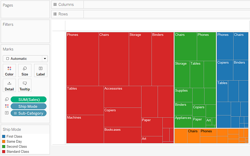
Basic Treemap Construction
My journey with creating treemaps in Tableau always begins with connecting to the right data source. Whether I'm working with the Sample Superstore dataset or custom business data, the process remains remarkably consistent and intuitive.
Quick Start Guide
- Connect to your data source (Excel, database, or cloud)
- Drag dimensions to define the treemap structure
- Add measures to Size and Color shelves
- Choose "Treemap" from the Show Me panel or build manually
- Fine-tune labels, tooltips, and color schemes
I've discovered that while the Show Me panel offers quick treemap generation, manual construction provides greater control. What's particularly exciting is how PageOn.ai's Vibe Creation feature enables conversational chart building, allowing me to describe what I want to visualize in plain language and watch as the system constructs the perfect treemap.
Advanced Configuration Techniques
Once I've created the basic structure, the real magic happens in the configuration. Implementing diverging color scales for positive and negative values has been crucial for my financial analysis projects. The ability to instantly spot profit and loss patterns through color gradients transforms raw numbers into actionable insights.
Managing small rectangle visibility remains one of the challenges I regularly encounter. However, by using PageOn.ai's Deep Search capabilities, I can automatically integrate relevant data visualizations that complement the main treemap, ensuring no insight gets lost in the hierarchy.
Advanced Implementation Strategies
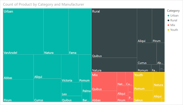
Hierarchical Data Visualization
Creating two-tier industry structures with nested categories has revolutionized how I present complex organizational data. By balancing color encoding for top-level categories while managing label placement for lower-level details, I can create visualizations that are both comprehensive and comprehensible.
Treemap Size Distribution Analysis
Specialized Treemap Variations
I've experimented with various specialized treemap variations, each serving unique analytical purposes. Building treemap bar charts for temporal analysis has been particularly effective for showing how market shares evolve over time. The drill-down functionality I've implemented allows users to explore nested treemaps, revealing layers of insight with each click.
What excites me most is transforming abstract market share data into tangible visual stories. Through PageOn.ai's drag-and-drop AI Blocks, I can structure complex hierarchies intuitively, making it possible to visualize binary search trees and other complex data structures with remarkable clarity.
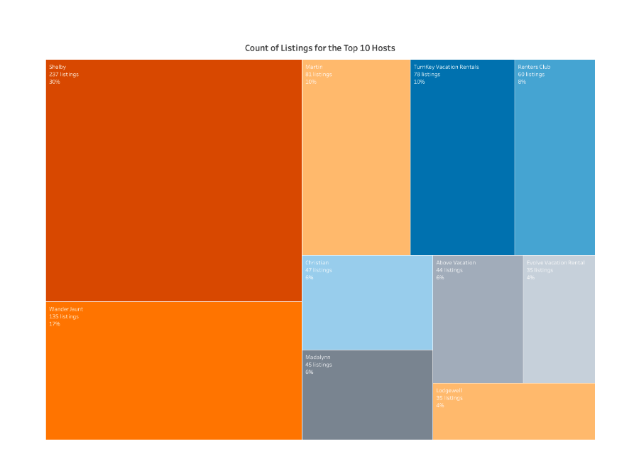
Real-World Applications and Analysis
Business Intelligence Use Cases
Through my extensive work with treemaps, I've applied them to diverse business scenarios. Analyzing employment changes across industries revealed fascinating patterns about economic shifts. When visualizing smartphone market share evolution—tracking Android, iOS, and Windows platforms—treemaps provided instant clarity on market dominance shifts that bar charts simply couldn't match.
Electoral Analysis
Used treemaps to visualize electoral vote distribution, making complex political landscapes instantly understandable through size and color encoding.
Retail Performance
Analyzed sales across product categories and regions, identifying top performers and underutilized opportunities at a glance.
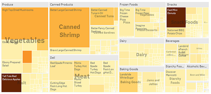
Data Interpretation Best Practices
Reading color gradients effectively has become second nature to me. I've learned to identify extremes and patterns quickly, using darker shades to spot high-value areas and lighter tones for areas needing attention. Understanding size proportions enables rapid comparisons without getting lost in exact numbers.
Navigating hierarchical structures effectively requires a systematic approach. I integrate insights from search results and leverage map data visualization basics to create comprehensive analyses that tell complete stories, not just present isolated facts.
Optimization and Enhancement Techniques
Visual Design Considerations
Choosing the right color palette can make or break a treemap visualization. I've learned that categorical palettes work best for distinct categories, while continuous gradients excel at showing progression or intensity. The key is matching the palette to the data story I'm trying to tell.
Design Best Practices
- • Use consistent border styles (1-2px white borders for clarity)
- • Implement smart label truncation for small rectangles
- • Apply hover tooltips for detailed information
- • Create responsive layouts for different screen sizes
- • Use contrasting colors for positive/negative values
Interactive Features Implementation
Adding dynamic filters has transformed my static treemaps into interactive exploration tools. Users can filter by region, category, or time period, instantly updating the visualization to reflect their specific interests. I've implemented hover actions that highlight related data across multiple visualizations, creating a cohesive analytical experience.
What's particularly powerful is leveraging PageOn.ai's Agentic processes to transform user intent into polished visualizations. Users can simply describe what they want to see, and the system automatically applies the appropriate filters, color schemes, and layouts to deliver exactly what they need.
Treemaps vs. Alternative Visualizations
Comparative Analysis
Through extensive experimentation, I've identified specific scenarios where treemaps outperform traditional visualizations. When dealing with hierarchical data containing dozens or hundreds of categories, treemaps provide superior space utilization compared to bar charts or pie charts.
| Visualization Type | Best For | Limitations |
|---|---|---|
| Treemap | Hierarchical data, part-to-whole, space efficiency | Precise comparisons difficult |
| Bar Chart | Precise comparisons, time series | Limited categories, no hierarchy |
| Heatmap | Matrix data, correlations | No hierarchical relationships |
Understanding these limitations has been crucial. While treemaps excel at pattern recognition, they struggle with precision. As detailed tutorials demonstrate, choosing between heatmaps and treemaps depends entirely on whether you're visualizing hierarchical structures or matrix relationships.
Decision Framework
I've developed a simple decision framework: if the data has natural hierarchies and I need to show proportions within categories, treemaps win. For exact value comparisons or temporal trends, I turn to bar or line charts. The key is matching the visualization to both the data characteristics and the analytical objectives.
Common Pitfalls and Solutions
Technical Challenges
- • Negative values breaking visualizations
- • Too many categories causing clutter
- • Similar-sized rectangles reducing clarity
- • Label overlap and readability issues
Strategic Solutions
- • Use absolute value transformations
- • Create logical category groupings
- • Apply context filters for focus
- • Implement smart label positioning
I've found that using PageOn.ai's Deep Search capabilities helps discover and integrate supporting visuals that complement the main treemap, ensuring comprehensive data storytelling even when the primary visualization has limitations.
Future-Ready Treemap Strategies
The future of treemap visualization excites me tremendously. I'm incorporating AI-driven insights into my treemap designs, allowing the system to automatically suggest optimal hierarchies and color schemes based on the data patterns it detects.
Evolution of Treemap Technology
flowchart LR
                            A["Traditional
Treemaps"] --> B["Interactive
Dashboards"]
                            B --> C["AI-Enhanced
Visualizations"]
                            C --> D["Real-time
Adaptive Views"]
                            D --> E["Predictive
Visual Analytics"]

                            style A fill:#FFE6CC
                            style C fill:#FF8000
                            style E fill:#FF4500
Adapting treemaps for mobile and touch interfaces has become essential. I'm designing responsive treemaps that reorganize themselves based on screen size, ensuring optimal readability whether viewed on a smartphone or a large display.
Integrating real-time data streams for dynamic updates transforms static reports into living dashboards. By utilizing PageOn.ai's Plan, Search, Act methodology, I can evolve treemap visualizations based on changing business needs, ensuring they remain relevant and impactful.
Key Takeaways for Modern Treemap Design
- ✓ Embrace AI assistance for optimal design decisions
- ✓ Design for mobile-first experiences
- ✓ Integrate real-time data capabilities
- ✓ Focus on interactive storytelling
- ✓ Combine multiple visualization techniques
Advanced Customization and Integration
Dashboard Integration Excellence
Embedding treemaps within comprehensive analytical dashboards has become one of my specialties. I create linked visualizations where selecting a rectangle in the treemap filters related charts, creating a seamless multi-dimensional analysis experience.
Implementing action filters for cross-chart interactivity requires careful planning. I ensure that each interaction feels natural and enhances understanding rather than adding complexity. Building narrative flow with PageOn.ai's structured content blocks helps me create dashboards that tell cohesive stories.
Performance Optimization Mastery
Managing large dataset rendering efficiently has been crucial for enterprise deployments. I've implemented progressive disclosure techniques for complex hierarchies, showing top-level categories first and loading details on demand. This approach maintains responsiveness even with millions of data points.
Optimizing calculation fields and leveraging aggregation strategies has dramatically improved performance. By pre-calculating hierarchical summaries and using extract filters strategically, I've reduced load times from minutes to seconds while maintaining visual quality.
Practical Implementation Guide
Let me share a concrete example from my recent project analyzing global sales data. I needed to visualize product performance across regions and categories—a perfect use case for treemaps.
Regional Sales Distribution
The process began with data preparation—ensuring proper hierarchical structure and clean category names. I then built the treemap incrementally, starting with top-level categories and gradually adding detail layers. This methodical approach prevented overwhelming complexity.
What made this project successful was combining the treemap with complementary visualizations. While the treemap showed the overall hierarchy and proportions, I added trend lines for temporal analysis and used techniques from AI-powered organizational charts to display the company structure driving these sales patterns.
Comprehensive Best Practices
Data Preparation
- • Clean hierarchical structure
- • Consistent naming conventions
- • Proper aggregation levels
- • Handle null values appropriately
Visual Design
- • Intuitive color schemes
- • Clear label hierarchy
- • Appropriate borders/spacing
- • Responsive layouts
User Experience
- • Interactive tooltips
- • Drill-down capabilities
- • Context-aware filtering
- • Clear navigation paths
Remember, the goal isn't just to create a treemap—it's to create understanding. Every design decision should serve the ultimate purpose of making complex data accessible and actionable for your audience.
Transform Your Visual Expressions with PageOn.ai
Ready to revolutionize how you visualize hierarchical data? PageOn.ai's innovative AI-powered tools make creating stunning treemaps and other visualizations effortless. Join thousands of professionals who are already transforming complex data into clear, actionable insights.
Start Creating with PageOn.ai TodayYou Might Also Like
Creating Dynamic Picture Backgrounds in PowerPoint: Transform Your Presentations
Learn how to create stunning dynamic picture backgrounds in PowerPoint presentations to boost engagement, improve retention, and enhance visual appeal with step-by-step techniques.
Transforming Raw Data into Stunning Presentations with Cloud AI Integration
Discover how to leverage cloud AI integration to transform raw data into compelling visual stories. Learn advanced techniques for data visualization and presentation creation.
Crafting Intuitive Interfaces: Applying Gestalt Psychology for Enhanced User Perception
Learn how to apply Gestalt psychology principles to create more intuitive user interfaces. Discover proximity, similarity, figure/ground, and other key principles for better UX design.
Redefining Developer & Designer Roles in the Age of Intent-Based Creation | PageOn.ai
Explore how intent-based creation is transforming developer and designer collaboration, blurring traditional boundaries, and creating new hybrid roles like intent engineers in the modern tech landscape.