How Timeline Infographics Transform Complex Histories Into Visual Stories
Master the art of visual chronology and discover how timeline infographics revolutionize the way we understand and share sequential information
The Power of Visual Chronology
When I first discovered timeline infographics, I was amazed by their ability to transform dense historical data into captivating visual narratives. These powerful tools organize events, milestones, and processes chronologically, making complex sequences instantly understandable at a glance.
What makes timeline infographics truly revolutionary is their unique ability to simplify intricate progressions that would otherwise require pages of text to explain. Whether you're tracking a company's evolution, managing project milestones, or teaching historical events, these visual tools have become indispensable across industries.
In my experience working with various visualization tools, I've found that PageOn.ai's approach stands out through its AI-powered visual building blocks. This innovation allows anyone – regardless of design expertise – to create professional-grade timeline infographics that resonate with their audience. The platform's intelligent assistance transforms the traditionally complex process of timeline creation into an intuitive, drag-and-drop experience.
Essential Components That Make Timeline Infographics Work
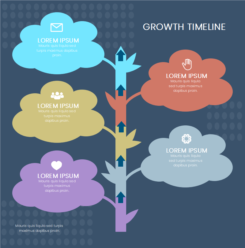
The Backbone Structure
Through years of creating and analyzing timeline infographics, I've identified four primary layout structures that serve different narrative purposes:
flowchart TD
                        A[Timeline Layout Types] --> B[Vertical Layout]
                        A --> C[Horizontal Layout]
                        A --> D[Snake Layout]
                        A --> E[Circular Layout]
                        B --> F[Best for: Text-heavy content]
                        C --> G[Best for: Presentations]
                        D --> H[Best for: 10+ events]
                        E --> I[Best for: Cyclical processes]
- Vertical timelines excel when you have extensive text or need to show hierarchical information
- Horizontal layouts work perfectly for presentations with 5-7 key points
- Snake formats maximize space efficiency for timelines with 10+ events
- Circular designs beautifully represent cyclical or recurring processes
What I particularly love about PageOn.ai's AI Blocks is how they enable effortless drag-and-drop timeline construction. You can experiment with different layouts instantly, seeing which structure best serves your narrative without starting from scratch each time.
Visual Hierarchy Elements

Creating effective visual hierarchy requires careful balance between dates, descriptions, headers, and supporting imagery. I've learned that the most successful timeline infographics maintain a consistent ratio: approximately 30% text, 40% visual elements, and 30% white space. This balance ensures optimal comprehension without overwhelming the viewer.
Color coding serves as a powerful organizational tool. I typically use warm colors like red and orange to highlight urgent tasks or critical milestones, while cooler blues and greens indicate completed phases or ongoing processes. PageOn.ai's Deep Search feature brilliantly automates this process by intelligently suggesting relevant visuals and data points based on your content context.
Real-World Applications: Timeline Infographics in Action
Business and Corporate Timelines
In my consulting work, I've witnessed how company evolution stories transform from boring annual reports into compelling visual narratives. One technology startup I worked with used a timeline infographic to showcase their journey from a garage startup to a billion-dollar enterprise, highlighting product launches, funding rounds, and strategic acquisitions along the way.
Corporate Milestone Distribution
PageOn.ai's Vibe Creation feature has revolutionized how we approach these corporate narratives. By simply inputting key company milestones, the AI transforms dry historical data into visually stunning stories that resonate with stakeholders, investors, and employees alike.
For project management, I've found that Gantt chart-style timelines provide unparalleled clarity in visualizing task dependencies and deadline management. Creating interactive timelines in Google Slides has become my go-to method for dynamic presentations that allow real-time updates during meetings.
Educational and Historical Timelines
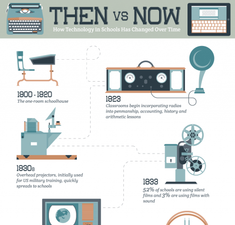
Working with educators has shown me the transformative power of timeline infographics in making history tangible for students. From ancient civilizations to modern scientific discoveries, these visual tools help students grasp temporal relationships that textbooks often fail to convey effectively.
I recently collaborated with a history teacher who used PageOn.ai to build engaging lesson materials without any design expertise. The platform's ability to incorporate infographic data visualizations for statistical timelines transformed her students' understanding of historical trends and patterns.
Design Excellence: Principles for Compelling Timeline Infographics
Visual Design Fundamentals
Typography plays a crucial role in timeline readability. I've developed a hierarchy system that consistently works: bold sans-serif fonts for headers (24-36pt), clean sans-serif for dates (18-20pt), and readable serif or sans-serif for descriptions (14-16pt). This structure ensures information flows naturally while maintaining visual interest.
Color Psychology in Timeline Design
- Red/Orange: Urgency, deadlines, critical milestones
- Blue/Green: Completed tasks, stable phases, growth
- Yellow/Gold: Achievements, highlights, celebrations
- Gray/Neutral: Background information, context, transitions
Following proven infographic design principles ensures brand consistency while maximizing visual impact. I always recommend selecting a primary brand color and using it at 60% saturation for main elements, with complementary colors at 30% and accent colors at 10%.
Icon and Symbol Integration
Icons serve as visual anchors that enhance understanding without adding clutter. My rule of thumb: if an icon doesn't immediately clarify the associated content, it's better to omit it. PageOn.ai's intelligent icon suggestions based on content context have saved me countless hours of searching for the perfect visual elements.
Creating Your Timeline Infographic: A Strategic Approach
Planning and Content Organization
My timeline creation process always begins with a comprehensive outline. I determine the scope, identify key events, and establish the narrative arc before touching any design tools. This foundation ensures that the visual design serves the content, not the other way around.
Timeline Creation Workflow
flowchart LR
                        A[Content Outline] --> B[Data Collection]
                        B --> C[Layout Selection]
                        C --> D[Visual Design]
                        D --> E["Review & Refine"]
                        E --> F["Publish & Share"]

                        B -.-> G[PageOn.ai Deep Search]
                        C -.-> H[AI Template Suggestions]
                        D -.-> I[AI Block Assembly]
What excites me most about PageOn.ai's voice/text input feature is how it streamlines the initial structuring phase. I can literally speak my timeline content, and the AI organizes it into a logical sequence, suggesting appropriate visual treatments for each element.
Data verification remains crucial for credibility. PageOn.ai's Deep Search capability has become my secret weapon for automatic fact-checking and asset discovery, ensuring accuracy while significantly reducing research time. When creating timelines in Google Slides, this verified data integration provides confidence in every presentation.
Design Execution with PageOn.ai
The decision between templates and custom creation depends on your specific needs. For quick turnarounds, I leverage pre-built timeline templates that can be customized within minutes. However, for unique requirements or brand-specific designs, building custom timelines with AI Blocks offers unlimited creative freedom.
I've found that the iterative refinement process is where PageOn.ai truly shines. The platform's collaborative features enable real-time team input, allowing stakeholders to provide feedback directly on the timeline. This eliminates the endless email chains and revision cycles that traditionally plague design projects.
Advanced Techniques and Future Trends
Data-Driven Timeline Innovation
The future of timeline infographics lies in dynamic, data-driven visualizations. I'm particularly excited about integrating live data sources to create timelines that update in real-time. Imagine a project timeline that automatically adjusts based on task completion or a company timeline that adds new milestones as they occur.
Timeline Format Effectiveness
Looking at successful data visualization examples, I see tremendous potential in multi-dimensional timeline formats. Parallel timelines for comparative analysis and 3D timeline experiences are pushing the boundaries of what's possible in visual storytelling.
Measuring Timeline Effectiveness
Understanding viewer interaction through engagement metrics has become essential for optimization. I track time spent on each timeline section, click-through rates on interactive elements, and sharing patterns to continuously improve my designs. A/B testing different formats reveals surprising insights about audience preferences.

Accessibility remains a top priority in my timeline designs. Color-blind friendly palettes, proper contrast ratios, and screen reader compatibility ensure that timeline infographics serve all audiences effectively. PageOn.ai's built-in accessibility checking features have become indispensable for maintaining inclusive design standards.
The Future of Visual Time Mapping
Timeline infographics have fundamentally transformed how we communicate sequential information. Through my journey exploring these powerful visualization tools, I've witnessed their evolution from simple linear representations to dynamic, interactive experiences that captivate and inform audiences across every industry.
What excites me most about the current landscape is how PageOn.ai democratizes professional timeline creation through AI. No longer do you need years of design experience or expensive software to create stunning visual chronologies. The platform's intuitive approach means that anyone with a story to tell can transform their chronological data into compelling visual narratives.
Looking ahead, I see emerging technologies like AR and VR opening entirely new dimensions for timeline experiences. Imagine walking through a virtual timeline of your company's history or exploring historical events in an immersive 3D environment. These aren't distant fantasies – they're the next evolution of visual storytelling.
The convergence of AI assistance, real-time data integration, and immersive technologies promises a future where timeline infographics become living, breathing representations of our collective experiences and achievements.
Transform Your Visual Expressions with PageOn.ai
Ready to create timeline infographics that captivate your audience? Join thousands of creators who are already transforming their data into stunning visual stories with PageOn.ai's revolutionary AI-powered platform.
Start Creating with PageOn.ai TodayYou Might Also Like
Understanding Native Multimodality: The Key to Truly Intelligent AI Systems
Explore how native multimodality powers modern AI understanding by integrating text, visual, audio, and interactive elements to create more intuitive and powerful artificial intelligence systems.
Mastering Custom Image Creation with Gemini AI in Google Slides | Visual Revolution
Learn how to create stunning custom images with Gemini AI in Google Slides. Step-by-step guide to transform your presentations with AI-generated visuals for maximum impact.
Mastering Object Animations: Transform Static Slides into Engaging Visual Stories
Learn how to enhance your presentations with dynamic object animations. Discover techniques for entrance effects, motion paths, interactive elements, and more for PowerPoint and Google Slides.
Mastering the Three-Body Structure for Compelling Business Presentations | PageOn.ai
Transform ordinary business presentations into compelling visual narratives using the three-body storytelling structure. Learn techniques for creating impactful openings, persuasive middles, and inspiring closings.