Timeline Line Charts: Transforming Time-Based Data into Visual Clarity
Master the art of visualizing temporal data through interactive timeline line charts that reveal patterns, trends, and insights at a glance
Understanding Timeline Line Charts: The Foundation
When I first encountered timeline line charts, I was struck by their unique ability to merge two powerful visualization concepts: the chronological clarity of timelines and the trend-revealing nature of line graphs. Unlike standard timelines that simply mark events along a temporal axis, timeline line charts add a crucial vertical dimension—quantitative measurement—transforming static event markers into dynamic trend visualizations.
Key Components of Timeline Line Charts
- • Time Axis (Horizontal): Represents chronological progression from past to present
- • Value Axis (Vertical): Displays quantitative measurements or metrics
- • Data Points: Individual measurements plotted at specific time intervals
- • Connecting Lines: Visual threads that reveal trends and patterns over time
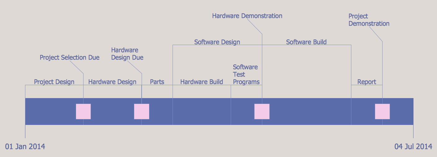
Interactive Timeline Line Chart Example
What makes timeline line charts particularly powerful is their ability to excel at showing trends, patterns, and changes over various time periods. Whether you're tracking project milestones with associated metrics, analyzing historical data trends, or visualizing business performance over quarters, these charts provide immediate visual insights that tables of numbers simply cannot match. I've found them invaluable for everything from monitoring website traffic patterns to presenting complex scientific data in accessible formats.
Building Effective Timeline Line Charts with PageOn.ai
The Challenge of Complex Time-Series Data
I remember my frustration trying to create timeline charts in Excel—wrestling with date formatting, struggling to align multiple data series, and spending hours tweaking axis scales. The traditional approach requires mastery of complex charting software, understanding of formulas, and often results in static visualizations that don't engage viewers. The real challenge isn't just creating the chart; it's balancing detail with readability while maintaining visual clarity across different time granularities.
PageOn.ai's Revolutionary Approach
Vibe Creation: Conversational Chart Building
With PageOn.ai's Vibe Creation feature, I simply describe my timeline data needs conversationally. Instead of clicking through endless menu options, I tell PageOn.ai: "Create a timeline showing monthly sales trends alongside customer satisfaction scores for 2023." The AI understands context, suggests appropriate scales, and even recommends complementary visualizations.
- • Natural language processing understands your data relationships
- • Automatic time period detection and formatting
- • Intelligent suggestions for trend line smoothing and annotations
AI Blocks: Modular Timeline Construction
PageOn.ai's AI Blocks transform timeline creation into a visual building process. I drag and drop time periods, add data series with different colors and styles, and position milestone markers exactly where needed. Each block represents a data element that can be customized, connected, or animated independently.
The beauty lies in combining multiple data series on single timeline views without cluttering. I can layer trend lines, add confidence intervals, and include annotations—all while maintaining visual hierarchy. The system automatically handles scale adjustments when combining different metric types, something that would take hours to configure manually in traditional tools.
Advanced Timeline Line Chart Applications
Multi-Series Timeline Comparisons
One of my favorite applications involves visualizing parallel trends across different metrics or categories. Imagine comparing product launch performance across multiple regions, each with its own trend line but sharing the same temporal axis. By using consistent color coding and varied line styles (solid, dashed, dotted), I create layered timeline views that reveal correlations and divergences at a glance.
Multi-Series Data Flow Architecture
flowchart LR
                        A[Raw Time-Series Data] --> B[Data Processing]
                        B --> C[Series Alignment]
                        C --> D[Scale Normalization]
                        D --> E[Visual Encoding]
                        E --> F[Interactive Timeline]

                        G[User Interactions] --> H[Dynamic Updates]
                        H --> F

                        style A fill:#FFE5CC
                        style F fill:#D4F1D4
                        style G fill:#E6E6FA
Integrating these visualizations with line graphs to visualize trends enhances pattern recognition capabilities. I've discovered that combining timeline line charts with heat maps or scatter plots in PageOn.ai creates comprehensive analytical dashboards that tell complete data stories.
Interactive and Dynamic Timeline Features
Interactive Elements
- • Hover tooltips revealing detailed metrics
- • Clickable data points for drill-down analysis
- • Zoom capabilities for time period focus
- • Pan controls for exploring extended timelines
Animation Features
- • Progressive data reveal animations
- • Smooth transitions between time periods
- • Highlighting specific trend segments
- • Synchronized multi-chart animations
Building Interactive Timelines Google Slides presentations becomes effortless when I export my PageOn.ai creations. The interactivity translates beautifully into presentation formats, allowing audiences to explore data during meetings rather than passively viewing static charts.
Design Best Practices for Timeline Line Charts
Visual Hierarchy and Clarity
Through years of creating timeline visualizations, I've learned that choosing appropriate time intervals is crucial. Daily data might be perfect for a monthly view, but becomes overwhelming when viewing a full year. My approach involves starting with the broadest view and allowing users to drill down into finer granularities as needed.
Essential Design Principles
Time Interval Selection
- • Hours/Minutes for operational dashboards
- • Days for project tracking
- • Weeks for quarterly reviews
- • Months for annual trends
- • Years for historical analysis
Visual Elements
- • Subtle gridlines for reference
- • Milestone diamonds for key events
- • Color-coded trend lines
- • Contextual annotations
- • Clear axis labels
.png)
Data Presentation Strategies
When dealing with exponential growth or wide-ranging values, I often switch between linear and logarithmic scales. Linear scales work perfectly for steady trends, but logarithmic scales reveal patterns in data that spans multiple orders of magnitude. PageOn.ai intelligently suggests the appropriate scale based on data distribution, saving me from trial and error.
Combining timeline line charts with other data visualization charts creates comprehensive dashboards. I frequently pair timeline charts with horizontal bar charts to show both temporal trends and categorical comparisons simultaneously.
Real-World Implementation Scenarios
Business and Project Management
In my experience managing product launches, timeline line charts have become indispensable. I track pre-launch buzz metrics, launch day spikes, and post-launch engagement trends all on a single visualization. By overlaying planned versus actual performance trajectories, stakeholders immediately see whether we're meeting, exceeding, or falling short of targets.
Product Launch Performance Timeline
Common Business Applications
- • Sales Trend Analysis: Quarterly revenue patterns with seasonal adjustments
- • Resource Utilization: Team capacity over project phases
- • Customer Journey Metrics: Engagement scores through lifecycle stages
- • Competitive Analysis: Market share evolution over time
Scientific and Educational Applications
Working with research teams, I've seen how timeline line charts transform complex scientific data into comprehensible narratives. Temperature change visualizations, like those from NASA's climate data, become powerful communication tools when properly designed. The ability to show multiple variables—temperature, CO2 levels, sea ice extent—on synchronized timelines reveals correlations that might otherwise remain hidden in spreadsheets.
Educational applications particularly benefit from interactive timelines. Students can explore historical events with associated economic indicators, see mathematical functions evolve over time, or track experimental results across multiple trials. The visual nature of timeline charts makes abstract concepts tangible and memorable.
Maximizing Impact with PageOn.ai's Timeline Tools
Deep Search Integration for Data Enhancement
PageOn.ai's Deep Search capability revolutionizes how I build timeline charts. When creating a market analysis timeline, the system automatically finds relevant historical data points, benchmark comparisons, and industry standards. It's like having a research assistant who instantly provides context for every data point I'm plotting.
Automatic Data Enhancement
- • Historical benchmark integration
- • Industry standard comparisons
- • Contextual event annotations
- • Related trend identification
Visual Element Sourcing
- • Relevant icons and symbols
- • Complementary color schemes
- • Supporting imagery
- • Brand-aligned styling
Collaborative Timeline Development
Real-time collaboration transforms timeline creation from a solitary task into a team effort. I've worked on timelines where marketing provides engagement metrics, finance adds budget data, and operations includes resource utilization—all simultaneously. PageOn.ai's version control ensures we never lose work, while stakeholder feedback appears directly on the visualization, eliminating endless email threads about chart adjustments.
Export options cater to every presentation need. Whether I'm creating a timeline in google slides for a board presentation or generating high-resolution images for reports, PageOn.ai maintains visual fidelity across all formats.
Troubleshooting Common Timeline Line Chart Challenges
Over the years, I've encountered and solved numerous timeline chart challenges. Irregular time intervals often plague real-world data—sales might be recorded daily during peak seasons but weekly during slow periods. PageOn.ai handles this elegantly by intelligently interpolating missing points or clearly marking data gaps, maintaining visual continuity without misrepresenting information.
Common Challenges and Solutions
Challenge: Overlapping Data Labels
Solution: Implement smart label positioning, use callout lines, or enable interactive tooltips for dense data regions
Challenge: Multiple Scale Requirements
Solution: Use dual-axis designs or normalized scales with clear legends
Challenge: Continuous vs. Stepped Data
Solution: Choose line styles that match data nature—smooth for continuous, stepped for discrete changes
Troubleshooting Decision Flow
flowchart TD
                        A[Timeline Issue Detected] --> B{Data Type?}
                        B -->|Missing Points| C[Interpolation Options]
                        B -->|Overlapping| D[Label Management]
                        B -->|Scale Issues| E[Axis Configuration]

                        C --> F[Linear Interpolation]
                        C --> G[Show Gaps]
                        C --> H[Use Markers]

                        D --> I[Smart Positioning]
                        D --> J[Interactive Tooltips]

                        E --> K[Dual Axis]
                        E --> L[Normalized Scale]

                        style A fill:#FFE5CC
                        style B fill:#E6E6FA
Optimizing for different viewing contexts requires thoughtful design decisions. Desktop presentations allow for detailed, multi-layered timelines, while mobile views demand simplified, focused visualizations. PageOn.ai's responsive design tools automatically adjust element sizes, label densities, and interaction methods based on the viewing device, ensuring optimal experiences across all platforms.
Future-Proofing Your Timeline Visualizations
Building sustainable timeline systems means thinking beyond individual charts. I create templates for recurring reports—monthly performance reviews, quarterly business updates, annual trend analyses—that automatically adapt to new data while maintaining consistent visual language. These templates become organizational assets, ensuring brand consistency while dramatically reducing creation time.
Template System Benefits
Speed
80% faster chart creation with pre-built templates
Consistency
Uniform visual language across all timelines
Scalability
Easily expand to new data sources and metrics
Creating scalable timeline systems involves designing flexible data structures that accommodate growth. My timelines start simple but include hooks for additional data series, annotation layers, and interactive elements. As projects evolve and data complexity increases, the visualizations grow organically without requiring complete redesigns.
Leveraging PageOn.ai's Agentic Capabilities
The game-changer for me has been PageOn.ai's Agentic capabilities. My timeline charts now automatically update when new data arrives, refine themselves based on viewer interactions, and even suggest improvements based on engagement analytics. It's like having a dedicated data visualization expert continuously optimizing my charts.
- • Automatic data refresh and validation
- • Intelligent anomaly detection and highlighting
- • Adaptive formatting based on data patterns
- • Proactive optimization suggestions
.jpg?width=800&height=475&name=Refrenzarchitekturv1_1%20(2).jpg)
Responsive design isn't just about screen sizes—it's about context-aware visualizations. My timeline charts detect whether they're being viewed in a detailed analysis session or a quick mobile check-in, adjusting information density accordingly. Critical trends remain visible while supplementary details appear on demand, ensuring viewers always get the right level of information for their current needs.
Transform Your Visual Expressions with PageOn.ai
Ready to create timeline line charts that captivate audiences and reveal hidden insights? PageOn.ai's intelligent visualization platform makes it effortless to transform complex time-series data into compelling visual narratives. Join thousands of professionals who've revolutionized their data storytelling.
Start Creating with PageOn.ai TodayYou Might Also Like
Mastering Google Slides Transitions and Animations: The Complete Motion Panel Guide
Learn how to create smooth transitions and animations in Google Slides using the Motion panel. Master slide transitions, object animations, and advanced techniques for impactful presentations.
Mastering Visual Weight in Design: Creating Hierarchy, Balance, and Impact
Explore the principles of visual weight in design and learn how to create compelling hierarchies, perfect balance, and maximum impact in your visual compositions.
Price Anchoring: Transform Customer Perception of Value | Strategic Marketing Guide
Learn how to implement price anchoring strategies to enhance perceived value, influence purchasing decisions, and create more effective pricing displays for your products and services.
Balancing Unity and Variety in Digital Product Design: Creating Harmonious User Experiences
Discover how to achieve the perfect balance between unity and variety in digital product design to create visually appealing, engaging user experiences that drive product success.