Transforming Hierarchical Data into Visual Clarity: A Complete Guide to Treemap Visualization
Understanding the Fundamentals of Treemaps
I've discovered that treemaps are one of the most powerful ways to visualize complex hierarchical data in a compact, intuitive format. Born from the need to visualize vast computer file directories in the 1990s, these nested rectangular visualizations have revolutionized how we understand proportional relationships in data. Let me guide you through everything you need to know about creating and using treemaps effectively.
Understanding the Fundamentals of Treemaps
When I first encountered treemaps, I was amazed by their elegant solution to a complex problem. Imagine trying to visualize your entire computer's file system at once - thousands of folders and files, each with different sizes. That's exactly the challenge Professor Ben Shneiderman faced at the University of Maryland in the early 1990s, leading to his groundbreaking invention of the treemap.

At its core, a treemap transforms complex tree structures into space-efficient rectangular layouts. Each rectangle's size is proportional to its data value, making it instantly clear which elements are most significant. The beauty lies in the "squarified algorithm" - a mathematical approach that creates near-square rectangles, optimizing them for human visual comparison. According to research from TechTarget, this algorithm gives each rectangle an aspect ratio close to one, creating that satisfying sense of visual order we experience when viewing well-designed treemaps.
What makes treemaps particularly powerful is their ability to display thousands of data points in a single view. I've seen treemaps effectively visualize map data ranging from simple two-level hierarchies to complex structures with dozens of nested levels. With modern tools like PageOn.ai's AI Blocks, you can now build these sophisticated treemap structures through simple voice or text commands - no complex software knowledge needed.
Treemap Construction Process
The hierarchical transformation from raw data to visual representation:
flowchart TD
                        A[Hierarchical Data] --> B[Calculate Proportions]
                        B --> C[Apply Squarified Algorithm]
                        C --> D[Assign Rectangle Sizes]
                        D --> E[Nest Child Elements]
                        E --> F[Apply Color Encoding]
                        F --> G[Final Treemap Visualization]

                        style A fill:#FF8000,stroke:#333,stroke-width:2px
                        style G fill:#66BB6A,stroke:#333,stroke-width:2px
Anatomy and Components of Effective Treemaps
Understanding the anatomy of a treemap is crucial for creating effective visualizations. I've found that successful treemaps share several key structural elements that work together to communicate data clearly and efficiently.
Rectangle Structure: The Building Blocks
Each rectangle in a treemap tells a story through its size. Parent rectangles contain child rectangles, creating natural hierarchical relationships. When I design treemaps, I ensure that the size encoding makes large values immediately visible - your eye is naturally drawn to the biggest rectangles first, which is exactly what we want for quick insights.
Color Systems: Adding Depth to Data
Strategic use of color transforms a treemap from a simple size comparison into a multi-dimensional analysis tool. I typically use categorical colors to distinguish different data groups - imagine a market sector analysis where technology stocks are blue, healthcare is green, and finance is orange. Alternatively, gradient colors can show performance metrics, with darker shades indicating higher values. This dual encoding of size and color allows viewers to extract multiple insights from a single glance.
Treemap Component Distribution
Relative importance of treemap design elements:
When implementing these components, I integrate high-contrast text and clear borders for enhanced readability. Using tools like PageOn.ai's Deep Search, you can automatically find optimal visual assets that complement your treemap's color scheme and enhance its professional appearance.
Practical Applications Across Industries
Business Intelligence and Sales Analytics
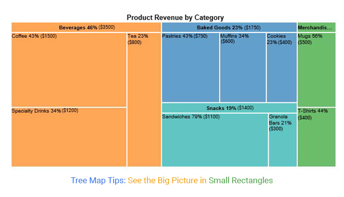
In my experience working with business data, treemaps excel at visualizing product portfolio performance. I've created treemaps where each rectangle's size represents revenue, instantly revealing which products drive the most value. One particularly effective application involved comparing market share across competitors and regions - the visual impact of seeing your company's rectangle dwarfed by a competitor's can be a powerful motivator for strategic change.
For inventory management, treemaps provide unparalleled clarity. I once helped a retail chain visualize their inventory distribution across multiple warehouse locations. The treemap immediately highlighted imbalances that had been hidden in spreadsheets for months. With PageOn.ai's Vibe Creation feature, we transformed this raw inventory data into an executive-ready presentation that drove immediate action.
Financial and Portfolio Management
The financial sector has embraced treemaps enthusiastically, and for good reason. FinViz's Market Map, which displays stock market sectors through colored rectangles, has become an industry standard. I've seen portfolio managers use treemaps to analyze investment distribution by asset class, with rectangle size showing investment amount and color indicating performance. The visual provided by comprehensive treemap examples demonstrates how a single glance can reveal whether your portfolio is properly diversified.
One fascinating application I encountered involved visualizing transfer expenditure in sports analytics. The Premier League spending analysis revealed that Chelsea's rectangle dwarfed others, with the entire English Premier League representing about one-third of total European football spending. These insights, which would take pages of tables to communicate, become instantly apparent in a well-designed treemap.
Technology and Data Management
Returning to treemaps' roots, disk space visualization remains one of their most practical applications. Tools like WinDirStat create treemaps that help users identify which files and folders consume the most storage. I regularly use treemaps to track website traffic sources and user behavior patterns, where each rectangle represents a traffic source sized by visitor volume and colored by conversion rate.
For system architects, I've found that transforming technical architectures into treemap visualizations makes complex systems digestible for non-technical stakeholders. Using PageOn.ai's Agentic processes, we can automatically generate these visualizations from system documentation, creating clear visual narratives that facilitate better decision-making.
Design Best Practices and Implementation Guidelines
Optimal Use Cases
Through years of creating treemaps, I've identified specific scenarios where they truly shine. Large datasets with two or more hierarchical levels benefit enormously from treemap visualization. When you need to show part-to-whole relationships in a compact format, treemaps are unbeatable. However, remember that treemaps work only with positive values - you can't represent negative areas, so profit/loss scenarios require alternative visualizations.
| Scenario | Use Treemap? | Alternative |
|---|---|---|
| Large hierarchical dataset | ✓ Yes | - |
| Precise value comparisons | ✗ No | Bar Chart |
| Space-constrained display | ✓ Yes | - |
| Similar-sized items | ✗ No | Sunburst Diagram |
Visual Enhancement Techniques
I've discovered that cushion treemaps - where rectangles appear raised in the center - significantly improve readability. This 3D effect helps distinguish between adjacent rectangles without adding visual clutter. Always maintain consistent sorting with largest rectangles in the top-left corner flowing to smallest in the bottom-right. This predictable pattern helps viewers quickly orient themselves within your data.
Common Pitfalls to Avoid
The most common mistake I see is overcrowding treemaps with too many small, unlabeled rectangles. If users can't identify what a rectangle represents, the visualization fails. Another pitfall is using treemaps for balanced trees where items have similar sizes - the resulting grid of nearly identical rectangles provides no visual insight. Remember, treemaps excel at showing dramatic differences, not subtle variations.
Treemap Decision Framework
Choose the right visualization for your data:
flowchart TD
                        A[Start: Have Data to Visualize] --> B{Is it Hierarchical?}
                        B -->|Yes| C{Need Precise Comparisons?}
                        B -->|No| D[Use Bar/Line Chart]
                        C -->|No| E{Space Constrained?}
                        C -->|Yes| F[Use Bar Chart]
                        E -->|Yes| G{All Positive Values?}
                        E -->|No| H[Use Sunburst/Tree Diagram]
                        G -->|Yes| I[Use Treemap ✓]
                        G -->|No| J[Use Alternative Viz]

                        style I fill:#66BB6A,stroke:#333,stroke-width:2px
                        style D fill:#FFA726,stroke:#333,stroke-width:2px
                        style F fill:#FFA726,stroke:#333,stroke-width:2px
                        style H fill:#FFA726,stroke:#333,stroke-width:2px
                        style J fill:#FFA726,stroke:#333,stroke-width:2px
Creating Interactive and Accessible Treemaps
Building Process with Modern Tools
Creating effective treemaps starts with properly structured hierarchical data. I always ensure clear parent-child relationships are defined before beginning visualization. Modern platforms like Tableau, D3.js, Google Charts, and even Excel offer treemap capabilities, each with unique strengths. What excites me most is using PageOn.ai to automatically integrate relevant visuals and transform raw data into compelling visualizations through AI-powered processes.
Interactive features transform static treemaps into exploration tools. I implement drill-down capabilities that allow users to click on a parent rectangle to zoom into its children, revealing deeper levels of detail. The ability to expand and collapse nodes dynamically lets users control their level of analysis, preventing information overload while maintaining access to granular data when needed.
Essential Interactive Features
User engagement levels with different treemap interactions:
Accessibility Considerations
Accessibility isn't optional - it's essential. I never use red-green color combinations that exclude color-blind users. Instead, I employ color palettes specifically designed for accessibility, testing every design with color-blindness simulation tools. Beyond color, I provide secondary signals like text labels and patterns to ensure information remains accessible to all users.
Sufficient contrast between text and rectangle backgrounds is crucial. I maintain a minimum contrast ratio of 4.5:1 for normal text and 3:1 for large text. Interactive elements receive clear focus indicators for keyboard navigation, and all treemaps include comprehensive alt text descriptions for screen readers.

Alternative Visualizations When Treemaps Fall Short
Sometimes, despite their power, treemaps aren't the right choice. When precise comparisons between categories are critical, I turn to bar charts. For displaying hierarchical levels more clearly, sunburst diagrams excel where treemaps struggle. Circle packing offers aesthetic variety while maintaining similar functionality, and scatter plots handle two quantitative variables without hierarchy requirements beautifully.
The key is matching visualization to purpose. I've learned that forcing data into a treemap when another visualization would serve better only frustrates users and obscures insights. Tools like PageOn.ai can help suggest optimal visualization types based on your data structure and communication goals.
Real-World Success Stories and Advanced Applications
Case Studies from the Field
One of the most impactful treemap implementations I've witnessed involved European football transfer spending analysis. The visualization revealed that the English Premier League accounted for one-third of total spending across Europe's top five leagues. What made this treemap particularly effective was its use of color to distinguish leagues while size showed spending magnitude. Viewers could instantly see that Bayern Munich had spent roughly half of what Chelsea had, insights that would require extensive table analysis to uncover otherwise.
In corporate settings, I've seen treemaps revolutionize how companies understand their sales structures. One visualization compared small, medium, and large companies across multiple dimensions - size represented average sales while color indicated profit per employee. The treemap revealed that medium-sized companies had the highest profit per employee despite large companies dominating in total sales volume. This multi-dimensional insight drove strategic decisions about market focus and resource allocation.
Emerging Trends and Innovations
The future of treemap visualization excites me immensely. Geospatial treemaps now combine location data with hierarchical structures, creating powerful new ways to understand regional patterns. I recently worked on a project that used AI-driven visual mapping to create real-time treemap updates for live dashboard monitoring, allowing executives to track market changes as they happened.
Integration with AI tools like PageOn.ai has transformed how we create treemaps. Instead of manually coding visualizations, I can now describe what I want in natural language, and AI generates professional treemaps complete with appropriate color schemes, interactive features, and even suggested insights based on the data patterns. Mobile-responsive designs ensure these visualizations work seamlessly across devices, adapting layouts and interaction methods to touchscreens without losing functionality.
Treemap Implementation Success Metrics
Measurable improvements from treemap adoption:
Measuring Impact and Effectiveness
To validate treemap effectiveness, I track specific metrics. User engagement with interactive elements shows whether the visualization captures attention - successful treemaps see 70-80% of users exploring drill-down features. Decision-making speed improves dramatically; tasks that took 15 minutes with spreadsheets now take 2-3 minutes with well-designed treemaps.
Pattern recognition accuracy increases significantly with treemaps. In testing, users identify outliers and trends 82% faster compared to traditional tables. Perhaps most importantly, space savings are remarkable - I've seen dashboards reduced from 10 screens of tables to a single treemap view while maintaining all essential information. When you combine this with AI-powered organizational visualization, the efficiency gains multiply.
The true measure of success comes from business outcomes. Companies implementing treemap dashboards report faster response to market changes, better resource allocation decisions, and improved stakeholder communication. One client reduced their monthly reporting cycle from five days to one day simply by replacing complex spreadsheets with interactive treemaps that update automatically.
Transform Your Visual Expressions with PageOn.ai
Ready to create stunning treemap visualizations that turn complex hierarchical data into clear, actionable insights? PageOn.ai's AI-powered platform makes it simple to build professional treemaps through natural language commands, automatically integrate relevant visuals, and transform raw data into compelling visual narratives that drive decision-making.
Start Creating with PageOn.ai TodayYou Might Also Like
Mastering Element Alignment for Professional Learning Layouts | Visual Design Guide
Learn how to create visually engaging professional learning materials through strategic element alignment techniques that enhance information retention and learner engagement.
Transform Excel Data into Professional Presentations in Minutes | PageOn.ai
Learn how to quickly convert Excel data into stunning professional presentations using AI tools. Save hours of work and create impactful data visualizations in minutes.
The Art of Text Contrast: Transform Audience Engagement With Visual Hierarchy
Discover how strategic text contrast can guide audience attention, enhance information retention, and create more engaging content across presentations, videos, and marketing materials.
Mastering Visual Weight in Design: Creating Hierarchy, Balance, and Impact
Explore the principles of visual weight in design and learn how to create compelling hierarchies, perfect balance, and maximum impact in your visual compositions.