Mastering Treemap Charts in Excel: Transform Complex Data into Visual Clarity
Unlock the Power of Hierarchical Data Visualization
I've discovered that treemap charts are one of Excel's most underutilized yet powerful visualization tools. When I first encountered them, I was amazed at how they could transform complex hierarchical data into intuitive visual stories. Today, I'll guide you through everything you need to know about creating stunning treemap charts that make your data speak volumes.
Understanding the Power of Treemap Visualization
When I first started working with data visualization in Excel, I quickly realized that traditional charts often fall short when dealing with hierarchical data. That's when I discovered treemap charts – a game-changing visualization tool that uses nested rectangles to represent proportional relationships in data.
What makes treemap charts truly unique is their ability to display multi-level categorical data where size represents importance. Unlike pie charts or bar graphs, treemaps excel at showing part-to-whole relationships across multiple dimensions simultaneously. I've found them particularly powerful for visualizing sales analysis by region and product, budget allocations across departments, portfolio compositions, and market share analysis.
Key Insight: Treemaps can display thousands of data points in a single view while maintaining clarity – something traditional charts struggle with. The hierarchical structure makes patterns immediately visible that would be hidden in spreadsheet rows.
Treemap Structure Visualization
Here's how treemap hierarchies work conceptually:
flowchart TD
                        A[Total Dataset] --> B[Category 1]
                        A --> C[Category 2]
                        A --> D[Category 3]
                        B --> E[Subcategory 1.1]
                        B --> F[Subcategory 1.2]
                        C --> G[Subcategory 2.1]
                        C --> H[Subcategory 2.2]
                        D --> I[Subcategory 3.1]

                        style A fill:#FF8000,stroke:#333,stroke-width:2px
                        style B fill:#42A5F5,stroke:#333,stroke-width:2px
                        style C fill:#66BB6A,stroke:#333,stroke-width:2px
                        style D fill:#FFA726,stroke:#333,stroke-width:2px
Building Your First Treemap: Data Preparation Essentials
I've learned through experience that the success of your treemap chart depends heavily on proper data preparation. The structure needs to be hierarchical: categories, subcategories, and values. Think of it as building a family tree where each branch represents a relationship.
Essential Data Structure
- Column 1: Main categories (e.g., Regions)
- Column 2: Subcategories (e.g., Products)
- Column 3: Numerical values (e.g., Sales figures)
- Optional Column 4: Additional subcategory level
One critical aspect I discovered the hard way: treemaps cannot display negative values. Excel simply skips them, which can lead to incomplete visualizations. My workaround? I use absolute values with color coding to indicate negative performance, or I create separate treemaps for gains and losses.
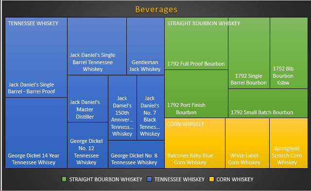
Sample Data Distribution
This chart shows how data should be proportioned for effective treemap visualization:
To streamline this process, I often use PageOn.ai's AI Blocks feature to structure and organize hierarchical data before importing it into Excel. This ensures my data relationships are properly defined and eliminates common preparation errors.
Step-by-Step Creation Process in Excel
Creating your first treemap in Excel 2016 or newer is surprisingly straightforward. I'll walk you through the exact process I use, which has become second nature after creating hundreds of these visualizations.
The Essential Steps
- Select your data: Highlight all columns including headers (Ctrl+A for entire dataset)
- Navigate to Insert tab: Look for the Charts group in the ribbon
- Choose Hierarchy Chart: Click Insert Hierarchy Chart > Treemap
- Initial chart appears: Excel automatically generates with default settings
- Resize and position: Drag corners to adjust size and placement
An alternative method I often use is the Recommended Charts feature. Simply select your data and press Alt+F1, then choose treemap from the suggestions. Excel's AI analyzes your data structure and recommends the most suitable chart types.
Pro Tip: Before creating your chart in Excel, I recommend using PageOn.ai's Vibe Creation feature to plan your design. This helps visualize the final outcome and ensures your color schemes and layouts align with your presentation goals.
Customization Techniques for Enhanced Clarity
Visual Hierarchy and Color Management
I've found that effective color management can transform a confusing treemap into an insightful visualization. Excel automatically assigns different colors to top-level categories, but customization is where the magic happens.
Color Strategies
- Use gradients for performance metrics
- Apply brand colors for consistency
- Implement heat maps for value ranges
- Create monochromatic schemes for simplicity
Label Configuration
- Banner display for category headers
- Overlapping for dense datasets
- Value and percentage combinations
- Multi-line separators for clarity
Impact of Different Label Styles
Comparison of label effectiveness across different data densities:
To access these formatting options, I right-click on any rectangle in the treemap and select "Format Data Series." The Format pane opens on the right, offering extensive customization options including borders, shadows, and transparency settings.
Real-World Applications and Best Practices
Through my experience with various industries, I've discovered that treemaps excel in specific scenarios. Let me share the most impactful applications I've encountered.
Financial Analysis
Budget allocation across departments becomes instantly clear. I've used treemaps to help CFOs identify budget inefficiencies at a glance.
- Department spending patterns
- Cost center analysis
- Investment portfolio composition
Sales Performance
Regional and product-based comparisons reveal performance gaps immediately. Sales teams love these for quarterly reviews.
- Territory performance ranking
- Product category contributions
- Customer segment analysis
When deciding between treemaps and other visualizations like bar charts in Excel, I consider the data hierarchy depth. Treemaps shine with 2-3 levels of hierarchy, while sunburst charts work better for deeper nesting.
Best Practice: I integrate PageOn.ai's Deep Search feature to find relevant industry benchmarks and incorporate them into my treemap analysis. This adds context that transforms a simple visualization into a strategic insight tool.
Advanced Techniques and Workarounds
After years of working with treemaps, I've developed several advanced techniques that take these visualizations to the next level. Let me share my most valuable discoveries.
Creating Dynamic Treemaps
Dynamic treemaps that update automatically have revolutionized my reporting workflow. By linking treemaps to PivotTables, I create interactive dashboards that respond to slicer selections. This approach is particularly powerful when combined with AI tools for Excel charts.
Dynamic Treemap Workflow
My process for creating automated treemap updates:
flowchart LR
                        A[Data Source] --> B[PivotTable]
                        B --> C[Treemap Chart]
                        D[Slicers] --> B
                        E[VBA Macro] --> C
                        C --> F[Dashboard]
                        G[Auto-Refresh] -.-> A

                        style A fill:#FF8000,stroke:#333,stroke-width:2px
                        style C fill:#42A5F5,stroke:#333,stroke-width:2px
                        style F fill:#66BB6A,stroke:#333,stroke-width:2px
Export Format Recommendations
Best for presentations
Scalable for web
Print-ready quality
Office integration
For large datasets exceeding 1000 data points, I implement performance optimization strategies. This includes data aggregation at higher levels, implementing drill-down functionality through VBA, and using PageOn.ai's Agentic features to automatically identify and highlight the most significant patterns in the treemap.
Common Challenges and Solutions
Every visualization tool has its limitations, and I've encountered numerous challenges with treemaps over the years. Here are the most common issues and my proven solutions.
Challenge: Too Many Categories
When datasets have 50+ categories, treemaps become cluttered and unreadable.
Solution: I group smaller categories into an "Others" category or create multiple focused treemaps.
Challenge: Negative Values
Treemaps cannot display negative values, causing data gaps.
Solution: I use absolute values with color coding or create separate gain/loss treemaps.
Challenge: Updating Data
Manual updates break chart consistency and formatting.
Solution: I use named ranges and table references to maintain dynamic links.
When to Choose Alternative Visualizations
Decision matrix for selecting the right chart type:
When treemaps aren't suitable, I transform complex insights into clear visual narratives using PageOn.ai's content expression tools. This ensures my data story remains compelling regardless of the visualization method chosen.
Integration with Modern Data Workflows
The future of treemap visualization lies in seamless integration with modern data ecosystems. I've evolved my approach from static Excel charts to dynamic, connected visualizations that update in real-time.
Connecting to Live Data Sources
By connecting treemaps to live data feeds through Power Query or direct database connections, I've created dashboards that reflect real-time business metrics. This integration is particularly powerful when visualizing AI-powered organizational charts or dynamic inventory systems.
Automation Possibilities
VBA Macros
Automate formatting and updates with custom scripts
Power Automate
Schedule refreshes and email reports automatically
Python Integration
Advanced analytics and machine learning insights
Cross-Platform Compatibility
I ensure my treemaps work across different platforms by following these principles: using standard fonts, avoiding platform-specific features, testing on multiple devices, and exporting in universal formats. When sharing with teams, I often complement Excel treemaps with interactive web versions created through visualization tools like binary search trees for technical audiences.
Future-Proofing Tip: I enhance my treemap presentations by using PageOn.ai to create comprehensive visual stories around the data insights. This approach ensures the message remains clear even if the technical visualization needs updating.
Transform Your Visual Expressions with PageOn.ai
Ready to take your data visualization beyond Excel? PageOn.ai empowers you to create stunning, interactive visual stories that bring your treemap insights to life. From AI-powered data structuring to automated insight generation, discover how our platform can revolutionize your data presentation workflow.
Start Creating with PageOn.ai TodayYou Might Also Like
Unlocking Innovation: How Democratized Development Tools Break Technical Barriers
Discover how democratized development tools are reshaping technical landscapes by breaking down barriers, enabling non-technical users to create sophisticated applications without coding expertise.
Maximizing Google Drive Integration for AI-Powered Presentations | PageOn.ai
Discover how to transform your workflow by integrating Google Drive with AI presentation tools like PageOn.ai. Learn advanced techniques for automated, data-rich visual storytelling.
Transform ChatGPT Prompts into Professional PowerPoint Slides | Ultimate Guide
Learn how to transform ChatGPT prompts into stunning PowerPoint presentations with our comprehensive guide. Discover expert techniques, tools, and workflows for AI-powered slides.
Smart Icon Libraries: Transform Your Document Design with Visual Intelligence
Discover how smart icon libraries can enhance your document design. Learn strategic icon selection, AI-powered systems, and visual communication techniques for better engagement and retention.