Mastering Python Treemaps: Transform Hierarchical Data into Clear Visual Stories
Unlock the power of treemap visualizations to reveal hidden patterns in your hierarchical data. From business analytics to scientific exploration, I'll guide you through creating stunning, interactive treemaps that tell compelling data stories.
Why Treemaps Matter for Data Storytelling
When I first encountered treemaps in my data visualization journey, I was amazed by their elegance. Unlike traditional pie charts that struggle with multiple categories, treemaps excel at displaying hierarchical data in a space-efficient manner. They're particularly powerful when you need to map data visualization basics to complex organizational structures.
Key Benefits of Treemaps:
- Space-efficient visualization of part-to-whole relationships
- Instant pattern recognition across hierarchical levels
- Superior to pie charts for displaying 10+ categories
- Interactive exploration capabilities with modern libraries
I've found treemaps particularly valuable in business analytics scenarios. Whether I'm analyzing sales performance across regions or visualizing budget allocations, treemaps provide immediate insights that would be hidden in traditional charts. The nested rectangle structure naturally guides the eye from major categories to detailed subcategories.
When to Choose Treemaps
flowchart TD
                        A[Data Visualization Need] --> B{Hierarchical Data?}
                        B -->|Yes| C{Space Constraint?}
                        B -->|No| D[Use Bar/Line Chart]
                        C -->|Yes| E{10+ Categories?}
                        C -->|No| F[Consider Sunburst]
                        E -->|Yes| G[TREEMAP!]
                        E -->|No| H[Pie Chart OK]
                        G --> I[Interactive Exploration]
                        G --> J[Pattern Detection]
                        G --> K[Drill-down Analysis]
Core Concepts and Data Structures
Understanding treemaps requires distinguishing between two concepts: the TreeMap data structure (a self-balancing binary search tree) and treemap visualizations (nested rectangles). While Python doesn't include a built-in TreeMap like Java, we have powerful alternatives for creating stunning visualizations.
TreeMap Data Structure
- • Self-balancing binary search tree
- • O(log n) search, insert, delete
- • Maintains sorted order
- • Used in Java, C++ (std::map)
Treemap Visualization
- • Nested rectangles display
- • Area proportional to value
- • Color indicates categories
- • Interactive exploration
Data Preparation Fundamentals
When I prepare data for treemap visualization, I focus on establishing clear parent-child relationships. The most common formats I work with include JSON hierarchies and rectangular DataFrames. Here's my approach to structuring data effectively:
# Essential treemap data structure
data = {
    'labels': ['World', 'Asia', 'China', 'India', 'Europe', 'Germany', 'France'],
    'parents': ['', 'World', 'Asia', 'Asia', 'World', 'Europe', 'Europe'],
    'values': [100, 60, 35, 25, 40, 22, 18]
}

# Converting flat data to hierarchical format
import pandas as pd
df = pd.DataFrame(data)
# Each label has a parent, creating the hierarchy
For complex organizational data, I often need to create AI-powered organizational charts that can be transformed into treemap visualizations, providing both structural clarity and quantitative insights.
Building Your First Treemap with Squarify
Squarify is my go-to library when I need quick, customizable treemaps with matplotlib integration. Created by Uri Laserson, it implements the squarification algorithm that optimizes rectangle aspect ratios for better readability.
# Installing and basic setup
pip install squarify matplotlib seaborn

import squarify
import matplotlib.pyplot as plt
import seaborn as sns

# Create a simple treemap
sizes = [50, 25, 15, 10]
labels = ['Product A', 'Product B', 'Product C', 'Product D']
colors = sns.color_palette('viridis', len(sizes))

plt.figure(figsize=(10, 6))
squarify.plot(sizes=sizes, label=labels, color=colors, alpha=0.8)
plt.axis('off')
plt.title('Sales Distribution by Product', fontsize=18, pad=20)
plt.show()
Advanced Squarify Techniques
I've discovered several techniques that elevate basic Squarify treemaps into professional visualizations. The key is understanding how to leverage matplotlib's extensive customization options alongside Squarify's layout engine.
Color Customization
I use Seaborn color palettes for professional gradients:
- • 'viridis' for continuous data
- • 'Set2' for categorical distinctions
- • Custom RGB values for branding
Label Enhancement
Improve readability with text formatting:
- • text_kwargs for font control
- • Value + percentage labels
- • Conditional text sizing
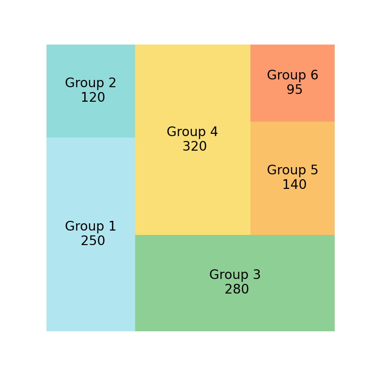
Treemap Size Distribution Analysis
Interactive Treemaps with Plotly
While Squarify excels at static visualizations, Plotly transforms treemaps into interactive exploration tools. I particularly love how Plotly Express simplifies complex hierarchical visualizations with just a few lines of code.
# Plotly Express treemap from DataFrame
import plotly.express as px
import pandas as pd

# Create hierarchical data
df = pd.DataFrame({
    'names': ['Global', 'North America', 'USA', 'Canada', 'Europe', 'UK', 'Germany'],
    'parents': ['', 'Global', 'North America', 'North America', 'Global', 'Europe', 'Europe'],
    'values': [100, 45, 30, 15, 55, 25, 30]
})

fig = px.treemap(
    df,
    names='names',
    parents='parents',
    values='values',
    title='Global Sales Distribution'
)

fig.update_traces(
    root_color="lightgrey",
    hovertemplate='%{label}
Value: %{value}
%{percentParent} of parent'
)
fig.show()
One of my favorite Plotly features is the path parameter, which automatically creates hierarchies from rectangular DataFrames. This approach has saved me countless hours when working with corporate data that needs to be visualized quickly.
Professional Plotly Customizations
Interactive Features I Always Include:
- ✓ Zoom and drill-down navigation
- ✓ Pathbar for hierarchical context
- ✓ Custom hover templates
- ✓ Color scales for metrics
- ✓ Rounded corners (v5.12+)
- ✓ Uniform text sizing
For data teams looking to create charts from text using AI, combining natural language processing with Plotly's treemap capabilities opens up powerful automation possibilities.
Practical Implementation Patterns
Through my experience building treemaps for various industries, I've developed reliable patterns that solve common visualization challenges. These patterns help me quickly adapt treemaps to different business contexts while maintaining clarity and impact.
Pattern 1: Multi-Metric Business Dashboard
When visualizing KPIs across departments, I combine treemap size (budget) with color intensity (performance). This dual-encoding technique reveals both resource allocation and efficiency at a glance.
Size = Department Budget | Color = ROI Percentage | Interaction = Drill to Teams
Pattern 2: Portfolio Visualization
For financial portfolios, I structure treemaps with asset classes at the top level, then drill down to individual holdings. Color gradients show performance relative to benchmarks.
Level 1: Asset Class | Level 2: Sector | Level 3: Individual Stock
Real-World Case Studies
I recently worked with a retail company to visualize their nationwide sales performance. By creating a three-level treemap (Region → Store → Product Category), we immediately identified underperforming stores and product mix imbalances that were hidden in traditional reports.
Sales Analysis Workflow
flowchart LR
                        A[Raw Sales Data] --> B[Data Aggregation]
                        B --> C[Hierarchy Creation]
                        C --> D[Treemap Generation]
                        D --> E[Interactive Dashboard]
                        E --> F["Insights & Actions"]

                        B -.-> G[By Region]
                        B -.-> H[By Product]
                        B -.-> I[By Time]
These visualizations become even more powerful when integrated with PageOn.ai's capabilities. The platform's AI Blocks feature allows teams to quickly transform complex hierarchical data into clear, actionable visual stories that drive decision-making.
Alternative Approaches and Tools
While Python lacks a built-in TreeMap data structure, I've discovered several alternatives that work brilliantly for different use cases. Understanding these options helps me choose the right tool for each project's specific requirements.
| Approach | Best For | Complexity | Performance |
|---|---|---|---|
| sortedcontainers | Data structure operations | Low | O(log n) |
| Segment Trees | Range queries | Medium | O(log n) |
| HashMap + Binary Search | Interview solutions | Low | O(log n) search |
| anytree Library | Tree manipulation | Medium | Varies |
For those interested in visualizing binary search trees, these alternative approaches provide excellent foundations for understanding tree-based data structures before diving into treemap visualizations.
💡 Pro Tip: Choosing the Right Tool
I use sortedcontainers when I need TreeMap-like functionality for data processing, but switch to Plotly or Squarify for visualization. This separation of concerns keeps my code clean and performant.
Best Practices and Optimization
After creating hundreds of treemaps, I've learned that success lies in the details. The difference between a good treemap and a great one often comes down to thoughtful color choices, proper data preparation, and performance optimization.
Color Scheme Guidelines
- 🎨 Use sequential colors for continuous data
- 🎨 Limit categorical colors to 7-10 distinct hues
- 🎨 Ensure sufficient contrast for accessibility
- 🎨 Reserve red for negative values or alerts
- 🎨 Test with colorblind simulators
Performance Optimization
- ⚡ Pre-aggregate data at appropriate levels
- ⚡ Implement lazy loading for large datasets
- ⚡ Cache computed hierarchies
- ⚡ Limit initial depth to 3-4 levels
- ⚡ Use WebGL renderer for 1000+ elements
Common Pitfalls to Avoid
❌ Mistakes I've Learned From:
- • Too many hierarchy levels making navigation confusing
- • Using size AND color for the same metric (redundant encoding)
- • Forgetting to handle missing or null values in hierarchies
- • Not providing context through proper labeling and legends
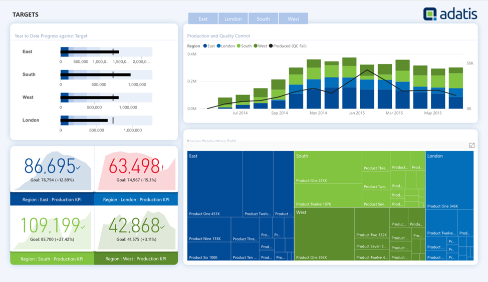
Treemap Library Performance Comparison
When working with complex datasets, I've found that PageOn.ai's Deep Search capabilities can dramatically speed up the data preparation phase, automatically identifying hierarchical relationships that might otherwise take hours to structure manually.
Advanced Visualization Techniques
Taking treemaps to the next level involves combining them with other visualization techniques and adding sophisticated interactivity. I've developed several advanced patterns that create truly engaging data experiences.
Hybrid Visualization Approaches
# Combining treemap with time series animation
import plotly.graph_objects as go
from plotly.subplots import make_subplots

# Create animated treemap showing evolution over time
def create_animated_treemap(df, time_column):
    frames = []
    for time_period in df[time_column].unique():
        period_data = df[df[time_column] == time_period]
        frame = go.Frame(
            data=[go.Treemap(
                labels=period_data['category'],
                parents=period_data['parent'],
                values=period_data['value'],
                text=period_data['label']
            )],
            name=str(time_period)
        )
        frames.append(frame)

    # Add play button and slider
    fig = go.Figure(frames=frames)
    fig.update_layout(
        updatemenus=[{
            'type': 'buttons',
            'showactive': False,
            'buttons': [{'label': 'Play', 'method': 'animate'}]
        }]
    )
    return fig
Treemap + Timeline
Show evolution of hierarchies over time periods
Treemap + Heatmap
Overlay performance metrics on structure
Treemap + Network
Show relationships between hierarchy nodes
Building Dashboard-Ready Components
For production dashboards, I wrap treemaps in reusable components that handle data updates, error states, and responsive sizing automatically. This approach has saved me countless hours when building enterprise analytics platforms.
Dashboard Integration Checklist
- ✅ Responsive container sizing
- ✅ Loading and error states
- ✅ Export functionality (PNG/SVG)
- ✅ Cross-filter integration
- ✅ Drill-through to detail views
- ✅ Real-time data updates
- ✅ Mobile touch interactions
- ✅ Accessibility features
Integration and Deployment
Deploying treemaps in production requires careful consideration of performance, scalability, and user experience. I've successfully integrated treemap visualizations into various platforms, from simple web apps to complex enterprise dashboards.
Web Application Integration
# Flask app with interactive treemap endpoint
from flask import Flask, render_template, jsonify
import plotly.graph_objects as go
import plotly.utils

app = Flask(__name__)

@app.route('/api/treemap/')
def get_treemap_data(category):
    # Fetch and process data
    data = fetch_hierarchical_data(category)

    # Create Plotly treemap
    fig = go.Figure(go.Treemap(
        labels=data['labels'],
        parents=data['parents'],
        values=data['values'],
        textinfo="label+value+percent parent"
    ))

    # Convert to JSON for frontend
    graphJSON = plotly.utils.PlotlyJSONEncoder().encode(fig)
    return jsonify(graphJSON)
For teams looking to rapidly prototype and deploy visualizations, I recommend exploring how PageOn.ai's Vibe Creation feature can accelerate the development process. By combining AI-assisted design with robust visualization libraries, you can create production-ready dashboards in a fraction of the traditional development time.
Deployment Best Practices
- 📦 Bundle visualization code separately for better caching
- 📦 Implement progressive loading for large hierarchies
- 📦 Use CDN for visualization libraries in production
- 📦 Monitor rendering performance with browser metrics
- 📦 Provide fallback static images for email reports
I've also found success in exploring historical data visualizations, such as America's industrial landscape visualization, which demonstrates how treemaps can bring historical data to life in compelling ways.
Transform Your Visual Expressions with PageOn.ai
Ready to take your data visualization to the next level? PageOn.ai's powerful AI-driven platform helps you create stunning treemaps and other visualizations that tell compelling data stories. From automated hierarchy detection to intelligent color schemes, discover how our tools can accelerate your visualization workflow.
Start Creating with PageOn.ai TodayKey Takeaways and Next Steps
Throughout this journey into Python treemaps, we've explored powerful techniques for transforming hierarchical data into clear, actionable insights. From the simplicity of Squarify to the interactivity of Plotly, you now have a comprehensive toolkit for creating compelling data visualizations.
Your Treemap Mastery Checklist
Foundation Skills ✓
- • Understanding hierarchical data structures
- • Creating basic treemaps with Squarify
- • Building interactive visualizations with Plotly
- • Implementing proper color schemes
Advanced Techniques ✓
- • Multi-level hierarchy navigation
- • Performance optimization strategies
- • Dashboard integration patterns
- • Hybrid visualization approaches
Emerging Trends in Hierarchical Visualization
As we look ahead, I'm excited about the convergence of AI and data visualization. Natural language interfaces for creating visualizations, automated insight detection, and real-time collaborative exploration are transforming how we interact with hierarchical data.
🚀 Future Directions to Explore:
- • 3D treemaps for additional data dimensions
- • AR/VR hierarchical data exploration
- • AI-assisted automatic hierarchy detection
- • Real-time streaming data treemaps
Resources for Continued Learning
Documentation & Tutorials
- 📚 Plotly Treemap Documentation
- 📚 Squarify GitHub Repository
- 📚 D3.js Treemap Examples
- 📚 Python Graph Gallery
Community & Support
- 💬 Stack Overflow Python Visualization
- 💬 Reddit r/dataisbeautiful
- 💬 Plotly Community Forum
- 💬 Python Visualization Discord
Final Thoughts
Mastering treemaps is more than learning syntax—it's about developing an intuition for when and how to use them effectively. Each dataset tells a unique story, and treemaps give us a powerful lens to reveal hierarchical patterns that might otherwise remain hidden.
As you continue your data visualization journey, remember that the best treemap is one that clearly communicates insights to your audience. Whether you're building executive dashboards or exploring scientific datasets, the techniques we've covered will help you create visualizations that inform, engage, and inspire action.
Ready to put these techniques into practice?
Start with your own hierarchical dataset and experiment with the code examples we've explored. The journey from data to insight begins with that first visualization. Happy coding, and may your treemaps always tell compelling stories!
You Might Also Like
Mastering PowerPoint's Grid System: Build Professional Consistent Layouts
Learn how to leverage PowerPoint's grid system to create visually harmonious presentations with consistent layouts, proper alignment, and professional design that improves audience retention.
Essential MCP Tools for Automated Slide Creation and Design | PageOn.ai
Discover essential Model Context Protocol (MCP) tools for automated slide creation and design. Learn how to transform presentation workflows with AI-powered automation.
Bringing Google Slides to Life with Dynamic Animations | Complete Guide
Transform static presentations into engaging visual stories with our comprehensive guide to Google Slides animations. Learn essential techniques, advanced storytelling, and practical applications.
Strategic Contrast in E-Learning: Creating Visual Impact That Enhances Learning Outcomes
Discover how to leverage strategic contrast in e-learning design to reduce cognitive load, improve retention, and create visually impactful learning experiences that drive better outcomes.