Mastering Treemap Visualization
From Hierarchical Chaos to Visual Clarity
When I first encountered treemap visualizations, I was amazed by their ability to transform overwhelming hierarchical datasets into instantly comprehensible visual patterns. Today, I'll share my journey through the fascinating world of treemaps and how they've revolutionized the way we understand complex, nested data relationships.
The Challenge of Hierarchical Data
I remember the first time I tried to visualize a complex organizational dataset with thousands of nested categories. Traditional charts simply couldn't handle the depth and breadth of the relationships. That's when I discovered the revolutionary power of treemaps—a visualization technique invented by Ben Shneiderman at the University of Maryland in 1990.
The fundamental problem treemaps solve is overwhelming: How do we display hierarchical datasets that might contain hundreds or thousands of nested relationships in a way that's both space-efficient and instantly comprehensible? Shneiderman's breakthrough was realizing that nested rectangles could represent these relationships proportionally, with size encoding quantitative values and position showing hierarchical structure.
Today, treemaps have become essential in business intelligence, portfolio management, and organizational analytics. According to research from Nielsen Norman Group, treemaps excel at showing part-to-whole relationships when you have hierarchical data with distinct numerical values. They're particularly powerful when you need to identify the largest contributors within categories at a glance.
The explosion of hierarchical data in modern organizations makes treemaps more relevant than ever. Whether you're analyzing sales territories, visualizing file systems, or exploring market segments, treemaps transform nested complexity into visual patterns our brains can process instantly. This is why major platforms like FinViz's Market Map have become indispensable tools for investors worldwide.
Anatomy of Effective Treemaps
Essential Components and Visual Grammar
Understanding the visual grammar of treemaps is crucial for creating effective visualizations. At its core, a treemap consists of nested rectangles where parent-child relationships are represented through containment. Each rectangle's area is proportional to its quantitative value, creating an immediate visual hierarchy that our brains process preattentively.
Treemap Hierarchical Structure
Below is a visualization of how treemap components relate to each other:
flowchart TD
                        A[Root Category] --> B[Parent Rectangle 1]
                        A --> C[Parent Rectangle 2]
                        B --> D[Child Rectangle 1.1]
                        B --> E[Child Rectangle 1.2]
                        C --> F[Child Rectangle 2.1]
                        C --> G[Child Rectangle 2.2]
                        C --> H[Child Rectangle 2.3]

                        style A fill:#FF8000,stroke:#333,stroke-width:2px
                        style B fill:#42A5F5,stroke:#333,stroke-width:2px
                        style C fill:#66BB6A,stroke:#333,stroke-width:2px
Color strategies in treemaps serve two distinct purposes. For categorical data, I use different hues to distinguish between categories—think of how FinViz uses red and green to show stock performance. For continuous values, I employ gradient scales where color intensity represents magnitude. This dual encoding through size and color allows treemaps to display multiple data dimensions simultaneously.
The crucial balance in treemap design lies in managing visual density while maintaining interpretability. Too many small rectangles create visual clutter, while too few fail to leverage the treemap's strength in displaying detailed hierarchies. I've found that limiting visible depth to 3-4 levels typically provides the optimal balance.
Design Principles for Maximum Impact
The aspect ratio of rectangles significantly impacts perception accuracy. Squarified algorithms, which aim to create rectangles as close to squares as possible, dramatically improve our ability to compare areas. This is why most modern treemap implementations use squarified layouts rather than the original slice-and-dice algorithm.

Visual hierarchy through borders and spacing is essential for distinguishing between levels. I typically use thicker borders for higher-level categories and subtle shadows to create a sense of depth. This technique, known as "cushion treemaps," uses visual effects to make each rectangle appear raised, significantly improving readability when dealing with hundreds of items.
Accessibility considerations are non-negotiable in modern data visualization techniques. I always ensure my treemaps use color-blind safe palettes and provide secondary signals like patterns or labels for critical information. Testing with simulation tools helps verify that the visualization remains effective for all users.
Building Treemaps That Tell Stories
Data Preparation and Structure
The foundation of any compelling treemap lies in properly structured data. I start by organizing hierarchical relationships from raw data into clear nested categories. This process often reveals hidden patterns—for instance, when I analyzed a retail company's product hierarchy, the treemap immediately highlighted that 80% of revenue came from just 20% of product categories.
One critical constraint: treemaps can only handle positive numerical values since area cannot be negative. When dealing with data containing both gains and losses, I either create separate treemaps or use alternative visualizations for negative values. Aggregation methods become crucial here—deciding whether to sum, average, or count values at each hierarchical level fundamentally shapes the story your treemap tells.
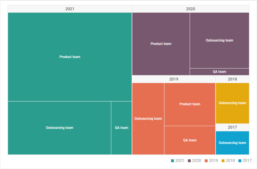
Hierarchical Data Distribution
Comparison of data points across different hierarchy levels:
Determining optimal depth is an art form. While treemaps can theoretically display unlimited levels, cognitive limitations mean that beyond 3-4 levels, users struggle to maintain context. I've learned to ask: "What's the primary story?" If it's about top-level proportions, I limit depth. If it's about detailed exploration, I implement interactive drill-down capabilities.
When working with fuzzy hierarchical concepts, tools like PageOn.ai's AI Blocks can transform ambiguous relationships into clear visual structures. This is particularly valuable when dealing with organizational data where reporting lines might be fluid or when categorizing unstructured content into meaningful hierarchies.
Implementation Strategies
Choosing the right algorithm fundamentally affects your treemap's effectiveness. The slice-and-dice method preserves order but creates elongated rectangles. Squarified algorithms optimize aspect ratios but sacrifice ordering. Strip layouts offer a middle ground. I typically use squarified for static displays and strip layouts when showing change over time.
Interactive features transform treemaps from static displays into exploration tools. Implementing zoom functionality allows users to focus on specific branches, while hover details provide precise values without cluttering the display. Click-to-drill-down navigation enables progressive disclosure of complexity.
Responsive design ensures treemaps work across devices. On mobile, I often limit initial depth and rely more heavily on interaction. PageOn.ai's Deep Search capability can automatically integrate relevant data visualizations into your treemap presentations, adapting the display based on available screen real estate and user context.
Advanced Applications and Industry Use Cases
Financial and Business Analytics
In portfolio visualization, treemaps excel at showing asset allocation and performance simultaneously. I've seen investment managers use them to display entire portfolios where rectangle size represents investment amount and color indicates returns. This dual encoding immediately highlights both large positions and performance outliers—critical for risk management.
Sales territory mapping through treemaps reveals hierarchical performance metrics across regions, districts, and individual territories. One particularly effective implementation I created showed global sales data with countries as parent rectangles containing regional subdivisions. The visualization instantly identified underperforming regions despite high country-level totals.
Treemap Effectiveness Across Industries
Comparative analysis of treemap utility in different sectors:
The enduring success of FinViz's Market Map demonstrates treemaps' power in market analysis. By visualizing the entire S&P 500 as a treemap, traders can instantly see market movements, sector performance, and individual stock changes. The visual metaphor of "market territory" resonates deeply with users, making complex market dynamics accessible.
Creating compelling investment narratives becomes effortless when you combine treemap insights with contextual storytelling. PageOn.ai's Vibe Creation feature helps transform raw treemap data into narratives that resonate with stakeholders, automatically generating explanatory text that highlights key patterns and anomalies.
Beyond Traditional Business Uses
Healthcare organizations leverage treemaps to visualize vaccination rates across demographic distributions. I worked with a public health department that used treemaps to display COVID-19 vaccination data hierarchically by state, county, and zip code, with color indicating vaccination percentage. The visualization immediately identified geographic clusters requiring targeted outreach.

Research applications include comparing study participants and identifying patterns in complex datasets. Treemaps excel at displaying demographic breakdowns where you need to see both the overall distribution and drill into specific subgroups. One genomics researcher used treemaps to visualize gene expression data across different tissue types and experimental conditions.
File system analysis remains one of treemaps' original and most practical applications. System administrators use them to identify storage hogs and optimize disk usage. The visual representation makes it trivial to spot that one log file consuming 40% of available space or the forgotten backup directory from three years ago.
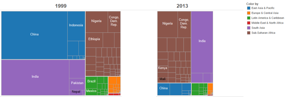
Political data visualization through treemaps offers unique insights into electoral results and demographic voting patterns. The 2012 U.S. Presidential election treemap by Steve Wexler elegantly showed each state's electoral votes as rectangle size and party preference as color, creating an instantly understandable view of the electoral landscape that traditional maps obscure.
Overcoming Treemap Limitations
Common Pitfalls and Solutions
The comparison problem represents treemaps' most significant limitation. While our brains excel at comparing lengths, comparing areas is cognitively demanding. Studies show that users consistently misjudge relative sizes when rectangles have different aspect ratios. I address this by providing precise values on hover and using consistent aspect ratios wherever possible.
Visual clutter management becomes critical when handling hundreds of data points. I've learned several strategies: implement hierarchical filtering to show only relevant branches, use semantic zoom that reveals more detail as users focus on specific areas, and employ aggregation to combine small items into "other" categories when they fall below a visibility threshold.
Choosing the Right Visualization
Decision flow for selecting treemaps vs. alternatives:
flowchart TD
                        A[Hierarchical Data?] -->|Yes| B[Many Categories?]
                        A -->|No| C[Use Bar/Line Chart]
                        B -->|Yes >50| D[Space Constrained?]
                        B -->|No <50| E[Use Sunburst/Tree]
                        D -->|Yes| F[Use Treemap]
                        D -->|No| G[Use Tree Diagram]
                        F --> H[Need Precise Values?]
                        H -->|Yes| I[Add Interactive Details]
                        H -->|No| J[Static Treemap OK]

                        style F fill:#FF8000,stroke:#333,stroke-width:2px
                        style J fill:#66BB6A,stroke:#333,stroke-width:2px
Balanced tree challenges arise when categories have similar sizes, reducing the treemap's effectiveness at highlighting dominant elements. In these cases, I often recommend alternative visualizations. A sorted bar chart might better serve data with one hierarchical level and similar values, while scatter plots excel when comparing two continuous variables.
Sometimes the best solution is knowing when not to use a treemap. For temporal data, line charts reveal trends more effectively. For precise comparisons, tables provide exact values. For showing relationships between non-hierarchical entities, network diagrams work better. The key is matching the visualization to your specific analytical needs.
Enhancing Readability and User Experience
Cushion treemaps revolutionized readability by using shading to create pseudo-3D effects. Each rectangle appears raised in the center and tapers at edges, leveraging our brain's depth perception to distinguish boundaries. This technique proves invaluable when displaying hundreds of items where traditional borders would create visual noise.

Color coding best practices have evolved significantly. I avoid rainbow scales for quantitative data—they imply false boundaries and aren't perceptually uniform. Instead, I use single-hue gradients for continuous values and carefully selected categorical palettes for discrete groups. Testing has shown that limiting myself to 5-7 distinct colors maximizes discrimination without overwhelming users.
Interactive tooltips and details-on-demand patterns transform treemaps from static displays into exploration tools. I implement progressive disclosure: basic information on hover, detailed statistics on click, and full drill-down on double-click. This layered approach accommodates both casual viewers and power users.
To transform complex treemap data into clear, actionable insights, I leverage PageOn.ai's Agentic processes. These AI-driven workflows can automatically identify significant patterns, generate explanatory annotations, and even suggest alternative visualizations when treemaps aren't optimal for the specific data structure or analytical goal.
Modern Tools and Implementation
No-Code Solutions
The democratization of treemap creation through no-code platforms has been remarkable. Flourish and Canva offer browser-based treemap generators that handle the complex algorithms behind the scenes. I've used Flourish to create publication-ready treemaps in minutes, simply by uploading a CSV and configuring the hierarchy columns.
Enterprise visualization platforms like Tableau and Power BI provide robust treemap capabilities with extensive customization options. These tools excel at handling large datasets and offer features like automatic aggregation, drill-through actions, and cross-filtering with other visualizations on dashboards. Tableau's treemap implementation particularly impresses with its smooth animations during data updates.
Treemap Tool Comparison
Comparing features across popular treemap creation platforms:
Excel and Google Sheets now offer native treemap chart types, making them accessible to millions of users. While these implementations lack advanced features, they're perfect for quick exploratory analysis. I often prototype treemaps in Excel before moving to specialized tools for production visualizations.
Streamlining your treemap creation workflow becomes effortless with PageOn.ai's conversational interface. Instead of clicking through menus and dialogs, you can describe your visualization needs in natural language. "Create a treemap showing sales by region and product category" instantly generates the appropriate structure and styling.
Advanced Techniques
Spatial treemaps represent a fascinating evolution, combining geographic awareness with hierarchical visualization. These tessellated cartograms maintain approximate geographic relationships while sizing regions by data values. I've used them to show population density where maintaining spatial context was crucial for interpretation.

Voronoi treemaps offer organic, non-rectangular alternatives that some find more aesthetically pleasing. Based on Voronoi diagram calculations, these create bubble-like cells that can better represent certain types of data. However, they sacrifice the space efficiency that makes traditional treemaps so powerful.
Dynamic treemaps showing change over time require careful consideration of layout stability. The challenge: as values change, rectangles resize and reposition, making it difficult to track individual items. Solutions include using consistent positioning algorithms and smooth animated transitions that help users maintain context during updates.
Multi-dimensional encoding pushes treemaps beyond size and color. I've experimented with texture patterns for additional categorical dimensions, border styles to indicate data quality, and even embedded sparklines within larger rectangles to show temporal trends. These techniques require careful design to avoid overwhelming users but can pack incredible information density into limited space.
Best Practices and Future Directions
The three-to-four category rule has become my golden standard for maintaining visual clarity. When I need to display more categories, I group smaller ones into an "Other" category that users can expand on demand. This approach maintains the big-picture view while preserving access to detailed data.
Storytelling with treemaps requires thoughtful narrative construction through hierarchical reveal. I start with the highest level to establish context, then progressively drill into specific areas of interest. Annotations guide viewers' attention, highlighting surprising patterns or significant outliers. The goal isn't just to display data but to lead viewers through a journey of discovery.
Treemap Design Workflow
Best practices for creating effective treemaps:
flowchart LR
                        A[Define Purpose] --> B[Structure Data]
                        B --> C[Choose Algorithm]
                        C --> D[Design Visual Encoding]
                        D --> E[Add Interactivity]
                        E --> F[Test with Users]
                        F --> G[Refine and Deploy]

                        G -.-> H[Monitor Usage]
                        H -.-> B

                        style A fill:#FF8000,stroke:#333,stroke-width:2px
                        style G fill:#66BB6A,stroke:#333,stroke-width:2px
Combining treemaps with other visualizations creates comprehensive dashboards that leverage each chart type's strengths. I often pair treemaps showing current state with line charts displaying trends, or use them alongside map data visualization basics to provide both hierarchical and geographic context.
Emerging trends point toward AI-assisted layout optimization that automatically adjusts algorithms based on data characteristics. Machine learning models can predict which layout will maximize readability for specific datasets. Automatic insight detection highlights statistical anomalies and significant patterns without manual exploration.

The future of treemap visualization lies in intelligent, adaptive displays that respond to user behavior and data changes. Imagine treemaps that automatically reorganize based on what users frequently explore, or that proactively surface insights when new data arrives. These capabilities are becoming reality through platforms that combine visualization with AI.
Using PageOn.ai to rapidly prototype and iterate treemap designs through natural language commands has transformed my workflow. Instead of manually adjusting parameters, I can say "make the color scale more pronounced" or "group all categories under 5% into Other" and see instant results. This conversational approach to data visualization dramatically accelerates the design process.
As we look ahead, treemaps will continue evolving to meet the challenges of increasingly complex data. Whether through improved algorithms, better interaction paradigms, or AI-enhanced insights, the core promise remains: transforming hierarchical complexity into visual clarity. The journey from Shneiderman's original file system visualization to today's sophisticated implementations shows how powerful ideas evolve when combined with technological advancement and design innovation.
Transform Your Visual Expressions with PageOn.ai
Ready to create stunning treemap visualizations that turn complex hierarchical data into clear, actionable insights? PageOn.ai's AI-powered platform helps you design, iterate, and deploy professional treemaps through simple conversational commands. Whether you're visualizing binary search trees or analyzing business hierarchies, our intelligent tools streamline your entire visualization workflow.
Start Creating with PageOn.ai TodayYou Might Also Like
Crafting Indonesia's Story: Visual Narratives That Captivate Global Audiences
Discover how to create compelling visual narratives about Indonesia that engage global audiences. Learn strategies for showcasing Indonesia's cultural diversity, geography, and economic potential.
Understanding Native Multimodality: The Key to Truly Intelligent AI Systems
Explore how native multimodality powers modern AI understanding by integrating text, visual, audio, and interactive elements to create more intuitive and powerful artificial intelligence systems.
The Art of Text Contrast: Transform Audience Engagement With Visual Hierarchy
Discover how strategic text contrast can guide audience attention, enhance information retention, and create more engaging content across presentations, videos, and marketing materials.
Mark Cuban's NBA Transformation: From Worst to Champions Through Direct Sales
Discover how Mark Cuban revolutionized the Dallas Mavericks using direct sales principles, transforming the NBA's worst franchise into champions through customer-focused strategies.