Mastering Types of Histograms: Transform Complex Data Distributions into Clear Visual Insights
Unlock the Power of Distribution Analysis Through Smart Visualization Choices
I've spent years working with data distributions, and I can tell you that choosing the right histogram type can make the difference between confusion and clarity. Whether you're analyzing customer demographics, quality metrics, or financial returns, understanding the nuances of different histogram types empowers you to reveal patterns that drive better decisions.
The Power of Visual Distribution Analysis
When I first encountered histograms in my data analysis journey, I thought they were just fancy bar charts. How wrong I was! Histograms are fundamental tools that reveal the hidden patterns in continuous data—patterns that simple statistics like mean and median can't capture. They show us not just where data clusters, but how it spreads, skews, and sometimes surprises us with multiple peaks.
The critical difference between histograms and bar charts vs histograms lies in their purpose: bar charts compare discrete categories, while histograms reveal the distribution of continuous variables. This distinction is crucial for choosing the right visualization for your data story.
💡 Key Insight:
Histograms excel at answering three fundamental questions about your data: What's the typical value (center)? How much variation exists (spread)? Are there unusual patterns or outliers (shape)?
In my experience working with PageOn.ai's AI Blocks, I've discovered that transforming raw frequency data into polished histogram visualizations doesn't have to be complex. The platform's intelligent features automatically suggest optimal bin widths and highlight significant patterns, making professional-grade histograms accessible to everyone.
Core Histogram Types and Their Strategic Applications
Frequency Histograms: The Foundation
I consider frequency histograms the workhorses of data visualization. They display raw counts within data ranges, making them perfect for understanding absolute quantities. When I analyze student test scores or customer age demographics, frequency histograms provide immediate insight into where most values concentrate.
Example: Test Score Distribution
Best practices I've learned for frequency histograms:
- Choose bin widths that reveal patterns without oversimplifying
- Start the y-axis at zero to avoid misleading representations
- Label axes clearly with units of measurement
- Consider your audience's familiarity with statistical concepts
Density and Relative Frequency Histograms
When I need to compare datasets of different sizes, density histograms become invaluable. By converting absolute counts to proportions, they enable fair comparisons. I've used these extensively in probability analysis and when comparing performance metrics across departments of varying sizes.
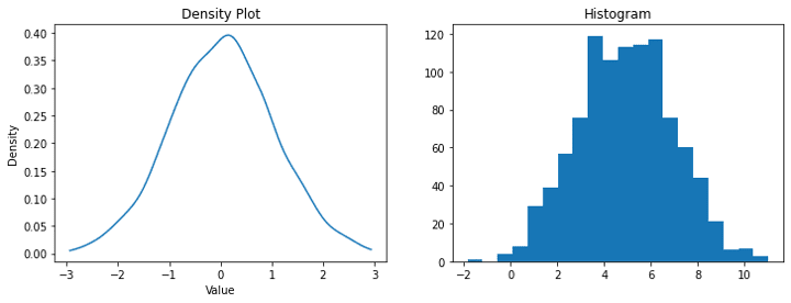
The power of density histograms lies in normalization. When using PageOn.ai's Deep Search feature, I can automatically integrate relevant statistical benchmarks, making it easy to contextualize my data against industry standards or historical patterns.
Cumulative Frequency Histograms
Cumulative frequency histograms reveal running totals, perfect for identifying percentiles at a glance. I've found them particularly useful in customer lifetime value analysis and inventory management, where understanding accumulation patterns drives strategic decisions.
Cumulative Frequency Build-Up Process
flowchart LR
                            A[Raw Data] --> B[Sort Values]
                            B --> C[Create Bins]
                            C --> D[Count Frequencies]
                            D --> E[Calculate Running Total]
                            E --> F[Plot Cumulative Histogram]

                            style A fill:#FFE5CC
                            style F fill:#FFB366
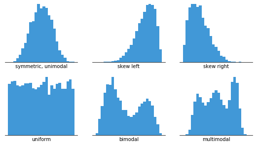
Distribution Shapes: Reading the Visual Language
Symmetric Distributions
In my quality control work, I frequently encounter bell-shaped distributions. These normal distributions appear everywhere in nature—from manufacturing tolerances to human heights. When I see a symmetric histogram, it often indicates a stable, predictable process.
Bell Curve Distribution Example
Uniform distributions, where all ranges have similar frequencies, often indicate randomness or equal probability across outcomes. I've seen these in random sampling exercises and fair dice rolls.
Skewed Distributions
Skewed distributions tell fascinating stories. Right-skewed data, with a long tail extending to higher values, appears in income distributions, response times, and failure rates. I always look for these patterns because they often indicate natural limits or rare but extreme events.
Right-Skewed (Positive)
- • Income distributions
- • City populations
- • Insurance claims
- • Website visit durations
Left-Skewed (Negative)
- • Test scores with ceiling effects
- • Age at retirement
- • Product failure times
- • Customer satisfaction scores
Identifying outliers in skewed data requires careful attention. I use PageOn.ai's intelligent layout suggestions to highlight these anomalies without letting them dominate the visualization.
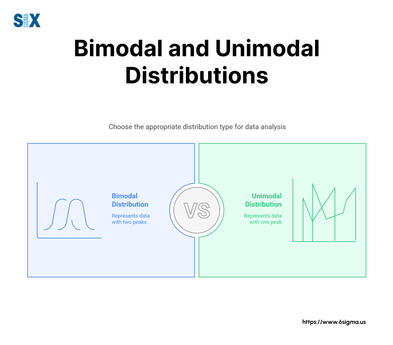
Multimodal Distributions
Bimodal patterns are like detective stories—they reveal hidden subgroups within your data. I once analyzed customer purchase times and discovered two distinct peaks: lunch-hour mobile shoppers and evening desktop users. This insight completely changed our marketing strategy.
When working with multimodal distributions, PageOn.ai's Agentic features automatically highlight multiple peaks and their significance, making it easy to identify and communicate these complex patterns to stakeholders.
Advanced Histogram Variations for Specialized Analysis
Comparative Histograms
Comparative histograms have revolutionized how I present demographic data. Back-to-back histograms, like population pyramids, elegantly show age and gender distributions simultaneously. For time-series comparisons, I prefer small multiples—they reveal trends that single histograms miss.
Comparative Histogram Techniques
flowchart TD
                            A[Comparative Histograms] --> B[Back-to-Back]
                            A --> C[Overlapping]
                            A --> D[Small Multiples]
                            A --> E[Animated]

                            B --> B1[Population Pyramids]
                            C --> C1[Transparency Layers]
                            D --> D1[Time Series Grids]
                            E --> E1[Temporal Changes]

                            style A fill:#FF8000
                            style B fill:#FFE5CC
                            style C fill:#FFE5CC
                            style D fill:#FFE5CC
                            style E fill:#FFE5CC
Using PageOn.ai's AI Blocks, I can create synchronized comparative views effortlessly. The platform automatically aligns scales and maintains consistent binning across multiple histograms, ensuring valid comparisons.
2D and 3D Histograms
When dealing with two continuous variables, hexagonal binning has become my go-to solution for large datasets. It handles overplotting elegantly and reveals density patterns that scatter plots obscure. I've used this technique extensively in geographic data analysis and customer behavior mapping.
⚠️ Caution with 3D:
While 3D histograms look impressive, they often sacrifice clarity for aesthetics. I only use them when the third dimension adds genuine insight, not just visual appeal.
Interactive and Dynamic Histograms
Interactive histograms transform passive viewers into active explorers. Variable bin width adjustments let users discover patterns at different granularities. I've implemented drill-down capabilities that reveal individual data points within bins, perfect for investigating outliers or verifying data quality.
Real-time updates with streaming data bring histograms to life. In monitoring applications, I've watched distributions shift as new data arrives, providing immediate insight into process changes or anomalies.
Industry-Specific Applications and Best Practices
Financial Services
In finance, histograms are indispensable for risk analysis. I use Value at Risk (VaR) histograms to visualize potential losses across different confidence levels. Portfolio return distributions reveal not just average performance but the full spectrum of outcomes—crucial for setting realistic expectations with clients.
Portfolio Returns Distribution
For fraud detection, transaction amount histograms reveal unusual patterns. Legitimate transactions typically follow predictable distributions—deviations often signal fraudulent activity.
Healthcare and Life Sciences
Healthcare data demands careful visualization. Patient outcome distributions help identify treatment efficacy across populations. I've used histograms to visualize clinical trial results, making complex statistical findings accessible to medical professionals and regulators alike.
Epidemiological data patterns become clear through well-designed histograms. During public health monitoring, age distribution histograms reveal vulnerable populations, while symptom onset distributions help track disease progression.
PageOn.ai's Vibe Creation feature helps me transform medical data into accessible visuals that respect both scientific accuracy and patient privacy requirements.
Manufacturing and Quality Control
Process capability histograms are the backbone of Six Sigma initiatives. I analyze thousands of measurements to ensure processes stay within specification limits. These histograms immediately reveal whether a process is centered, spread appropriately, and capable of meeting requirements.
✅ Best Practice:
Always overlay specification limits on manufacturing histograms. This visual reference instantly shows whether your process meets requirements and where improvements are needed.
Equipment performance monitoring through histograms enables predictive maintenance. By tracking vibration frequencies or temperature distributions over time, I can identify degradation patterns before failures occur.
Technical Considerations and Optimization
Bin Width Selection Strategies
Choosing the right bin width can make or break your histogram. I've learned that Sturges' rule works well for small datasets, while the Freedman-Diaconis rule handles outliers better. Here's my practical guide:
| Rule | Best For | Formula |
|---|---|---|
| Sturges' Rule | Small, normal data | k = ⌈log₂n + 1⌉ |
| Scott's Rule | Normal distributions | h = 3.5σ/n^(1/3) |
| Freedman-Diaconis | Robust to outliers | h = 2×IQR/n^(1/3) |
PageOn.ai's intelligent suggestions experiment with different binning strategies automatically, showing me multiple options so I can choose the most revealing representation for my specific data and audience.
Handling Special Cases
Outliers pose a constant challenge. I've developed a strategy: first, create a histogram with all data to understand the full picture, then create a focused view excluding extreme outliers for detailed analysis of the main distribution. Always document what's excluded and why.
For highly skewed or heavy-tailed distributions, I often combine histograms with box plots. This dual approach provides both the detailed distribution shape and robust summary statistics, giving viewers multiple perspectives on the same data.
Color and Design Principles
Color should enhance understanding, not distract. I use a single color for most histograms, reserving color variation for highlighting specific ranges or thresholds. For comparative histograms, I ensure sufficient contrast while maintaining accessibility for color-blind viewers.
Primary
#FF8000
Comparison
#3B82F6
Success
#10B981
Alert
#EF4444
PageOn.ai's design intelligence automatically applies these principles, creating publication-ready histograms that balance information density with visual clarity.
From Data to Decision: Actionable Insights
Statistical Inference from Visual Patterns
Histograms reveal whether data meets assumptions for parametric tests. When I see a roughly bell-shaped distribution, I know t-tests and ANOVA are appropriate. Skewed distributions signal the need for transformations or non-parametric alternatives.
Data quality issues jump out from histograms. Unexpected gaps might indicate measurement errors, while suspicious spikes often reveal data entry mistakes or rounding artifacts. I've caught countless errors this way that summary statistics would have hidden.
Statistical Test Selection Based on Distribution
flowchart TD
                            A[Examine Histogram] --> B{Distribution Shape?}
                            B -->|Normal| C[Parametric Tests]
                            B -->|Skewed| D[Transform or Non-parametric]
                            B -->|Bimodal| E[Investigate Subgroups]

                            C --> C1[t-test]
                            C --> C2[ANOVA]
                            C --> C3[Linear Regression]

                            D --> D1[Log Transform]
                            D --> D2[Mann-Whitney U]
                            D --> D3[Kruskal-Wallis]

                            E --> E1[Separate Analyses]
                            E --> E2[Mixture Models]

                            style A fill:#FF8000
                            style B fill:#FFE5CC
Combining Histograms with Other Visualizations
I've found that histograms work best as part of a visualization ensemble. Pairing them with scatter plot matrices creates comprehensive exploratory data analysis dashboards. For executive reporting, I combine histograms with KPI cards and trend lines to tell complete stories.
Storytelling with histogram sequences showing change over time can be incredibly powerful. I once presented quarterly customer satisfaction distributions, revealing how a new initiative gradually shifted the entire distribution rightward—a success story that a simple average would have undersold.
Building these integrated visual narratives becomes effortless with PageOn.ai's block-based approach. I can combine different data visualization charts seamlessly, ensuring consistent styling and interactive behaviors across all components.
Common Pitfalls and How to Avoid Them
The most dangerous pitfall I see is misleading bin boundaries. Arbitrary cutoffs can create or hide patterns. I always test multiple binning strategies and document my choices. When presenting to stakeholders, I explain why I chose specific bin widths.
⚠️ Critical Mistakes to Avoid:
- • Over-interpreting patterns in small samples (n < 30)
- • Confusing frequency with probability without proper scaling
- • Using too many bins that create noise rather than insight
- • Ignoring the impact of outliers on bin width calculations
- • Comparing histograms with different bin widths or scales
PageOn.ai's Agentic features help validate and refine histogram choices, flagging potential issues and suggesting improvements based on best practices and your specific data characteristics.
Transform Your Visual Expressions with PageOn.ai
Ready to create stunning histogram visualizations that turn complex distributions into clear insights? PageOn.ai's intelligent blocks and AI-powered features make professional data visualization accessible to everyone. From automatic bin optimization to interactive comparisons, discover how our platform can elevate your data storytelling.
Start Creating with PageOn.ai TodayYour Journey with Histogram Mastery
Throughout my career working with data, I've seen how the right histogram can transform confusion into clarity, turning overwhelming datasets into actionable insights. Whether you're analyzing financial returns, monitoring manufacturing processes, or exploring customer behaviors, understanding different types of diagrams and when to use each histogram variation empowers you to tell more compelling data stories.
Remember, histograms aren't just about displaying data—they're about revealing truths hidden within numbers. Each distribution shape tells a story, each outlier raises a question, and each pattern suggests an opportunity. With modern tools like PageOn.ai, creating professional, insightful histograms is no longer the exclusive domain of data scientists.
As you continue your data visualization journey, experiment with different histogram types. Try horizontal bar charts for categorical comparisons, explore scattergraph vs quadrant charts for correlation analysis, but always return to histograms when you need to understand the fundamental distribution of your data.
🎯 Key Takeaway:
The power of histograms lies not in their complexity, but in their ability to make the complex simple. Choose the right type, optimize your bins thoughtfully, and always remember your audience. With these principles and the right tools, you're ready to transform any dataset into visual insights that drive better decisions.
Start exploring your data through the lens of histograms today. Whether you're working with a handful of measurements or millions of data points, the right histogram visualization awaits—and with it, the insights that will shape tomorrow's decisions.
You Might Also Like
Mastering Object Animations: Transform Static Slides into Engaging Visual Stories
Learn how to enhance your presentations with dynamic object animations. Discover techniques for entrance effects, motion paths, interactive elements, and more for PowerPoint and Google Slides.
Creating Dynamic LLM Comparison Presentations with Model Context Protocol | Visual Guide
Learn how to build effective LLM comparison presentations using Model Context Protocol. Explore visualization techniques, decision frameworks, and implementation roadmaps with PageOn.ai.
Mastering Custom Image Creation with Gemini AI in Google Slides | Visual Revolution
Learn how to create stunning custom images with Gemini AI in Google Slides. Step-by-step guide to transform your presentations with AI-generated visuals for maximum impact.
Streamlining AI Integration: How MCP Transforms the N×N Challenge into a Manageable Solution
Discover how the Model Context Protocol (MCP) solves the complex N×N integration challenge in AI ecosystems, transforming it into a simpler N+N equation for enterprise AI adoption.