Building a Cohesive Visual Brand Identity
From Strategic Foundations to Successful Implementation
In today's visually saturated marketplace, a strong brand identity isn't just nice to have—it's essential. I've found that the most successful brands create cohesive visual systems that communicate their values and personality across every touchpoint, building recognition and fostering emotional connections with their audience.
The Foundation of Visual Brand Design
I've learned that visual branding goes far beyond just having a nice logo. It encompasses all visual elements that represent your business—from logos and typography to imagery and color schemes. These elements don't exist in isolation; they work together to create a cohesive look and feel that communicates your brand's personality to the world.
                    flowchart TD
                        A[Visual Brand Identity] --> B[Brand Personality]
                        A --> C[Market Positioning]
                        A --> D[Brand Recognition]
                        A --> E[Brand Values]

                        B --> F[Emotional Connection]
                        C --> G[Premium vs Budget]
                        D --> H[Memorability]
                        E --> I[Mission & Vision]

                        style A fill:#FF8000,stroke:#333,stroke-width:2px
                        style B fill:#FFD580,stroke:#333,stroke-width:1px
                        style C fill:#FFD580,stroke:#333,stroke-width:1px
                        style D fill:#FFD580,stroke:#333,stroke-width:1px
                        style E fill:#FFD580,stroke:#333,stroke-width:1px
The multi-faceted purpose of visual brand identity
A strong visual brand serves multiple critical purposes:
- It conveys your brand personality and creates emotional connections with your audience
- It establishes your market positioning, signaling whether you're a premium or budget-friendly option
- It builds recognition and memorability in a crowded marketplace
- It reinforces your brand's values, mission, and overall identity
In my experience, effective visual branding requires a deep understanding of both design principles and brand strategy. It's about finding that perfect intersection between aesthetic appeal and strategic communication.
When developing your visual brand foundation, I recommend starting with a clear articulation of your brand's core values and personality traits. These will serve as guiding principles for all visual decisions. Tools like PageOn.ai can help translate your brand vision into clear visual components by organizing your brand elements into cohesive structures that align with your strategic objectives.
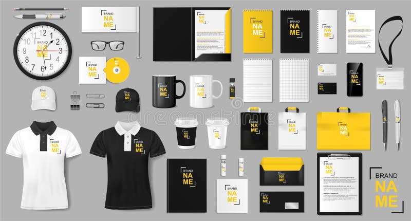
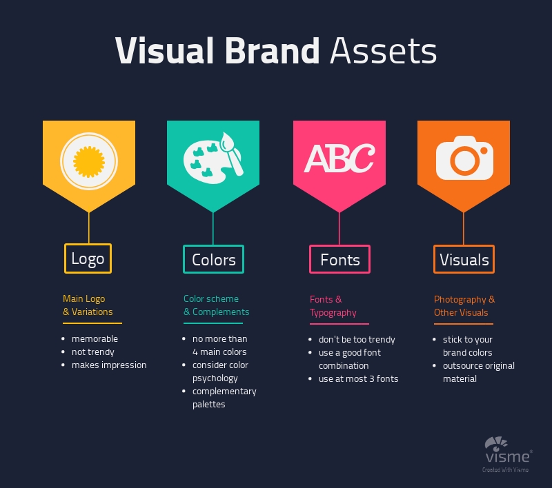
Core Elements of Visual Brand Identity
I've found that a comprehensive visual brand identity consists of several interconnected elements. Each component plays a specific role in communicating your brand's personality and values.

The four pillars of visual brand identity
Logo Design
Your logo is the centerpiece of your visual identity. I've seen how a well-designed logo can become the face of a brand, instantly recognizable and capable of communicating your brand's essence at a glance.
- It must work across multiple platforms and sizes—from a tiny favicon to a billboard
- It should be distinctive enough to stand out from competitors
- Consider scalability, versatility, and memorability in your design process
When developing logo concepts, I like to start by identifying the key attributes my brand wants to communicate. PageOn.ai's visualization tools can help generate structured variations based on these brand values, allowing you to see how different approaches might resonate with your audience.
Color Psychology and Palette Development
Color is perhaps the most emotionally evocative element of your visual brand. Each color carries specific psychological associations that can significantly impact how your brand is perceived.
Color psychology impact on brand perception
When developing your color palette, I recommend considering:
- Primary colors that reflect your core brand personality
- Secondary colors that complement and support your primary palette
- Accent colors for highlighting calls-to-action and important elements
- Color harmony principles to ensure visual appeal
PageOn.ai's AI Blocks feature is particularly helpful for experimenting with different color combinations and visualizing their impact on various brand materials before finalizing your palette.
Typography System
Typography plays a crucial role in communicating your brand's personality. The fonts you choose can convey attributes ranging from traditional and trustworthy to modern and innovative.
Serif Fonts
Traditional, reliable, authoritative
Ideal for: Law firms, financial institutions, luxury brands
Sans-Serif Fonts
Modern, clean, approachable
Ideal for: Tech companies, startups, healthcare
Monospaced Fonts
Technical, precise, functional
Ideal for: Coding platforms, engineering firms
Display Fonts
Creative, distinctive, expressive
Ideal for: Entertainment, food, children's brands
When establishing your typography system, consider:
- Selecting fonts that reflect your brand's personality
- Establishing a clear hierarchy through font weights and sizes
- Ensuring readability across digital and print applications
- Developing font pairing strategies for complementary combinations
I've found that PageOn.ai can help integrate your typography system into various content formats while maintaining brand consistency, which is essential for a cohesive visual identity.
Visual Elements and Imagery
Beyond logo, color, and typography, your visual brand identity includes additional elements that create a complete visual language.

Extended visual language components
These extended elements include:
- Photography style and treatment (lighting, subjects, composition)
- Illustration and iconography systems
- Patterns and textures that can be used as backgrounds or accents
- Composition principles and grid systems to organize content
Finding and creating visuals that consistently align with your brand identity can be challenging. I've used PageOn.ai's Deep Search feature to discover and integrate on-brand visuals that perfectly align with established identity guidelines, saving significant time in the design process.
From Theory to Application: Implementing Your Visual Brand
Having a beautiful visual brand concept is just the beginning. The real challenge lies in implementing it consistently across all touchpoints. In my experience, this requires clear documentation and systems.
                    flowchart TD
                        A[Brand Guidelines] --> B[Logo Usage]
                        A --> C[Color Specifications]
                        A --> D[Typography Rules]
                        A --> E[Visual Elements]
                        A --> F[Application Examples]

                        B --> B1[Size Requirements]
                        B --> B2[Clear Space Rules]
                        B --> B3[Variations]

                        C --> C1[RGB Values]
                        C --> C2[CMYK Values]
                        C --> C3[HEX Codes]
                        C --> C4[Pantone References]

                        D --> D1[Font Families]
                        D --> D2[Hierarchies]
                        D --> D3[Spacing Standards]

                        E --> E1[Photography Style]
                        E --> E2[Iconography]
                        E --> E3[Patterns & Textures]

                        F --> F1[Digital Applications]
                        F --> F2[Print Materials]
                        F --> F3[Environmental Design]

                        style A fill:#FF8000,stroke:#333,stroke-width:2px
Comprehensive brand guidelines structure
Creating comprehensive brand guidelines is essential for maintaining consistency. These guidelines should include:
- Detailed rules for logo usage, including minimum sizes, clear space requirements, and approved variations
- Color specifications in all relevant formats (RGB, CMYK, HEX, Pantone) for consistent reproduction
- Typography hierarchies and spacing standards for different applications
- Examples of proper and improper usage to clarify expectations
I've found that the most effective brand guidelines go beyond theory to include practical templates for common applications. This makes it easier for team members and external partners to implement the brand correctly.

Example of logo usage guidelines from a brand manual
While written guidelines are essential, I've discovered that visual examples are even more powerful for ensuring proper implementation. PageOn.ai's Vibe Creation feature has been invaluable for transforming abstract guidelines into concrete visual examples that clearly demonstrate how the brand should look in various contexts.
Visual Brand Design Across Touchpoints
A truly effective visual brand must maintain consistency while adapting appropriately to different contexts and platforms. Each touchpoint presents unique challenges and opportunities for brand expression.
Brand impact potential across different touchpoints
Let's explore how visual brand identity adapts across key touchpoints:
Digital Presence
Your digital presence is often the first point of contact for potential customers. I've found that digital applications require special consideration for responsive design and interactive elements.
- Website design that embodies your brand personality while maintaining usability
- Social media templates that maintain brand consistency while optimized for each platform
- Email marketing designs that extend your visual language to subscriber inboxes
Print Materials
Despite our digital world, physical materials still play an important role in brand perception. Print materials offer tactile experiences that can enhance brand value.
- Business cards that make a memorable first impression
- Letterheads and stationery that convey professionalism
- Brochures and sales materials that showcase your offerings
Environmental Applications
Physical spaces present three-dimensional opportunities to immerse people in your brand experience.
- Signage that guides and reinforces brand recognition
- Office design that reflects your company culture
- Retail spaces that create immersive brand experiences
Product Packaging
For product-based businesses, packaging is a crucial touchpoint that can significantly influence purchasing decisions.
- Package design that stands out on shelves
- Unboxing experiences that delight customers
- Sustainable packaging options that align with brand values
Consistent visual brand identity across multiple touchpoints
Maintaining visual consistency across these diverse touchpoints can be challenging. I've used PageOn.ai to visualize how brand identity translates across different contexts, allowing me to identify potential inconsistencies before implementation. This helps ensure that the brand experience remains cohesive regardless of where customers encounter it.
Building a Memorable Visual Identity
Creating a visual brand that sticks in people's minds requires strategic thinking and attention to several key principles. In my experience, memorability comes from the perfect balance of consistency, distinctiveness, and emotional resonance.
Consistency as the Key to Recognition
I've observed that the most recognizable brands maintain unwavering consistency in their visual presentation. When elements appear consistently across touchpoints, they become imprinted in the consumer's mind, leading to instant recognition even from small fragments of your visual identity.
Consistency Checklist:
- Are your brand colors used consistently across all materials?
- Is your typography system applied correctly in all communications?
- Do your visual elements maintain the same style and treatment?
- Is your logo presented according to guidelines everywhere it appears?
Balancing Distinctiveness with Appropriateness
Standing out is crucial, but I've learned that distinctiveness must be balanced with appropriateness for your industry. The most effective visual brands find ways to be unique while still meeting audience expectations for their category.
%20(1).png?width=650&name=Color%20Psych-03%20(1)%20(1).png)
Balancing distinctiveness with industry appropriateness
Creating Visual Systems that Evolve
The most enduring visual brands are those that can evolve without losing their core identity. I recommend developing flexible systems rather than rigid rules, allowing your visual brand to stay fresh while maintaining recognition.
Developing a Visual Language that Supports Your Story
Every brand has a story, and your visual elements should help tell it. I've found that when visual design reinforces narrative, the brand becomes more memorable and meaningful to audiences.
Creating a memorable visual identity is both art and science. PageOn.ai has been a valuable tool for maintaining consistency while exploring creative variations that keep visual brands fresh and engaging. Its ability to visualize different iterations while preserving core brand elements helps strike that perfect balance between consistency and evolution.
Measuring Visual Brand Effectiveness
How do you know if your visual brand is working? In my experience, measuring effectiveness requires both qualitative and quantitative approaches. Let's explore the methods I've found most valuable for evaluating visual brand performance.
Recognition Testing Methodologies
Recognition is a fundamental measure of visual brand success. Several methodologies can help gauge how well your audience recognizes your brand elements:
- Logo recognition tests (showing partial or modified logos)
- Color association studies (linking brand colors to company names)
- Visual asset attribution (identifying which visuals belong to which brands)
Emotional Response Evaluation
Beyond recognition, effective visual brands evoke specific emotional responses. Methods to evaluate this include:
- Sentiment analysis of responses to visual brand elements
- Emotional association mapping
- Qualitative interviews about brand perception
Brand perception gap analysis
Competitive Visual Audits
Understanding how your visual brand performs relative to competitors provides valuable context:
- Comparative analysis of visual brand elements
- Positioning maps based on visual attributes
- Share-of-eye measurements in competitive contexts
Brand Perception Studies
Comprehensive brand perception studies can reveal how your visual identity contributes to overall brand perception:
- Brand attribute association tests
- Visual preference studies
- Before-and-after testing for rebranding initiatives
Data visualization is crucial for understanding and communicating brand performance metrics. I've used PageOn.ai to create visual presentations of brand performance data and insights, making complex information accessible to stakeholders and decision-makers. These visualizations help identify gaps between target and actual brand perception, guiding refinements to visual brand elements.
Case Studies: Successful Visual Brand Systems
Learning from successful visual branding examples provides valuable insights. I've analyzed several brands with particularly effective visual identities to understand what makes them work so well.
Analysis of Iconic Visual Brand Systems
Google's visual brand system exemplifies simplicity and flexibility. Their playful, colorful approach maintains recognition while allowing for creative expression through variations.
Key strength: Adaptable system that maintains recognition through color and simplified forms
Apple
Apple's minimalist visual identity creates a premium feel through white space, clean typography, and restrained use of color. Their visual system emphasizes product as hero.
Key strength: Consistency and simplicity that creates a premium, sophisticated brand experience
Nike
Nike's visual system revolves around their iconic swoosh symbol, dynamic imagery, and bold typography. Their visual language communicates motion and athletic performance.
Key strength: Symbol recognition and emotional connection through aspirational visual storytelling

Evolution of iconic brand visual systems over time
Examination of Successful Rebranding Efforts
Rebranding provides particularly instructive case studies, as they show how brands evolve while maintaining recognition:
| Brand | Rebranding Year | Key Visual Changes | Success Factors |
|---|---|---|---|
| Airbnb | 2014 | Introduction of the "Bélo" symbol, new coral color, custom typography | Symbol with meaning (belonging), distinctive color, comprehensive system |
| Mastercard | 2016 | Simplified overlapping circles, removal of wordmark in many applications | Evolution not revolution, leveraging iconic elements, digital optimization |
| Slack | 2019 | Simplified logo, refined color palette, custom typeface | Maintained brand recognition while solving technical limitations |
Industry-Specific Visual Branding Considerations
Different industries have unique visual branding requirements and conventions:
Technology
- Clean, minimal aesthetics
- Forward-looking visual language
- Abstract symbolism
- Vibrant color palettes
Finance
- Conservative color schemes (blues, greens)
- Traditional typography
- Symbols of stability and security
- Restrained visual expression
Food & Beverage
- Appetizing color palettes
- Warm, inviting visuals
- Emphasis on product photography
- Nostalgic or artisanal elements
Healthcare
- Clean, clinical aesthetics
- Soothing color palettes
- Human-centered imagery
- Clear, accessible typography
Analyzing these case studies reveals patterns of successful visual branding that can be applied to your own brand development. PageOn.ai has been invaluable for visualizing these case studies by structuring the information into clear, compelling visual narratives that highlight key lessons and applications.
Creating Your Visual Brand Strategy with Modern Tools
Today's visual branding landscape benefits from innovative approaches and tools that can enhance both the strategic development and practical implementation of your visual identity.
Leveraging Visual Storytelling for Emotional Connection
I've found that incorporating visual personal brand story approaches creates deeper emotional connections with audiences. By visually expressing your brand's journey, values, and purpose, you create a narrative that resonates on a human level.
                    flowchart TD
                        A[Brand Story] --> B[Brand Values]
                        A --> C[Brand Purpose]
                        A --> D[Brand History]

                        B --> E[Visual Expression of Values]
                        C --> F[Visual Expression of Purpose]
                        D --> G[Visual Expression of Heritage]

                        E --> H[Emotional Connection]
                        F --> H
                        G --> H

                        H --> I[Brand Loyalty]
                        H --> J[Brand Advocacy]
                        H --> K[Brand Recognition]

                        style A fill:#FF8000,stroke:#333,stroke-width:2px
                        style H fill:#FF8000,stroke:#333,stroke-width:2px
How visual storytelling builds emotional connection
Incorporating Principles of Visual Communication Design
Understanding fundamental visual communication design principles helps create brand visuals that effectively convey your intended message. These principles include:
- Visual hierarchy to guide attention
- Contrast to create focus and interest
- Balance to create harmony and stability
- Unity to ensure cohesive visual presentation
- Gestalt principles for organizing visual elements
Adapting Visual Advertising Techniques
Modern visual advertising techniques offer valuable approaches for creating memorable brand visuals. These techniques focus on:
- Creating visual impact through unexpected elements
- Using visual metaphors to communicate abstract concepts
- Employing color psychology to trigger specific emotions
- Developing visual shortcuts that communicate quickly
Visual advertising techniques applied to brand design
Understanding Visual Communication in Media Design
Developing a comprehensive visual communication in media design approach ensures your brand maintains consistency across increasingly diverse media channels. This includes:
- Responsive design principles for digital applications
- Animation guidelines for motion-based media
- Sound design integration for multimedia experiences
- Interactive element standards for engagement
Following the Commandments of Visual Communication
The commandments of visual communication for designers provide essential guidelines for creating effective brand visuals:
1-5
- Clarity before creativity
- Know your audience
- Establish clear visual hierarchy
- Maintain consistency
- Embrace white space
6-10
- Use color with purpose
- Typography must serve readability
- Test across all platforms
- Simplify whenever possible
- Design for inclusivity
Using AI Tools for Visual Brand Development
Modern AI tools are transforming how visual brands are developed and implemented. These tools can:
- Generate visual concepts based on brand attributes
- Create consistent visual assets across platforms
- Analyze visual brand performance
- Ensure brand consistency at scale
PageOn.ai's agentic capabilities have been particularly valuable in transforming abstract brand concepts into tangible visual assets. By organizing and structuring brand information, PageOn.ai helps create visual systems that communicate your unique identity clearly and consistently across all touchpoints.
Transform Your Visual Brand Expression with PageOn.ai
Ready to create a cohesive visual brand that resonates with your audience? PageOn.ai helps you organize, visualize, and implement your brand identity with powerful AI-driven tools that bring clarity to your visual communication.
Start Creating with PageOn.ai TodayBringing It All Together
Creating a cohesive visual brand identity is both an art and a science. It requires strategic thinking, creative execution, and consistent implementation across all touchpoints. By understanding the core elements of visual branding and following established principles, you can develop a visual identity that effectively communicates your brand's personality and values.
Remember that your visual brand is not static—it should evolve as your business grows and as design trends change. However, this evolution should maintain the core elements that make your brand recognizable and meaningful to your audience.
With the right tools and approach, you can create a visual brand identity that not only looks beautiful but also works strategically to build recognition, trust, and emotional connection with your audience. Tools like PageOn.ai can help simplify this process by providing structured ways to organize and visualize your brand elements, ensuring consistency while allowing for creative expression.
You Might Also Like
Beyond "Today I'm Going to Talk About": Creating Memorable Presentation Openings
Transform your presentation openings from forgettable to captivating. Learn psychological techniques, avoid common pitfalls, and discover high-impact alternatives to the 'Today I'm going to talk about' trap.
From Slides to Stories: Transform Presentations into Purpose-Driven Visual Experiences
Discover how to move beyond traditional PowerPoint presentations to create purpose-driven visual experiences that engage audiences, drive action, and leave lasting impact.
Mastering Workplace Communication with International Phonetic Alphabet (IPA) - Visual Guide
Discover how the International Phonetic Alphabet transforms workplace communication. Learn visual approaches to implement IPA for clearer global business interactions.
Visualizing Fluency: Transform English Learning for Non-Native Speakers | PageOn.ai
Discover innovative visual strategies to enhance English fluency for non-native speakers. Learn how to transform abstract language concepts into clear visual frameworks using PageOn.ai.