Understanding Histograms: Transform Raw Data into Visual Insights
Making Sense of Data Distribution
When I first encountered a massive dataset of customer purchase amounts, I was overwhelmed by thousands of numbers. Then I discovered histograms - a powerful visualization tool that transformed those numbers into clear patterns, revealing insights about spending behaviors that would have remained hidden in raw data.
Introduction: Making Sense of Data Distribution
When I work with data, one of my first challenges is understanding how values are distributed. A histogram is more than just a chart - it's a powerful statistical tool that reveals the underlying patterns in continuous data. Unlike simple lists of numbers, histograms transform raw data into visual stories that immediately communicate frequency distributions, central tendencies, and data spread.
What makes histograms particularly valuable is their ability to handle continuous data - measurements that can take any value within a range. While bar charts vs histograms might seem similar at first glance, I've learned that histograms excel when dealing with numerical ranges rather than discrete categories.
In my experience across various industries, histograms have proven invaluable for quality control in manufacturing, demographic analysis in marketing, and risk assessment in finance. They're the foundation for understanding whether our data follows a normal distribution, identifying outliers, and making data-driven decisions.
Core Components and Architecture
The Building Blocks of a Histogram
Understanding histogram components is crucial for both creating and interpreting them effectively. I think of histograms as having three essential elements that work together to tell the data's story.
Bins/Intervals
Consecutive ranges that group continuous data points into meaningful categories
Frequency Axis
Vertical axis showing count or density of data points in each bin
Adjacent Bars
No gaps between bars, representing continuous nature of the data
Mathematical Foundation
The mathematics behind histograms might seem complex, but I've found that understanding a few key concepts makes all the difference. When I create a histogram, I'm essentially dividing my data range into equal-width intervals and counting how many data points fall into each interval.
Sample Data Distribution
This interactive histogram shows test scores distribution for 500 students:
When working with PageOn.ai's AI Blocks, I can structure these data ranges intelligently, automatically determining optimal bin sizes based on the dataset's characteristics. This ensures that my histograms reveal meaningful patterns rather than creating noise or oversimplification.
Creating Effective Histograms: Step-by-Step Process
Data Preparation Phase
My histogram creation process always begins with thorough data preparation. I've learned that the quality of the histogram directly depends on how well I prepare my data. First, I collect and clean the dataset, removing any obvious errors or inconsistencies. Then, I identify the continuous variable I want to analyze - whether it's customer ages, transaction amounts, or manufacturing measurements.

One powerful technique I use is leveraging PageOn.ai's Deep Search capability to integrate relevant datasets and benchmarks. This helps me understand how my data compares to industry standards or historical patterns, providing crucial context for interpretation.
Bin Configuration Strategy
Choosing the right number and size of bins is perhaps the most critical decision in histogram creation. I've experimented with various rules of thumb:
Common Bin Selection Methods:
- • Sturges' Rule: k = ⌈log₂n + 1⌉ - Best for normal distributions
- • Square-root choice: k = ⌈√n⌉ - Simple and effective for most datasets
- • Freedman-Diaconis rule: Bin width = 2×IQR×n^(-1/3) - Resistant to outliers
Histogram Creation Workflow
My systematic approach to creating effective histograms:
flowchart TD
                        A[Collect Raw Data] --> B["Clean & Validate"]
                        B --> C[Determine Data Range]
                        C --> D[Select Bin Strategy]
                        D --> E[Calculate Bin Width]
                        E --> F[Count Frequencies]
                        F --> G[Create Visualization]
                        G --> H["Add Labels & Context"]
                        H --> I[Interpret Patterns]
Using PageOn.ai's Vibe Creation feature, I can experiment with different bin configurations visually, instantly seeing how changes affect the histogram's shape and the patterns it reveals. This interactive approach has saved me countless hours of trial and error.
Interpreting Histogram Patterns and Shapes
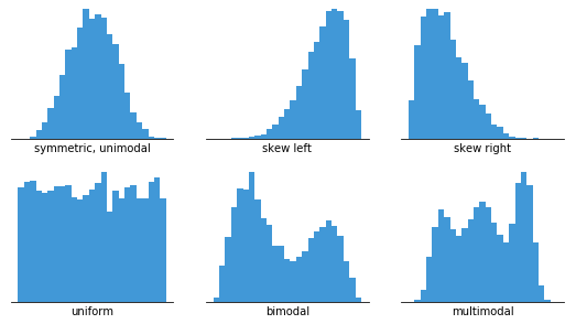
Common Distribution Types
Over the years, I've learned to recognize distinct histogram shapes that tell different stories about the underlying data. Each pattern provides unique insights into the process or population being studied.
Distribution Pattern Comparison
Frequency characteristics of different distribution types:
Bell-Shaped (Normal)
Single peak with symmetric tails, indicating a natural process with random variation around a central value.
Skewed Distributions
Asymmetric with a longer tail on one side, often indicating natural limits or multiplicative processes.
Bimodal
Two distinct peaks suggesting two different groups or processes mixed in the data.
Uniform
Equal frequencies across all bins, indicating random distribution without preference.
Statistical Insights from Visual Patterns
When I analyze a histogram, I look for several key features that reveal important statistical properties. The location of the peak tells me about the central tendency, while the spread indicates variability. Gaps in the distribution might suggest data collection issues or natural boundaries in the process.
I've found that using PageOn.ai's Agentic processes can automatically identify and highlight these key patterns, making it easier to spot outliers, clusters, and other significant features that might otherwise be overlooked in manual analysis.
Practical Applications Across Industries
Business and Finance
In my work with financial data, histograms have become indispensable for understanding customer behavior and risk profiles. I regularly use them to analyze transaction amounts, revealing spending patterns that inform marketing strategies and fraud detection systems.

For instance, when analyzing customer age demographics, a histogram immediately shows whether we're serving primarily younger or older customers, and whether there are underserved age groups we should target. I create dynamic dashboards with PageOn.ai that track these distribution changes over time, allowing stakeholders to spot trends as they emerge.
Healthcare and Research
Healthcare applications of histograms have shown me their life-saving potential. When analyzing patient wait times, treatment durations, or test results, histograms reveal patterns that can improve patient care and operational efficiency.
Healthcare Histogram Applications:
- • Emergency room wait time distributions to optimize staffing
- • Blood pressure readings across patient populations
- • Treatment response times in clinical trials
- • Lab test result distributions for establishing normal ranges
Using PageOn.ai's specialized healthcare templates, I can visualize complex medical data patterns while maintaining HIPAA compliance and ensuring that sensitive information is properly protected.
Manufacturing and Quality Control
In manufacturing, histograms are the backbone of statistical process control. I use them to monitor product measurements, ensuring they stay within specification limits and identifying when a process is drifting out of control.
Manufacturing Quality Control
Product dimension measurements showing process capability:
By building quality control reports with integrated histograms using PageOn.ai's AI Blocks, I can automatically flag when measurements start trending toward specification limits, preventing defects before they occur.
Advanced Techniques and Considerations
Choosing Between Histogram Alternatives
While histograms are powerful, I've learned when other visualizations might be more appropriate. Understanding these alternatives helps me choose the best tool for each analytical challenge.
| Visualization Type | Best Use Case | Key Advantage |
|---|---|---|
| Histogram | Single continuous variable distribution | Shows frequency and shape clearly |
| Box Plot | Comparing multiple distributions | Compact summary with quartiles |
| Density Curve | Smooth distribution estimation | No binning artifacts |
| Violin Plot | Distribution + summary statistics | Combines box plot with density |
When integrating multiple data visualization charts types in PageOn.ai, I can create comprehensive dashboards that leverage each visualization's strengths.
Common Pitfalls and How to Avoid Them
Through experience, I've encountered several common histogram mistakes that can mislead viewers or hide important patterns:
Critical Mistakes to Avoid:
-
⚠️
Wrong bin size: Too many bins create noise; too few hide patterns. I always test multiple configurations.
-
⚠️
Using with categorical data: Histograms are for continuous data. For categories, I use bar charts instead.
-
⚠️
Ignoring outliers: Extreme values can distort the scale. I consider whether to include or analyze them separately.
-
⚠️
Non-zero baseline: Always start the y-axis at zero to avoid misrepresenting frequencies.
Using PageOn.ai's AI guidance helps me avoid these visualization mistakes by providing real-time feedback on histogram design choices and suggesting improvements based on best practices.
Digital Tools and Automation
Modern tools have revolutionized how I create and analyze histograms. From simple Excel charts to sophisticated Python libraries, each tool offers unique capabilities:
Histogram Tool Selection Guide
Choosing the right tool based on your needs:
flowchart TD
                        A[Need Histogram?] --> B{Data Size?}
                        B -->|Small <1000| C[Excel/Sheets]
                        B -->|Medium 1K-100K| D[Tableau/PowerBI]
                        B -->|Large >100K| E[Python/R]

                        C --> F[Quick Analysis]
                        D --> G[Interactive Dashboards]
                        E --> H[Advanced Statistics]

                        F --> I[PageOn.ai Integration]
                        G --> I
                        H --> I

                        I --> J[Automated Insights]
What excites me most is leveraging PageOn.ai's Deep Search to automatically pull and visualize data from multiple sources. This capability transforms histogram creation from a manual process into an automated insight generation system.
Making Histograms Work for Your Data Story
Throughout my journey with data visualization, histograms have proven to be one of the most versatile and insightful tools in my analytical toolkit. They transform overwhelming datasets into clear visual narratives that drive decision-making across industries.
The key to effective histogram use isn't just technical proficiency - it's understanding your audience and crafting visualizations that resonate with their needs. Whether I'm presenting to executives, engineers, or healthcare professionals, I adapt my histograms to tell the story that matters most to them.
Best Practices I Follow:
- ✓ Always provide context with clear titles and labels
- ✓ Test multiple bin configurations before finalizing
- ✓ Combine histograms with other visualizations for comprehensive analysis
- ✓ Use interactive features to allow deeper exploration
- ✓ Document assumptions and data preparation steps
By transforming complex statistical concepts into clear visual narratives with PageOn.ai's Vibe Creation, I can build comprehensive data reports that integrate histograms seamlessly with other analytical elements. This approach ensures that insights are not just discovered but effectively communicated and acted upon.
Looking ahead, I'm excited about the future of histogram analysis. AI-enhanced tools are making it possible to automatically detect patterns, suggest optimal configurations, and even predict future distributions based on historical data. These advances are democratizing data analysis, making powerful statistical tools accessible to everyone, regardless of their technical background.
Transform Your Visual Expressions with PageOn.ai
Ready to create stunning histogram visualizations that tell compelling data stories? PageOn.ai's intelligent tools make it easy to transform raw data into actionable insights with beautiful, interactive histograms and comprehensive data dashboards.
Start Creating with PageOn.ai TodayYou Might Also Like
Stock Photos in Presentations: Bringing Vibrancy and Depth to Visual Storytelling
Discover how to transform your presentations with strategic stock photography. Learn selection techniques, design integration, and visual consistency to create compelling visual narratives.
Understanding Native Multimodality: The Key to Truly Intelligent AI Systems
Explore how native multimodality powers modern AI understanding by integrating text, visual, audio, and interactive elements to create more intuitive and powerful artificial intelligence systems.
Harnessing Creative Tension: Strategic Conflict in Experience Design | PageOn.ai
Discover how to intentionally use conflict as a creative catalyst in experience design. Learn techniques for implementing productive tension that transforms friction into innovative solutions.
The Creative Edge: Harnessing Templates and Icons for Impactful Visual Design
Discover how to leverage the power of templates and icons in design to boost creativity, not restrict it. Learn best practices for iconic communication and template customization.