The Art and Science of Design and Visual Communication
Transforming Ideas into Impact
In a world where information moves at lightning speed, the power of visual communication has never been more crucial. I've found that effective design isn't just about making things look good—it's about creating meaningful connections through visual elements that transcend language barriers and speak directly to our human experience.
Foundations of Visual Communication
I've always been fascinated by how visual communication serves as a universal language. At its core, visual communication is the art of conveying messages, ideas, and information through visual elements. Unlike verbal or written communication, visuals have the unique ability to transcend language barriers through universally recognizable symbols and imagery.
The core elements that make up visual communication include typography, graphics, illustrations, photography, animation, and digital interfaces. Each of these components plays a crucial role in how we perceive and process information visually.
Core Elements of Visual Communication
The following chart shows the relative usage of different visual elements in modern communication:
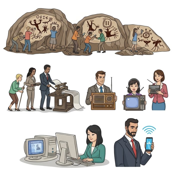
When we look at the historical evolution of visual communication, we can trace a fascinating journey from ancient cave paintings to modern digital interfaces. This evolution reflects humanity's innate reliance on visuals to share knowledge and express ideas across generations and cultures.
flowchart TB
    A[Cave Paintings] -->|40,000 BCE| B[Hieroglyphics]
    B -->|3,200 BCE| C[Alphabets]
    C -->|1,000 BCE| D[Manuscripts]
    D -->|15th Century| E[Printing Press]
    E -->|19th Century| F[Photography]
    F -->|20th Century| G[Digital Design]
    G -->|21st Century| H[AI-Assisted Design]
    style H fill:#FF8000,stroke:#333,stroke-width:1px
Today's tools like PageOn.ai's AI Blocks feature help users structure visual elements without needing to master complex design software, democratizing the creation of professional-quality visual communication.
The Fundamental Elements of Visual Design
In my experience working with visual communication design, I've found that understanding the fundamental elements is crucial for creating effective visual messages. These building blocks form the language of visual design and help structure how information is perceived.
Line, Shape, and Form

Lines, shapes, and forms serve as the fundamental building blocks of visual design. They create structure and guide the viewer's eye through the composition. Different line types convey different emotions:
- Straight lines – Suggest stability, order, and formality
- Curved lines – Evoke movement, fluidity, and organic qualities
- Thick lines – Create emphasis and boldness
- Thin lines – Suggest delicacy and precision
Space and Composition
The thoughtful use of space creates visual harmony and balance. Positive space (occupied by visual elements) and negative space (the empty areas) work together to create effective compositions. Grid systems provide organizational frameworks that help establish consistency and structure in layouts.
Grid System Structure
A visual representation of how grid systems organize content:
graph TD
    A[Grid System] --> B[Columns]
    A --> C[Rows]
    A --> D[Margins]
    A --> E[Gutters]
    B --> F[Content Alignment]
    C --> F
    D --> G[White Space Management]
    E --> G
    F --> H[Visual Hierarchy]
    G --> H
Color Theory and Psychology
Colors evoke specific emotions and have cultural associations that can significantly impact how a message is received. Understanding color theory is essential for visual communication for designers who want to create maximum impact and ensure readability.
Emotional Associations of Colors
Common emotional responses to different colors in Western cultures:
Typography and Hierarchy
Typography is not just about selecting fonts—it's about creating clear information hierarchies through strategic use of size, weight, spacing, and contrast. Effective typography guides the viewer's eye and enhances message clarity.

PageOn.ai's Deep Search functionality helps integrate relevant visual assets that align with these design principles, making it easier to create cohesive visual communications without extensive design experience.
The Science Behind Visual Communication Effectiveness
The effectiveness of visual communication isn't just about aesthetics—it's rooted in cognitive science and how our brains process information. Understanding these scientific principles can help us create more impactful visual messages.
Cognitive Processing of Visual Information
One of the most remarkable aspects of visual processing is its speed. Research has shown that the human brain processes visuals 60,000 times faster than text. This explains why we can understand the meaning of an image almost instantaneously, while reading text requires sequential processing.
Visual vs. Textual Processing Speed
Comparison of information processing speed between different formats:
Pattern recognition plays a crucial role in how we process visual information. Our brains are constantly looking for familiar patterns, shapes, and structures to make sense of what we see. This is why well-designed visuals that leverage existing mental models are more easily understood.
Attention and Memory Retention
In our information-saturated world, capturing and maintaining attention is increasingly challenging. Strategic visuals can cut through the noise and direct focus to key messages. Studies have shown that content with relevant images gets 94% more views than content without visuals.
Visual mnemonics significantly improve information recall and retention. When information is presented visually, people can remember up to 65% of it three days later, compared to only 10% for text-only information. This is why importance of visual communication cannot be overstated in educational and marketing contexts.
Simplifying Complex Information
One of the most valuable functions of visual communication is its ability to break down abstract concepts into digestible visual components. This is particularly important when communicating complex ideas, processes, or data.
Complex Concept Visualization Process
How abstract concepts are transformed into visual representations:
flowchart LR
    A[Complex Concept] --> B[Identify Core Components]
    B --> C[Determine Visual Metaphors]
    C --> D[Create Visual Hierarchy]
    D --> E[Simplify & Refine]
    E --> F[Clear Visual Output]

    style F fill:#FF8000,stroke:#333,stroke-width:1px
PageOn.ai transforms fuzzy concepts into clear visuals, helping communicate complex ideas more effectively. By leveraging cognitive principles and visual processing patterns, these tools can significantly enhance how information is received and understood.
Design Principles for Impactful Visual Communication
To create truly effective visual communication in media design, I've found that following established design principles is essential. These principles have been refined over centuries of visual arts and design practice, and they provide a framework for creating visuals that resonate with viewers.
Balance and Harmony
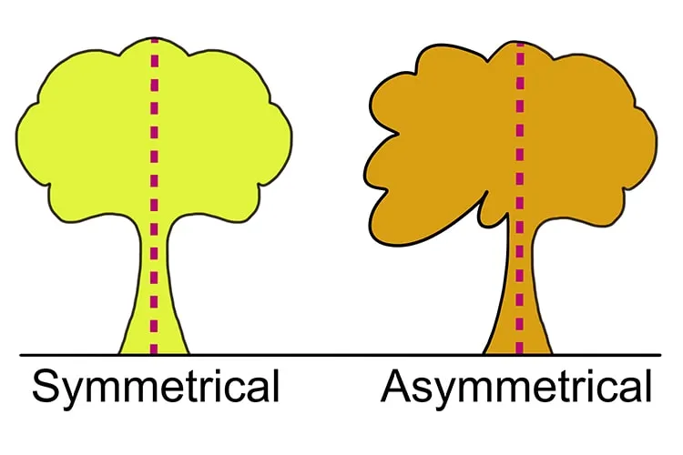
Balance in design creates a sense of equilibrium and stability. It can be achieved through:
- Symmetrical balance – Elements are evenly distributed on either side of a central axis
- Asymmetrical balance – Different elements with varying visual weights create equilibrium
- Radial balance – Elements radiate from a central point
Harmony refers to the cohesive relationships between disparate design components. When elements work together harmoniously, the overall design feels unified and complete.
Contrast and Emphasis
Contrast creates visual interest and directs attention by highlighting differences between elements. It can be achieved through variations in:
Size Contrast
Large elements contrasted with smaller ones create hierarchy and draw attention to important information.
Color Contrast
Complementary or opposing colors create visual tension and highlight key elements.
Texture Contrast
Smooth against rough textures creates tactile interest and draws the eye.
Typography Contrast
Varying font weights, styles, and sizes establishes information hierarchy.
Rhythm, Movement, and Flow
Rhythm in visual design creates a sense of movement and engagement. By establishing visual patterns through repetition, alternation, or progression, designers can guide viewers through content in a dynamic way.
Visual Flow Patterns
Common eye movement patterns in visual design:
flowchart TD
    A[Entry Point] --> B[F-Pattern]
    A --> C[Z-Pattern]
    A --> D[Circular Pattern]

    B --> E[Left-to-Right Scanning]
    B --> F[Top-to-Bottom Progression]

    C --> G[Diagonal Movement]
    C --> H[Corner-to-Corner Scanning]

    D --> I[Radial Movement]
    D --> J[Spiral Progression]

    style A fill:#FF8000,stroke:#333,stroke-width:1px
Unity and Consistency
Unity ensures that all elements in a design work together as a cohesive whole. This principle is particularly important when building visual systems that maintain brand coherence across different media and touchpoints.
PageOn.ai's Vibe Creation helps users establish consistent visual styles through conversational guidance, making it easier to maintain unity across different visual communications without extensive design expertise.
Visual Communication Across Different Media and Contexts
The principles of visual communication must be adapted to different media contexts, each with its own constraints and opportunities. I've found that understanding these nuances is essential for creating effective visual messages across platforms.
Digital Interfaces and User Experience
In digital interfaces, visual design directly influences usability and engagement. The most effective digital designs balance aesthetic appeal with functional clarity, guiding users intuitively through interactions.
Impact of Visual Elements on User Experience
How different visual factors influence key UX metrics:
Responsive design principles ensure that visual communications adapt seamlessly across devices with different screen sizes. This approach recognizes that users interact with content on everything from large desktop monitors to small smartphone screens.
Print and Environmental Design
Despite the digital revolution, print design remains a vital medium for visual communication. Print materials offer tactile experiences that digital media cannot replicate, and they exist in physical spaces rather than virtual ones.
Environmental design extends visual communication into three-dimensional spaces, creating immersive experiences through signage, wayfinding systems, exhibitions, and architectural elements. These applications must consider how people move through and interact with physical environments.
Social Media and Content Marketing
Social media platforms each have their own visual languages and constraints. Creating effective visual communication for these channels requires understanding their specific formats, audience expectations, and algorithmic preferences.
Platform-Specific Visual Strategies
Visual approaches tailored to different social platforms:
flowchart TD
    A[Social Media Visual Strategy] --> B[Instagram]
    A --> C[LinkedIn]
    A --> D[Twitter/X]
    A --> E[TikTok]

    B --> B1[High-quality imagery]
    B --> B2[Consistent visual identity]
    B --> B3[Story-focused visuals]

    C --> C1[Professional aesthetics]
    C --> C2[Data visualizations]
    C --> C3[Industry-relevant imagery]

    D --> D1[High contrast for scrolling]
    D --> D2[Text-image integration]
    D --> D3[Shareable graphics]

    E --> E1[Motion-focused design]
    E --> E2[Vertical format optimization]
    E --> E3[Trend-responsive visuals]
Presentations and Information Design
Transforming data and concepts into compelling visual stories is the essence of effective presentations and information design. These applications focus on making complex information accessible and engaging.
Presentation Engagement Factors
Elements that impact audience engagement in presentations:
PageOn.ai's Agentic capabilities help transform user intent into polished visuals across various media contexts. This adaptability is crucial for creating coherent visual communication strategies that work effectively across different platforms and formats.
The Intersection of Design and Communication Strategy
Effective visual communication isn't just about creating beautiful visuals—it's about aligning those visuals with strategic communication goals. I've found that this intersection of design and strategy is where the most powerful visual messages emerge.
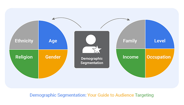
Audience Analysis and Visual Adaptation
Understanding your audience is the foundation of strategic visual communication. Different demographic groups have distinct visual preferences, cultural references, and information processing patterns that should inform design choices.
Cultural considerations become particularly important in global visual communication. Colors, symbols, and even directional flows can have different meanings across cultures. For example, while white represents purity in Western cultures, it's associated with mourning in many Eastern cultures.
Message Clarity and Visual Hierarchy
Strategic visual communication requires structuring visual elements to prioritize critical information. This involves creating clear visual hierarchies that guide viewers through content in a logical sequence.
Visual Hierarchy Framework
How visual elements are prioritized to create clear information flow:
flowchart TD
    A[Visual Hierarchy] --> B[Primary Elements]
    A --> C[Secondary Elements]
    A --> D[Tertiary Elements]

    B --> B1[Main Headlines]
    B --> B2[Key Visuals]
    B --> B3[Call to Action]

    C --> C1[Subheadings]
    C --> C2[Supporting Images]
    C --> C3[Important Details]

    D --> D1[Body Text]
    D --> D2[Background Elements]
    D --> D3[Fine Print]

    style B fill:#FF8000,stroke:#333,stroke-width:1px
    style C fill:#FFC78F,stroke:#333,stroke-width:1px
    style D fill:#FFE9D1,stroke:#333,stroke-width:1px
Eliminating visual noise is just as important as highlighting key information. Every element in a design should serve a purpose—if it doesn't contribute to the message, it may be distracting from it.
Brand Identity and Visual Storytelling
Visual communication plays a central role in brand building. Cohesive visual narratives create recognition and build trust over time. The most successful brands maintain visual consistency while allowing for creative expression within established guidelines.
Brand Visual Identity Components
The relative importance of different visual elements in brand recognition:
PageOn.ai helps users quickly iterate through visual approaches to find what resonates with specific audiences. This ability to test and refine visual strategies is invaluable for developing effective communication that connects with target viewers.
The Future of Design and Visual Communication
The field of design and visual communication is evolving rapidly, driven by technological innovations and changing cultural contexts. Looking ahead, several key trends are shaping how we'll create and consume visual information.
AI and Generative Design Tools
Machine learning is transforming the design process in profound ways. AI-assisted tools can now generate layout options, suggest color palettes, create imagery, and even help with typography choices. This is democratizing design by making sophisticated visual communication tools accessible to non-designers.
AI in the Design Process
How AI is integrated into different stages of visual creation:
flowchart LR
    A[Design Brief] --> B[Research & Analysis]
    B --> C[Concept Generation]
    C --> D[Design Development]
    D --> E[Refinement]
    E --> F[Production]

    B1[AI Research Tools] -.-> B
    C1[AI Concept Generation] -.-> C
    D1[AI Design Assistance] -.-> D
    E1[AI Feedback & Testing] -.-> E
    F1[AI Production Automation] -.-> F
The challenge moving forward will be balancing automation with human creativity and intention. The most effective approach combines AI efficiency with human strategic thinking and emotional intelligence.
Immersive Technologies (AR/VR)

Augmented reality (AR) and virtual reality (VR) are opening new frontiers for spatial and interactive visual communication. These technologies allow for multisensory experiences that go beyond traditional visual design, creating immersive environments where users can interact with information in three-dimensional space.
As these technologies become more accessible, designers will need to develop new skills for creating experiences that blend visual elements with spatial, auditory, and even haptic feedback.
Accessibility and Inclusive Design
The future of visual communication must prioritize accessibility, ensuring that visual messages can reach diverse audiences regardless of ability. This includes considerations for:
- Visual impairments – Using sufficient contrast, scalable interfaces, and alternative text
- Cognitive disabilities – Creating clear, consistent layouts with minimal distractions
- Motor limitations – Designing for different input methods and interaction patterns
- Neurodiversity – Providing options for reducing sensory stimulation when needed
Sustainability in Visual Communication
Environmental considerations are becoming increasingly important in design decisions. This includes reducing the environmental impact of physical materials in print and environmental design, as well as considering the energy consumption of digital interfaces.
Sustainable Design Practices
Adoption rates of sustainable approaches in visual communication:
PageOn.ai's innovative AI approach represents the future of visual communication, where technology amplifies human creativity rather than replacing it. By making sophisticated design capabilities more accessible, these tools are democratizing visual communication and enabling more people to express their ideas visually.
Transform Your Visual Expressions with PageOn.ai
Ready to create stunning visual communications that clearly convey your complex ideas? PageOn.ai combines powerful AI with intuitive design tools to help you communicate visually without design expertise.
Start Creating with PageOn.ai TodayBringing It All Together
Design and visual communication form the backbone of how we share ideas and information in an increasingly visual world. By understanding the foundations, elements, principles, and strategies of visual communication, we can create more effective, impactful, and meaningful visual messages.
As we look to the future, the integration of AI tools like PageOn.ai with human creativity offers exciting possibilities for democratizing design and making visual communication more accessible to everyone, regardless of their design background.
The most powerful visual communication happens when we combine strategic thinking with creative execution, keeping our audience's needs at the center of our design decisions. Whether you're a seasoned designer or just beginning to explore visual communication, remember that effective visuals are those that connect with viewers on both intellectual and emotional levels, creating experiences that inform, inspire, and move people to action.
You Might Also Like
Mastering Visual Harmony: Typography and Color Selection for Impactful Presentations
Learn how to create professional presentations through strategic typography and color harmony. Discover font pairing, color theory, and design principles for slides that captivate audiences.
The Art of Instant Connection: Crafting Opening Strategies That Captivate Any Audience
Discover powerful opening strategies that create instant audience connection. Learn visual storytelling, interactive techniques, and data visualization methods to captivate any audience from the start.
Audience-Centered Pitching Techniques: Visual Strategies That Win Every Time
Discover powerful audience-centered pitching techniques using visual storytelling, interactive engagement, and benefit visualization strategies that consistently win over any audience.
Visualizing Fluency: Transform English Learning for Non-Native Speakers | PageOn.ai
Discover innovative visual strategies to enhance English fluency for non-native speakers. Learn how to transform abstract language concepts into clear visual frameworks using PageOn.ai.