Demystifying 3D Pie Charts: From Concept to Creation with Modern Tools
Discover how to effectively use 3D pie charts for impactful data visualization, when they're appropriate, and how modern AI tools are revolutionizing their creation.
Understanding the Fundamentals of 3D Pie Charts
What Exactly Is a 3D Pie Chart?
When I first encountered 3D pie charts in my data visualization journey, I was immediately struck by their visual appeal. A 3D pie chart is essentially a three-dimensional representation of data that adds depth to the traditional circular pie chart format we're all familiar with. Unlike its flat counterpart, it appears as a tilted disc with thickness, creating an illusion of volume through perspective and shading.
What's crucial to understand—and this is a common misconception I often address—is that the third dimension doesn't represent additional data. It's purely aesthetic, designed to make your visualizations more engaging and visually striking. This distinction is vital when deciding whether to use 3D pie charts in your presentations.
The Evolution from 2D to 3D
The journey of pie charts is fascinating. William Playfair's original pie charts from 1801 were simple 2D representations, revolutionary for their time. Florence Nightingale later innovated by making these charts more readable, introducing what we now know as polar area diagrams. But it wasn't until the late 20th century, with the advent of computer graphics, that 3D effects became possible and popular.
Today, we find ourselves in an ongoing debate about visual appeal versus data accuracy. While 3D pie charts can make your data visualization charts more engaging, they come with trade-offs that I'll explore in detail throughout this guide.
When to Use (and Avoid) 3D Pie Charts
Appropriate Use Cases
Through my experience creating countless presentations, I've identified specific scenarios where 3D pie charts truly shine. They're particularly effective in business presentations where visual impact takes precedence over precise data comparison. Marketing materials, where engagement matters more than exact percentages, benefit greatly from the added visual appeal.
I recommend limiting 3D pie charts to situations with 3-5 clearly distinct categories. This ensures clarity while maintaining the visual impact you're seeking.
When working with stakeholders who prefer aesthetically pleasing visuals, 3D pie charts can be your secret weapon. I've found that visualizing budget allocations becomes particularly compelling when you leverage tools like PageOn.ai's AI Blocks for dynamic presentations—the combination of 3D effects and intelligent design creates truly memorable visualizations.
Critical Limitations to Consider
However, I must emphasize the limitations. The most significant issue is perspective distortion—front slices appear larger than they actually are, which can mislead your audience. Research from AT&T Bell Laboratories has consistently shown reduced accuracy compared to 2D alternatives, and many data visualization experts recommend avoiding 3D pie charts when precision is paramount.
2D vs 3D Comparison: Same Data, Different Perception
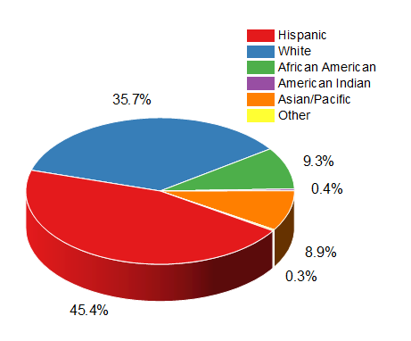
The challenge becomes even more pronounced with smaller percentages—they become nearly invisible in 3D representations. This is why I often recommend exploring the differences between pie vs donut charts when considering your visualization options.
Creating 3D Pie Charts: Technical Implementation
Traditional Software Methods
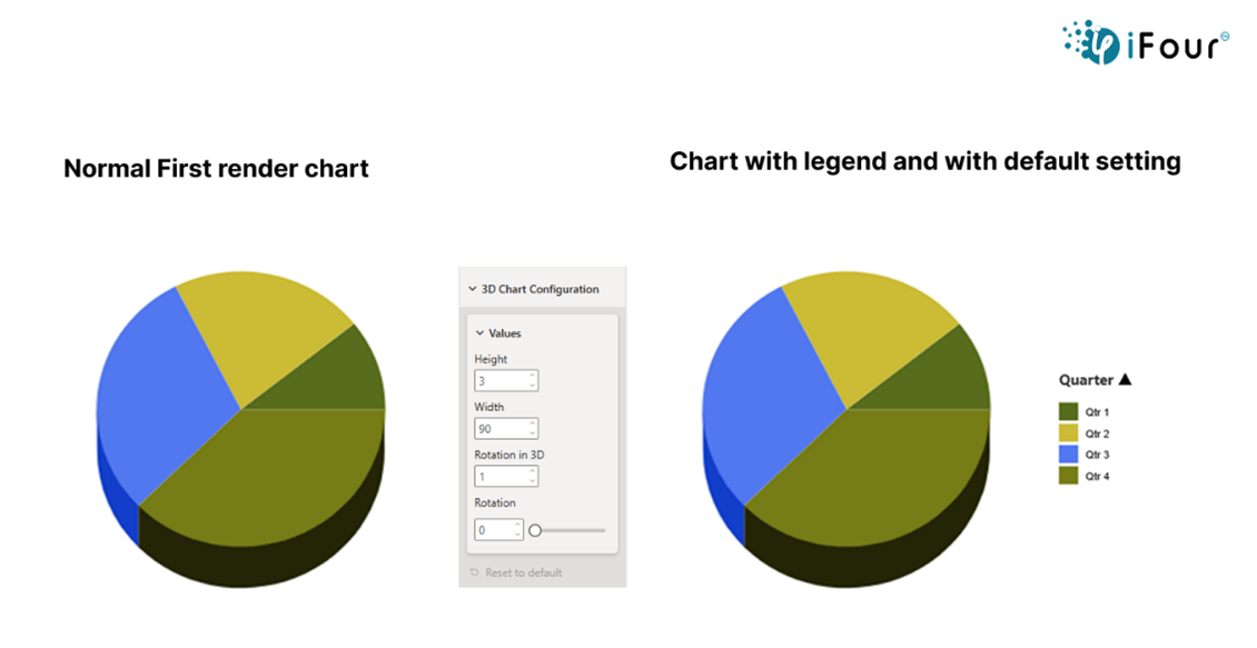
Let me walk you through the traditional approach I've used countless times in Excel. The process begins by selecting your data and navigating to Insert > Charts > 3D Pie. The key to success lies in adjusting the rotation angles—I typically work with 0-360 degrees for horizontal rotation and 0-90 degrees for vertical elevation.
3D Pie Chart Creation Process
flowchart TD
                            A[Select Data Range] --> B[Insert Tab]
                            B --> C[Choose 3D Pie Chart]
                            C --> D[Adjust Rotation]
                            D --> E[Set Elevation]
                            E --> F[Configure Perspective]
                            F --> G[Add Labels]
                            G --> H[Apply Color Scheme]
                            H --> I[Final 3D Pie Chart]

                            style A fill:#FF8000,color:#fff
                            style I fill:#4ECDC4,color:#fff
One common pitfall I've encountered is that default 3D settings often create excessive distortion. I always recommend starting with a 15-degree elevation and 20-degree rotation, then adjusting based on your specific data. For those looking to transform Excel data into polished 3D visualizations, PageOn.ai's Deep Search capabilities can automatically optimize these settings for maximum clarity.
Modern AI-Powered Approaches
The game has completely changed with AI-powered visualization tools. Now, I can simply use natural language commands like "Create a 3D pie chart showing quarterly sales" and watch as the AI automatically optimizes viewing angles for clarity. These modern AI pie chart generators understand context and make intelligent decisions about color selection, ensuring distinctions remain clear despite 3D effects.
What excites me most is the smart labeling that automatically adjusts for perspective distortion. When integrated with PageOn.ai's Vibe Creation feature, you can build charts through natural conversation, making the entire process intuitive and efficient.
Design Best Practices for 3D Pie Charts
Optimizing Visual Clarity
Through years of creating presentations, I've developed a set of non-negotiable rules for 3D pie chart clarity. First and foremost, I limit myself to 5-6 slices maximum. Any more than that, and visual clutter becomes inevitable, defeating the purpose of using a pie chart in the first place.
✓ Do's
- • Use contrasting colors
- • Position largest slice at 12 o'clock
- • Maintain consistent lighting
- • Keep depth moderate
✗ Don'ts
- • Use similar shades
- • Over-rotate the chart
- • Make charts too "thick"
- • Explode multiple slices
I've found that leveraging PageOn.ai's Agentic process can automatically optimize visual hierarchy, ensuring your 3D pie charts maintain professional standards while maximizing impact.
Enhancing Readability
Readability in 3D pie charts requires special attention. I always include percentage labels directly on or near slices, and add value annotations to compensate for any perspective distortion. While exploding key slices can add emphasis, I use this technique sparingly—typically only for the most critical data point.
For digital presentations, implementing interactive tooltips has become my secret weapon. They provide detailed information without cluttering the visual, maintaining the clean aesthetic that makes 3D pie charts appealing in the first place.
Alternatives and Modern Solutions
When to Choose Other Visualizations
I've learned that knowing when NOT to use a 3D pie chart is just as important as knowing when to use one. Bar charts remain my go-to for precise comparisons between categories—they simply can't be beaten for accuracy. When precision is paramount, I stick with 2D pie charts, which eliminate the perspective issues entirely.
Chart Type Effectiveness Comparison
Donut charts offer an interesting middle ground—they can display additional central information while maintaining the circular format. Waffle charts provide better percentage visualization, especially for audiences who struggle with angle interpretation. And stacked bar charts excel at showing both parts and the whole simultaneously.
The AI Revolution in Chart Creation
We're witnessing a revolution in how charts are created. AI now provides automated chart type recommendations based on your data structure, saving hours of trial and error. Real-time optimization of 3D effects ensures clarity without manual tweaking, and intelligent data cleaning happens before visualization even begins.
What truly excites me is the one-click switching between 2D and 3D representations. With PageOn.ai's comprehensive visualization toolkit, you can create compelling data stories that adapt to your audience's needs, transforming complex data visualizations into clear, actionable insights.
Practical Applications and Industry Usage
Common Business Scenarios
In my consulting work, I've seen 3D pie charts excel in specific business contexts. Market share visualization in investor presentations benefits from the added visual impact—it makes your company's position memorable. Budget allocation displays for stakeholder meetings become more engaging, helping maintain attention during lengthy presentations.
Sales distribution across product categories and customer demographic breakdowns for marketing teams are other areas where I've successfully implemented 3D pie charts. The key is transforming complex business data into clear visual insights—something that PageOn.ai's AI Blocks facilitate beautifully through intelligent design suggestions.
Educational and Research Applications
In educational settings, 3D pie charts serve a unique purpose: making statistical concepts accessible to students. They create memorable infographics for reports and enhance engagement in data-heavy presentations. I've found them particularly effective when introducing data visualization concepts to beginners.
Important Note: Academic papers typically avoid 3D pie charts due to accuracy concerns. In peer-reviewed research, stick to 2D representations unless the 3D aspect itself is the subject of study.
Future Trends and Considerations
Emerging Technologies
The future of 3D pie charts is incredibly exciting. We're moving toward VR/AR integration for truly interactive 3D data exploration—imagine walking around your data, examining it from every angle. AI-powered automatic optimization of 3D parameters is becoming standard, eliminating the guesswork from chart creation.
Real-time data updates with smooth 3D transitions are transforming static presentations into dynamic experiences. Adaptive visualizations that adjust based on viewer preferences ensure everyone gets the most from your data. Integration with PageOn.ai's Deep Search capabilities enables dynamic data sourcing, keeping your visualizations current and relevant.
Best Practice Evolution
I'm seeing a growing emphasis on accessibility in 3D visualizations. We're developing standards for 3D chart distortion limits, ensuring visual appeal doesn't compromise data integrity. Hybrid approaches that combine 3D aesthetics with 2D precision are gaining traction.
Evolution of 3D Pie Chart Technology
timeline
                            title 3D Pie Chart Evolution Timeline

                            2000s : Basic 3D Effects
                                  : Manual Creation
                                  : Limited Customization

                            2010s : Enhanced Graphics
                                  : Template Libraries
                                  : Interactive Elements

                            2020s : AI Optimization
                                  : Natural Language Input
                                  : Real-time Updates

                            Future : VR/AR Integration
                                   : Adaptive Visualizations
                                   : Accessibility Standards
The increased focus on interactive elements to overcome static limitations is reshaping how we think about 3D pie charts. We're witnessing a movement toward AI-assisted decision-making in chart type selection, helping creators choose the right data visualization for their specific needs.
Transform Your Visual Expressions with PageOn.ai
Ready to create stunning 3D pie charts and other compelling visualizations? PageOn.ai's AI-powered tools make it simple to transform your data into clear, impactful visual stories that resonate with your audience.
Start Creating with PageOn.ai TodayYour Journey with 3D Pie Charts Begins Now
As we've explored together, 3D pie charts are powerful tools when used appropriately. They bring data to life, create memorable presentations, and engage audiences in ways that flat visualizations simply can't match. Yet, they require thoughtful application and an understanding of their limitations.
My advice? Start with your audience and objectives. If engagement and visual impact are paramount, 3D pie charts can be your secret weapon. If precision and detailed comparison are crucial, consider the alternatives we've discussed. And remember, with modern AI tools like PageOn.ai, you're never alone in making these decisions.
The world of data visualization is evolving rapidly, and 3D pie charts are just one piece of this exciting puzzle. By mastering when and how to use them effectively, you're adding a valuable tool to your visualization toolkit—one that can transform dry statistics into compelling visual stories that drive understanding and action.
You Might Also Like
Essential MCP Tools for Automated Slide Creation and Design | PageOn.ai
Discover essential Model Context Protocol (MCP) tools for automated slide creation and design. Learn how to transform presentation workflows with AI-powered automation.
Mastering Presentation Efficiency: Build Impactful Decks by Reusing Slides
Learn how to save time and create better presentations by reusing slides. Discover PowerPoint's built-in reuse features, strategic approaches, and how PageOn.ai enhances your workflow.
Transforming Raw Data into Stunning Presentations with Cloud AI Integration
Discover how to leverage cloud AI integration to transform raw data into compelling visual stories. Learn advanced techniques for data visualization and presentation creation.
Understanding Native Multimodality: The Key to Truly Intelligent AI Systems
Explore how native multimodality powers modern AI understanding by integrating text, visual, audio, and interactive elements to create more intuitive and powerful artificial intelligence systems.