Exploring Data Visualization: Key Concepts and Best Tools
Exploring Data Visualization: Key Concepts and Best Tools
Transform complex data into actionable insights with powerful visualization techniques and cutting-edge tools
Data visualization transforms complex information into visual formats like charts, graphs, and maps, enabling you to understand data and extract valuable insights effortlessly. In today's data-driven world, effective visualization is crucial for interpreting complex datasets and making informed decisions. Companies leveraging visualization tools can improve decision-making speed by up to 5x. Whether you're exploring visualization blogs or mastering tools like Tableau and PageOn.ai, these skills empower you to present data clearly and effectively.
Key Concepts of Data Visualization
Data visualization goes beyond creating charts and graphs. It encompasses fundamental concepts that ensure effective communication of data insights. Understanding these principles will help you create visualizations that are both informative and engaging.
Clarity
The cornerstone of effective visualization. Focus on simplicity, avoid clutter, and use clear labels with colors that enhance readability. When your visualization is clear, your audience grasps information without confusion.
Accuracy
Represent data truthfully to build trust. Ensure consistent scales, precise data points, and double-check sources. Accurate visualizations prevent misleading conclusions and reflect reality.
Storytelling
Transform data into compelling narratives that bridge the gap between insights and action. Guide your audience through information, highlighting important trends and patterns for accessible decision-making.
By incorporating these key concepts into your visualization efforts, you'll enhance your ability to communicate effectively. PageOn.ai's intuitive tools help you implement these principles seamlessly, ensuring your visualizations maintain clarity, accuracy, and compelling storytelling elements.
Benefits of Data Visualization
Data visualization offers transformative benefits that enhance your ability to interpret and act on information. By converting raw data into visual formats, you unlock insights that might otherwise remain hidden.
Aids in Data Interpretation
Visualization simplifies complex datasets, making them instantly understandable. You can quickly identify patterns, trends, and outliers that reveal the underlying story within your data.
- • Identify Patterns: Spot recurring themes and behaviors crucial for predictions
- • Highlight Trends: Track changes over time in sales, customer behavior, or metrics
- • Detect Outliers: Easily spot anomalies that require investigation
Enhances Decision-Making
Effective visualization plays a pivotal role in improving understanding and communication, leading to better decision outcomes.
- • Improved Understanding: Clear visuals enable quick comprehension of complex information
- • Informed Decisions: Reduce misinterpretation risks with clear visual representations
- • Better Communication: Convey insights effectively, ensuring team alignment
Impact of Data Visualization on Business Performance
Types of Data Visualization
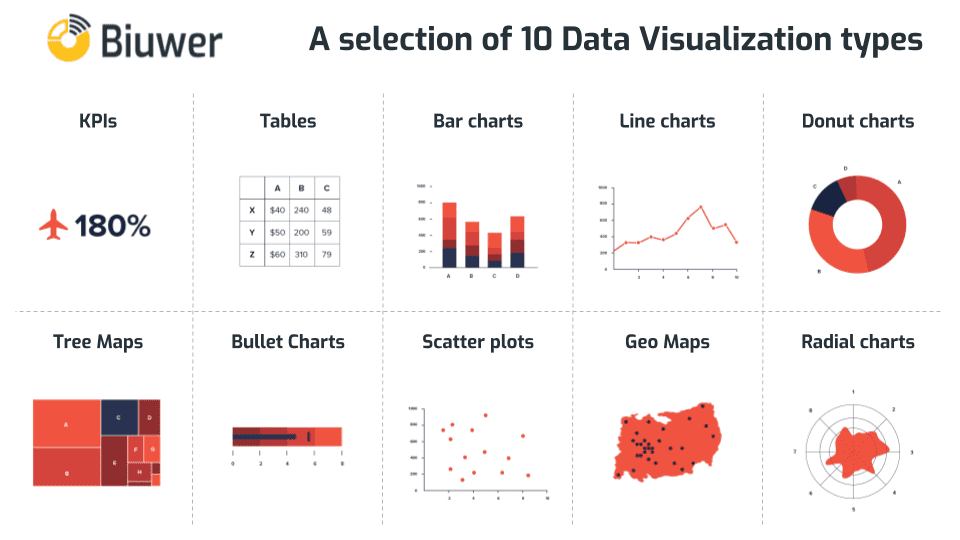
Data visualization transforms complex information into visual formats, making interpretation and analysis intuitive. Different visualization types serve various purposes, helping you convey information effectively for your specific needs.
Charts
Charts are fundamental visualization tools that present data in structured, visually appealing formats. They excel at making comparisons and showing relationships.
Bar Charts
Perfect for comparing discrete categories or showing distributions. Use them for sales comparisons, survey responses, or category analysis.
Line Charts
Ideal for visualizing trends over time. Track stock prices, temperature changes, or any continuous data series.
Graphs
Graphs illustrate relationships between variables, helping uncover correlations and patterns hidden in raw data.
Scatter Plots
Display data points on two-dimensional graphs to identify relationships, correlations, or clusters between variables.
Pie Charts
Show percentage distributions within a dataset, perfect for market share or budget allocation visualization.
Maps
Maps provide geographical context to your data, visualizing spatial patterns and distributions effectively.
Heat Maps
Use color gradients to highlight data densities, perfect for website activity or demographic studies.
Geographical Maps
Incorporate demographics and consumer behavior to segment regions for targeted marketing strategies.
Infographics
Infographics combine visuals and text to present data in compelling, easy-to-understand formats that engage broad audiences.
Why Use Infographics?
- 1. Simplify Complex Data: Break down intricate information into digestible visual pieces
- 2. Enhance Engagement: Visual elements capture attention and improve retention
- 3. Tell a Story: Connect data points to create cohesive narratives
PageOn.ai's AI Blocks feature allows you to create modular diagrams and infographics effortlessly, breaking down complexity into understandable visual segments that resonate with your audience.
Five Essential Data Visualization Techniques
Master these five powerful techniques to transform complex data into clear, actionable insights. Each technique serves specific purposes in your visualization toolkit.
Data Visualization Technique Selection Process
flowchart TD
                            A[Start: Analyze Your Data] --> B{What's Your Goal?}
                            B --> C[Show Relationships]
                            B --> D[Display Trends]
                            B --> E[Compare Categories]
                            B --> F[Show Distribution]

                            C --> G[Scatter Plot]
                            D --> H[Line Graph]
                            E --> I[Bar Chart]
                            F --> J[Heat Map/Pie Chart]

                            G --> K["Visualize & Analyze"]
                            H --> K
                            I --> K
                            J --> K

                            K --> L[Extract Insights]
                            L --> M[Make Data-Driven Decisions]
1. Heat Maps
Heat maps use color gradients to represent data values within a matrix format, making patterns and concentrations instantly visible in large datasets.
- • Identify Patterns: Recognize recurring themes crucial for predictions
- • Highlight Concentrations: Reveal high/low data density areas
2. Scatter Plots
Display individual data points on two-dimensional graphs to identify relationships, correlations, or clusters between variables.
- • Uncover Correlations: Explore how variables influence each other
- • Detect Clusters: Identify natural groupings in your data
3. Line Graphs
Connect data points with lines to visualize trends over time, perfect for tracking changes in continuous data series.
- • Track Trends: Monitor directional changes over time
- • Visualize Fluctuations: Highlight variations and patterns
4. Bar Charts
Compare different categories using rectangular bars, where length correlates with value for easy visual comparison.
- • Easy Comparison: Quickly identify highest/lowest values
- • Versatility: Use vertical or horizontal orientation
- • Clarity: Simple, straightforward data presentation
5. Pie Charts
Display proportions within a whole using circular segments, ideal for showing percentage distributions.
- • Proportional View: Show parts of a whole effectively
- • Visual Appeal: Engaging circular format captures attention
- • Best Practice: Limit to 5-7 categories for clarity
Pro Tip: PageOn.ai's visualization tools help you seamlessly implement these techniques, transforming complex data relationships into clear, interactive charts that make your insights accessible to any audience.
Advantages and Disadvantages of Data Visualization
Data visualization is a powerful tool for interpreting complex datasets and gaining insights. However, like any tool, it has both strengths and limitations you should understand.
✓ Advantages
- 1. Enhanced Understanding: Simplifies complex datasets for quick pattern identification
- 2. Improved Decision-Making: Clear visuals lead to better, faster decisions
- 3. Better Communication: Ensures team alignment through visual insights
- 4. Increased Engagement: Visual elements capture and retain attention
- 5. Storytelling Power: Transforms data into compelling narratives
✗ Disadvantages
- 1. Misinterpretation Risk: Incorrect visualizations can mislead audiences
- 2. Over-Simplification: Important nuances may be lost in translation
- 3. Tool Dependence: Over-reliance may limit creativity and understanding
- 4. Cost and Resources: Professional tools can be expensive to implement
- 5. Privacy Concerns: Visualizing sensitive data requires careful handling
Balancing Visualization Benefits and Challenges
Key Takeaway: While data visualization offers numerous benefits for interpreting and communicating information, it's essential to use it wisely. Understanding both advantages and limitations helps you leverage visualization effectively for informed decision-making.
Top Data Visualization Tools

Selecting the right visualization tool significantly impacts how effectively you communicate insights. Let's explore the top tools that can transform raw data into meaningful visuals.
PageOn.ai
Overview
PageOn.ai stands out as a versatile visualization platform with an intuitive interface that empowers both beginners and experienced analysts to create stunning visualizations effortlessly.
Key Features:
- • Intuitive drag-and-drop interface
- • Customizable templates library
- • Interactive visual elements
- • Seamless data integration
- • AI-powered insights
How to Use:
- 1. Import your data (multiple formats supported)
- 2. Select a matching template
- 3. Customize with drag-and-drop tools
- 4. Add interactive features
- 5. Publish and share instantly
Tableau
Industry-leading platform known for powerful capabilities and ease of use. Create interactive dashboards that bring data to life.
- ✓ Drag-and-drop functionality
- ✓ Real-time data analysis
- ✓ Collaboration features
Power BI
Microsoft's solution for interactive reports and dashboards, seamlessly integrated with the Microsoft ecosystem.
- ✓ Extensive data connectivity
- ✓ Custom visuals marketplace
- ✓ AI-powered insights
D3.js
Powerful JavaScript library for creating dynamic, interactive web-based visualizations with unlimited customization.
- ✓ Complete flexibility
- ✓ Advanced interactivity
- ✓ Handles big data efficiently
Google Data Studio
Free tool for creating interactive dashboards, perfectly integrated with Google's product ecosystem.
- ✓ User-friendly interface
- ✓ Google integration
- ✓ Real-time collaboration
Microsoft Excel
The versatile staple for data analysis and visualization, familiar to professionals worldwide.
- ✓ Universal familiarity
- ✓ Powerful analysis tools
- ✓ Extensive customization
Zoho Analytics
Comprehensive platform with user-friendly interface for creating insightful visualizations and dashboards.
- ✓ Multiple data sources
- ✓ Customizable dashboards
- ✓ Team collaboration
QlikView
Features a unique associative data model for exploring data from different angles. Create dynamic visualizations that adapt to your exploration needs with powerful scalability for large datasets.
IBM Watson Analytics
Leverages AI to discover insights automatically. Use natural language queries to explore data and create compelling visualizations that tell your data story effectively.
How to Choose the Right Tool
Selecting the right visualization tool is crucial for effectively communicating insights. Here's a comprehensive guide to help you make an informed decision.
Tool Selection Decision Framework
flowchart TD
                            A[Start: Define Requirements] --> B[Assess Your Needs]
                            B --> C{Data Complexity?}
                            C -->|Simple| D[Basic Tools]
                            C -->|Complex| E[Advanced Tools]

                            D --> F[Excel/Google Data Studio]
                            E --> G[Tableau/Power BI/PageOn.ai]

                            B --> H[Evaluate Features]
                            H --> I{Key Requirements?}
                            I --> J[Ease of Use]
                            I --> K[Customization]
                            I --> L[Integration]

                            B --> M[Consider Budget]
                            M --> N{Budget Level?}
                            N -->|Limited| O[Free/Low-Cost Options]
                            N -->|Flexible| P[Premium Solutions]

                            F --> Q[Make Decision]
                            G --> Q
                            O --> Q
                            P --> Q

                            Q --> R["Implement & Test"]
                            R --> S["Optimize & Scale"]
1. Assessing Your Needs
Begin by identifying your specific visualization requirements. Understanding your needs guides you toward the most suitable tool.
- • Data Complexity: Determine if you're working with simple charts or complex, multi-dimensional datasets
- • Audience: Consider stakeholder familiarity with data - choose tools that simplify presentation accordingly
- • Purpose: Define whether you're informing, persuading, or exploring data
2. Evaluating Features
Evaluate tools based on functionalities that match your requirements. Different tools excel in different areas.
- • Ease of Use: Prioritize intuitive interfaces that minimize training requirements
- • Customization: Ensure the tool allows visual customization for clarity and impact
- • Integration: Verify seamless connection with your existing data sources
3. Considering Budget and Resources
Budget and resources significantly influence your decision. Evaluate both immediate and long-term costs.
- • Cost Analysis: Compare initial expenses and ongoing subscription fees
- • Resource Assessment: Consider available personnel expertise and implementation time
- • ROI Evaluation: Premium tools may offer features that significantly enhance capabilities
Recommendation: PageOn.ai offers an excellent balance of powerful features, ease of use, and cost-effectiveness. Its AI-powered capabilities and intuitive interface make it ideal for teams looking to create professional visualizations without extensive training.
Data Visualization Best Practices
Creating effective visualizations requires more than technical skills. Follow these essential tips to ensure your visualizations communicate insights clearly and engage your audience.
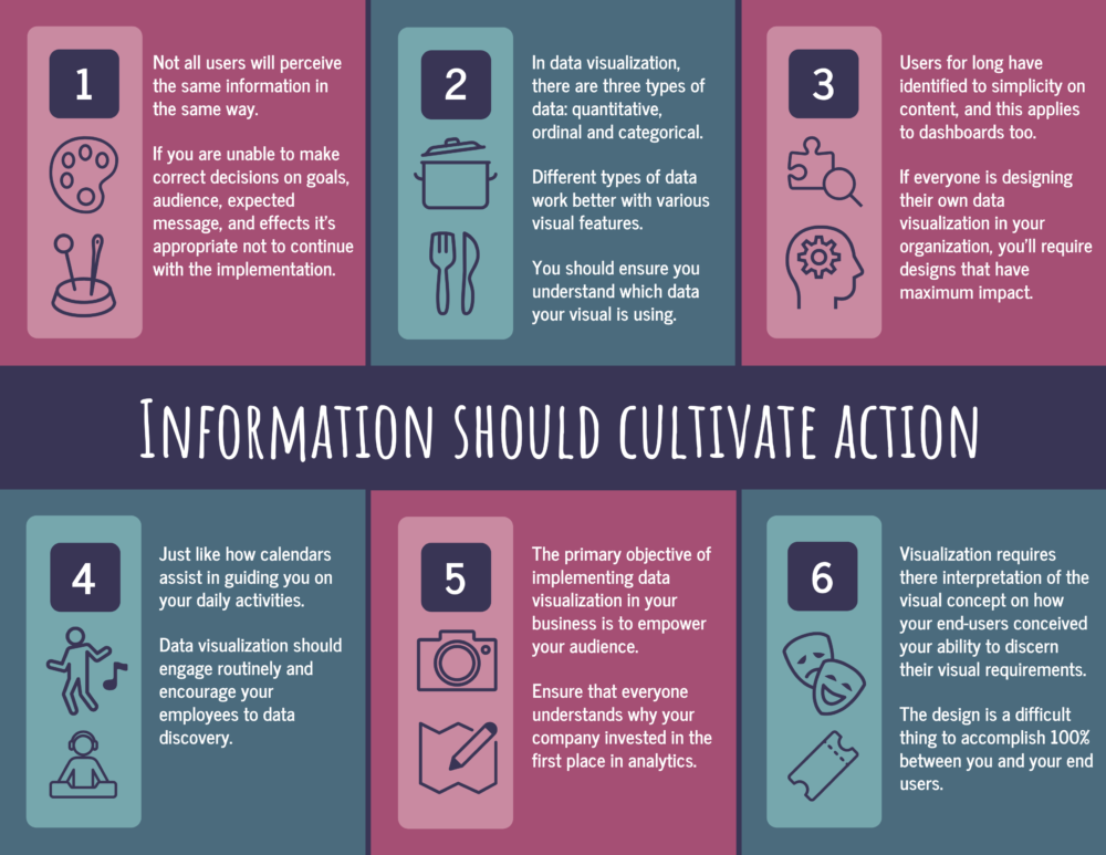
1 Know Your Audience
Understanding your audience is crucial for creating effective visualizations. Tailor your approach to their needs and expertise level.
• Identify Needs: Determine if they want high-level insights or detailed analysis
• Use Appropriate Language: Avoid jargon for non-technical audiences
• Match Presentation Style: Executives prefer dashboards, analysts appreciate detailed charts
2 Keep It Simple
Simplicity is key - overcomplicating visuals can confuse your audience and obscure your message.
• Focus on Key Insights: Highlight only the most important data points
• Use Simple Visuals: Bar charts, line graphs, and pie charts communicate clearly
• Limit Elements: Reduce colors, gridlines, and labels to essentials
3 Use Color Wisely
Color enhances understanding and draws attention when used effectively and thoughtfully.
• Choose Meaningful Colors: Red for negative, green for positive values
• Ensure Accessibility: Consider color blindness with appropriate palettes
• Highlight Important Data: Use color to emphasize critical trends
4 Tell a Story
Transform raw data into engaging narratives that make information relatable and memorable.

• Structure Your Narrative: Build a logical flow around your key message
• Use Visualization Tools: Leverage Tableau and Power BI for interactive dashboards
• Highlight Key Insights: Make critical points stand out visually
• Engage Your Audience: Use relatable examples and scenarios
• Encourage Action: End with clear next steps based on insights
Remember: Effective data visualization combines technical skill with thoughtful design. Tools like PageOn.ai help you implement these best practices effortlessly, ensuring your visualizations communicate clearly while engaging your audience effectively.
Transform Your Data Into Insights
Data visualization plays a crucial role in transforming complex information into understandable insights. By mastering various visualization techniques, you can effectively communicate data and make informed decisions that drive success.
Exploring different visualization tools—from Excel's basic charts to D3.js's dynamic interactive visualizations—enhances your ability to create impactful visuals. Each tool offers unique strengths: Excel provides familiarity and versatility, while advanced platforms like PageOn.ai deliver AI-powered insights and intuitive interfaces.
Embrace the potential of modern visualization tools to craft compelling presentations that resonate with your audience. As you continue learning about data visualization, experiment with different tools to discover which best suits your needs and enhances your data storytelling capabilities.
You Might Also Like
Streamlining Presentation Automation: Combining VBA and AI for Next-Generation Slide Decks
Discover how to combine VBA and AI technology to create automated, intelligent presentations. Learn technical implementation, practical applications, and future trends in presentation automation.
Streamlining AI Integration: How MCP Transforms the N×N Challenge into a Manageable Solution
Discover how the Model Context Protocol (MCP) solves the complex N×N integration challenge in AI ecosystems, transforming it into a simpler N+N equation for enterprise AI adoption.
The Art of Yes Ladders: Building Momentum to Overcome Sales Objections
Discover how to build effective yes ladders in sales conversations to overcome objections and create momentum toward closing deals with proven psychological techniques and strategies.
The Ultimate Design Tools & Workflow Ecosystem for Creative Professionals
Discover essential design tools and optimized workflows for creative professionals. Learn how to build a cohesive ecosystem of visual tools that streamline ideation, feedback, and asset management.