Transforming Your Ideas into Compelling Post Visuals
The Designer's Ultimate Guide
In today's visually saturated digital landscape, I've found that creating compelling post visuals isn't just about making something pretty—it's about strategic communication that captures attention and drives engagement. Whether you're designing for social media, blogs, or digital marketing campaigns, the visual elements you choose can make or break your message's effectiveness.
Throughout my journey as a designer, I've discovered that the most successful post visuals strike a delicate balance between aesthetic appeal and clear information delivery. In this comprehensive guide, I'll share my insights on transforming your ideas into visual content that not only looks professional but also achieves your communication goals across various platforms.
Understanding the Fundamentals of Post Visual Design
When I first began exploring post visual design, I quickly realized it's a specialized discipline within the broader field of visual communication design. In today's digital ecosystem, post visuals serve as the front line of your communication strategy—they're what stops the scroll and invites deeper engagement.

The Psychology Behind Effective Visual Communication
I've found that understanding the psychological principles behind visual perception is crucial for creating effective post visuals. Our brains process images 60,000 times faster than text, making visual elements the perfect vehicle for quick communication in fast-scrolling environments.
Visual Processing Timeline
                    flowchart LR
                        A[Visual Stimulus] -->|13 milliseconds| B[Initial Processing]
                        B -->|100 milliseconds| C[Pattern Recognition]
                        C -->|250 milliseconds| D[Emotional Response]
                        D -->|500+ milliseconds| E[Cognitive Processing]
                        style A fill:#FF8000,color:white
                        style E fill:#FF8000,color:white
Platform-Specific Considerations
Through my experience, I've learned that each platform has unique requirements and audience expectations that significantly impact design decisions:
| Platform | Optimal Dimensions | Visual Style | Audience Expectations |
|---|---|---|---|
| 1:1 (Square), 4:5 (Portrait) | High aesthetic value, lifestyle-oriented | Visually striking, authentic moments | |
| 1200 × 627 pixels (1.91:1) | Professional, data-driven | Informative, business-relevant | |
| 1600 × 900 pixels (16:9) | Concise, attention-grabbing | Timely, conversation-starting | |
| 1200 × 630 pixels (1.91:1) | Versatile, community-focused | Shareable, emotionally resonant |
I've noticed that post visual design differs from traditional graphic design in its emphasis on immediate impact and simplified messaging. While traditional design might allow for deeper exploration, post visuals must communicate effectively at a glance while still maintaining the core principles of visual communication in media design.
Essential Elements of High-Converting Post Visuals
In my design practice, I've identified several key elements that consistently drive engagement and conversion in post visuals. These elements form the foundation of what I call the "visual conversion framework."
Color Psychology
I've found that strategic color selection can dramatically influence how audiences perceive and interact with your posts. Different colors evoke specific emotional responses that can be leveraged to support your communication goals.
Typography Hierarchy
When designing post visuals, I always establish a clear typography hierarchy to guide the viewer's eye and ensure key messages stand out. This is one of the visual communication for designers principles I never compromise on.

Visual Hierarchy Techniques
Beyond typography, I use several techniques to establish visual hierarchy in my post designs:
- Size contrast: Larger elements naturally draw attention first
- Color contrast: Vibrant colors against neutral backgrounds create focal points
- Positioning: Elements placed in the upper-left quadrant typically receive first attention in Western cultures
- Isolation: Separated elements stand out from grouped elements
- Repetition and pattern breaking: Disrupting patterns draws attention to specific elements
Visual Hierarchy Flow
                    flowchart TD
                        A[Primary Element:
                        Headline/Key Visual] -->|First Attention| B[Secondary Elements:
                        Supporting Visuals/Subheads]
                        B -->|Second Attention| C[Tertiary Elements:
                        Body Text/Details]
                        C -->|Final Attention| D[Call to Action]
                        style A fill:#FF8000,color:white
                        style D fill:#FF8000,color:white
Negative Space Utilization
In my experience, one of the most common mistakes in post visual design is overcrowding. I've found that strategic use of negative space (also called white space) creates cleaner, more focused designs that allow key elements to breathe and stand out.
When designing posts that feature symbol visuals in art and design, I'm particularly careful to provide adequate negative space around symbolic elements to ensure their meaning is clearly communicated.
From Concept to Creation: The Post Visual Design Process
My approach to creating effective post visuals follows a structured yet flexible process that ensures both creative exploration and strategic alignment with communication goals.
Post Visual Design Process
                    flowchart LR
                        A[Goal Setting] --> B[Research &
                        Inspiration]
                        B --> C[Wireframing &
                        Sketching]
                        C --> D[Mood Board
                        Creation]
                        D --> E[Design
                        Development]
                        E --> F[Platform
                        Adaptation]
                        F --> G[Testing &
                        Optimization]
                        G --> H[Deployment]
                        H -.-> A
                        style A fill:#FF8000,color:white
                        style H fill:#FF8000,color:white
Establishing Clear Communication Goals
Before I start designing, I always define what I want the visual to achieve. Is it to educate, entertain, inspire action, build brand awareness, or something else? This clarity guides every subsequent design decision.
Communication Goal Checklist
- Primary objective: What's the ONE thing this visual must communicate?
- Target audience: Who specifically am I designing for?
- Desired action: What should viewers do after seeing this visual?
- Platform context: Where will this visual appear?
- Success metrics: How will I measure this visual's effectiveness?
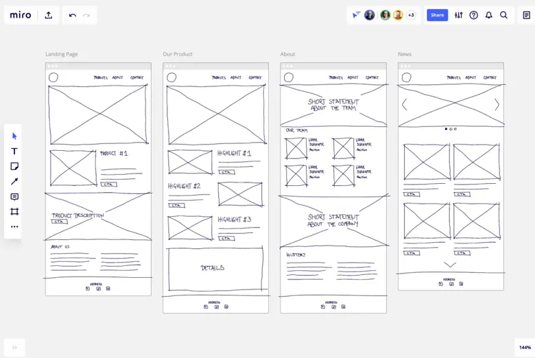
Wireframing and Sketching Techniques
I always begin with low-fidelity sketches to explore multiple concepts quickly. This helps me focus on structure and layout before getting distracted by colors and details.
Creating Mood Boards
Mood boards help me establish the visual direction before diving into detailed design. I typically include color palettes, typography examples, imagery styles, and reference designs that capture the desired aesthetic and emotional tone.
Platform Adaptation
One of the most challenging aspects of post visual design is adapting a single concept for multiple platforms with different technical specifications and audience expectations.
Using PageOn.ai's Vibe Creation feature has transformed my workflow, allowing me to rapidly generate multiple visual concepts based on a single communication goal. This has been particularly valuable for clients who need to see several options before committing to a direction.
Advanced Visual Storytelling Techniques for Posts
Throughout my design career, I've discovered that the most engaging post visuals don't just look good—they tell compelling stories. Visual storytelling creates an emotional connection with viewers and makes your content more memorable.
Creating Narrative Flow in Single-Image Posts
Even with just one image, I use several techniques to create a sense of narrative:
- Visual metaphors that convey complex ideas through familiar concepts
- Before/after juxtapositions that imply transformation
- Character-based scenarios that viewers can relate to
- Sequential elements that guide the eye through a process or journey
- Emotional contrast to create tension and resolution
Designing Effective Carousel Posts
Carousel posts offer unique storytelling opportunities but require careful planning to maintain viewer interest across multiple slides.
Carousel Post Structure
                    flowchart LR
                        A[Slide 1:
                        Hook/Problem] --> B[Slide 2:
                        Context/Stakes]
                        B --> C[Slide 3-4:
                        Solution/Process]
                        C --> D[Slide 5:
                        Results/Benefits]
                        D --> E[Slide 6:
                        Call to Action]
                        style A fill:#FF8000,color:white
                        style E fill:#FF8000,color:white
When incorporating symbol visuals in art and design, I ensure the symbolic elements are consistent across all carousel slides to create a cohesive visual language.
Animation and Motion Design Principles
Adding motion to post visuals can dramatically increase engagement, but must be done thoughtfully. I follow these principles for effective motion design in posts:
DO:
- Use motion to direct attention to key elements
- Create smooth, natural transitions
- Maintain consistent timing and pacing
- Ensure animations support the core message
- Consider accessibility (avoid rapid flashing)
DON'T:
- Add motion just for the sake of movement
- Create distracting animations that compete with content
- Use complex animations that slow down loading
- Rely on motion for critical information
- Overuse transitions and effects
PageOn.ai's AI Blocks feature has been invaluable for my visual storytelling approach. It allows me to build complex visual narratives by connecting modular components without requiring advanced technical skills. This has been particularly useful when creating explanatory posts about complex processes or systems.
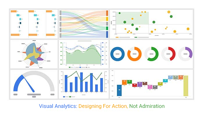
Data Visualization for Engaging Post Design
In my experience, data-driven posts can be incredibly powerful for building credibility and providing valuable insights to your audience. However, the key challenge is transforming complex statistics into visually appealing, easily digestible graphics.
Transforming Complex Statistics into Shareable Graphics
When I approach data visualization for social posts, I follow these key principles:
- Focus on a single key insight rather than trying to communicate everything
- Use visual metaphors to make abstract data more relatable
- Incorporate brand colors and elements for consistency
- Prioritize clarity over complexity
- Include context to help viewers understand the significance
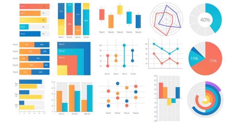
Choosing the Right Chart Types
Different data stories call for different visualization approaches. Here's my guide to selecting the most effective chart type:
| Chart Type | Best For | Avoid When |
|---|---|---|
| Bar Charts | Comparing categories, showing rankings | Showing trends over time, too many categories |
| Line Charts | Showing trends over time, continuous data | Comparing unrelated categories |
| Pie Charts | Showing composition, parts of a whole | More than 5-7 categories, similar-sized segments |
| Infographics | Telling a data story, combining multiple insights | Need for precise numerical comparison |
Common Data Visualization Mistakes
In my years of creating data visualizations for posts, I've identified several common pitfalls:
- Misleading scales that exaggerate differences
- 3D effects that distort perception of values
- Too many data points causing visual clutter
- Poor color choices that create confusion
- Missing context that leaves viewers unable to interpret data
- Overcomplicating visualizations with unnecessary elements
PageOn.ai's Deep Search feature has revolutionized how I approach data-driven posts. It allows me to quickly find relevant statistics and research to support my visual narratives, ensuring my data visualizations are both accurate and impactful.
Optimizing Post Visuals for Different Platforms and Audiences
One of the biggest challenges I face in post visual design is creating content that works effectively across multiple platforms while still feeling native to each environment.
Platform-Specific Design Considerations
Platform Visual Design Requirements
                    flowchart TD
                        A[Post Visual Design] --> B[Instagram]
                        A --> C[LinkedIn]
                        A --> D[Twitter]
                        A --> E[Facebook]
                        A --> F[TikTok]

                        B --> B1[High aesthetic value]
                        B --> B2[Square or 4:5 ratio]
                        B --> B3[Minimal text]

                        C --> C1[Professional look]
                        C --> C2[Data-driven]
                        C --> C3[1200×627px ratio]

                        D --> D1[Attention-grabbing]
                        D --> D2[16:9 ratio]
                        D --> D3[Clear without clicking]

                        E --> E1[Emotionally engaging]
                        E --> E2[1200×630px ratio]
                        E --> E3[Mobile-optimized]

                        F --> F1[Highly dynamic]
                        F --> F2[9:16 vertical ratio]
                        F --> F3[Motion-focused]

                        style A fill:#FF8000,color:white
When I'm designing for multiple platforms, I start with a "primary platform" that aligns most closely with the campaign objectives, then adapt the design for secondary platforms while maintaining visual consistency.
Adapting Visual Designs for Different Demographics
Different audience segments respond to different visual approaches. Through my experience, I've developed these guidelines for demographic-specific design:
| Demographic | Visual Preferences | Design Approach |
|---|---|---|
| Gen Z | Bold colors, authenticity, humor, motion | Experimental layouts, meme-inspired elements, video-first |
| Millennials | Clean aesthetics, nostalgia, values alignment | Minimalist design with purpose-driven messaging |
| Gen X | Practical information, straightforward visuals | Clear hierarchy, value-focused content, less trendy |
| Baby Boomers | Higher contrast, larger text, traditional layouts | Accessible design, familiar imagery, clear call to action |
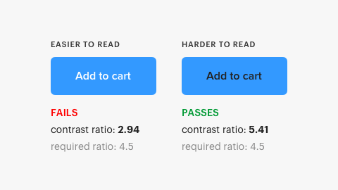
Accessibility Considerations
Creating accessible post visuals isn't just ethical—it expands your potential audience. I always incorporate these accessibility best practices:
- Sufficient color contrast (at least 4.5:1 for text)
- Alternative text for images when platforms allow
- Readable font sizes (minimum 16pt for primary text)
- Avoiding color as the only means of conveying information
- Captions for video content
- Simple, clear language in visual text elements
Cultural Sensitivity
When designing for global audiences, I'm careful to consider cultural differences in visual interpretation. Symbols, colors, and even layout can have dramatically different meanings across cultures.
PageOn.ai's Agentic capabilities have transformed how I approach multi-platform design. The system can automatically optimize visual elements for different platforms while maintaining brand consistency, saving hours of manual adaptation work.
The Critique and Refinement Process
In my experience, the difference between good and exceptional post visuals often comes down to a rigorous critique and refinement process. Receiving and implementing feedback effectively is a skill I've developed over years of design practice.
Establishing Objective Criteria
Before seeking feedback, I establish clear criteria for evaluating visual effectiveness:
Communication Criteria
- Message clarity
- Hierarchy effectiveness
- Emotional resonance
- Call-to-action clarity
- Information accessibility
Visual Criteria
- Brand alignment
- Visual appeal
- Composition strength
- Technical execution
- Platform appropriateness
Presenting Designs for Critique
I've found that how designers present in visual critique sessions significantly impacts the quality of feedback received. My approach includes:
- Providing context about the objectives and constraints
- Explaining key design decisions without being defensive
- Showing designs in their intended environment (e.g., on mobile screens for mobile posts)
- Asking specific questions rather than just "What do you think?"
- Remaining open to unexpected feedback and new perspectives
Feedback Implementation Process
                    flowchart TD
                        A[Collect Feedback] --> B{Categorize Feedback}
                        B --> C[Must Address:
                        Critical Issues]
                        B --> D[Should Consider:
                        Improvement Opportunities]
                        B --> E[Nice to Have:
                        Enhancements]
                        C --> F[Prioritize Changes]
                        D --> F
                        E --> F
                        F --> G[Implement Revisions]
                        G --> H[Re-evaluate]
                        H --> I{Meets Criteria?}
                        I -->|Yes| J[Finalize Design]
                        I -->|No| A
                        style A fill:#FF8000,color:white
                        style J fill:#FF8000,color:white
Common Post Visual Design Pitfalls
Through countless design reviews, I've identified these recurring issues in post visual design:
- Overcrowding: Trying to communicate too many messages in one visual
- Poor contrast: Text that's difficult to read against the background
- Inconsistent branding: Visuals that don't align with brand identity
- Unclear hierarchy: No clear focal point or reading path
- Platform mismatch: Designs that don't account for platform-specific contexts
- Missing call to action: No clear next step for the viewer
PageOn.ai has transformed my revision process by allowing me to quickly generate alternative versions based on feedback. Instead of manually creating multiple iterations, I can use the platform to explore different approaches efficiently, saving valuable time during tight deadlines.
Measuring Success: Analytics for Post Visual Design
Throughout my career, I've learned that data-informed design decisions consistently outperform those based solely on intuition or aesthetics. Establishing the right metrics and measurement systems is crucial for continuous improvement in post visual design.
Key Performance Indicators
I track these essential KPIs to evaluate the effectiveness of post visuals:
Tools and Methods for Tracking
I use a combination of tools to gather comprehensive insights about visual performance:
- Native platform analytics (Instagram Insights, LinkedIn Analytics, etc.)
- Third-party social media management tools (Hootsuite, Buffer, Sprout Social)
- Google Analytics for tracking post-click behavior
- Heat mapping tools for understanding visual attention patterns
- Custom UTM parameters to track specific campaigns
- A/B testing platforms for controlled experiments
Correlating Visual Elements with Performance
One of the most valuable analyses I conduct is correlating specific visual elements with performance metrics. This helps identify patterns and optimize future designs.
A/B Testing Methodologies
When I conduct A/B tests for visual elements, I follow these principles for reliable results:
- Test one variable at a time (color, layout, typography, imagery)
- Ensure sufficient sample size for statistical significance
- Control for timing, audience targeting, and other external factors
- Set clear success metrics before beginning the test
- Document findings systematically to build institutional knowledge
By consistently analyzing performance data and correlating it with specific design elements, I've been able to develop data-driven visual strategies that consistently outperform industry benchmarks for engagement and conversion.
Future Trends in Post Visual Design
As I look ahead, I see several emerging trends that will reshape how we approach post visual design in the coming years. Staying ahead of these developments will be crucial for maintaining competitive advantage in the digital space.
AI-Assisted Visual Design
Artificial intelligence is already transforming the post visual design landscape in several ways:
- Automated generation of visual concepts based on text prompts
- Smart cropping and composition tools that optimize for engagement
- Style transfer capabilities that maintain brand consistency
- Predictive analytics that forecast visual performance
- Personalized visual content tailored to individual viewers
AI in the Visual Design Workflow
                    flowchart TD
                        A[Design Brief] --> B[AI Concept Generation]
                        B --> C[Human Review & Direction]
                        C --> D[AI Refinement & Variations]
                        D --> E[Human Selection & Editing]
                        E --> F[AI Platform Adaptation]
                        F --> G[Human Final Approval]
                        G --> H[Deployment & Analytics]
                        H --> I[AI Performance Analysis]
                        I --> J[Insights for Future Designs]
                        J -.-> A
                        style A fill:#FF8000,color:white
                        style J fill:#FF8000,color:white
Emerging Visual Formats
I'm closely watching these new and evolving formats that are changing how we think about post visuals:
Short-Form Video Evolution
- Micro-animations (under 5 seconds)
- Loop-optimized content
- Seamless transitions between static and motion
- Sound-off optimized visual storytelling
- Vertical-first composition approaches
Interactive Visual Elements
- Swipe-to-reveal information layers
- Tap-to-change visual states
- Scrolling-triggered animations
- User input affecting visual outcomes
- Gamified visual experiences
Augmented Reality Integration
AR features are increasingly accessible across social platforms, opening new possibilities for immersive post visuals:
- AR filters that transform static images into interactive experiences
- 3D objects that viewers can place in their environment
- Virtual try-on capabilities for products
- Location-based AR experiences triggered by posts
- AR-enhanced data visualizations

Sustainability and Ethical Considerations
As digital consumption continues to grow, I believe we'll see increased focus on:
- Energy-efficient visual design (optimized file sizes, reduced processing requirements)
- Inclusive representation in visual content
- Transparent disclosure of AI-generated elements
- Ethical sourcing of visual assets
- Reduced digital clutter through more thoughtful, high-quality visual communication
PageOn.ai's innovative features are at the forefront of these emerging trends, particularly in the realm of AI-assisted visual creation. The platform's ability to generate visually compelling content while maintaining brand consistency represents the future direction of post visual design—where creativity is augmented rather than replaced by technology.
As algorithms continue to evolve across platforms, I believe we'll see increasing emphasis on authentic, high-quality visual content that genuinely resonates with audiences rather than simply chasing engagement metrics. Designers who can balance technological innovation with human-centered visual storytelling will thrive in this new landscape.
Transform Your Visual Expressions with PageOn.ai
Ready to take your post visual design to the next level? PageOn.ai provides the tools and features you need to create stunning, effective visuals that communicate your ideas clearly and drive engagement.
Start Creating with PageOn.ai TodayConclusion: The Future of Post Visual Design
As I reflect on the evolution of post visual design, I'm excited by the possibilities that lie ahead. The convergence of design principles, technology, and data-driven insights is creating unprecedented opportunities for visual communication.
The most successful post visual designers of tomorrow will be those who can balance technical skills with strategic thinking, creativity with analytics, and brand consistency with platform-specific optimization. They'll understand that effective visual communication isn't just about aesthetics—it's about creating meaningful connections with audiences through thoughtful, purposeful design.
Tools like PageOn.ai are democratizing access to sophisticated visual design capabilities, allowing creators of all skill levels to produce professional-quality visuals. By embracing these tools while maintaining a strong foundation in design principles, you can create post visuals that not only capture attention but also drive meaningful engagement and action.
As platforms and audience preferences continue to evolve, the fundamental goal remains the same: to communicate ideas clearly, effectively, and beautifully through visual means. By applying the strategies and techniques outlined in this guide, you'll be well-equipped to meet that goal, regardless of how the visual landscape changes.
You Might Also Like
The Art of Instant Connection: Crafting Opening Strategies That Captivate Any Audience
Discover powerful opening strategies that create instant audience connection. Learn visual storytelling, interactive techniques, and data visualization methods to captivate any audience from the start.
Transform Any Content into Professional Slides: The Ultimate Conversion Guide
Learn expert techniques for converting documents, presentations, and visual content into professional slides with this comprehensive guide to content format transformation.
Audience-Centered Pitching Techniques: Visual Strategies That Win Every Time
Discover powerful audience-centered pitching techniques using visual storytelling, interactive engagement, and benefit visualization strategies that consistently win over any audience.
Mastering the American Accent: Essential Features for Global Professional Success
Discover key American accent features for global professionals with visual guides to vowel pronunciation, rhythm patterns, and industry-specific applications for career advancement.