Essential Visual Design Elements: Building Blocks for Effective Communication
Discover how fundamental visual components create meaning, hierarchy, and impact across all design mediums
Foundation of Visual Design
In my experience as a designer, I've found that visual design elements are the fundamental building blocks that form the basis of all visual communication. These elements work together like a visual language, communicating meaning and emotion without relying on words.
When I create designs, I think of these elements as my vocabulary—the components I arrange to craft a visual message. Just as writers carefully select their words, I deliberately choose and arrange visual elements to achieve specific communication goals.
These building blocks are universal across all design disciplines, whether I'm working on:
- Digital interfaces for websites and apps
- Print media like brochures and posters
- Presentations and information graphics
- Brand identity systems
When I use visual communication design principles effectively, I can create experiences that guide viewers' attention, evoke specific emotions, and communicate complex information clearly. PageOn.ai's intuitive block-building approach makes it easy for me to experiment with these elements without needing extensive design software knowledge.
Primary Visual Design Elements Explored
Line
Lines are perhaps the most fundamental visual element I work with. They create paths for the eye to follow and can convey different emotions based on their characteristics:
- Straight lines: Communicate stability, order, and formality
- Curved lines: Suggest movement, grace, and organic qualities
- Diagonal lines: Create dynamism and imply action or progress
- Zigzag lines: Convey energy, excitement, or tension
When I'm designing with PageOn.ai, I appreciate how I can easily manipulate line elements without needing complex software skills. This allows me to focus on the emotional impact I want to achieve rather than getting caught up in technical details.
graph TD
    A[Straight] -->|Stability| B[Types of Lines]
    C[Curved] -->|Movement| B
    D[Diagonal] -->|Dynamism| B
    E[Zigzag] -->|Energy| B

    classDef default fill:#FF8000,stroke:#333,stroke-width:1px;
    classDef center fill:#FF8000,stroke:#333,stroke-width:2px;
    class B center;
Different types of lines and their emotional associations
I've found that simple line drawings can function remarkably well as logomarks. By reducing a concept to its essential linear elements, I can create memorable visual identities that are versatile across different applications and sizes.
When working with symbol visuals in art and design, I often start with line explorations to establish the foundational structure before adding other elements.
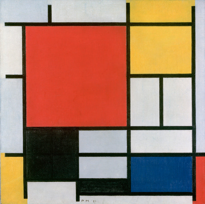
Shape
Shapes are enclosed areas created when lines connect to form boundaries. In my design work, I regularly use both:
- Geometric shapes: Squares, circles, triangles that convey structure, order, and precision
- Organic shapes: Irregular, natural forms that suggest growth, movement, and life
I've observed that shapes have strong psychological associations that I can leverage in my designs:
- Circles: Unity, wholeness, infinity
- Squares/Rectangles: Stability, reliability, trust
- Triangles: Direction, action, tension
Psychological perceptions of different shape types
When I use PageOn.ai's AI Blocks feature, I can easily combine shapes to build complex visual structures without needing advanced design skills. This has been particularly helpful when creating information hierarchies and organizing content visually.
I've found that strategic use of shapes significantly enhances recognition and memory retention in my designs. For example, using distinctive shape combinations for different sections of a presentation helps viewers mentally organize and recall information more effectively.
Space and White Space
In my design practice, I've come to appreciate that what I don't include is often as important as what I do include. White space (also called negative space) is the breathing room between and around elements in a composition.
I use white space strategically to:
- Create visual hierarchy and emphasize important elements
- Improve readability and comprehension
- Prevent visual clutter and cognitive overload
- Guide the viewer's eye through the composition
- Create a sense of elegance and sophistication
I've learned that many novice designers make the mistake of filling every available space, resulting in cluttered designs that are difficult to process. As I've gained experience, I've become more comfortable with generous white space, understanding that it's not "wasted space" but rather an active design element.
PageOn.ai's visual intelligence helps me optimize spacing in layouts automatically, suggesting adjustments that create better visual balance and improve readability. This has been particularly valuable when I'm working on information-dense presentations or complex data visualizations.
Color
Color is perhaps the most emotionally evocative visual element I work with. When I select colors for a project, I consider three key properties:
- Hue: The color itself (red, blue, green, etc.)
- Saturation: The intensity or purity of the color
- Value: The lightness or darkness of the color
I've found that understanding color psychology helps me make more effective design choices. For example:
- Red: Energy, passion, urgency
- Blue: Trust, calm, stability
- Green: Growth, health, prosperity
- Yellow: Optimism, clarity, warmth
Emotional responses to different colors
When creating color schemes, I typically work with one of these approaches:
- Monochromatic: Different shades and tints of a single hue
- Analogous: Colors that are adjacent on the color wheel
- Complementary: Colors that are opposite on the color wheel
- Triadic: Three colors equally spaced around the color wheel
I always consider accessibility when selecting colors, ensuring sufficient contrast for readability. PageOn.ai's Deep Search feature has been invaluable for identifying harmonious color palettes that align with my project goals while maintaining accessibility standards. This helps me create visual communication in media design that's both beautiful and inclusive.
Secondary Visual Design Elements
Texture

Texture adds depth and tactile qualities to my designs, creating visual interest and emotional connection. I work with two primary types of texture:
- Actual texture: Physical surfaces that can be touched (relevant in print design and physical materials)
- Visual texture: The illusion of texture created through imagery and visual techniques
In my digital designs, I use texture to:
- Create depth and dimension in flat interfaces
- Evoke specific emotions or associations
- Differentiate between interface elements
- Add visual richness and complexity
I've found that subtle textures often work best in interface design, providing just enough visual interest without overwhelming the content. PageOn.ai's discovery features help me find and incorporate relevant textures that enhance my messaging without distracting from it.
When I'm creating presentations, I use texture strategically to create visual separation between different sections or content types, helping viewers mentally organize the information.
Typography
I consider typography both a functional and expressive visual element. The fonts I choose not only need to be readable but also communicate personality and tone that align with my message.
When selecting and working with typography, I focus on:
- Readability: How easily text can be read in different contexts and sizes
- Hierarchy: Using type variations to indicate importance and structure
- Personality: The emotional qualities and associations of different typefaces
- Contrast: Creating visual interest through size, weight, and style differences
I typically follow these principles for effective typography:
- Limit to 2-3 typefaces per design
- Create clear size hierarchy (e.g., headings 2-3× larger than body text)
- Maintain adequate line spacing (leading) for readability
- Consider appropriate line length (45-75 characters per line)
flowchart TD
    A[Typography Elements] --> B[Typeface Selection]
    A --> C[Size Hierarchy]
    A --> D[Spacing]
    A --> E[Alignment]

    B --> F[Serif]
    B --> G[Sans-serif]
    B --> H[Display]
    B --> I[Script]

    C --> J[Headings]
    C --> K[Body Text]
    C --> L[Captions]

    D --> M[Line Spacing]
    D --> N[Letter Spacing]
    D --> O[Word Spacing]

    E --> P[Left]
    E --> Q[Center]
    E --> R[Right]
    E --> S[Justified]

    classDef default fill:#FF8000,stroke:#333,stroke-width:1px;
    classDef primary fill:#FF8000,stroke:#333,stroke-width:2px;
    class A primary;
PageOn.ai's intelligence has been helpful in selecting appropriate typography for specific communication goals. When I describe the mood and purpose of my project, it suggests typeface combinations that align with those objectives while maintaining readability and visual harmony. This has been particularly useful when I'm working with visual communication for designers where typography plays a central role.
Volume and Form
While I primarily work in 2D mediums, creating the illusion of dimension and depth adds richness to my designs. Volume and form refer to the representation of three-dimensional objects in two-dimensional space.
I use several techniques to create the perception of volume:
- Light and shadow: Creating highlights and shadows to suggest form
- Perspective: Using converging lines to create depth
- Overlapping: Placing elements in front of others to create spatial relationships
- Size variation: Making distant objects smaller than closer ones
- Gradient: Transitioning colors to suggest curved surfaces

In my interface designs, subtle volume cues like drop shadows and layering help create a sense of hierarchy and interaction affordance. For data visualizations, I use volume to make charts and graphs more engaging and easier to interpret.
I've found PageOn.ai's conversational interface particularly helpful when visualizing complex 3D concepts. Instead of struggling with complicated 3D modeling software, I can describe what I want to communicate, and PageOn.ai helps me create visual representations that effectively convey spatial relationships.
Principles for Combining Visual Elements Effectively
Visual Hierarchy
In my design practice, establishing clear visual hierarchy is essential for guiding viewers through information in the intended order. Visual hierarchy determines what viewers notice first, second, and third in a design.
I create hierarchy through several techniques:
- Size: Larger elements attract attention first
- Color: Bright or contrasting colors stand out
- Position: Elements at the top or center get noticed earlier
- White space: Isolated elements draw more attention
- Typography: Bold, italic, or distinctive fonts create emphasis

I typically aim to create 2-3 distinct levels of importance within my designs:
- Primary: The most important information that should be seen first
- Secondary: Supporting information that provides context or details
- Tertiary: Additional information that's available but less critical
PageOn.ai has been helpful in suggesting hierarchical structures based on content importance. When I input my content, it automatically identifies key points and suggests visual treatments that emphasize them appropriately. This feature has been particularly valuable when I'm creating interactive presentation elements where clear hierarchy is essential for audience comprehension.
Balance and Proportion
User preference for different balance types across design contexts
Balance refers to the distribution of visual weight in a design. In my work, I use two main approaches to balance:
- Symmetrical balance: Elements are mirrored across a central axis, creating a sense of formality and stability
- Asymmetrical balance: Different elements create equilibrium through their visual weight, creating more dynamic and interesting compositions
Proportion relates to the relative size and scale of elements. I often apply the Golden Ratio (approximately 1:1.618) to create naturally pleasing proportions in my layouts. This mathematical relationship appears throughout nature and has been used in design for centuries.
When working with proportion, I consider:
- The relationship between text and image sizes
- The division of space in the overall layout
- The scale of elements relative to each other
- The relationship between negative and positive space
PageOn.ai has been invaluable for automatically balancing elements in my designs. Its algorithms can analyze a layout and suggest adjustments to create more harmonious proportions, saving me time and helping me achieve more professional results. This is especially helpful when I'm working on complex presentations with multiple visual elements.
Contrast and Emphasis
Contrast creates visual interest and helps me direct attention to key elements in my designs. I create contrast through differences in:
- Size: Large vs. small elements
- Color: Light vs. dark, complementary colors
- Type: Bold vs. light, serif vs. sans-serif
- Direction: Horizontal vs. vertical elements
- Texture: Smooth vs. rough surfaces
Emphasis is about creating focal points that draw the viewer's eye. I typically create emphasis through:
- Isolation: Separating an element from others
- Placement: Positioning at natural focal points (e.g., rule of thirds)
- Contrast: Making an element visually different from its surroundings
- Direction: Using lines or shapes to point toward the important element
Contrast is also essential for accessibility. I always ensure sufficient contrast between text and background colors to meet WCAG guidelines, making my designs usable for people with visual impairments.
PageOn.ai has been helpful in identifying opportunities to enhance contrast in my designs. Its analysis tools can detect areas where contrast could be improved for both aesthetic impact and accessibility, suggesting specific adjustments to create more effective visual communication.
Visual Design Elements Across Different Contexts
UI/UX Applications
In my UI/UX design work, visual elements serve both aesthetic and functional purposes. They must not only look good but also help users understand and navigate interfaces effectively.
Key considerations I make when applying visual elements to interfaces:
- Consistency: Using similar visual treatments for similar functions
- Affordance: Making interactive elements look clickable/tappable
- Feedback: Visual cues that confirm user actions
- Accessibility: Ensuring elements are perceivable by all users
- Hierarchy: Guiding users to important actions and information
flowchart TD
    A[UI Visual Elements] --> B[Navigation]
    A --> C[Content]
    A --> D[Interactive Controls]
    A --> E[Feedback]

    B --> F[Menus]
    B --> G[Breadcrumbs]
    B --> H[Search]

    C --> I[Typography]
    C --> J[Images]
    C --> K[Data Visualization]

    D --> L[Buttons]
    D --> M[Forms]
    D --> N[Toggles]

    E --> O[Loading States]
    E --> P[Success/Error]
    E --> Q[Animations]

    classDef default fill:#FF8000,stroke:#333,stroke-width:1px;
    classDef primary fill:#FF8000,stroke:#333,stroke-width:2px;
    class A primary;
I've found that the most successful interfaces strike a careful balance between visual appeal and usability. Overly decorative elements can distract from functionality, while purely utilitarian designs might fail to engage users emotionally.
PageOn.ai has been helpful in transforming complex UI concepts into clear visual structures. By describing the functionality I want to achieve, I can quickly generate visual concepts that effectively communicate the interface's purpose and behavior.
Brand Identity Applications

When I work on brand identity systems, visual elements play a crucial role in building recognition and emotional connection. A cohesive visual language helps brands stand out and communicate their values consistently.
Key visual elements in my brand identity work include:
- Logo: The central visual identifier of the brand
- Color palette: Primary and secondary colors that evoke specific emotions
- Typography: Fonts that reflect the brand's personality
- Imagery style: Consistent approach to photography, illustration, etc.
- Graphic elements: Patterns, icons, and decorative elements
I've found that successful brand visual systems strike a balance between consistency and flexibility. They provide enough structure to maintain brand recognition while allowing for creative expression across different applications and contexts.
PageOn.ai's conversational approach has made it easier for me to visualize brand identity systems. Instead of creating multiple mockups manually, I can describe the brand's personality and values, and PageOn.ai helps me generate visual concepts that align with those attributes.
Information Design Applications
In my information design work, visual elements help clarify complex data and concepts. The primary goal is to make information accessible, understandable, and memorable.
I apply visual elements to information design through:
- Data visualization: Charts, graphs, and diagrams that represent numerical data
- Infographics: Visual representations of information, concepts, or processes
- Maps and spatial representations: Geographic or conceptual space visualization
- Timelines: Visual representation of chronological information
- Comparison displays: Visual juxtaposition of different options or scenarios
Information retention by presentation method
Effective information design requires a careful balance of accuracy and clarity. I focus on eliminating visual clutter, emphasizing important data points, and creating clear visual hierarchies that guide viewers through the information logically.
PageOn.ai's Deep Search capability has been invaluable for integrating relevant data visualizations into my projects. When I'm working on a presentation about a specific topic, PageOn.ai can find and incorporate appropriate charts, graphs, or diagrams that help illustrate key points effectively.
Practical Implementation Strategies
Over the years, I've developed a systematic approach to selecting and combining visual elements in my design projects. This process helps me create more intentional and effective visual communication.
Step-by-Step Process
- Define communication objectives: What needs to be communicated, to whom, and why?
- Identify key messages and hierarchy: What are the most important points? What should be seen first, second, third?
- Select appropriate visual elements: Which elements (line, shape, color, etc.) best support these messages?
- Create rough compositions: Experiment with different arrangements of these elements
- Refine and iterate: Test with target audiences and refine based on feedback
Common Pitfalls to Avoid
- Visual overload: Using too many elements or effects, creating confusion
- Misaligned elements: Poor alignment creating a messy, unprofessional appearance
- Conflicting styles: Mixing incompatible visual styles or treatments
- Poor contrast: Insufficient differentiation between important and secondary elements
- Ignoring context: Not considering how and where the design will be viewed
flowchart TD
    A[Define Objectives] --> B[Identify Key Messages]
    B --> C[Select Visual Elements]
    C --> D[Create Compositions]
    D --> E[Test & Refine]
    E --> F{Effective?}
    F -->|No| C
    F -->|Yes| G[Implement]

    subgraph "Selection Process"
    C1[Consider Line] -.-> C
    C2[Consider Shape] -.-> C
    C3[Consider Color] -.-> C
    C4[Consider Space] -.-> C
    C5[Consider Typography] -.-> C
    end

    classDef default fill:#FF8000,stroke:#333,stroke-width:1px;
    classDef process fill:#FF8000,stroke:#333,stroke-width:2px;
    classDef decision fill:#42A5F5,stroke:#333,stroke-width:2px;
    class A,B,C,D,E,G process;
    class F decision;
Testing and Iterating
I've found that testing designs with real users is invaluable for ensuring visual elements are working effectively. Some testing approaches I use include:
- Five-second tests: Showing designs briefly to see what viewers remember
- A/B testing: Comparing different visual approaches to see which performs better
- Eye-tracking: Understanding where viewers look first and how they navigate the design
- Comprehension testing: Verifying that viewers understand the intended message
PageOn.ai has transformed how I approach visual design by allowing me to quickly convert abstract concepts into concrete visual solutions through simple conversation. Instead of spending hours in complex design software, I can describe what I want to achieve, and PageOn.ai helps me visualize it effectively. This has been particularly valuable when I'm exploring multiple approaches or need to quickly generate visual concepts for client presentations.
Future Trends in Visual Design Elements
As technology evolves, I've noticed several emerging approaches to traditional visual elements that are reshaping how we think about design:
- Dynamic color: Color schemes that adapt to user preferences, time of day, or content
- Responsive typography: Type that adjusts not just size but style based on viewing context
- Dimensional interfaces: Blending 2D and 3D elements for more immersive experiences
- Generative elements: Visual components created algorithmically based on data or user interaction
- Animated micro-interactions: Small motion elements that provide feedback and delight
Technology is also expanding our definition of visual design elements to include:
- Voice and sound: Audio cues that complement visual elements
- Haptic feedback: Tactile responses that enhance visual interactions
- Augmented reality: Blending digital visual elements with the physical world
- Virtual reality: Fully immersive visual environments
- Ambient intelligence: Contextual visual systems that adapt to environment and user needs
Accessibility Considerations
As visual design evolves, I believe accessibility must remain a central consideration. Future trends in accessible visual design include:
- Adaptive interfaces: Designs that automatically adjust to user abilities and preferences
- Multi-sensory feedback: Providing information through multiple channels (visual, audio, haptic)
- Simplified complexity: Making complex information more accessible through thoughtful visual design
- Personalized experiences: Allowing users to customize visual elements to their needs
PageOn.ai helps me stay current with evolving visual design practices by continuously updating its capabilities based on emerging trends and best practices. When I describe what I want to achieve, PageOn.ai suggests contemporary approaches that incorporate current design thinking while maintaining usability and accessibility.
Transform Your Visual Expressions with PageOn.ai
Take your visual design to the next level by leveraging the power of AI to create stunning, effective visual communication. No design experience required.
Start Creating with PageOn.ai TodayPutting It All Together
Throughout my design career, I've come to appreciate that mastering visual design elements is both an art and a science. The most effective visual communication happens when these elements are combined thoughtfully and purposefully to serve specific communication goals.
By understanding the fundamental building blocks of visual design—line, shape, space, color, texture, typography, and form—and applying principles like hierarchy, balance, and contrast, I can create designs that not only look beautiful but also communicate clearly and effectively.
As design tools and technologies continue to evolve, the core principles remain remarkably consistent. What changes is how we apply them across new mediums and contexts. This is where tools like PageOn.ai become invaluable, helping bridge the gap between timeless design principles and cutting-edge implementation.
Whether you're a seasoned designer or just starting to explore visual communication, I encourage you to experiment with these elements and principles. With practice and intention, you'll develop an intuitive sense of how to combine them effectively to create visual designs that inform, engage, and inspire.
You Might Also Like
From Status Quo to Solution: Crafting the Perfect Pitch Narrative Arc | PageOn.ai
Learn how to transform your business presentations with powerful status quo to solution narratives. Discover visual storytelling techniques that captivate investors and stakeholders.
Transform Raw Text Data into Compelling Charts: AI-Powered Data Visualization | PageOn.ai
Discover how AI is revolutionizing data visualization by automatically creating professional charts from raw text data. Learn best practices and real-world applications with PageOn.ai.
Mastering FOMO Psychology: Creating Irresistible Business Pitch Strategies | PageOn.ai
Learn how to leverage FOMO psychology in your business pitches to drive urgent action. Discover proven strategies for creating authentic scarcity, exclusivity, and urgency that converts.
Mastering the American Accent: Essential Features for Global Professional Success
Discover key American accent features for global professionals with visual guides to vowel pronunciation, rhythm patterns, and industry-specific applications for career advancement.